Local Spatial Autocorrelation (2)
Other Local Spatial Autocorrelation Statistics
Luc Anselin1
10/10/2020 (updated)
Introduction
In this chapter, we continue our exploration of local spatial autocorrelation statistics. First, we cover several extensions of the Local Moran, such as the Median Local Moran, the Differential Local Moran and a specialized version that deals with the variance instability in rates or proportions, the EB Local Moran. In addition, we discuss the Local Geary statistic. We also cover a local statistics introduced by Getis and Ord. These statistics are not a LISA in a strict sense, but nevertheless are important tools to discover local hot spots and cold spots.
We use two of the example data sets we introduced earlier, the natregimes data on homicides in U.S. counties and the Guerry collection of socio-economic indicators for 1830 France.
Objectives
-
Assess the sensitivity of Local Moran to the use of a median spatial lag instead of an average spatial lag
-
Identify clusters and outliers in the change of a variable over time
-
Correct the local Moran statistic for variance instability in rates
-
Identify clusters and outliers by means of the Local Geary
-
Identify hot spots and cold spots by means to the Gi and Gi* statistics
GeoDa functions covered
- Space > Median Local Moran’s I
- Space > Differential Local Moran’s I
- Space > Local Moran’s I with EB rate
- Space > Univariate Local Geary
- Space > Local G
- Space > Local G*
Preliminaries
We will alternately use the Guerry data set and the natregimes data set. For each of these, we need an active spatial weights matrix, e.g., guerry_85_q for the former and natregimes_q for the latter. See the description in earlier Chapters on how to accomplish this.
For the natregimes data set, we need some further preparation to make the variables time sensitive. By means of the Time Editor, we first group the homicide rates hr60 through hr90 into the variable hr, the homicide counts hc60 through hc90 into the variable hc, and the population counts po60 through po90 into po.
Extensions of the Local Moran
We consider three extensions of the Local Moran. One uses the median of the neighboring values instead of the average in the computation of the local statistic. We refer to it as the Median Local Moran. A second extension provides an easy way to compute the Local Moran for the difference for a given variable at two points in time. The Differential Local Moran is equivalent to first computing the difference and then applying the Local Moran, but our implementation carries everything out in one step. Finally, we consider an adjustment to the Local Moran for the inherent variance instability of rates in the form of the EB Local Moran.
These extensions can be found among the first group in the Space item on the Menu, or in the corresponding drop down list obtained from the toolbar icon. For example, Figure 1 shows the selection of the Median Local Moran.
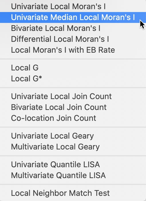
Figure 1: Median Local Moran and other Moran extensions
Median Local Moran
Principle
So far, we have defined a spatially lagged variable as \(\sum_j w_{ij} z_j\), or the average of the values observed at the neighboring locations. As we saw in the discussion of the interpretation of the clusters and outliers identified by a significant Local Moran, the spatial lag is sensitive to the presence of outliers. This may pull the average up (or down), even when many of the neighbors do not have high (low) values, creating a potentially misleading impression of a cluster or outlier.
An alternative can be based loosely on the idea of a median smoother (e.g., Wall and Devine 2000). In the latter, the value at a location (typically a rate) is replaced by the median of the neighboring locations. In the interpretation here, the median of the neighbors is used in the place of the average as a median spatial lag.
Consequently, the Median Local Moran becomes: \[I_{i}^M = z_i \times \mbox{med}(z_j, j \in N_i),\] where \(N_i\) is the neighbor set of location \(i\) (i.e., those locations for which \(w_{ij} \neq 0\)).
Inference and interpretation are identical to that for the original Local Moran.
Implementation
As shown in Figure 1, the Median Local Moran is invoked as the second item in first group of the Cluster Maps drop down list from the toolbar, or as Space > Univariate Median Local Moran’s I from the menu.
This brings up the usual variable selection dialog, as we saw in the previous Chapter. All the options are the same as for the Local Moran, i.e., the randomization, significance filter and saving of the results. We refer to that discussion for details.
Comparing Local Moran to Median Local Moran
To compare the results between the traditional Local Moran and the more robust Median Local Moran, we put the respective significance maps and cluster maps side by side. We use the Guerry data set with the Donatns variable in this illustration.
In Figure 2, we have the significance map for the Median Local Moran on the left, compared to the traditional Local Moran on the right. Both results are for 99,999 random permutations and use p=0.05 as the significance level, with queen contiguity as the spatial weights.
The Median Local Moran has slightly fewer significant locations, with 25 compared to 29 for the traditional Local Moran. Also, there is no longer a location that achieves a p-value of 0.0001. The changes work in both directions. Several locations that are significant for the Local Moran are no longer significant in the median version. However, especially in the group of locations in the center-west, there are a small number of newly significant locations.
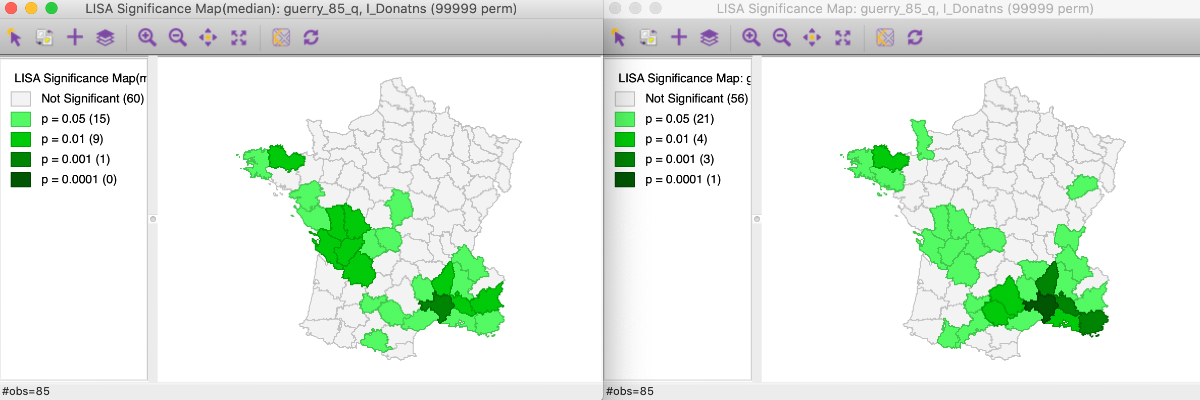
Figure 2: Significance maps for Local Moran and Median Local Moran
The respective cluster maps are compared side by side in Figure 3, with again the results for the Median Local Moran in the left panel. Now, we see more clearly what is going on. The main effect seems to be on the former spatial outliers (one High-Low and one Low-High), which are no longer significant. Recall the discussion in the previous Chapter about the potential leverage effect of some outliers. Using the median spatial lag effectively removes that influence. One of the spatial outliers remains significant however, strengthening our identification of that observation as an interesting location. The main effect on the clusters is a shrinkage of the number of Low-Low observations and an increase in the size of the center-west High-High cluster.
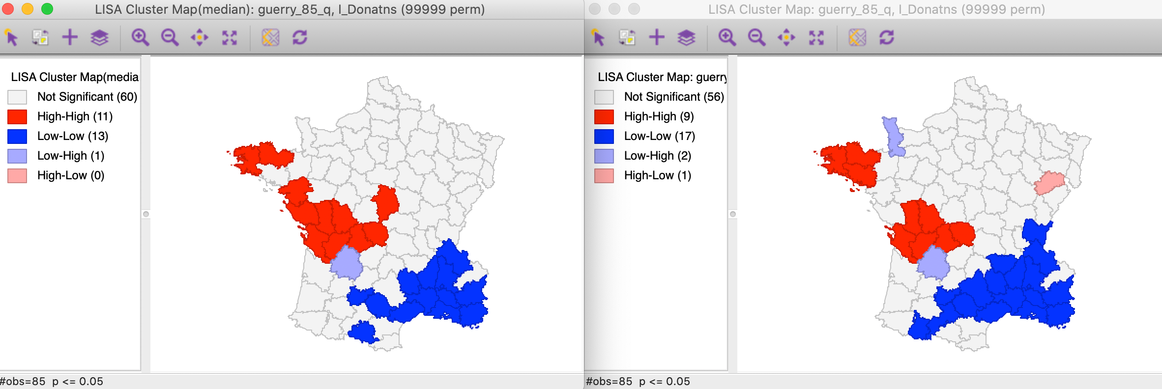
Figure 3: Cluster maps for Local Moran and Median Local Moran
Overall, a comparison of the results for the Median Local Moran to the traditional Local Moran provides insight into the sensitivity of the results to potential outliers. It should be part of a standard sensitivity analysis, together with an assessment of different p-value cut-offs.
Differential Local Moran
Principle
The Differential Local Moran statistic is the local counterpart to the differential Moran scatter plot, discussed in an earlier Chapter. Instead of using the observations on a variable at two different time periods separately, this statistic is based on the change over time, i.e., the difference between \(y_t\) and \(y_{t-1}\). Note that this is the actual difference and not the absolute difference, so that a positive change will be viewed as high, and a negative change as low. The differences are used in standardized form, i.e., they are not the differences between the standardized variable at two points in time, but the standardized differences between the original values for the variable.
The formal expression for this statistic follows the same logic as before, and consists of the cross product of the difference between \(y_t\) and \(y_{t-1}\) at \(i\) with the associated spatial lag:
\[I_{i}^D = c (y_{i,t} - y_{i,t-1}) \sum_j w_{ij} (y_{j,t} - y_{j,t-1}).\] The scaling constant \(c\) can be ignored. In essence, this is the same as the traditional Local Moran applied to the difference, but our implementation is based on selecting the two variables separately.
As before, inference is based on conditional permutation. All the usual caveats hold about multiple comparisons and the choice of a p-value. In all respects, the interpretation is the same as for the traditional Local Moran.
Implementation
In order to provide some reference, we first create a traditional Local Moran cluster map for the variable hr in 90 in the time enabled natregimes data set (see Preliminaries). The result, for the default of 999 permutations and p=0.05 is shown in Figure 4.
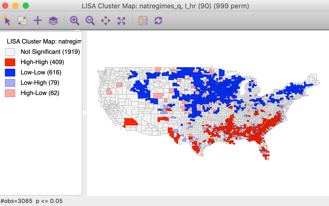
Figure 4: Local Moran cluster map for hr(90)
The differential local Moran functionality is invoked from the Cluster Maps toolbar icon, as shown in Figure 1, or from the menu as Space > Differential Local Moran’s I.
Next follows a variable selection dialog, shown in Figure 5, which is slightly different from the standard interface, but the same as for the differential Moran scatter plot.
First, the variable of interest is selected (here, hr), and then the two time periods are chosen (here, 90 and 80). Note that the system is agnostic about the actual time periods, so that any combination can be selected. The statistic is computed for the difference between the time period specified as the first item and that given as the second item. In our example, the spatial weights are natregime_q.
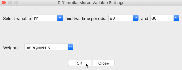
Figure 5: Differential Local Moran variable selection
As before, a choice is presented between a Significance Map, Cluster Map, and Moran Scatter Plot, with just the Cluster Map selected as the default. With the default setting, the result is based on 999 permutations with a p-value of 0.05, as shown in Figure 6.
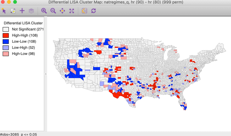
Figure 6: Differential Local Moran cluster map
All the options, such as randomization and significance filter are the same as for the univariate local Moran and will not be further discussed here. There is a slight difference in how the results are saved, which is illustrated below.
Interpretation
The first aspect of the results is a much smaller number of significant locations compared to the standard cluster map (compare to Figure 4). The result here gives the locations where the change in the variable over time is matched by similar/dissimilar changes in the surrounding locations. It is important to keep in mind that the focus is on change, and there is no direct connection to whether this changes is from high or from low values.
Two situations can be distinguished, depending on whether the change variable takes on both positive and negative values, or when all the changes are of the same sign (i.e., all observations either increase or decrease over time).
When both positive and negative change values are present, the High-High locations will tend to be locations with a large increase (positive change), surrounded by locations with similar large increases. The Low-Low locations will be observations with a large decrease (negative change), surrounded by locations with similar large decreases. Spatial outliers will be locations where an increase is surrounded by a decrease and vice versa.
When all changes are of the same sign, the interpretation of High-High and Low-Low depends on the sign. Due to the standardization, large positive values will be considered high (above the mean), whereas large negative values will be labeled low (below the mean). This should be kept in mind when interpreting the results.
Saving the results
Similar to the functionality for the differential Moran scatter plot, the Save Results option includes an item to save the actual change variable (in raw form, not in standardized form). In the dialog, this corresponds to the Diff Values item, as shown in Figure 7. The other options are the same as for all local spatial autocorrelation statistics, i.e., the value of the statistic, cluster type, and p-value.
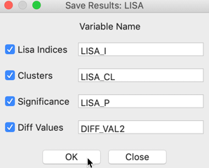
Figure 7: Saving the results for differential local Moran
Once the difference is saved as a separate variable, it can be used in a standard univariate Local Moran operation.
Local Moran with EB Rate
Principle
The last of the extensions of the local Moran’s I pertains to the special case where the variable of interest is a rate or proportion. As discussed for the Moran scatter plot, the resulting variance instability can cause problems for the Moran statistic. The EB standardization suggested by Assunção and Reis (1999) for the global case can be extended to the local statistic in a straightforward manner. The statistic has the usual form, but is computed for the standardized rates, \(z\).
\[I_{i}^{EB} = c z_i \sum_j w_{ij} z_j,\]
The standardization of the raw rate \(r_i\) is the same as before, and is repeated here for completeness (for a more detailed discussion, see the relevant Chapter):
\[z_i = \frac{r_i - \beta}{\sqrt{\alpha + (\beta/P_i)}}\] with \(\beta\) as an estimate of the mean and the denominator as an estimate of the standard error.2
All inference and interpretation is the same as for the univariate case and is not further pursued here.
Implementation and interpretation
The local Moran functionality for standardized rates is invoked as the last item in the Moran group on the Cluster Maps toolbar icon, shown in Figure 1. Alternatively, it can be selected from the menu as Space > Local Moran’s I with EB Rate.
Since the rate standardization is computed as part of the operation, the variable selection interface is similar to that used for rate maps. With the time enabled variables, we need to make sure the Time is synchronized so that both the numerator (the events) and the denominator (the population at risk) pertain to the same period (here, 90). In our example, shown in Figure 8, we take the Event Variable as homicide counts, hc(90), and the Base Variable as population, po(90). As before, we use the queen contiguity, natregimes_q.
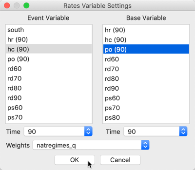
Figure 8: EB rates local Moran variable selection
Again, we can choose between a Significance Map, a Cluster Map and the Moran Scatter Plot options. With the default settings (cluster map, 999 permutations and p = 0.05), the resulting map is as in Figure 9.
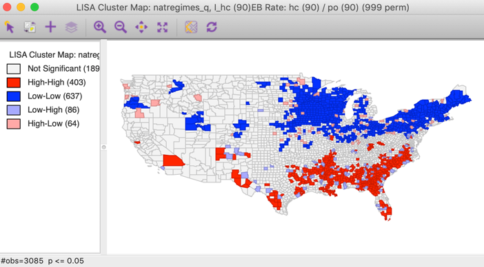
Figure 9: Local Moran cluster map for EB rates - hr90
Compared to the cluster map for the raw rates in Figure 4, we observe major differences in the Low-Low clusters in the upper midwest. Typically, the greater the variation among values for the base variable (population at risk), especially when the latter is small, the more the two maps will tend to differ. However, when the base population is more or less equal by design (e.g., for census tracts in the U.S.), there is little gain from using the EB rates.
Saving the results
Here again, the Save Results option includes an item to save the actual EB rate (this is identical to the EB Rate standardization that can be computed with the Table Calculator option). In the dialog, this corresponds to the EB Rates item, as shown in Figure 10. The other options are the same as for all local spatial autocorrelation statistics, i.e., the value of the statistic, cluster type, and p-value.
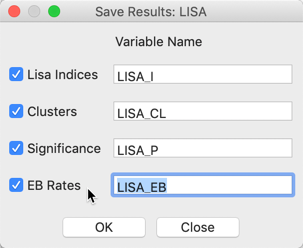
Figure 10: Saving the results for EB rates
Local Geary
Principle
The Local Geary statistic, first outlined in Anselin (1995), and further elaborated upon in Anselin (2019), is a Local Indicator of Spatial Association (LISA) that uses a different measure of attribute similarity. As in its global counterpart, the focus is on squared differences, or, rather, dissimilarity. In other words, small values of the statistics suggest positive spatial autocorrelation, whereas large values suggest negative spatial autocorrelation.
The Geary c statistic of spatial autocorrelation (Geary 1954) takes on the following form: \[c = \frac{\sum_i \sum_j w_{ij}(x_i - x_j)^2/2S_0}{\sum_i (x_i - \bar{x})^2 / (n-1)},\] with \(S_0 = \sum_i \sum_j w_{ij}\), and where the \(x\) in the numerator do not need to be in standardized form, due to the squared difference. The statistic has a mean value of 1 under the null hypothesis of spatial randomness. Significant values less than 1 indicate positive spatial autocorrelation and values larger than 1 negative spatial autocorrelation.
After controlling for the parts in the expression that do not change with \(i\), a local version of the statistic can be found as (for technical details, see Anselin 1995): \[LG_i = \sum_j w_{ij}(x_i - x_j)^2,\] in the usual notation. Again, because of the squared difference, there is no need to standardize \(x\).
Closer examination reveals that this statistic consists of a weighted sum of the squared distance in attribute space for the geographical neighbors of observation \(i\). Since there is no cross-product involved, there is no direct relation to linear similarity. In other words, since the Local Geary uses a different criterion of attribute similarity, it may detect patterns that escape the Local Moran, and vice versa.
As for the Local Moran, analytical inference is based on an approximation and generally not very reliable. Instead, the same conditional permutation procedure as for the Local Moran is implemented. The results are interpreted in the same way, with the caveat regarding the p-values and the notion of significance.
Clusters and spatial outliers
The interpretation of significant
locations in terms of the type of association is not as straightforward for the Local Geary as
it was for the Local Moran. In essence, this
is because the attribute similarity is not a cross-product and thus has no direct
correspondence with the slope in a scatter plot. Nevertheless, we can use the linking
capability within GeoDa to make an incomplete classification.
Those locations identified as significant and with the Local Geary statistic smaller than its mean, suggest positive spatial autocorrelation (small differences imply similarity). For those observations that can be classified in the upper-right or lower-left quadrants of a matching Moran scatter plot, we can identify the association as High-High or Low-Low. However, given that the squared difference can cross the mean, there may be observations for which such a classification is not possible. We will refer to those as other positive spatial autocorrelation.
For negative spatial autocorrelation (large values imply dissimilarity), it is not possible to assess whether the association is between High-Low or Low-High outliers, since the squaring of the differences removes the sign.
We will illustrate this further below.
Implementation
We return to using the Guerry data set for our illustration.
In the same way as for the Local Moran, the Local Geary can be invoked from the Cluster Maps toolbar icon, as the first item in the fourth block in Figure 1. Alternatively, it can be started from the main menu, as Space > Univariate Local Geary.
The subsequent step is the same as before, bringing up the Variable Settings dialog that contains the names of the available variables as well as the spatial weights. Everything operates in the same way for all local statistics, so we will not dwell on those aspects here. We again select Donatns as the variable, with guerry_85_q as the queen contiguity weights.
The following dialog offering different window options is slightly different, in that there is no Moran scatter plot option. The only options are for the Significance Map and the Cluster Map. The default is that only the latter is checked, as in Figure 11.

Figure 11: Local Geary window options
After selecting the Significance Map option as well, the OK button generates two maps, using a default p-value of 0.05 and 999 permutations, as shown in Figures 12 and 13. In our example, there are 28 significant locations, highlighted in Figure 12.
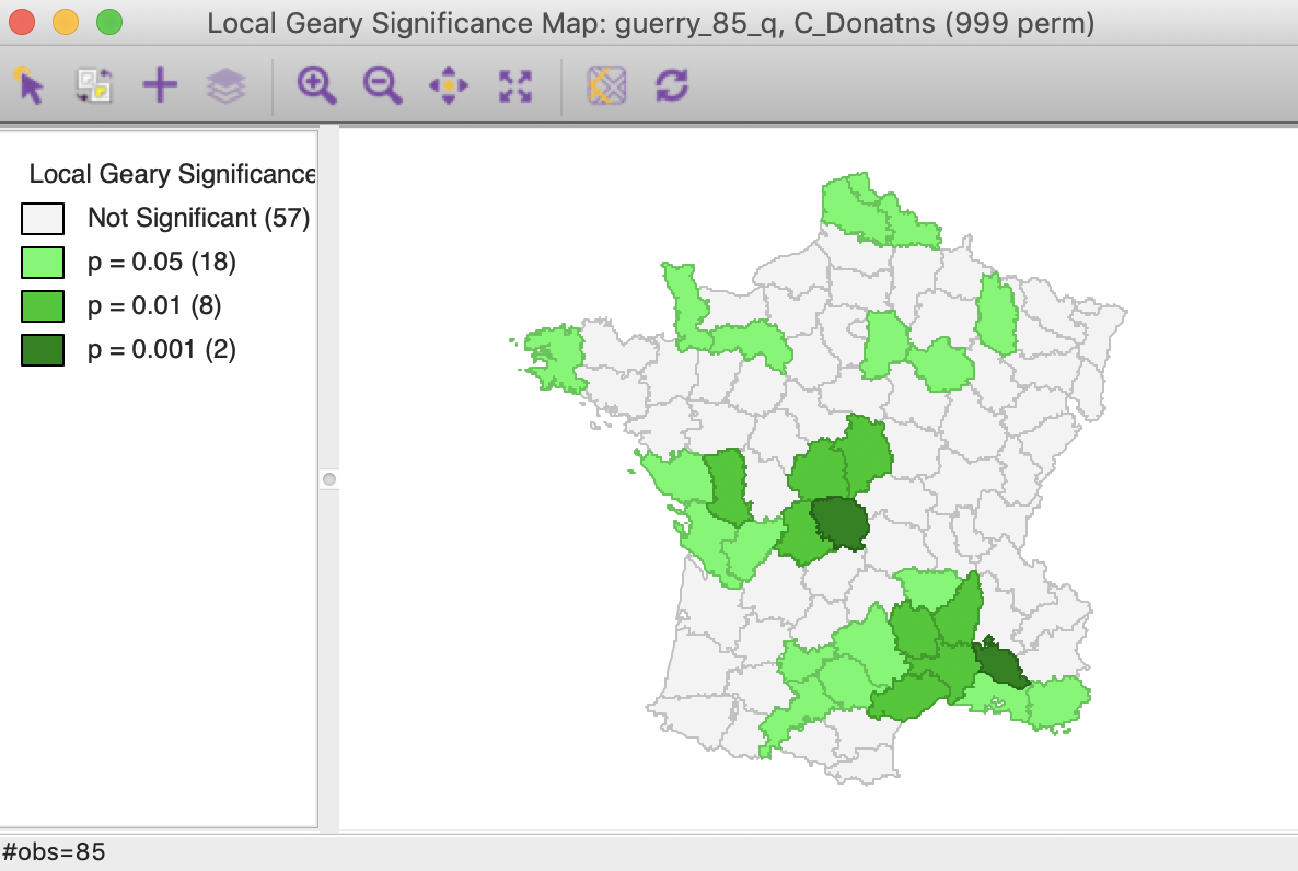
Figure 12: Local Geary default significance map (p<0.05)
As discussed above, some of the locations with a positive spatial autocorrelation can be distinguished between the High-High and Low-Low cases. As shown in Figure 13, there are 9 such High-High locations and 17 Low-Low locations. There are no locations with positive spatial autocorrelation classified as other in this case. There are two observations with negative spatial autocorrelation, although, as discussed, it is not possible to characterize the type of spatial outliers they correspond with.
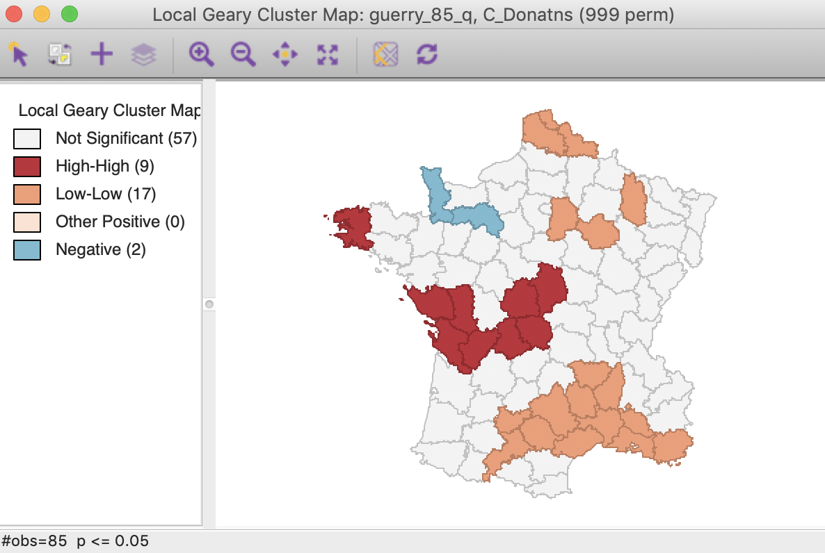
Figure 13: Local Geary default cluster map (p<0.05)
All the options operate the same for all local statistics, including the randomization setting, the selection of significance levels, the selection of cores and neighbors, the conditional map option, as well as the standard operations of setting the selection shape and saving the image.
Below, we only discuss the interpretation and how to save the results, which differ slightly from the standard case.
Interpretation and significance
Before proceeding further, we change the randomization option to 99,999 permutations. This results in minor changes in the cluster map, with two of the marginal (i.e., only significant at p < 0.05) Low-Low locations removed. As a result, there are now 26 significant locations.
Clusters and spatial outliers
To illustrate the rationale behind the classification of the local clusters, we link the locations identified as High-High with a matching Moran scatter plot. As usual, we select the observations in question by clicking on the red rectangle in the legend next to High-High. This highlights the corresponding locations in the cluster map (the other locations become more transparent) and simultaneously selects the matching points in the Moran scatter plot. As illustrated in Figure 14, the type of association is between locations above the mean and a spatial lag that is also above the mean, which we have characterized as High-High.
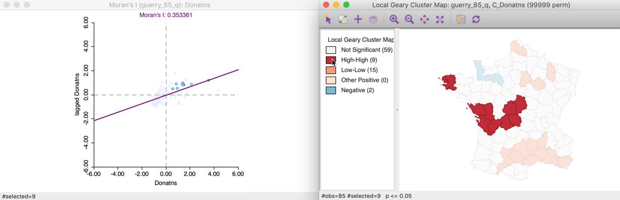
Figure 14: Local Geary High-High clusters
Similarly, selecting the Low-Low cluster cores (click the orange rectangle in the legend) shows the corresponding points in the lower-left quadrant of the Moran scatter plot in Figure 15.
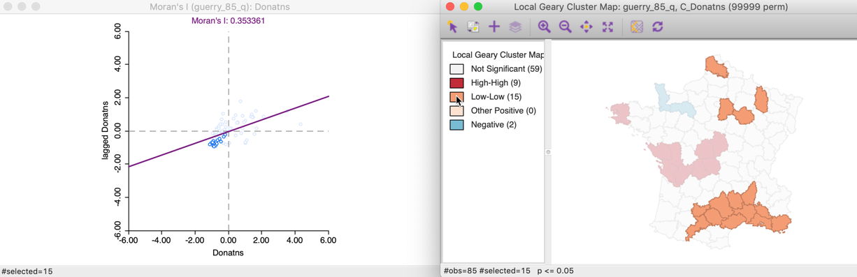
Figure 15: Local Geary Low-Low clusters
In our example, all cluster locations can be classified by means of the Moran scatter plot. However, typically, this is not the case and some observations have to be classified as other. Those are locations surrounded by neighbors that are similar (small squared difference), but they may be located on different sides of the mean (e.g., a value slightly above the mean and a neighbor slightly below the mean).
For negative spatial autocorrelation, there is no unambiguous classification, since the squared differences eliminate the sign of the dissimilarity between an observation and its neighbors. The corresponding points in the Moran scatter plot are not informative, as shown in Figure 16.
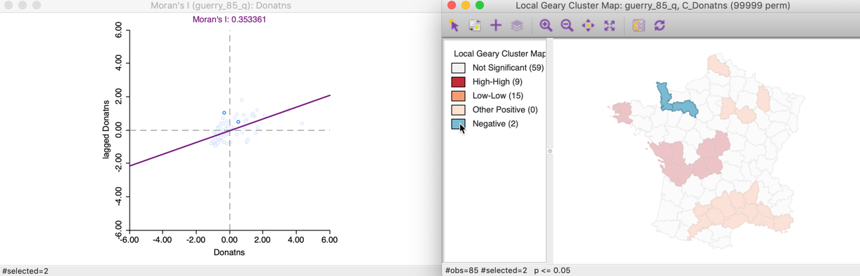
Figure 16: Local Geary negative spatial autocorrelation
Changing the significance threshold
With 99,999 permutations, the significance map allows for a much finer grained assessment of significance. In our example, in Figure 17, 14 locations are significant at 0.05, 10 at 0.01, and one each for 0.001 and 0.00001. Note that there is some correspondence between the Local Moran and the Local Geary cluster maps, but there is by no means a perfect match. Specifically, while the most significant locations are in the same region (the South of France), the location with p < 0.00001 found here is not the same as the one identified for the Local Moran, but a neighbor.
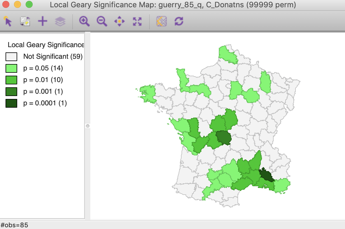
Figure 17: Local Geary significance map (99999 permutations)
In the same way as for the Local Moran statistic, we can manipulate the Significance Filter to assess the sensitivity of the identified clusters and spatial outliers to the choice of the cut-off point. For example, in Figure 18, with p < 0.01, there are six High-High and six Low-Low cluster cores, but there is no longer any evidence of spatial outliers.
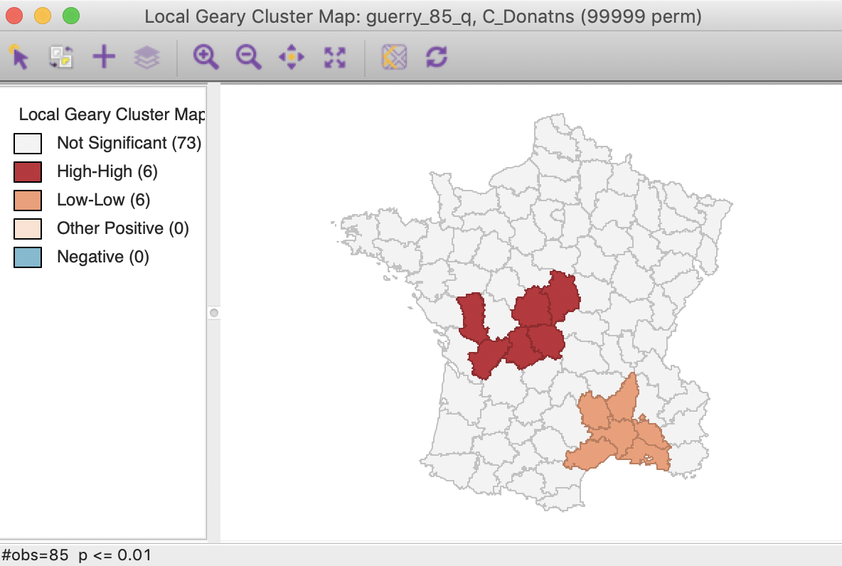
Figure 18: Local Geary (p < 0.01)
In this particular case, the Bonferroni bound and the FDR yield the same cut-off value of 0.00012, with only one significant location, highlighted in Figure 19.
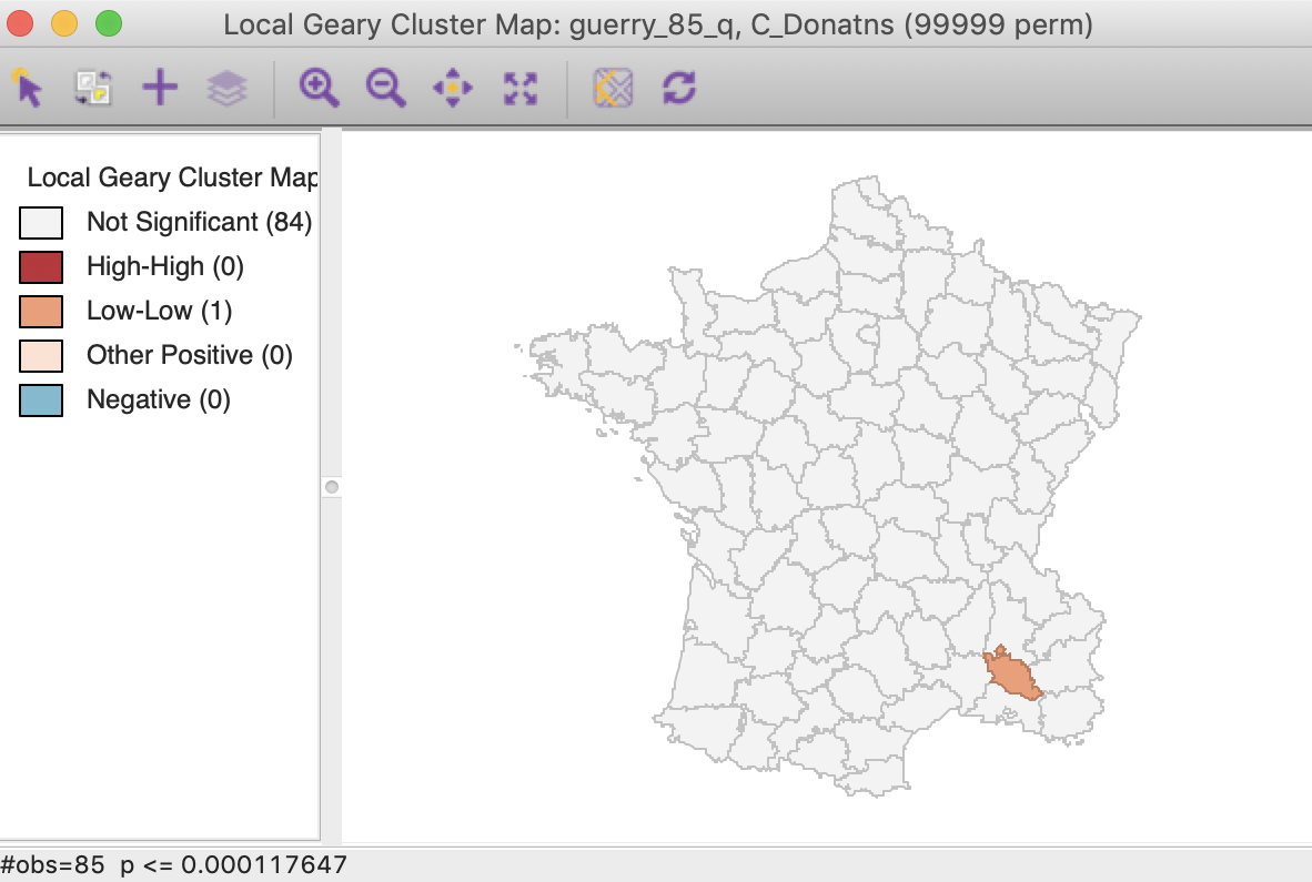
Figure 19: Local Geary FDR (p < 0.00012)
Saving the results
We can again add selected statistics to the data table by means of the Save Results option. As before, the dialog gives the option to save the statistic itself, the cluster indication and the significance, as shown in Figure 20. Default values for the variable names are suggested, but these will typically need to be customized.
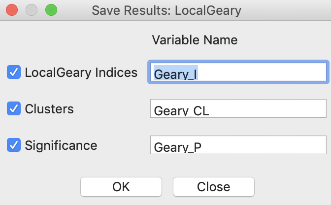
Figure 20: Local Geary Save Results options
The code for the cluster classification used for the Local Geary is 0 for not significant, 1 for a High-High cluster core, 2 for a Low-Low cluster core, 3 for other (positive spatial autocorrelation), and 4 for negative spatial autocorrelation.
As always, any addition to the data table is only made permanent after a Save operation.
Getis-Ord Statistics
Principle
An early class of statistics for local spatial autocorrelation was suggested by Getis and Ord (1992), and further elaborated upon in Ord and Getis (1995). It is derived from a point pattern analysis logic. In its earliest formulation the statistic consisted of a ratio of the number of observations within a given range of a point to the total count of points. In a more general form, the statistic is applied to the values at neighboring locations (as defined by the spatial weights). There are two versions of the statistic. They differ in that one takes the value at the given location into account, and the other does not.
The \(G_i\) statistic consist of a ratio of the weighted average of the values in the neighboring locations, to the sum of all values, not including the value at the location (\(x_i\)). \[G_i = \frac{\sum_{j \neq i} w_{ij} x_j}{\sum_{j \neq i} x_j}\]
In contrast, the \(G_i^*\) statistic includes the value \(x_i\) in both numerator and denominator: \[G_i^* = \frac{\sum_j w_{ij} x_j}{\sum_j x_j}.\] Note that in this case, the denominator is constant across all observations and simply consists of the total sum of all values in the data set. The statistic is the ratio of the average values in a window centered on an observation to the total sum of observations.
The interpretation of the Getis-Ord statistics is very straightforward: a value larger than the mean (or, a positive value for a standardized z-value) suggests a High-High cluster or hot spot, a value smaller than the mean (or, negative for a z-value) indicates a Low-Low cluster or cold spot. In contrast to the Local Moran and Local Geary statistics, the Getis-Ord approach does not consider spatial outliers.3
Inference can be derived from an analytical approximation, as given in Getis and Ord (1992) and Ord and Getis (1995). However, as for the Local Moran and Local Geary, such approximation may not be reliable in practice. Instead, conditional random permutation can be employed, using an identical procedure as for the other statistics.
Implementation
The implementation of the Getis-Ord statistics is largely identical to that of the other local statistics. Each statistic an be selected from the second group in the drop down menu generated by the Cluster Maps toolbar icon. Alternatively, they can be invoked from the menu as Space > Local G or Space > Local G*.
The next step brings up the Variable Settings dialog. We continue with the Guerry example and again select Donatns as the variable, with guerry_85_q as the queen contiguity weights.
This is followed by a choice of windows to be opened. The latter is again slightly different from the previous cases. The default, shown in Figure 21, is to use row-standardized weights and to generate only the Cluster Map. The Significance Map option needs to be invoked explicitly by checking the corresponding box.
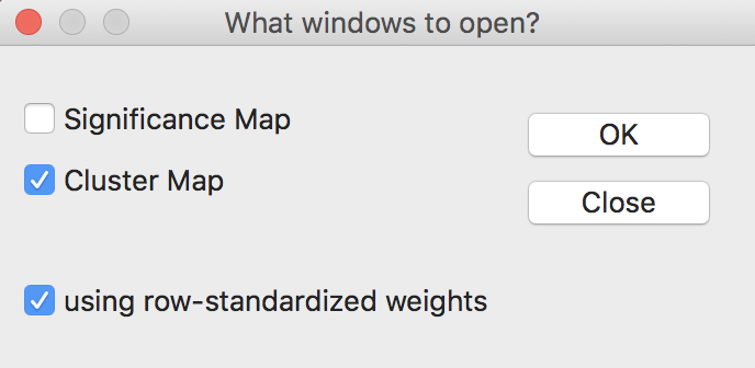
Figure 21: Getis-Ord statistics window options
The Getis-Ord statistics also allow the use of binary weights (i.e., not row-standardized), by having the row-standardized weights box unchecked. In practice, the results rarely differ much.
Using the default settings of 999 permutations, with p at 0.05, yields the significance map for the \(G_i\) statistic shown in Figure 22.
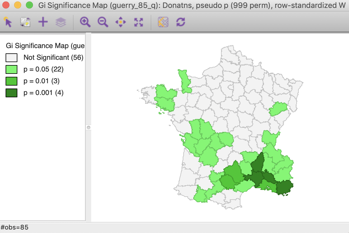
Figure 22: Gi statistic default significance map (999 permutations)
The corresponding cluster map, illustrated in Figure 23, shows 10 High-High cluster cores or hot spots (in red on the map), and 19 Low-Low cluster cores or cold spots (in blue on the map). Note that these are the exact same locations as identified for the Local Moran, except that the spatial outliers are now classified as part of the clusters (one in the High-High group and one in the Low-Low group).

Figure 23: Gi statistic default cluster map (999 permutations)
In this particular example, the cluster map for the \(G_i^*\) statistic, shown in Figure 24, gives the identical results. This is often the case, but not always, so there is a point in computing both statistics.
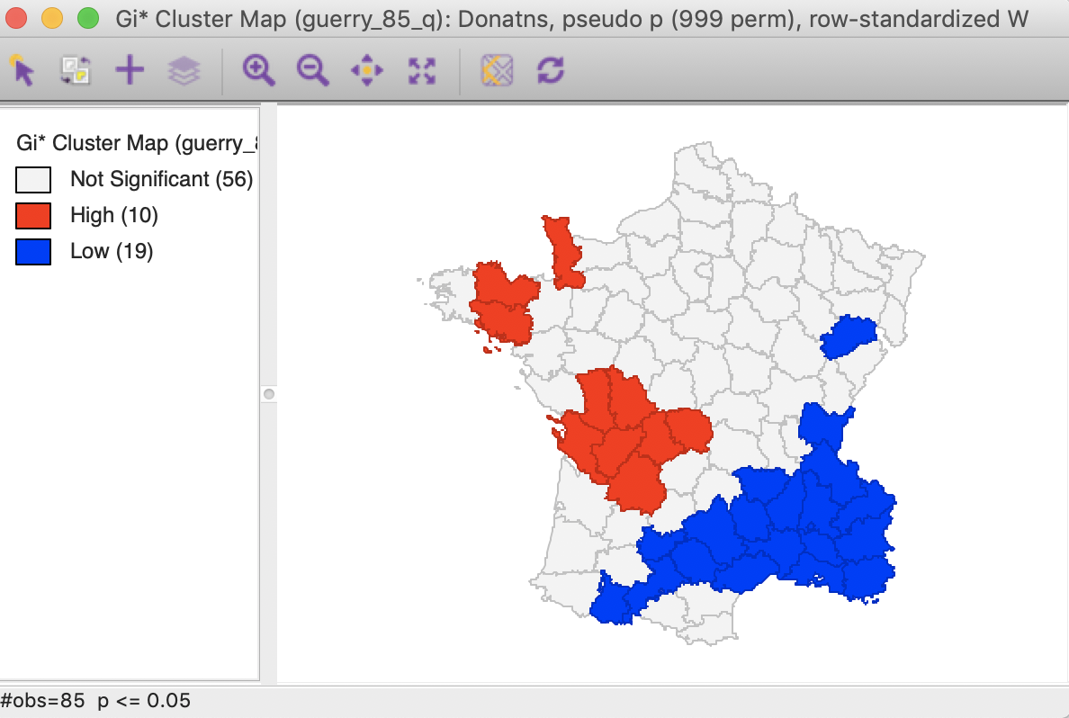
Figure 24: Gi* statistic default cluster map (999 permutations)
For the Getis-Ord statistics, all the same options are available as for the Local Moran and the Local Geary statistics, and we refer to those discussions for details.
Interpretation and significance
In the same way as for the other statistics, changing the number of permutations to 99,999 provides a more detailed insight into the importance of the different locations, as indicated in the significance map. While 21 locations are deemed to be significant for 0.05, there are only four such locations for 0.01, three for 0.001 and one for 0.00001. This is the exact same result as for the Local Moran, illustrated in Figure 25 for the \(G_i\) statistic (the results for the \(G_i^*\) statistic are the same).
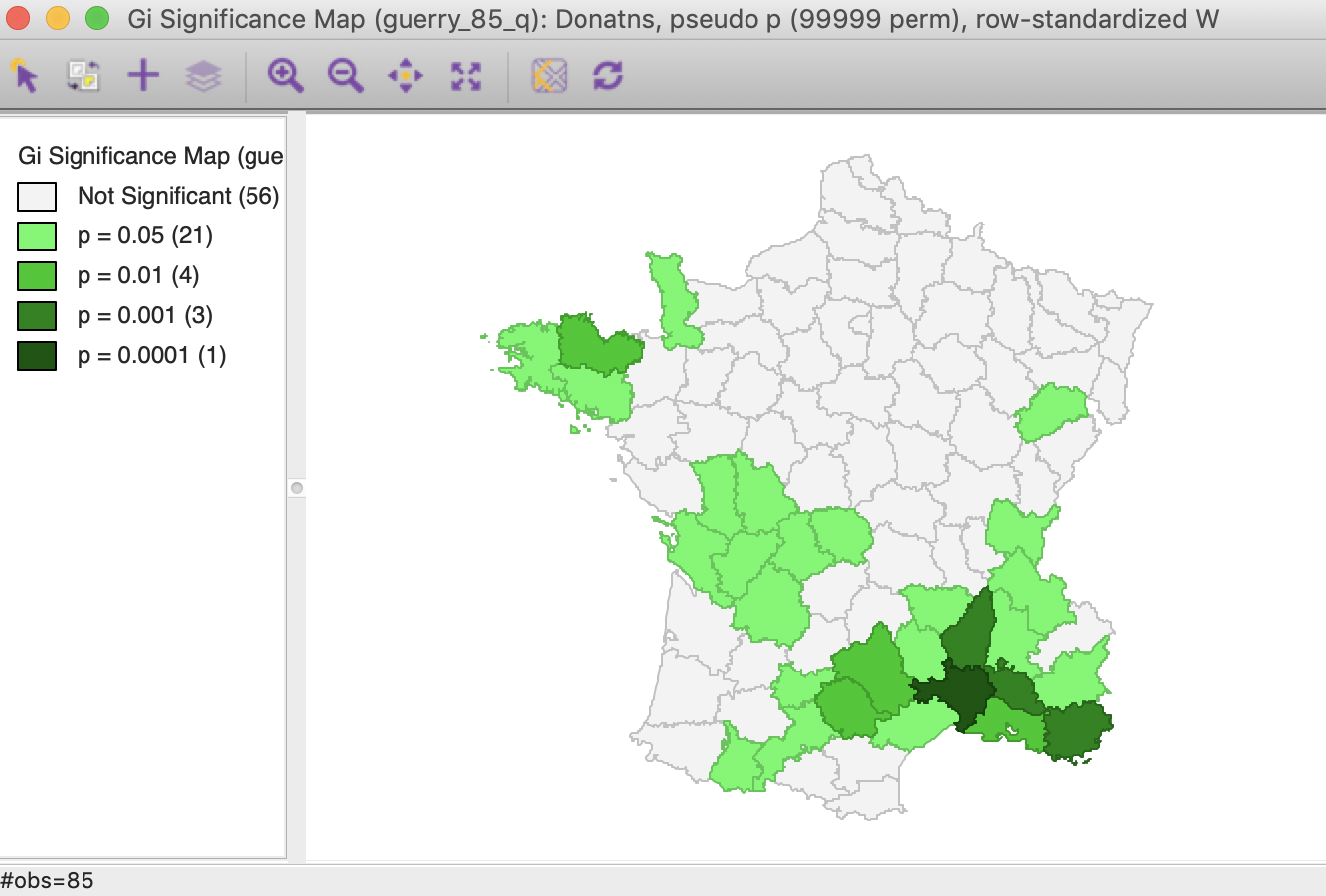
Figure 25: Gi statistic significance map (99999 permutations)
Using the Significance Filter, we can assess the effect of a change of critical p-value to 0.01. In Figure 26, only one High-High cluster core remains, whereas the Low-Low cluster is reduced to seven observations.
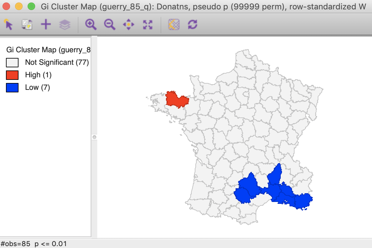
Figure 26: Gi statistic cluster map (p < 0.01)
As shown in Figure 27, the FDR criterion further reduces the number of significant locations to three in the South of the country. These are the same three locations also identified by the Local Moran statistic.
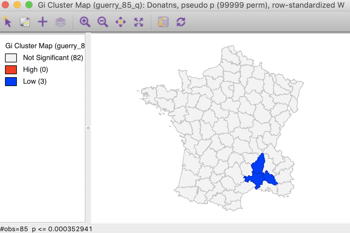
Figure 27: Gi statistic cluster map (FDR)
The result for the Bonferroni bound is again the same as for the Local Moran, with only one significant location (see the previous Chapter).
Saving the results
The Save Results option makes it possible to add the statistics and their characteristics to the data table. As shown in Figure 28, three options are available: the statistic itself (either \(G_i\) or \(G_i^*\)), the associated cluster category and pseudo p-values.
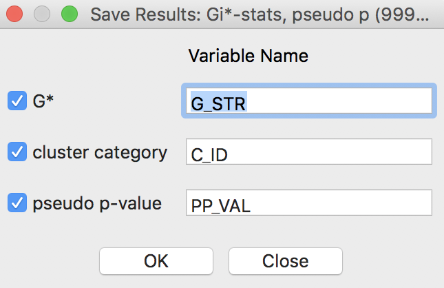
Figure 28: Getis-Ord statistics Save Results options
For the Getis-Ord statistics, there are only three cluster categories, with observations taking the value of 0 for not significant, 1 for a High-High cluster, and 2 for a Low-Low cluster.
As always, the addition of the new variables to the table is made permanent by a save operation.
References
Anselin, Luc. 1995. “Local Indicators of Spatial Association — LISA.” Geographical Analysis 27: 93–115.
———. 2019. “A Local Indicator of Multivariate Spatial Association, Extending Geary’s c.” Geographical Analysis 51 (2): 133–50.
Assunção, Renato, and Edna A. Reis. 1999. “A New Proposal to Adjust Moran’s I for Population Density.” Statistics in Medicine 18: 2147–61.
Geary, R. 1954. “The Contiguity Ratio and Statistical Mapping.” The Incorporated Statistician 5: 115–45.
Getis, Arthur, and J. Keith Ord. 1992. “The Analysis of Spatial Association by Use of Distance Statistics.” Geographical Analysis 24: 189–206.
Ord, J. Keith, and Arthur Getis. 1995. “Local Spatial Autocorrelation Statistics: Distributional Issues and an Application.” Geographical Analysis 27: 286–306.
Wall, Patrick, and Owen Devine. 2000. “Interactive Analysis of the Spatial Distribution of Disease Using a Geographic Information System.” Journal of Geographical Systems 2 (3): 243–56.
-
University of Chicago, Center for Spatial Data Science – anselin@uchicago.edu↩︎
-
To recap, \(\beta = \sum_i O_i / \sum_i P_i\), where \(O_i\) is the number of events at \(i\) and \(P_i\) is the population at risk. The estimate of \(\alpha = [\sum_i P_i ( r_i - \beta )^2 ] / P - \beta / ( P / n),\), with \(n\) as the total number of observations, such that \(P/n\) is the average population. Note that the estimate of \(\alpha\) can be negative, in which case it is set to zero.↩︎
-
When all observations for a variable are positive, as is the case in our examples, the G statistics are positive ratios less than one. Large ratios (more precisely, less small values since all ratios are small) correspond with High-High hot spots, small ratios with Low-Low cold spots.↩︎