Cluster Analysis (1)
Dimension Reduction Methods
Luc Anselin1
03/09/2019 (latest update)
Introduction
In this chapter, we move further into multivariate analysis and cover two standard methods that help to avoid the so-called curse of dimensionality, a concept originally formulated by Bellman (1961).2 In a nutshell, the curse of dimensionality means that techniques that work well in small dimensions (e.g., k-nearest neighbor searches), either break down or become unmanageably complex (i.e., computationally impractical) in higher dimensions.
Both principal components analysis (PCA) and multidimensional scaling (MDS) are techniques to reduce the variable dimensionality of the analysis. This is particularly relevant in situations where many variables are available that are highly intercorrelated. In essence, the original variables are replaced by a smaller number of proxies that represent them well, either in terms of overall variance explained (principal components), or in terms of their location in multiattribute space (MDS). We go over some basic concepts and then extend the standard notion to one where a spatial perspective is introduced.
To illustrate these techniques, we will use the Guerry data set on moral statistics in 1830 France, which comes pre-installed with GeoDa.
Objectives
-
Compute principal components for a set of variables
-
Interpret the characteristics of a principal component analysis
-
Spatializing the principal components
-
Carry out multidimensional scaling for a set of variables
-
Compare closeness in attribute space to closeness in geographic space
GeoDa functions covered
- Clusters > PCA
- select variables
- PCA parameters
- PCA summary statistics
- saving PCA results
- Clusters > MDS
- select variables
- MDS parameters
- saving MDS results
- spatial weights from MDS results
Getting started
With GeoDa launched and all previous projects closed, we again load the Guerry sample data set from the Connect to Data Source interface. We either load it from the sample data collection and then save the file in a working directory, or we use a previously saved version. The process should yield the familiar themeless base map, showing the 85 French departments, as in Figure 1.
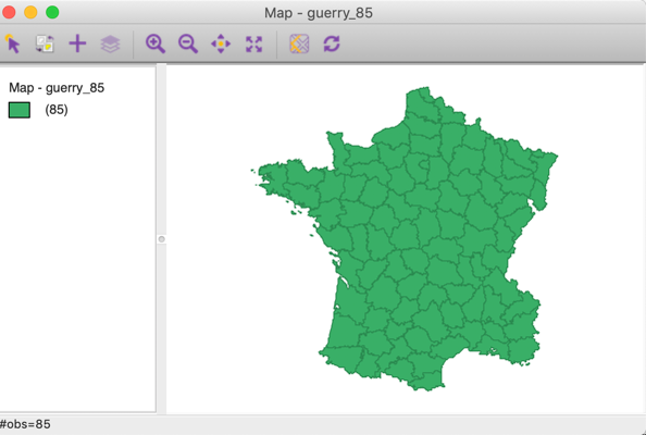
Figure 1: French departments themeless map
Principal Component Analysis (PCA)
Principles
Principal components are new variables constructed as a linear combination of the original variables, such that they capture the most variance. In a sense, the principal components can be interpreted as the best linear approximation to the multivariate point cloud of the data. The goal is to find a small number of principal components (much smaller than the number of original variables) that explains the bulk of the variance in the original variables.
More precisely, a value for the principal component \(u\) at observation \(i\), \(z_{ui}\), with \(u = 1, \dots, p\) and \(p << k\) (and \(k\) as the number of original variables), is defined as: \[z_{ui} = \sum_{h=1}^k a_{hu} x_{hi},\] i.e., a sum of the observations for the original variables, each multiplied by a coefficient \(a_{hu}\). The coefficients \(a_{hu}\) are obtained by maximizing the explained variance and ensuring that the resulting principal components are orthogonal to each other.
Principal components are closely related to the eigenvalues and eigenvectors of the cross-product matrix \(X'X\), where \(X\) is the \(n \times k\) matrix of \(n\) observations on \(k\) variables. The coefficients by which the original variables need to be multiplied to obtain each principal component can be shown to correspond to the elements of the eigenvectors of \(X'X\), with the associated eigenvalue giving the explained variance (for details, see, e.g., James et al. 2013, Chapter 10). In practice, the variables are standardized, so that the matrix \(X'X\) is also the correlation matrix.
Operationally, the principal component coefficients are obtained by means of a matrix decomposition. One option is to compute the eigenvalue decomposition of the \(k \times k\) matrix \(X'X\), i.e., the correlation matrix, as \[X'X = VGV',\] where \(V\) is a \(k \times k\) matrix with the eigenvectors as columns (the coefficients needed to construct the principal components), and \(G\) a \(k \times k\) diagonal matrix of the associated eigenvalues (the explained variance).
A second, and computationally preferred way to approach this is as a singular value decomposition (SVD) of the \(n \times k\) matrix \(X\), i.e., the matrix of (standardized) observations, as \[X = UDV',\] where again \(V\) (the transpose of the \(k \times k\) matrix \(V'\)) is the matrix with the eigenvectors as columns, and \(D\) is a \(k \times k\) diagonal matrix such that \(D^2\) is the matrix of eigenvalues.3
Note that the two computational approaches to obtain the eigenvalues and eigenvectors (there is no analytical solution) may yield opposite signs for the elements of the eigenvectors (but not for the eigenvalues). This will affect the sign of the resulting component (i.e., positives become negatives). We illustrate this below.
In a principal component analysis, we are typically interested in three main results. First, we need the principal component scores as a replacement for the original variables. This is particularly relevant when a small number of components explain a substantial share of the original variance. Second, the relative contribution of each of the original variables to each principal component is of interest. Finally, the variance proportion explained by each component in and of itself is also important.
Implementation
We invoke the principal components functionality from the Clusters toolbar icon, shown in Figure 2.
Figure 2: Clusters toolbar icon
PCA is the first item on the list of options. Alternatively, from the main menu, we can select Clusters > PCA, as in Figure 3.
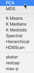
Figure 3: PCA Option
This brings up the PCA Settings dialog, the main interface through which variables are chosen, options selected, and summary results are provided.
Variable Settings Panel
We select the variables and set the parameters for the principal components analysis through the options in the left hand panel of the interface. We choose the six same variables as in the multivariate analysis presented in Dray and Jombart (2011): Crm_prs (crimes against persons), Crm_prp (crimes against property), Litercy (literacy), Donatns (donations), Infants (births out of wedlock), and Suicids (suicides) (see also Anselin 2018, for an extensive discussion of the variables).4 These variables appear highlighted in the Select Variables panel, Figure 4.
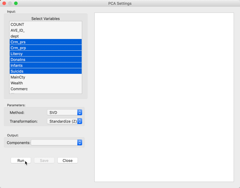
Figure 4: PCA Settings panel
The default settings for the Parameters are likely fine in most practical situations. The Method is set to SVD, i.e., singular value decomposition. The alternative Eigen carries out an explicit eigenvalue decomposition of the correlation matrix. In our example, the two approaches yield opposite signs for the loadings of three of the components. We return to this below. For larger data sets, the singular value decomposition approach is preferred.
The Transformation option is set to Standardize (Z) by default, which converts all variables such that their mean is zero and variance one, i.e., it creates a z-value as \[z = \frac{(x - \bar{x})}{\sigma(x)},\] with \(\bar{x}\) as the mean of the original variable \(x\), and \(\sigma(x)\) as its standard deviation.
An alternative standardization is Standardize (MAD), which uses the mean absolute deviation (MAD) as the denominator in the standardization. This is preferred in some of the clustering literature, since it dimineshes the effect of outliers on the standard deviation (see, for example, the illustration in Kaufman and Rousseeuw 2005, 8–9). The mean absolute deviation for a variable \(x\) is computed as: \[\mbox{mad} = (1/n) \sum_i |x_i - \bar{x}|,\] i.e., the average of the absolute deviations between an observation and the mean for that variable. The estimate for \(\mbox{mad}\) takes the place of \(\sigma(x)\) in the denominator of the standardization expression.
Other choices for the Transformation option are to use the variables in their original scale (Raw), or as deviations from the mean (Demean).
After clicking on the Run button, the summary statistics appear in the right hand panel, as shown in Figure 5. We return for a more detailed interpretation below.
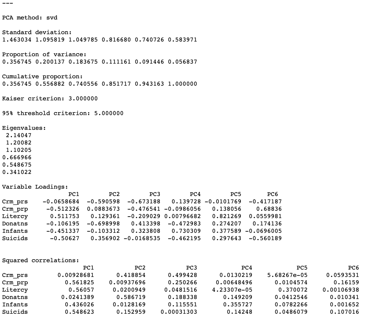
Figure 5: PCA results
Saving the Results
Once the results have been computed, a value appears next to the Output Components item in the left panel, shown in Figure 6. This value corresponds to the number of components that explain 95% of the variance, as indicated in the results panel. This determines the default number of components that will be added to the data table upon selecting Save. The value can be changed in the drop-down list. For now, we keep the number of components as 5, even though that is not a very good result (given that we started with only six variables).
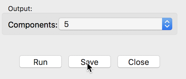
Figure 6: Save output dialog
The Save button brings up a dialog to select variable names for the principal components, shown in Figure 7. The default is generic and not suitable for a situation where a large number of analyses will be carried out. In practice, one would customize the components names to keep the results from different computations distinct.
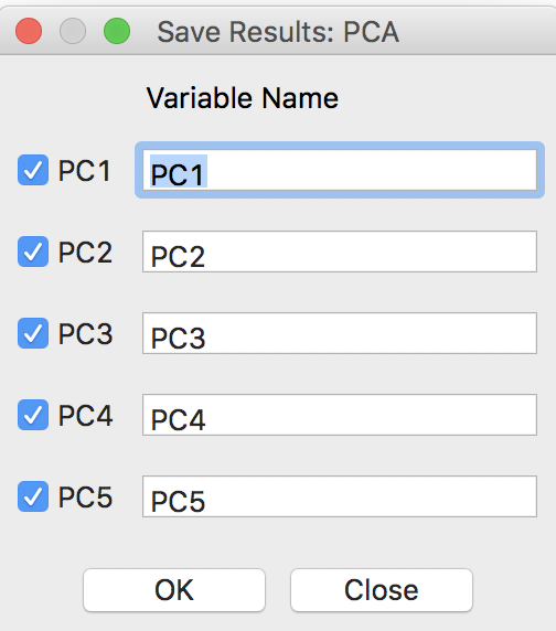
Figure 7: Principal Component variable names
Clicking on OK will add the principal components to the data table, where they become available for all types of analysis and visualization. As always, the addition is only made permanent after saving the table.
Interpretation
The panel with summary results provides several statistics pertaining to the variance decomposition, the eigenvalues, the variable loadings and the contribution of each of the original variables to the respective components.
Explained variance
The first item lists the Standard deviation explained by each of the components. This corresponds to the square root of the Eigenvalues (each eigenvalue equals the variance explained by the corresponding principal component), which are listed as well. In our example, the first eigenvalue is 2.14047, which is thus the variance of the first component. Consequently, the standard deviation is the square root of this value, i.e., 1.463034, given as the first item in the list.
The sum of all the eigenvalues is 6, which equals the number of variables, or, more precisely, the rank of the matrix \(X'X\). Therefore, the proportion of variance explained by the first component is 2.14047/6 = 0.356745, as reported in the list. Similarly, the proportion explained by the second component is 0.200137, so that the cumulative proportion of the first and second component amounts to 0.356745 + 0.200137 = 0.556882. In other words, the first two components explain a little over half of the total variance.
The fraction of the total variance explained is listed both as a separate Proportion and as a Cumulative proportion. The latter is typically used to choose a cut-off for the number of components. A common convention is to take a threshold of 95%, which would suggest 5 components in our example. Note that this is not a good result, given that we started with 6 variables, so there is not much of a dimension reduction.
An alternative criterion to select the number of components is the so-called Kaiser criterion (Kaiser 1960), which suggests to take the components for which the eigenvalue exceeds 1. In our example, this would yield 3 components (they explain about 74% of the total variance).
The bottom part of the results panel is occupied by two tables that have the original variables as rows and the components as columns.
Variable loadings
The first table shows the Variable Loadings. For each component (column), this lists the elements of the corresponding eigenvector. The eigenvectors are standardized such that the sum of the squared coefficients equals one. The elements of the eigenvector are the coefficients by which the original variables need to be multiplied to construct each component. For example, for each observation, the first component would be computed by multiplying the value for Crm_prs by -0.0658684, add to that the value for Crm_prp multiplied by -0.512326, etc.
It is important to keep in mind that the signs of the loadings may change, depending on the algorithm that is used in their computation, but the absolute value of the coefficients will be the same. In our example, setting Method to Eigen yields the loadings shown in Figure 8.
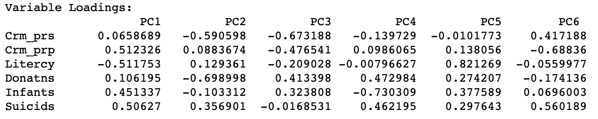
Figure 8: Variable Loadings - Eigen algorithm
For PC1, PC4, and PC6, the signs for the loadings are the opposite of those reported in Figure 5. This needs to be kept in mind when interpreting the actual value (and sign) of the components.
When the original variables are all standardized, each eigenvector coefficient gives a measure of the relative contribution of a variable to the component in question. These loadings are also the vectors employed in a principal component biplot, a common graph produced in a principal component analysis (but not currently available in GeoDa).
Substantive interpretation of principal components
The interpretation and substantive meaning of the principal components can be a challenge. In factor analysis, a number of rotations are applied to clarify the contribution of each variable to the different components. The latter are then imbued with meaning such as “social deprivation”, “religious climate”, etc. Principal component analysis tends to stay away from this, but nevertheless, it is useful to consider the relative contribution of each variable to the respective components.
The table labeled as Squared correlations lists those statistics between each of the original variables in a row and the principal component listed in the column. Each row of the table shows how much of the variance in the original variable is explained by each of the components. As a result, the values in each row sum to one.
More insightful is the analysis of each column, which indicates which variables are important in the computation of the matching component. In our example, we see that Crm_prp, Litercy, Infants and Suicids are the most important for the first component, whereas for the second component this is Crm_prs and Donatns. As we can see from the cumulative proportion listing, these two components explain about 56% of the variance in the original variables.
Since the correlations are squared, they do not depend on the sign of the eigenvector elements, unlike the loadings.
Visualizing principal components
Once the principal components are added to the data table, they are available for use in any graph (or map).
A useful graph is a scatter plot of any pair of principal components. For example, such a graph is shown for the first two components (based on the SVD method) in Figure 9. By construction, the principal component variables are uncorrelated, which yields the characteristic circular cloud plot. A regression line fit to this scatter plot yields a horizontal line (with slope zero). Through linking and brushing, we can identify the locations on the map for any point in the scatter plot.
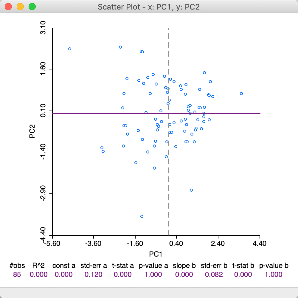
Figure 9: First two principal components scatter plot - SVD method
To illustrate the effect of the choice of eigenvalue computation, the scatter plot in Figure 10 again plots the values for the first and second component, but now using the loadings from the Eigen method. Note how the scatter has been flipped around the vertical axis, since what used to be positive for PC1, is now negative, and vice versa.
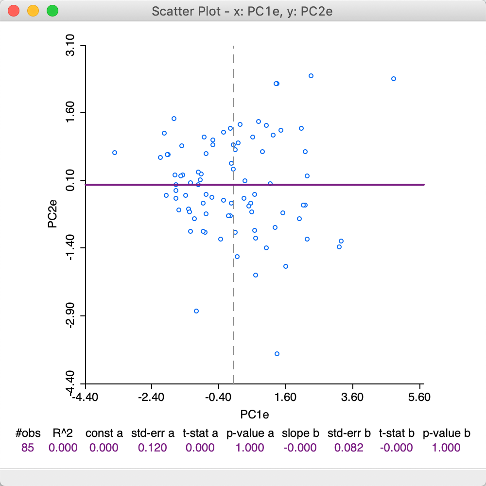
Figure 10: First two principal components scatter plot - Eigen method
In order to gain further insight into the composition of a principal component, we combine a box plot of the values for the component with a parallel coordinate plot of its main contributing variables. For example, in the box plot in Figure 11, we select the observations in the top quartile of PC1 (using SVD).5
We link the box plot to a parallel coordinate plot for the four variables that contribute most to this component. From the analysis above, we know that these are Crm_prp, Litercy, Infants and Suicids. The corresponding linked selection in the PCP shows low values for all but Litercy, but the lines in the plot are all close together. This nicely illustrates how the first component captures a clustering in multivariate attribute space among these four variables.
Since the variables are used in standardized form, low values will tend to have a negative sign, and high values a positive sign. The loadings for PC1 are negative for Crm_prp, Infants and Suicids, which, combined with negative standardized values, will make a (large) positive contribution to the component. The loadings for Litercy are positive and they multiply a (large) postive value, also making a positive contribution. As a result, the values for the principal component end up in the top quartile.
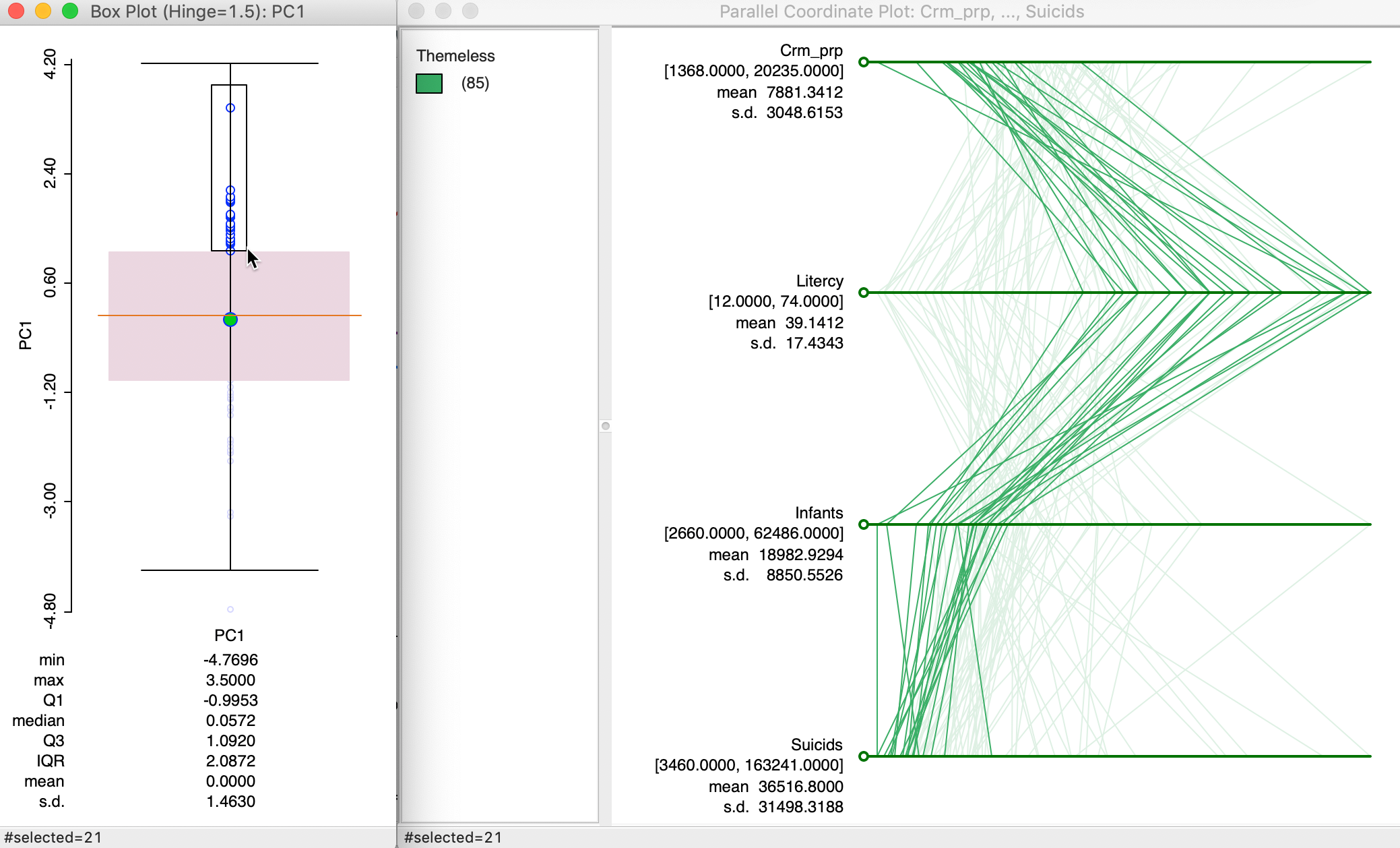
Figure 11: PC1 composition using PCP
The substantive interpretation is a bit of a challenge, since it suggests that high property crime, out of wedlock births and suicide rates (recall that low values for the variables are bad, so actually high rates) coincide with high literacy rates (although the latter are limited to military conscripts, so they may be a biased reflection of the whole population).
Spatializing Principal Components
We can further spatialize the visualization of principal components by explicitly considering their spatial distribution in a map. In addition, we can explore spatial patterns more formally through a local spatial autocorrelation analysis.
Principal component maps
The visualization of the spatial distribution of the value of a principal component by means of a choropleth map is mostly useful to suggest certain patterns. Caution needs to be used to interpret these in terms of high or low, since the latter depends on the sign of the component loadings (and thus on the method used to compute the eigenvectors).
For example, using the results from SVD for the first principal component, a quartile map shows a distinct pattern, with higher values above a diagonal line going from the north west to the middle of the south east border, as shown in Figure 12.
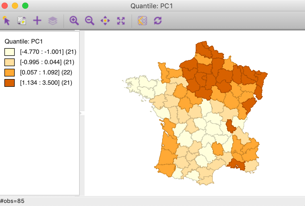
Figure 12: PC1 quartile map
A quartile map for the first component computed using the Eigen method shows the same overall spatial pattern, but the roles of high and low are reversed, as in Figure 13.
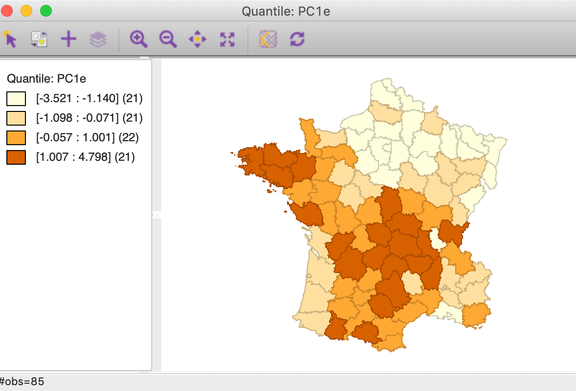
Figure 13: PC1 quartile map
Cluster maps
We pursue the nature of this pattern more formally through a local Moran cluster map. Again, using the first component from the SVD method, we find a strong High-High cluster in the northern part of the country, ranging from east to west (with p=0.01 and 99999 permutations, using queen contiguity). In addition, there is a pronounced Low-Low cluster in the center of the country.6
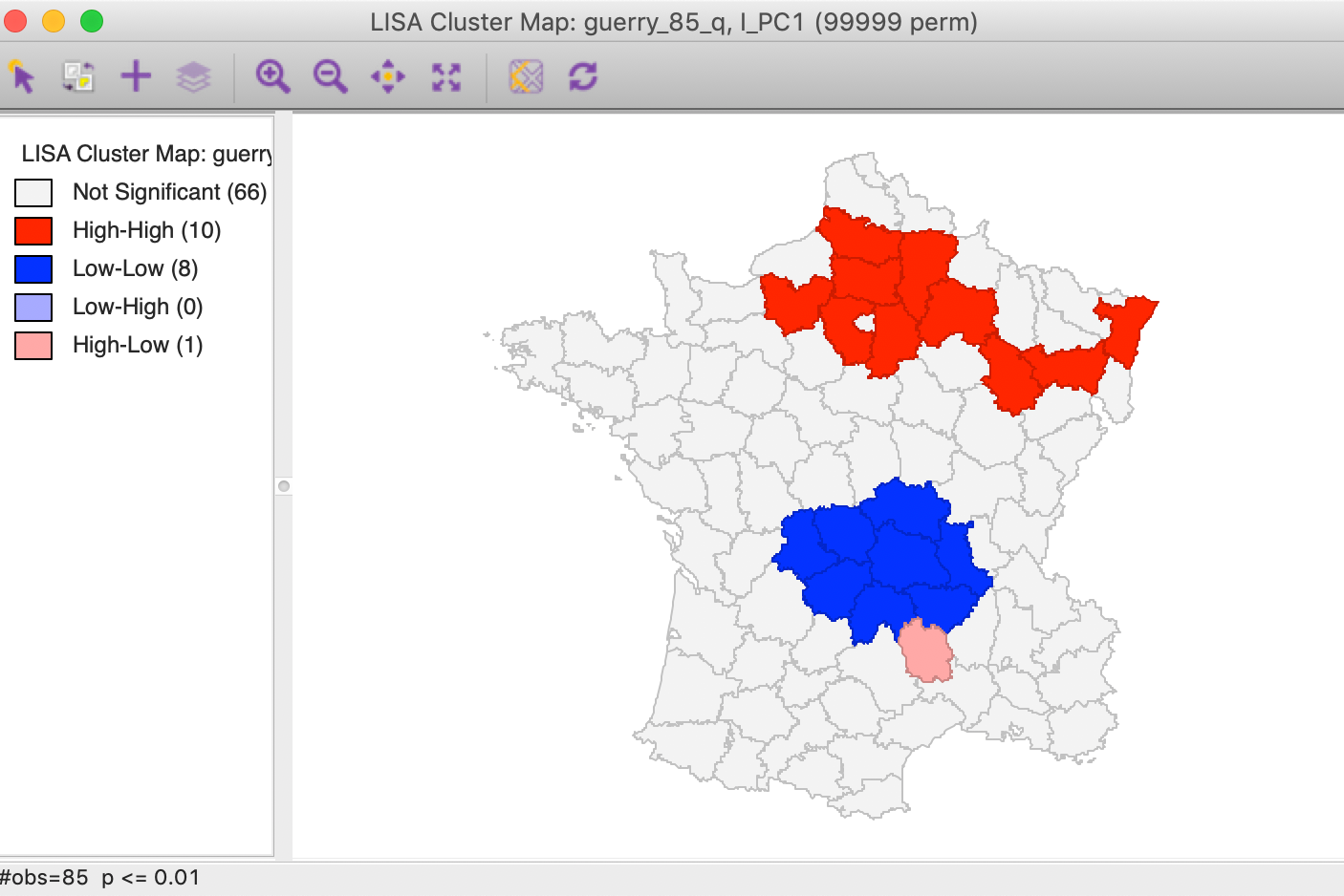
Figure 14: PC1 Local Moran cluster map
Principal components as multivariate cluster maps
Since the principal components combine the original variables, their patterns of spatial clustering could be viewed as an alternative to a full multivariate spatial clustering. The main difference is that in the latter each variable is given equal weight, whereas in the principal component some variables are more important than others. In our example, we saw that the first component is a reasonable summary of the pattern among four variables, Crm_prp, Litercy, Infants and Suicids.
First, we can check on the makeup of the component in the identified cluster. For example, we select the high-high values in the cluster map and find the matching lines in a parallel coordinate plot for the four variables, shown in Figure 15. The lines track closely (but not perfectly), suggesting some clustering of the data points in the four-dimensional attribute space. In other words, the high-high spatial cluster of the first principal component seems to match attribute similarity among the four variables.
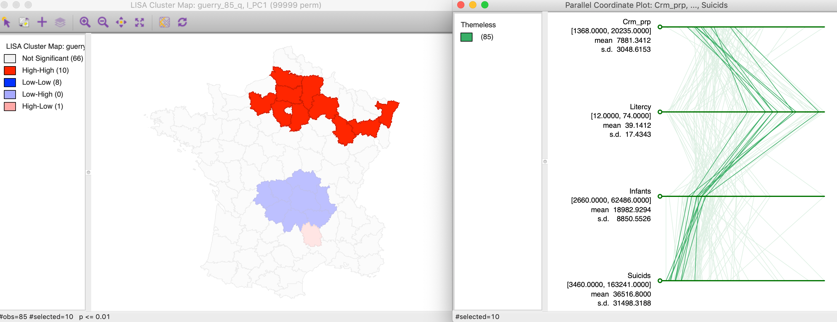
Figure 15: Linked PCA cluster map and PCP
In addition, we can now compare these results to a cluster or significance map from a multivariate local Geary analysis for the four variables. In Figure 16, we show the significance map rather than a cluster map, since all significant locations are for positive spatial autocorrelation (p < 0.01, 99999 permutations, queen contiguity). While the patterns are not identical to those in the principal component cluster map, they are quite similar and pick up the same general spatial trends.
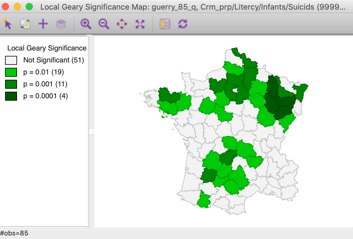
Figure 16: Multivariate local Geary significance map
This suggests that in some instances, a univariate local spatial autocorrelation analysis for one or a few dominant principal components may provide a viable alternative to a full-fledged multivariate analysis.
Multidimensional Scaling (MDS)
Principle
Multidimensional Scaling or MDS is an alternative approach to portraying a multivariate data cloud in lower dimensions.7 MDS is based on the notion of distance between observation points in multiattribute space. For \(p\) variables, the (squared) Euclidean distance between observations \(x_i\) and \(x_j\) in p-dimensional space is \[d_{ij} = || x_i - x_j || = \sum_{k=1}^p (x_{ik} - x_{jk})^2,\] the sum of the Euclidean distances over each dimension. Alternatively, the Manhattan distance is: \[d_{ij} = \sum_{k=1}^p |x_{ik} - x_{jk}|,\] the sum of the absolute differences in each dimension.
The objective of MDS is to find points \(z_1, z_2, \dots, z_n\) in two-dimensional space that mimic the distance in multiattribute space as closely as possible. This is implemented by minimizing a stress function, \(S(z)\): \[S(z) = \sum_i \sum_j (d_{ij} - ||z_i - z_j||)^2.\] In other words, a set of coordinates in two dimensions are found such that the distances between the resulting pairs of points are as close as possible to their pair-wise distances in multi-attribute space.
Further technical details can be found in Hastie, Tibshirani, and Friedman (2009), Chapter 14, among others.
Implementation
The MDS functionality in GeoDa is invoked from the Clusters toolbar icon, or from the main menu, as Clusters > MDS, in Figure 17.
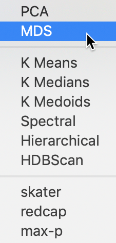
Figure 17: MDS menu option
This brings up the MDS Settings panel through which the variables are selected and various computational parameters are set. We continue with the same six variables as used previously, i.e., Crm_prs, Crm_prp, Litercy, Donatns, Infants, and Suicids. For now, we leave all options to their default settings, shown in Figure 18.
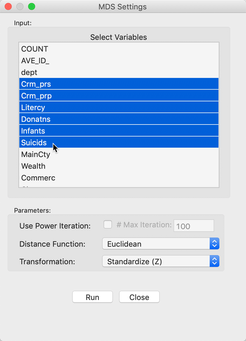
Figure 18: MDS input variable selection
After clicking the Run button, a small dialog is brought up to select the variable names for the new MDS coordinates, in Figure 19.
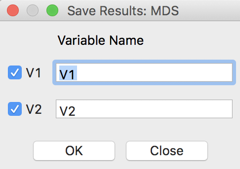
Figure 19: MDS result variable selection
After this selection, OK generates a two-dimensional scatter plot with the observations, illustrated in Figure 20. In this scatter plot, points that are close together in two dimensions should also be close together in the six-dimensional attribute space. In addition, two new variables with the coordinate values will be added to the data table (as usual, to make this addition permanent, we need to save the table).
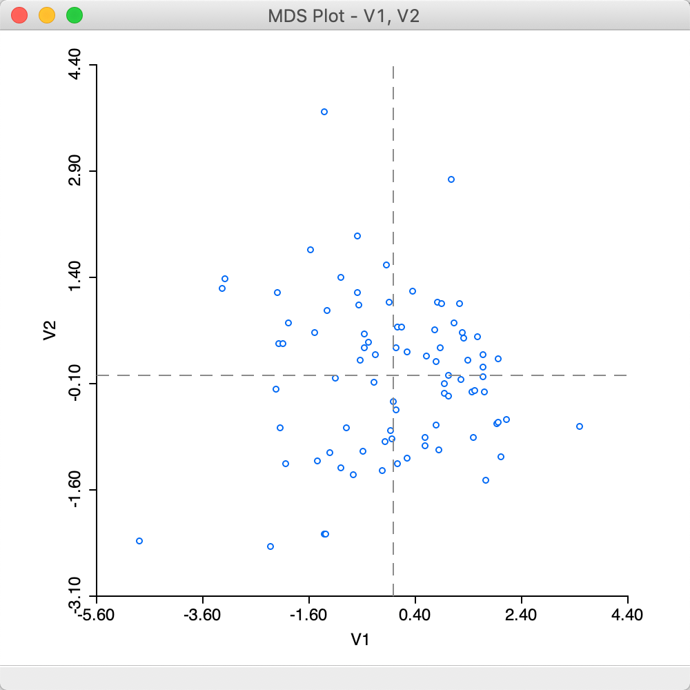
Figure 20: MDS plot
Distance measures
The Parameters panel in the MDS Settings dialog allows for a number of options to be set. The Transformation option is the same as for PCA, with the default set to Standardize (Z), but Standardize (MAD), Raw and Demean are available as well. Best practice is to use the variables in standardized form.
Another important option is the Distance Function setting. The default is to use Euclidean distance, but an alternative is Manhattan block distance, or, the use of absolute differences instead of squared differences, shown in Figure 21. The effect is to lessen the impact of outliers, or large distances.

Figure 21: MDS Manhattan distance function
The result that follows from a Manhattan distance metric can seem slightly different from the default Euclidean MDS plot. As seen in Figure 22, the scale of the coordinates is different, but the identification of close observations can also differ somewhat between the two plots. On the other hand, the identification of outliers is fairly consistent between the two.
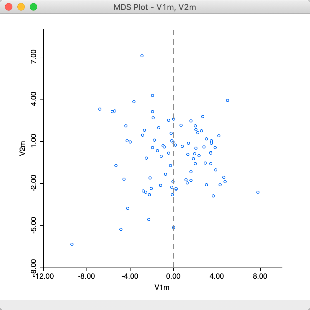
Figure 22: MDS plot (Manhattan distance)
For example, using the linking and brushing functionality shown in Figure 23, we can select two close points in the Manhattan graph and locate the matching points in the Euclidean graph. As it turns out, in our example, the matching locations in the Euclidean graph appear to be further apart, but still in proximity of each other (to some extent, the seeming larger distances may be due to the different scales in the graphs).
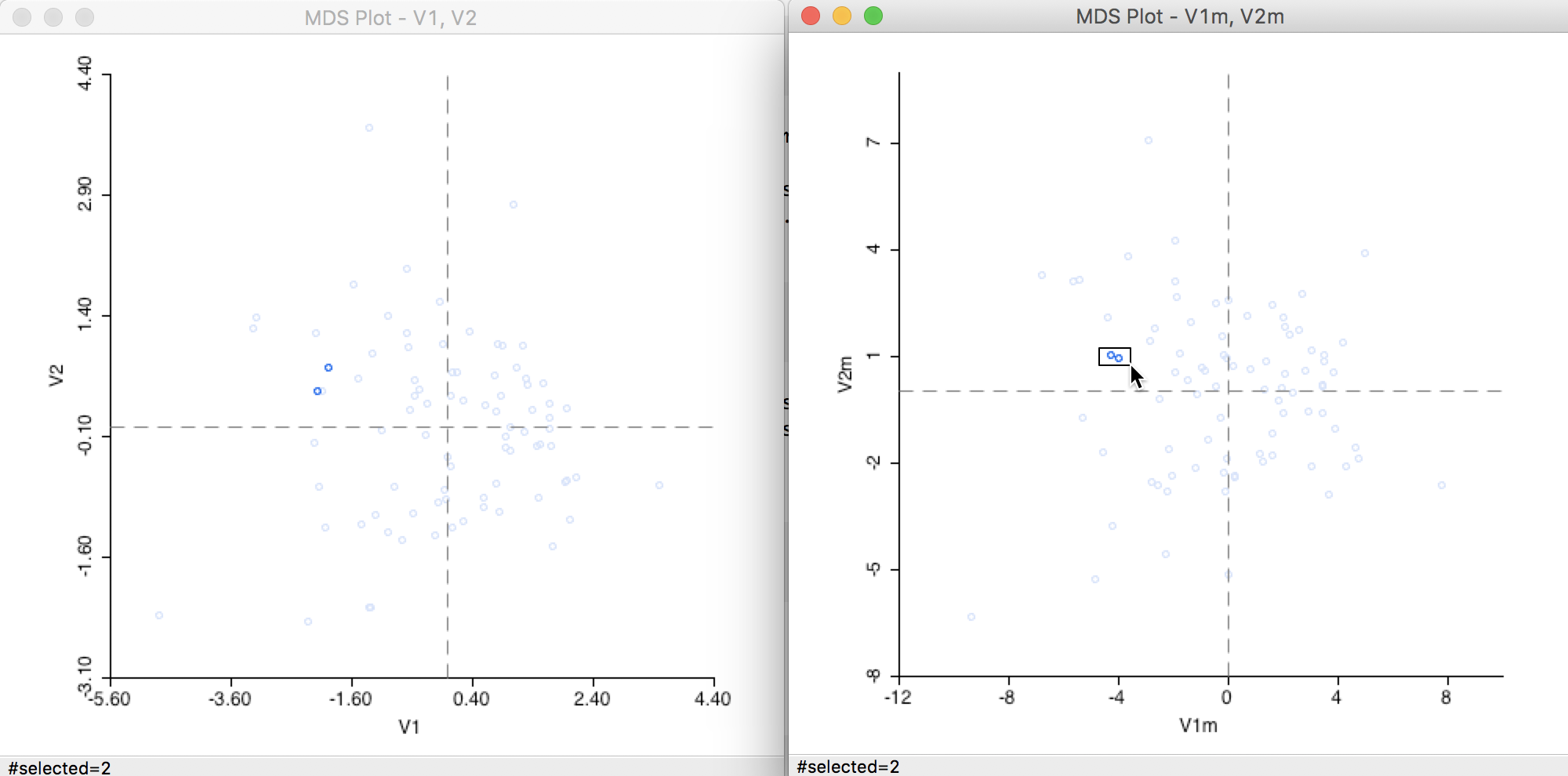
Figure 23: Distance metric comparison (1)
On the other hand, when we select an outlier in the Manhattan graph (a point far from the remainder of the point cloud), as in Figure 24, the matching observation in the Euclidean graph is an outlier as well.
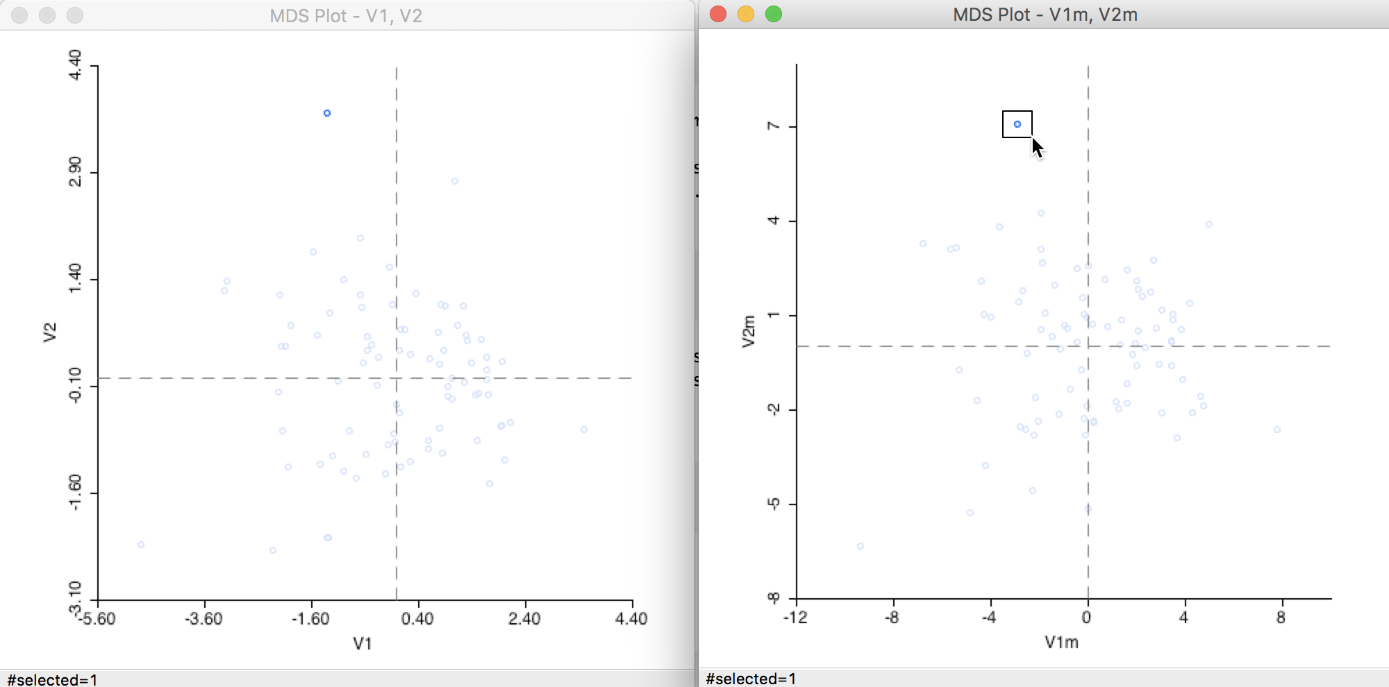
Figure 24: Distance metric comparison (2)
Power approximation
An option that is particularly useful in larger data sets is to use a Power Iteration to approximate the first few largest eigenvalues needed for the MDS algorithm. In large data sets with many variables, the standard algorithm will tend to break down.
This option is selected by checking the box in the Parameters panel in Figure 25. The default number of iterations is set to 100, which should be fine in most situations. However, if needed, it can be adjusted by entering a different value in the corresponding box.
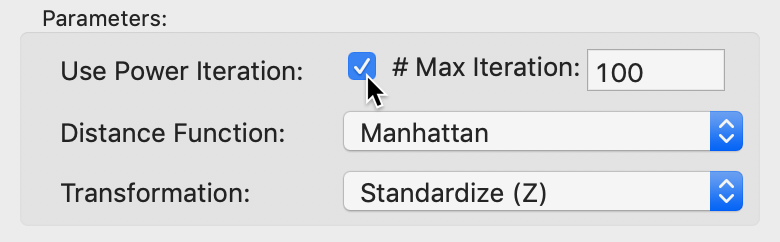
Figure 25: MDS power iteration option
At first sight, the result in Figure 26 may seem different from the standard output in Figure 20, but this is due to the indeterminacy of the signs of the eigenvectors.
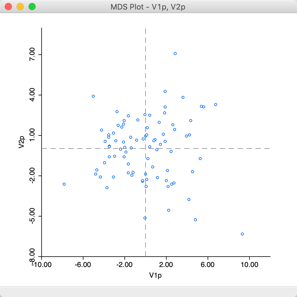
Figure 26: MDS plot (power approximation)
Closer inspection of the two graphs suggests that the axes are flipped. We can clearly see this by selecting two points in one graph and locating them in the other, as in Figure 27. The relative position of the points is the same in the two graphs, but they are on opposite sides of the origin on the y-axis.
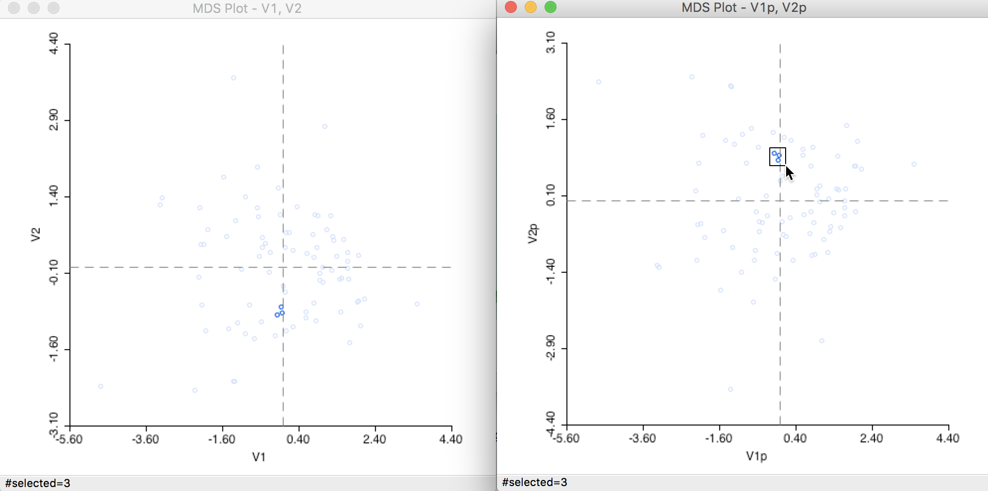
Figure 27: Computation algorithm comparison
Interpretation
The multidimensional scaling essentially projects points from a high-dimensional multivariate attribute space onto a two-dimensional plane. To get a better sense of how this process operates, we can link points that are close in the MDS scatter plot to the matching lines in a parallel coordinate plot. Data points that are close in multidimensional variable space should be represented by lines that are close in the PCP.
In Figure 28, we selected two points that are close in the MDS scatter plot and assess the matching lines in the six-variable PCP. Since the MDS works on standardized variables, we have expressed the PCP in those dimensions as well by means of the Data > View Standardized Data option. While the lines track each other closely, the match is not perfect, and is better on some dimensions than on others. For example, for Donatns, the values are near identical, whereas for Infants the gap between the two values is quite large.
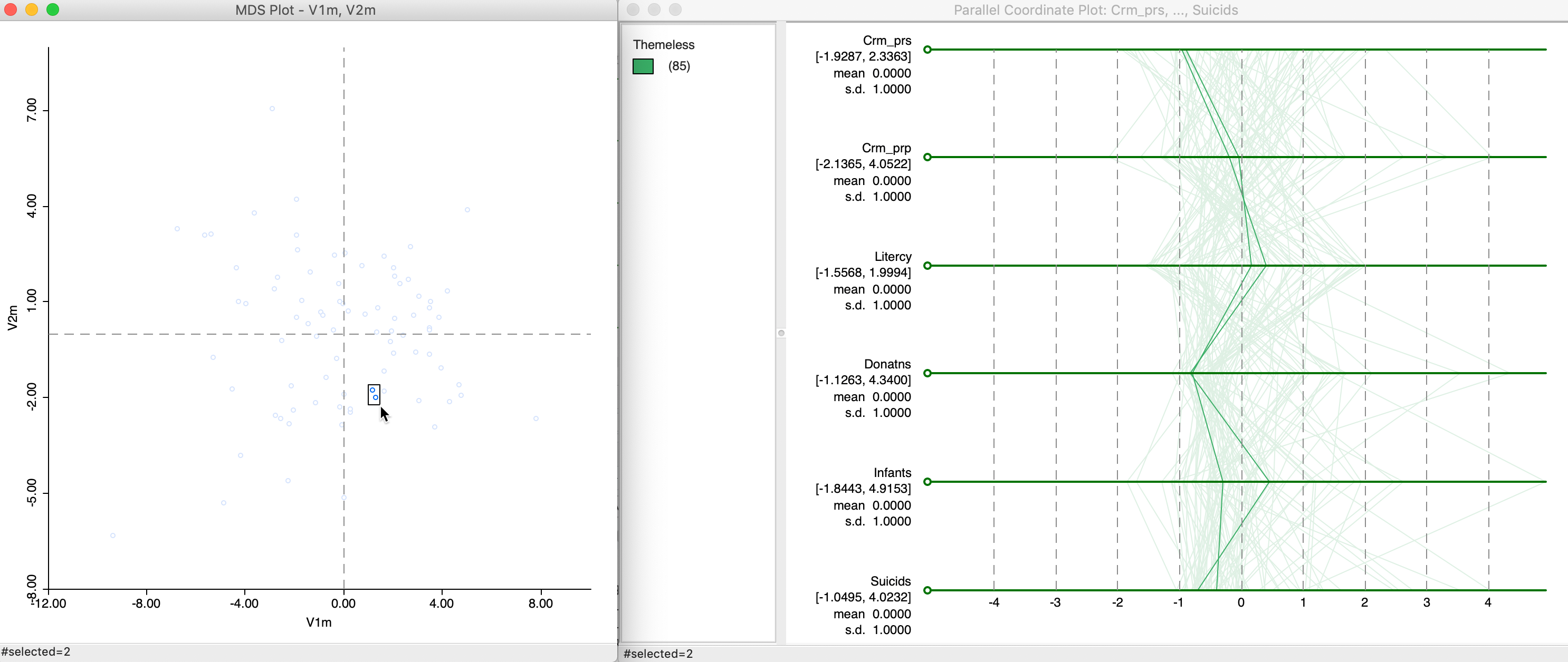
Figure 28: MDS and PCP
We can delve deeper into this by brushing the MDS scatter plot, or, alternatively, by brushing the PCP and examining the relative locations of the matching points in the MDS scatter plot.
Attribute and Locational Similarity in MDS
The points in the MDS scatter plot can be viewed as locations in a two-dimensional attribute space. This is an example of the use of geographical concepts (location, distance) in contexts where the space is non-geographical. It also allows us to investigate and visualize the tension between attribute similarity and locational similarity, two core components underlying the notion of spatial autocorrelation. These two concepts are also central to the various clustering techniques that we consider in later chapters.
An explicit spatial perspective is introduced by linking the MDS scatter plot with various map views of the data. In addition, it is possible to exploit the location of the points in attribute space to construct spatial weights based on neighboring locations. These weights can then be compared to their geographical counterparts to discover overlap. We briefly illustrate both approaches.
Linking MDS scatter plot and map
To illustrate the extent to which neighbors in attribute space correspond to neighbors in geographic space, we link a selection of close points in the MDS scatter plot to a quartile map of the first principal component. Clearly, this can easily be extended to all kinds of maps of the variables involved, including co-location maps that pertain to multiple variables, cluster maps, etc.
In Figure 29, we selected nine points that are close in attribute space in the right-hand panel, and assess their geographic location in the map on the left. All locations are in the upper quartile for PC1, and many, but not all, are also closely located in geographic space. We can explore this further by brushing the scatter plot to systematically evaluate the extent of the match between attribute and locational similarity.
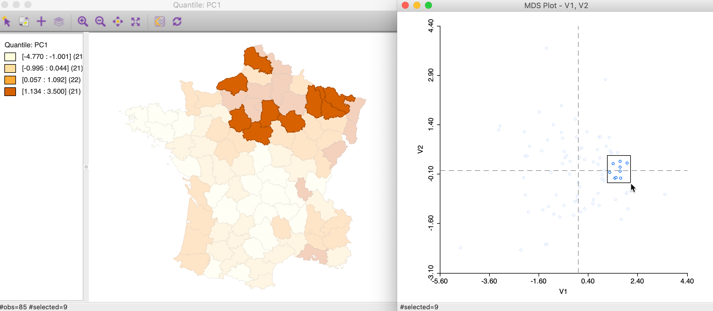
Figure 29: Neighbors in MDS space
Alternatively, we can brush the map and identify the matching observations in the MDS scatter plot, as in Figure 30. This reverses the logic and assesses the extent to which neighbors in geographic space are also neighbors in attribute space. In this instance in our example, the result is mixed, with some evidence of a match between the two concepts for selected points, but not for others.
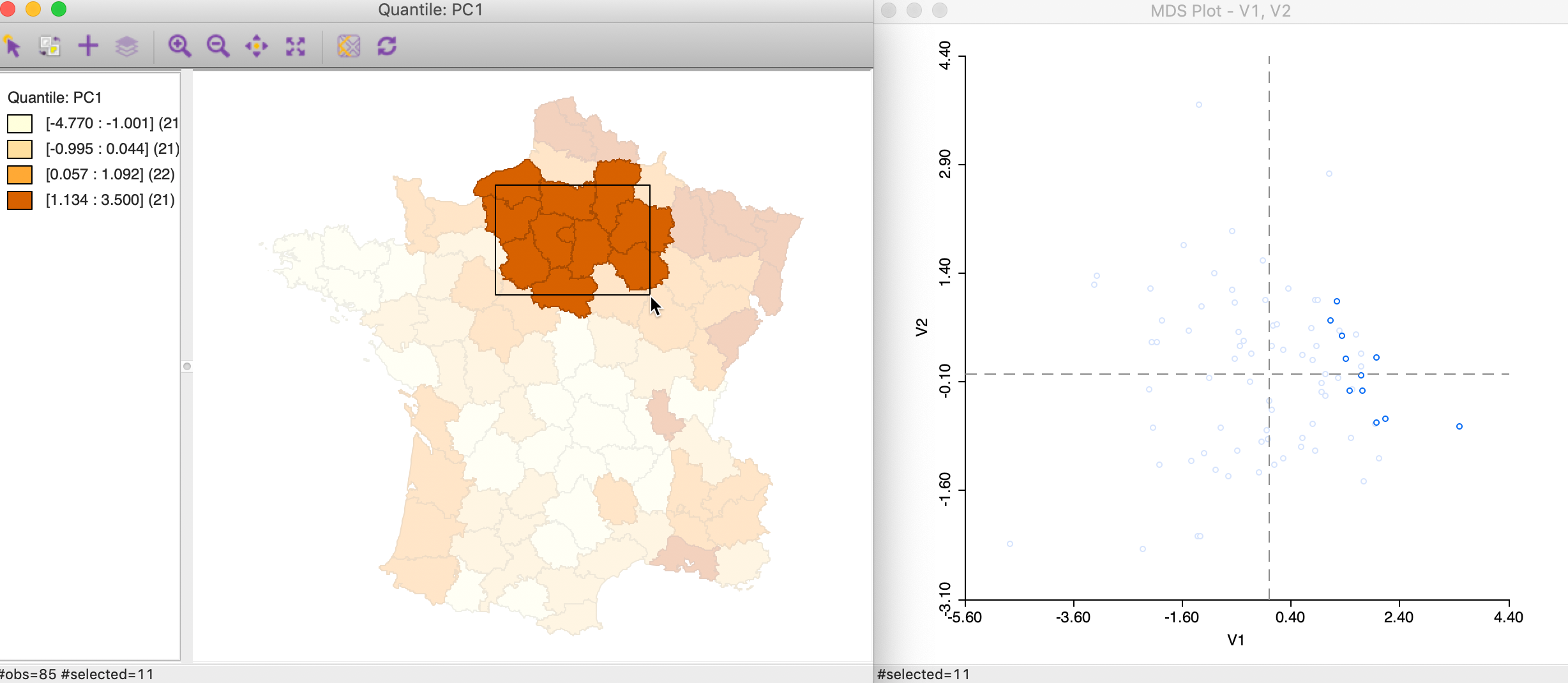
Figure 30: Brushing the map and MDS
Linking a location and its neighbors
We can also select the neighbors explicitly in the map (provided there is an active spatial weights matrix, in our example, this is the queen contiguity) using the selection and neighbors option (right click in the map to activate the options menu and select Connectivity > Show Selection and Neighbors). This allows an investigation of the tension between locational similarity (neighbors on the map) and attribute similarity (neigbhors in the MDS plot) for any selection and its neighbors. In our example in Figure 31, we selected one department (the location of the cursor on the map) with its neighbors (using first order queen contiguity) and identify the corresponding points in the MDS plot. For the selected observation, there is some evidence of a match between the two concepts for a few of the points, but not for others.
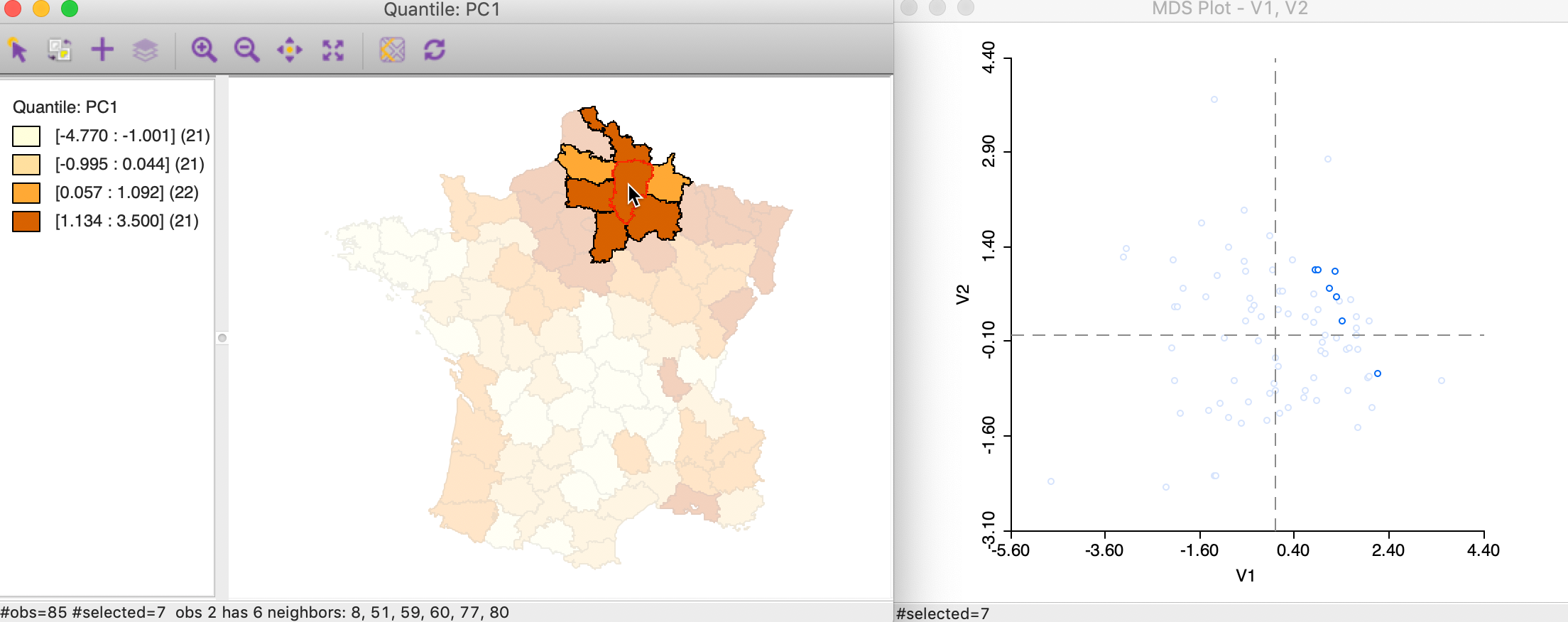
Figure 31: Selection and neighbors and MDS
Spatial weights from MDS scatter plot
The points in the MDS scatter plot can be viewed as locations in a projected attribute space. As such, they can be mapped. In such a point map, the neighbor structure among the points can be exploited to create spatial weights, in exactly the same way as for geographic points (e.g., distance bands, k-nearest neighbors, contiguity from Thiessen polygons). Conceptually, such spatial weights are similar to the distance weights created from multiple variables, but they are based on inter-observation distances from a projected space. While this involves some loss of information, the associated two-dimensional visualization is highly intuitive.
In GeoDa, there are two ways to create spatial weights from points in a MDS scatter plot. One is to explicitly create a point layer using the coordinates for V1 and V2, i.e., by means of Tools > Shape > Points from Table. Once the point layer is in place, the standard spatial weights functionality can be invoked.
A second way applies directly to the MDS scatterplot. As shown in Figure 32, one of the options available is to Create Weights.
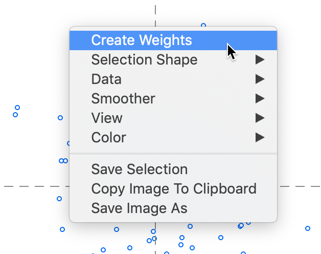
Figure 32: Create weights from MDS scatter plot
This brings up the standard Weights File Creation interface, as shown in Figure 33. In our example, we create queen contiguity weights based on the Thiessen polygons around the points in the MDS plot.
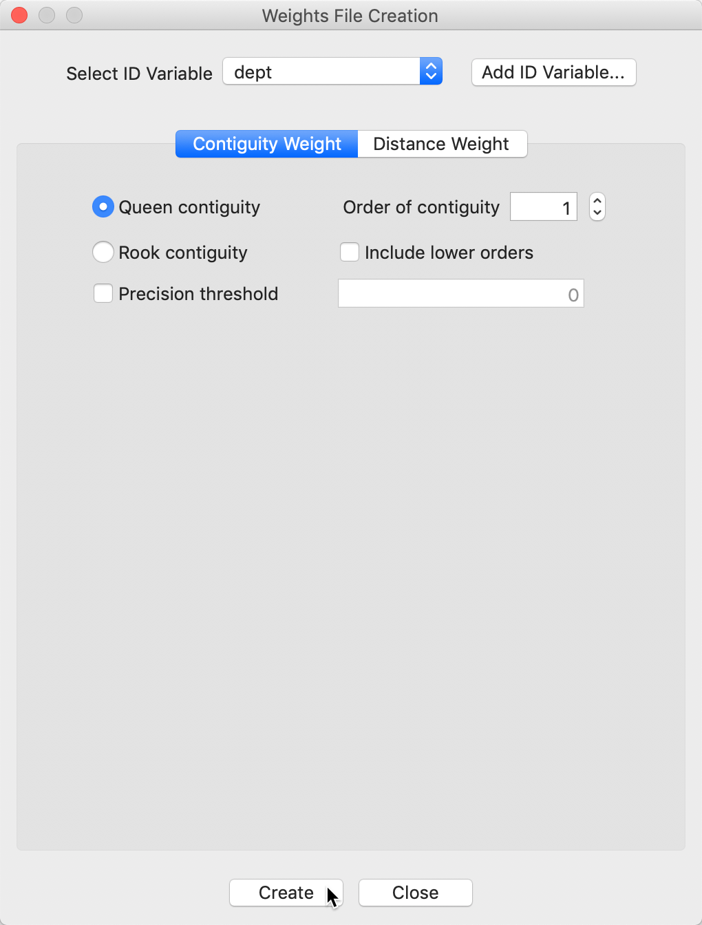
Figure 33: Queen weights from MDS scatter plot
Once created, the weights file appears in the Weights Manager and its properties are listed, in the same way as for other weights. In Figure 34, we see that guerry_85_mdsq is of type queen, with the number of neighbors ranging from 3 to 9 (compare that to the geographic queen weights with the number of neigbhors ranging from 2 to 8).
Figure 34: MDS weights properties
Matching attribute and geographic neighbors
We can now investigate the extent to which neighbors in geographic space (geographic queen contiguity) match neighbors in attribute space (queen contiguity from MDS scatter plot) using the Weights Intersection functionality in the Weights Manager (Figure 35).
Figure 35: Intersection queen contiguity and MDS weights
This creates a gal weights file (guerry_85_mds_queen.gal in our example) that lists for each observation the neighbors that are shared between the two queen contiguity files. As is to be expected, the resulting file is much sparser than the original weights. As Figure 36 illustrates, we notice several observations that have 0 neighbors in common. But in other places, we find quite a bit of commonality. For example, for location with dept=2, we have 3 neighbors in common, 60, 59, and 80.8
Figure 36: Intersection queen contiguity and MDS weights GAL file
The full list of properties of the weights intersection are listed in the Weights Manager, as shown in Figure 37. The mean and median number of neighbors is much smaller than for the original weights. For example, the median is 1, compared to 5 for geographic contiguity and 6 for MDS contiguity. Also, the min neighbors of 0 suggests the presence of isolates, which we noticed in Figure 36.
Figure 37: Intersection queen contiguity and MDS weights properties
Finally, we can visualize the overlap between geographic neighbors and attribute neighbors by means of a Connectivity Graph. In Figure 38, the blue lines connect observations that share the two neighbor relations (superimposed on a quartile map of the first principal component).
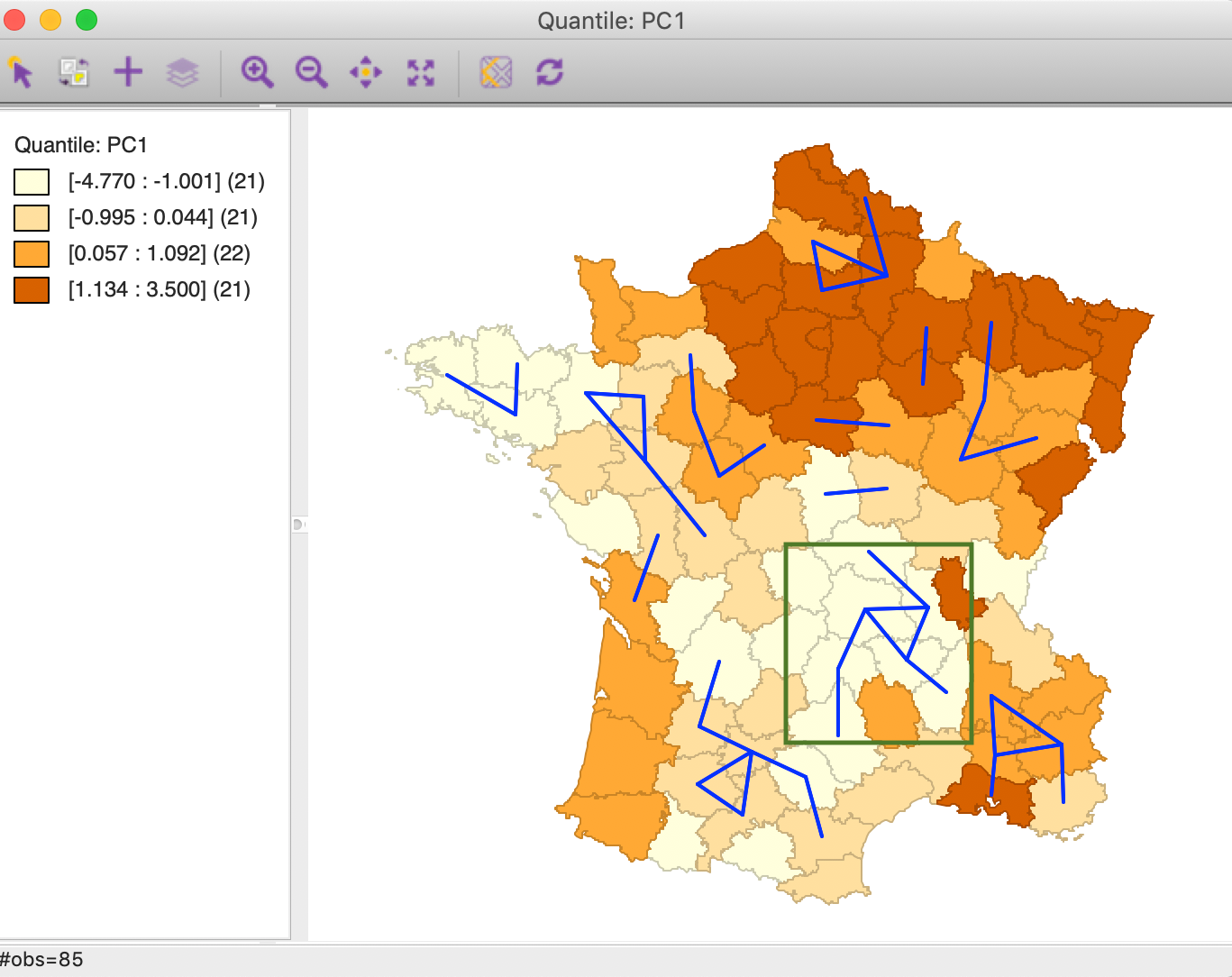
Figure 38: Intersection queen contiguity and MDS weights connectivity graph
Several sets of interconnected vertices suggest the presence of multivariate clustering, for example, among the departments enclosed by the green rectangle on the map. Although there is no significance associated with these potential clusters, this approach illustrates yet another way to find locations where there is a match between locational and multivariate attribute similarity.
References
Anselin, Luc. 2018. “A Local Indicator of Multivariate Spatial Association, Extending Geary’s c.” Geographical Analysis.
Bellman, R. E. 1961. Adaptive Control Processes. Princeton, N.J.: Princeton University Press.
Dray, Stéphane, and Thibaut Jombart. 2011. “Revisiting Guerry’s Data: Introducing Spatial Constraints in Multivariate Analysis.” The Annals of Applied Statistics 5 (4): 2278–99.
Hastie, Trevor, Robert Tibshirani, and Jerome Friedman. 2009. The Elements of Statistical Learning (2nd Edition). New York, NY: Springer.
James, Gareth, Daniela Witten, Trevor Hastie, and Robert Tibshirani. 2013. An Introduction to Statistical Learning, with Applications in R. New York, NY: Springer-Verlag.
Kaiser, H. F. 1960. “The Application of Electronic Computers to Factor Analysis.” Educational and Psychological Measurement 20: 141–51.
Kaufman, L., and P. Rousseeuw. 2005. Finding Groups in Data: An Introduction to Cluster Analysis. New York, NY: John Wiley.
Mead, A. 1992. “Review of the Development of Multidimensional Scaling Methods.” Journal of the Royal Statistical Society. Series D (the Statistician) 41: 27–39.
-
University of Chicago, Center for Spatial Data Science – anselin@uchicago.edu↩
-
See also Hastie, Tibshirani, and Friedman (2009), Chapter 2, for illustrations.↩
-
Since the eigenvalues equal the variance explained by the corresponding component, the diagonal elements of \(D\) are thus the standard deviation explained by the component.↩
-
Note that the scale of the variable is such that larger is better. For example, a large value for Crm_prs actually denotes a low crime rate.↩
-
Note that, when using the Eigen method, these would be the bottom quartile of the first component.↩
-
With the component based on the Eigen method, the locations of the clusters would be the same, but their labels would be opposite, i.e., what was high-high becomes low-low and vice versa.↩
-
For an overview of the principles and historical evolution of the development of MDS, see, e.g., Mead (1992).↩
-
In the geographic queen contiguity weights, dept=2 has 6 neighbors: 8, 51, 59, 60, 77, and 80. In the MDS queen contiguity weights, it has 5 neighbors: 80, 67, 60, 59, and 14. Thus 59, 60, and 80 are shared.↩