Spatial Data Wrangling (2) – GIS Operations
Luc Anselin1
09/16/2020 (updated)
Introduction
Even though GeoDa is not a GIS by design, a range of spatial data manipulation functions
are available
that perform some specialized GIS operations. This includes an efficient treatment of projections, conversion
between points and polygons, the computation of a minimum spanning tree, and spatial aggregation and spatial
join
through multi-layer support.
Objectives
-
Understand how projections are expressed in a coordinate reference system (CRS)
-
Be able to efficiently change from one projection to another
-
Create shape centers (mean center and centroid) for polygons
-
Construct Thiessen polygons for a point layer
-
Compute a minimum spanning tree based on the max-min distance between points
-
Operate on more than one layer
-
Dissolve areal units and compute aggregate values
-
Compute aggregate values based on a common indicator in a table
-
Implement a spatial join to carry out point in polygon operations
-
Visualize the common link between two layers
GeoDa functions covered
- File > Save As
- Map > Shape Centers
- Map > Thiessen Polygons
- Map > Minimum Spanning Tree
- Map > Add Map Layer
- Map > Map Layer Settings
- Tools > Dissolve
- Table > Aggregate
- Tools > Spatial Join
- Map Layer Settings > Set Highlight Association
- Map Layer Settings > Change Associate Line Color
Preliminaries
We will continue to illustrate the various operations by means of a series of example data sets, all contained in the GeoDa Center data set collection.
Some of these are the same files used in the previous chapter. For the sake of completeness, we list all the sample data sets used:
-
Chicago commpop: population data for 77 Chicago Community Areas in 2000 and 2010
-
Groceries: the location of 148 supermarkets in Chicago in 2015
-
Natregimes: homicide and socio-economic data for 3085 U.S. counties in 1960-1990
-
Home Sales: home sales in King County, WA during 2014-2015 (point data)
Make sure to have these data sets downloaded, unzipped and available in a working directory for analysis.
Projections
Spatial observations need to be georeferenced, i.e., associated with specific geometric objects for which the location is represented in a two-dimensional Cartesian coordinate system. Since all observations originate on the surface of the three-dimensional near-spherical earth, this requires a transformation. The transformation involves two steps that are often confused by non-geographers. The topic is complex and forms the basis for the discipline of geodesy. A detailed treatment is beyond our scope, but a good understanding of the fundamental concepts is important. The classic reference is Snyder (1993), and a recent overview of a range of technical issues is offered in Kessler and Battersby (2019).
The basic building blocks are degrees latitude and longitude that situate each location with respect to the equator and the Greenwich Meridian (near London, England). Longitude is the horizontal dimension (x), and is measured in degrees East (positive) and West (negative) of Greenwich, ranging from 0 to 180 degrees. Since the U.S. is west of Greenwich, the longitude for U.S. locations is negative. Latitude is the vertical dimension (y), and is measured in degrees North (positive) and South (negative) of the equator, ranging from 0 to 90 degrees. Since the U.S. is in the northern hemisphere, its latitude values will be positive.
In order to turn a geographic description, such as an address, into latitude-longitude degrees, we need to adhere to a so-called geodetic datum, a three-dimensional coordinate system or model that represents the shape of the earth. The most commonly used datum is the World Geodetic System of 1984, WGS 84, which represents the earth as an ellipsoid (and not as a perfect sphere). An earlier system, often used in older maps for North America, is NAD 83, the North American Datum of 1983.
The second step consists of converting the latitude-longitude coordinates to Cartesian x-y coordinates in a planar system using a cartographic projection. Hundreds of projections have been developed, each addressing different aspects of the mathematical problem of converting a three-dimensional object (on a sphere or ellipsoid) to two dimensions (a flat map). In this conversion, every projection involves distortion of one or more fundamental properties of geographic objects: angles (sometimes confused with shape), area, distance and direction. It is important to be aware of this limitation, since many investigations rely on the computation of variables such as distance, or density (which involves area). The use of an inappropriate projection or distance metric may yield misleading results, especially for analyses that cover large areas (e.g, US-wide).
For our purposes, two aspects are most important. One is to recognize whether spatial coordinates are projected
(typically in units of feet or meters), or unprojected (i.e., in decimal degrees). To confuse matters more, the
latter are sometimes
referred to as a geographic projection, even though there is no projection involved. An operation such as
Euclidean distance is only supported for projected coordinates. In many instances, GeoDa will
generate a warning when an attempt to compute distances with decimal degrees is made, but this cannot be
detected in all situations.
A second important aspect is to make sure that layers are in the same projection when combined.
GeoDa has some functionality to reproject layers on the fly to accomplish this, but it is not
fail-safe.
Coordinate reference system (CRS)
A coordinate reference system or CRS is a formal representation of location. It typically contains both a datum and a particular projection, as well as some information on the location of the coordinate center, units of measurement and related items. A CRS is typically referred to by a code, such as an EPSG code, originally developed by the European Petroleum Survey Group.
Interestingly, the lack of a projection, i.e., simple latitude-longitude degrees, has an EPSG code of 4326. Often, this will be the point of departure, after which a transformation can be performed to obtain an actual projected data set.
As we saw in the previous chapter, when a layer is saved in GeoDa, it is important to specify
the CRS, even
if the data is latitude-longitude. The CRS entry in the save dialog uses the proj4
convention, which
is compatible with the open source PROJ library upon which the projection
functionality
in GeoDa is build.
An extremely useful resource is the spatialreference.org web site, which contains literally hundreds of projection definitions. For example, Figure 1 shows the entry for EPSG 4326. It lists the important parameters and provide options to generate a CRS in a range of formats.
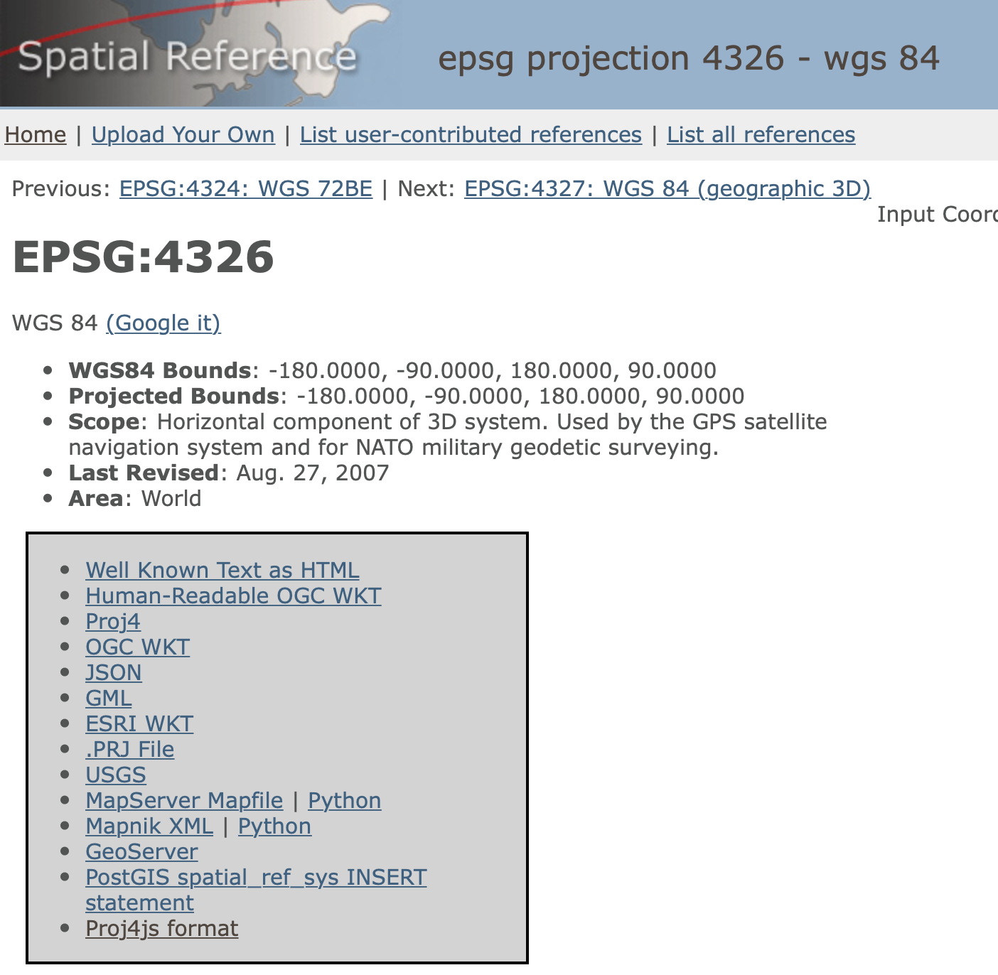
Figure 1: EPSG 4326
As mentioned, GeoDa uses the proj4 format. When this is selected from the list
on the web site, the following
description is generated:
+proj=longlat +ellps=WGS84 +datum=WGS84 +no_defs
This is the proper definition to be entered into the CRS box when saving an unprojected (lat-lon) spatial layer.
Selecting a projection
Non-cartographers are often at a loss when needing to select a projection to convert geographic data that are
provided with latitude-longitude coordinates. While it is possible to use great circle distance (or, arc
distance)
to compute the distance between locations using lat-lon, the implementation in GeoDa is only an
approximation.
In order to use Euclidean distance, we need to project the data.
For North America, a useful projection is universal transverse Mercator or UTM. The country is divided into parallel zones, as shown in Figure 2. With each zone corresponds a specific projection that is contained in an ESPG code.2
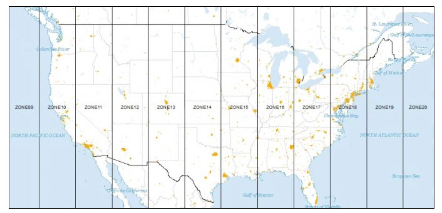
Figure 2: UTM zones for North America (source: GISGeography)
Let’s say we need a projection for locations in Chicago. From the map, we can see that this city is located in UTM zone 16 (north – there is a southern hemisphere equivalent). We can now search the spatialreference.org site for this projection. The search results are shown in Figure 3. Rather than a single code, a whole list of combinations of different datums is provided.
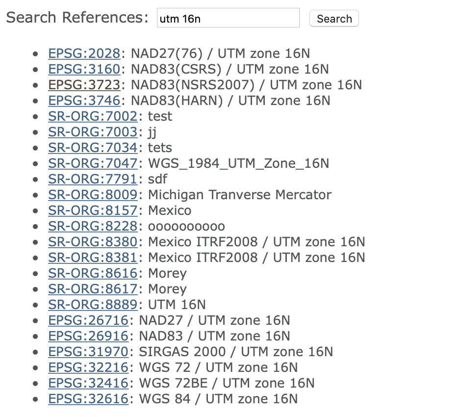
Figure 3: Projections for UTM Zone 16N
We select the more recent WGS84 datum with associated EPSG code 32616. This yields the information shown in Figure 4.
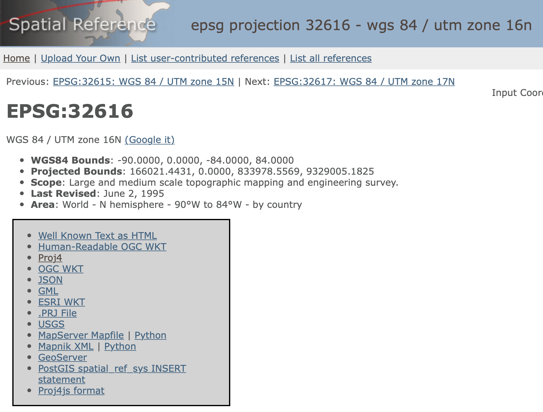
Figure 4: EPSG code 32616
We choose the proj4 format, which yields the following CRS:
+proj=utm +zone=16 +ellps=WGS84 +datum=WGS84 +units=m +no_defs
In order to change the projection of a lat-lon layer (EPSG 4326) to UTM Zone 16N, we need to enter this code in the CRS box when executing a Save As command. This will result in a new layer with the proper projection.
Reprojection
The procedure just described requires the manual entry of the correct CRS code. In practice,
this can create problems due to typographical errors or other imprecisions. The Save As
process in GeoDa provides an alternative that does not need an explicit entry, but
requires the presence of another layer with the desired projection. The CRS information
is then copied from that other layer and used in the reprojection of a current layer.
For example, consider the 77 Chicago community areas contained in the commpop.shp shape file. As we saw in the previous chapter, this layer is expressed in latitude-longitude coordinates and takes on the familiar shape, shown in Figure 5.

Figure 5: Chicago community areas in lat-lon
Say we want to convert this layer to the same projection as the supermarket locations, contained in the chicago_sup.shp shape file. We proceed with File > Save As. After entering a name for the new file, say commpop_proj, we can change the CRS information. The entry corresponding to the lat-lon layer is as in Figure 6. The small globe icon to the right allows us to load a CRS specification from another file.

Figure 6: Load CRS from another layer
Selecting this icon brings up a file load interface into which we drag the chicago_sup.shp file. At this point, the CRS information in the box changes to the new projection, as shown in Figure 7.

Figure 7: New CRS from another layer
After saving the new file, we close the current project and load the new layer. The corresponding themeless base map is as in Figure 8. The more compressed shape matches the layout of the supermarkets that we saw in the previous chapter.
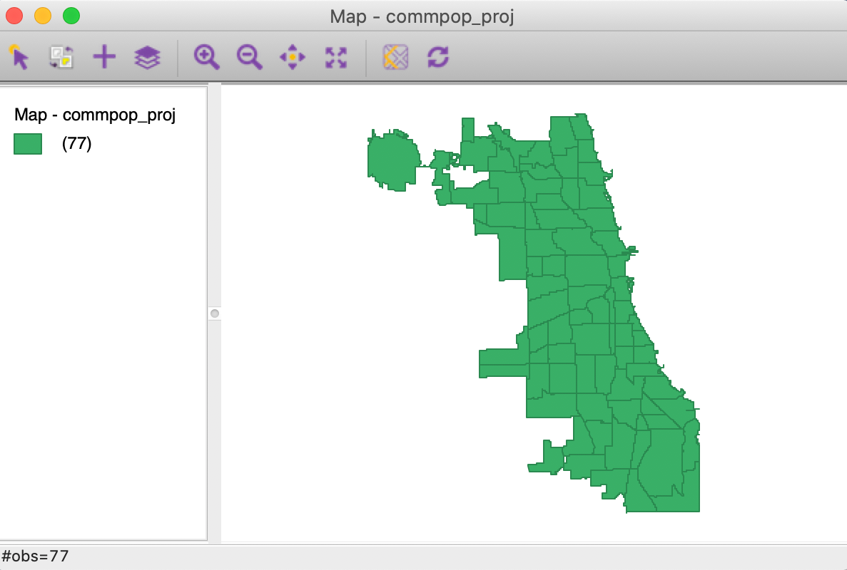
Figure 8: Reprojected Chicago community areas layer
Converting Between Points and Polygons
So far, we have represented the geography of the community areas by their actual boundaries. However, this is not the only possible way. We can equally well choose a representative point for each area, such as a mean center or a centroid. In addition, we can create new polygons to represent the community areas as tessellations around those central points, such as Thiessen polygons. The key factor is that all three representations are connected to the same cross-sectional data set. As we will see in later chapters, for some types of analyses it is advantageous to treat the areal units as points, whereas in other situations Thiessen polygons form a useful alternative to dealing with an actual point layer.
The center point and Thiessen polygon functionality is brought up through the options menu associated with any map view (right click on the map to bring up the menu). We illustrate these features with the projected community area map we just created.
Mean centers and centroids
The Shape Centers option, shown in Figure 9, applies to polygon layers and offers a number of different alternatives. All options pertain to either the Mean Center or to the Centroid. The former is obtained as the simple average of the the X and Y coordinates that define the vertices of the polygon. The latter is more complex, and is the actual center of mass of the polygon (image a cardboard cutout of the polygon, the centroid is the central point where a pin would hold up the cutout in a stable equilibrium).
Both methods can yield strange results when the polygons are highly irregular or in a so-called multi-polygon situation (different polygons associated with the same ID, such as a mainland area and an island belonging to the same county). In those instances the centers can end up being located outside the polygon. Nevertheless, the shape centers are a handy way to convert a polygon layer to a corresponding point layer with the same underlying geography. For example, as we will see in a later chapter, they are used under the hood to calculate distance-based spatial weights for polygons.
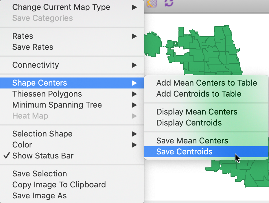
Figure 9: Centroids and mean centers options
There are three main operations associated with the central points. The simplest is to Display the points on the map. This is purely illustrative and the points are not available for any further manipulation. This contrasts with the multi-layer option discussed below. For example, in Figure 10, the community area centroids are displayed on top of the default themeless map.

Figure 10: Display centroids on map
As second option is the Add the coordinates of the central points to Table. This brings up a dialog that prompts for the variable names for the coordinates, as in Figure 11.
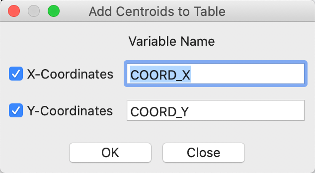
Figure 11: Add centroids to table
The new variables are added to the data table, as shown in Figure 12. At this point, we could use the Tools > Points from Table option to turn the coordinates into a separate point layer. However, this can also be done directly by choosing the Save central point option.
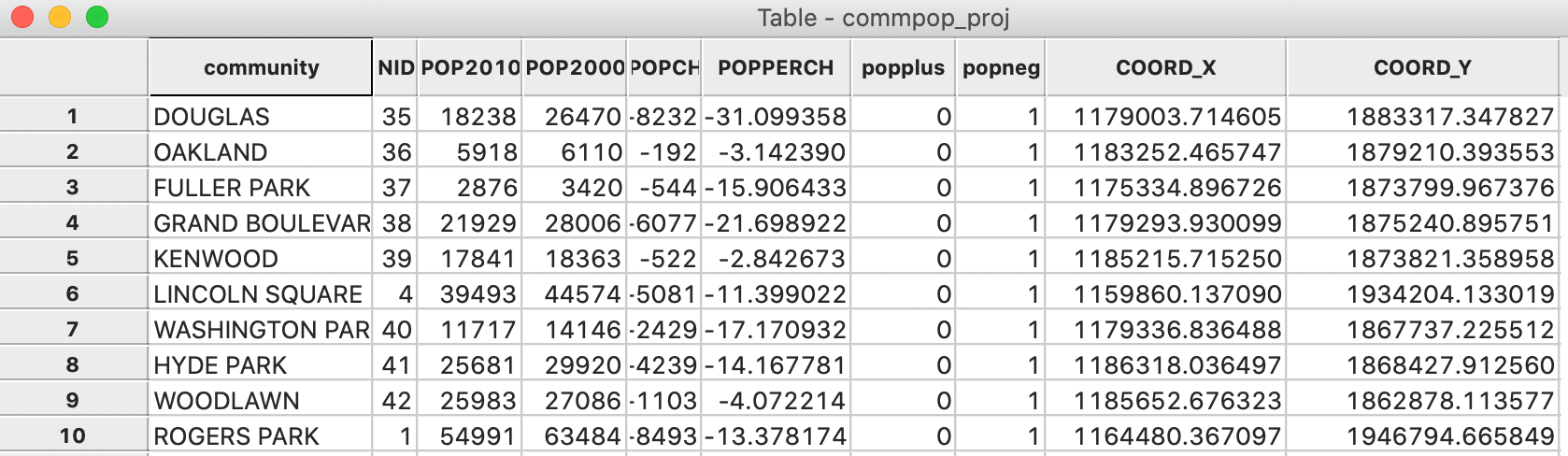
Figure 12: Centroids added to table
The Save option results in the usual prompt for a file name (e.g., comm_centroid) and creates the new layer. In our example, the point layer associated with the community area centroids is as in Figure 13.
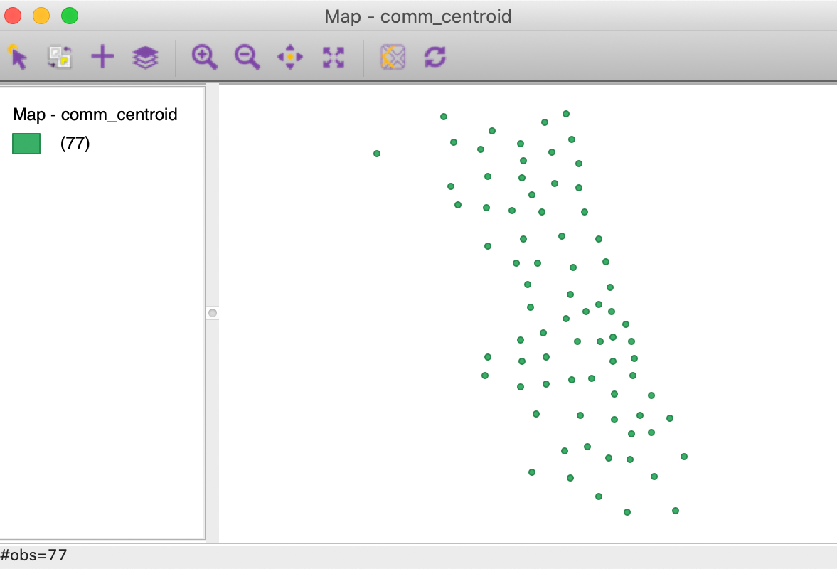
Figure 13: Chicago community area centroid layer
Thiessen polygons
Point layers can be turned into a so-called tessellation or regular tiling of polygons centered around the points. Thiessen polygons are those polygons that define an area that is closer to the central point than to any other point. In other words, the polygon contains all possible locations that are nearest neighbors to the central point, rather than to any other point in the data set. The polygons are constructed by considering a line perpendicular at the midpoint to a line connecting the central point to its neighbors.
The Thiessen Polygons functionality is available as an option in the map view for point layers, as shown in Figure 14 for the comm_centroid layer.
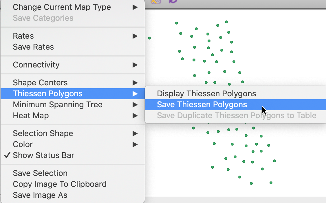
Figure 14: Thiessen polygons option
Again, we have the option to simply Display the polygons on top of the point layer, as in Figure 15, but this does not allow for any analysis.
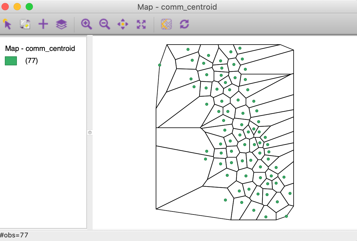
Figure 15: Display Thiessen polygons
Alternatively, we can Save the Thiessen polygons to a new layer in the usual fashion. For example, in Figure 16, we show the themeless base map of the layer associated with a chi_thiessen shape file that we just created.
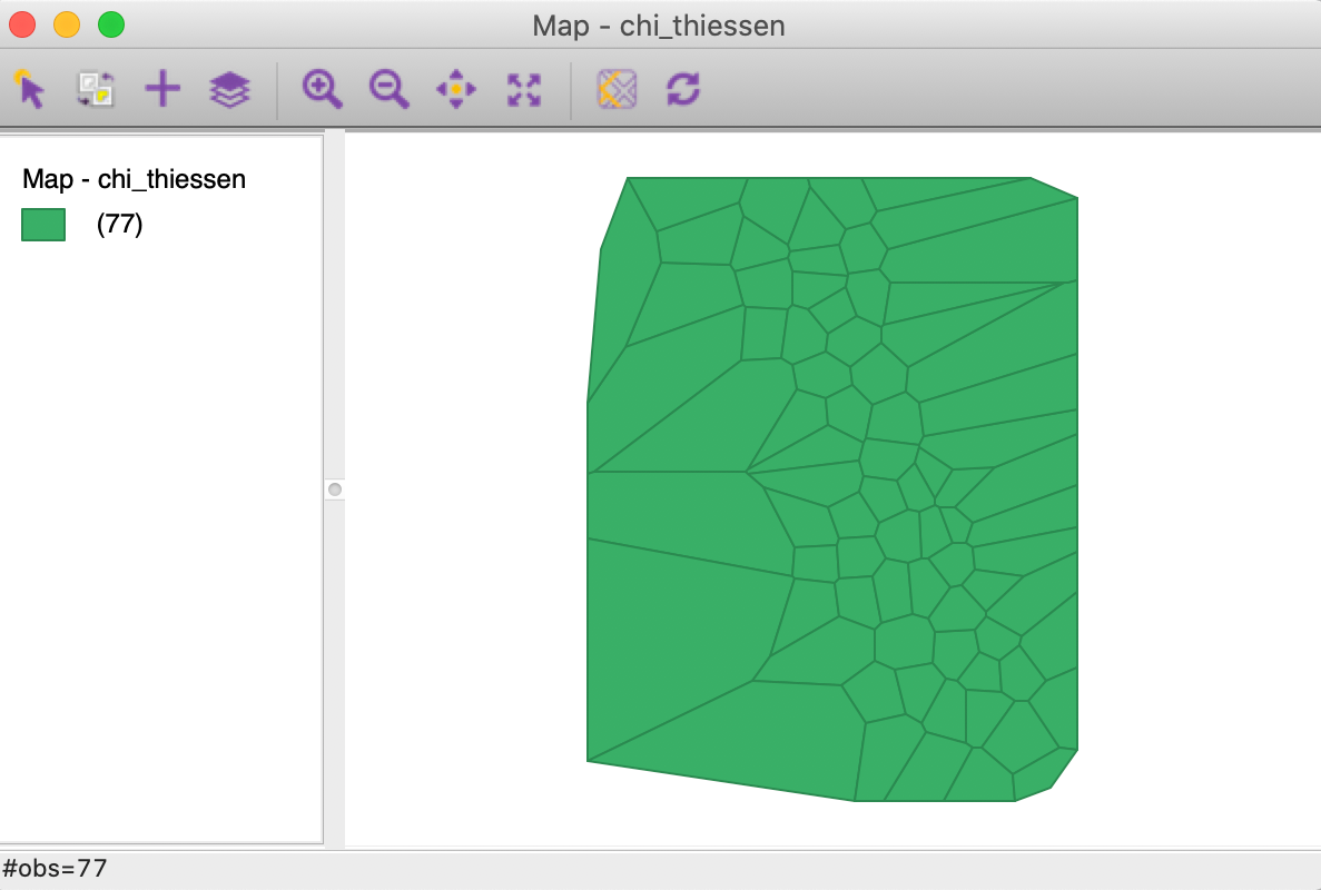
Figure 16: Thiessen polygon layer
Minimum Spanning Tree (MST)
A graph is a data structure that consists of nodes and vertices connecting these nodes. In our later discussions, we will often encounter a connectivity graph, which shows the observations that are connected for a given distance band. The connected points are separated by a distance that is smaller than the specified distance band.
An important graph is the so-called max-min connectivity graph, which shows the connectedness structure among points for the smallest distance band that guarantees that each point has at least one other point it is connected to.
A minimum spanning tree (MST) associated with a graph is a path through the graph that ensures that each node is visited once and which achieves a minimum cost objective. A typical application is to minimize the total distance traveled through the path. The MST is employed in a range of methods, particularly clustering algorithms.
GeoDa constructs an MST based on the max-min connectivity graph for any point layer. This is an
option
in the map menu for a point layer, as illustrated in Figure 17 for the
chicago_sup.shp layer.
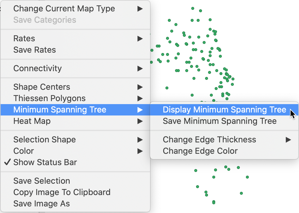
Figure 17: MST option in a point map layer
The construction of the MST employs Prim’s algorithm, which is illustrated in more detail in the Appendix. The Minimum Spanning Tree function has several options. The critical one is Display Minimum Spanning Tree. The graph is shown on top of the point layer. Change Edge Thickness and Change Edge Color allow for some customization. For example, in the MST shown in Figure 18, the edge thickness was changed to Strong and the edge color to Red. The graph clearly illustrates how each node is visited.
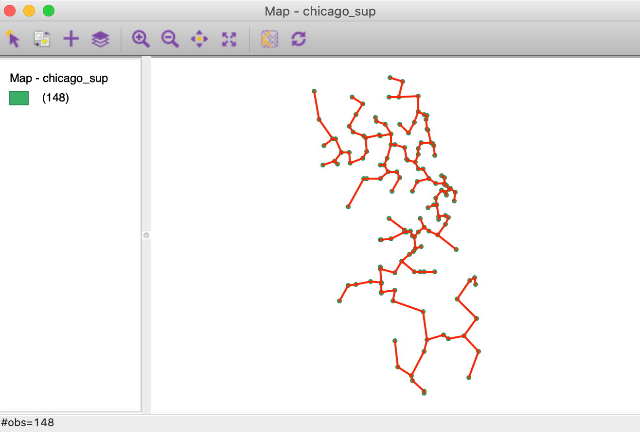
Figure 18: MST graph for Chicago grocery stores
A further option is to Save Minimum Spanning Tree, which creates a file that follows the gwt spatial weights format. This is discussed more in depth in the chapters dealing with spatial weights.
Aggregation
Spatial data sets often contain identifiers of larger encompassing units, such as states for counties, or
census
tracts for individual household data. GeoDa supports two different ways to compute aggregates from
the smaller units.
One approach also creates a dissolved map, the other is limited to computing a new table with the
aggregate information.
Dissolve
The Tools > Dissolve function, is invoked from the Tools icon on the toolbar, as shown in Figure 19, or from the menu.

Figure 19: Dissolve option
We illustrate this functionality with the natregimes shape file. While the observations are for counties, each county also includes a numeric code for the encompassing state in the variable STFIPS. We specify this as the variable for dissolving in the dialog shown in Figure 20. Next we need to select the variables for which we want to calculate the aggregate values. We need to be mindful of the type of variable that is appropriate for the selected aggregation Method, a choice from Average, Max, Min, and Sum. The Count function doesn’t actually compute any aggregate values, but provides a count of the number of smaller units included in the larger unit (e.g., the number of counties in each state).
In our example, we want to aggregate the homicide count, HC60, and population, PO60. We select these variables by double clicking on them, or choosing them and then using the > key. We also specify Sum as the method. The dialog in Figure 20 shows all the details.
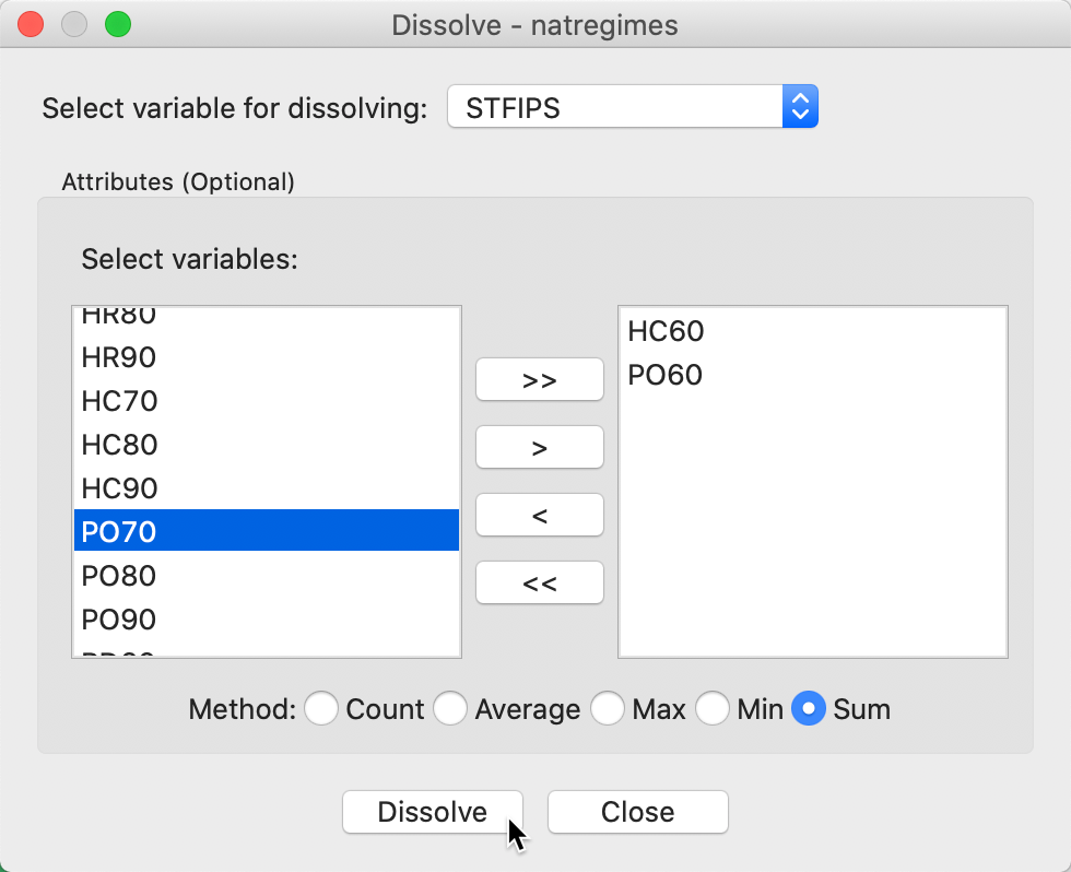
Figure 20: Dissolve dialog
After activating the Dissolve button, the usual file creation dialog is produced that allows us to specify a file type and file name. In our example, we created the states.shp shape file.
After closing the project and loading this shape file, we obtain a themeless base map with the 49 states outlines (and Washinton, DC), shown in Figure 21.
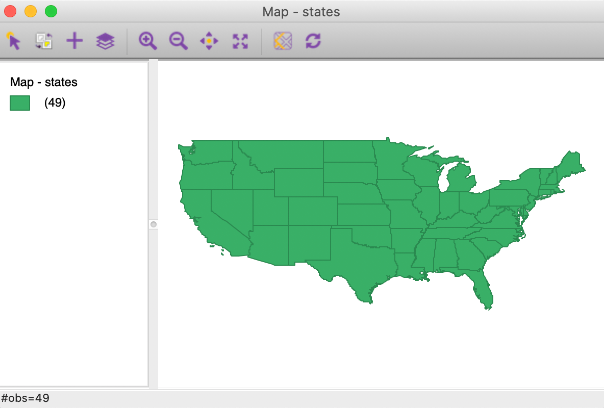
Figure 21: Dissolved states map
The associated table, in Figure 22, shows the entries for the state aggregates, as well as a new variable, AGG_COUNT, which indicates the number of counties aggregated into the respective state.3
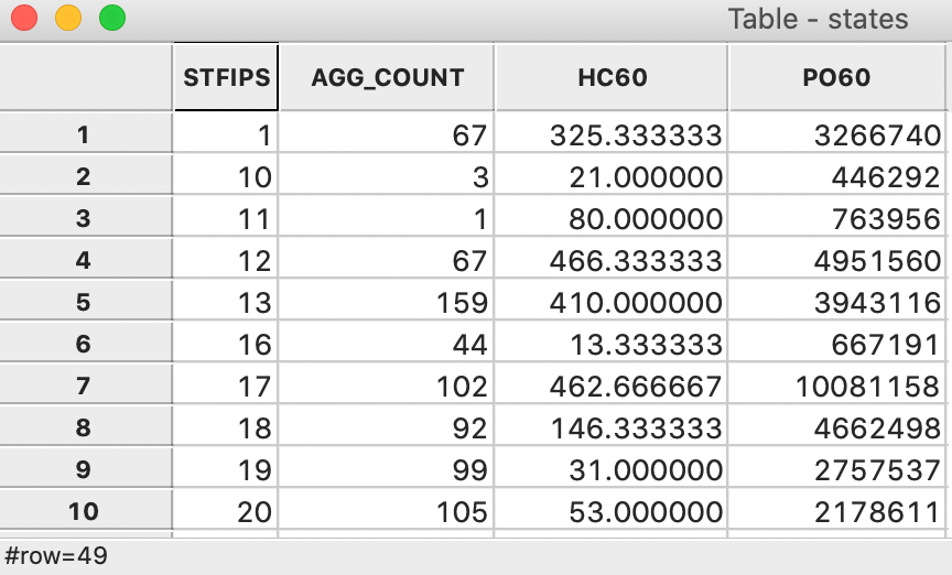
Figure 22: Dissolved states table
Aggregation in table
The same aggregation function is also available as an option for the table, as shown in Figure 23. The main difference with the Dissolve function is that the results are only available as a table, without an associated dissolved map.
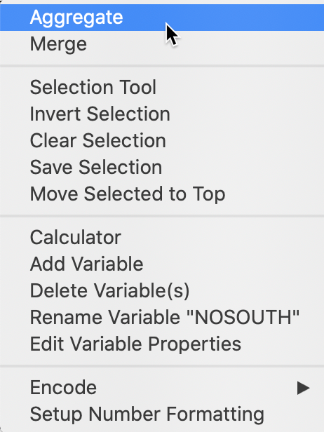
Figure 23: Aggregate option in table
The aggregation dialog is very similar to the previous one, as illustrated in Figure 24. We need to choose a Select key, a numeric variable following which the aggregation will be carried out. In our example, we again choose STFIPS. We also need to select a Method, Sum in our example, as well as the respective variables, here again HC60 and PO60. If we save the result as a table (e.g., in dbf format), the end result is identical to Figure 22.
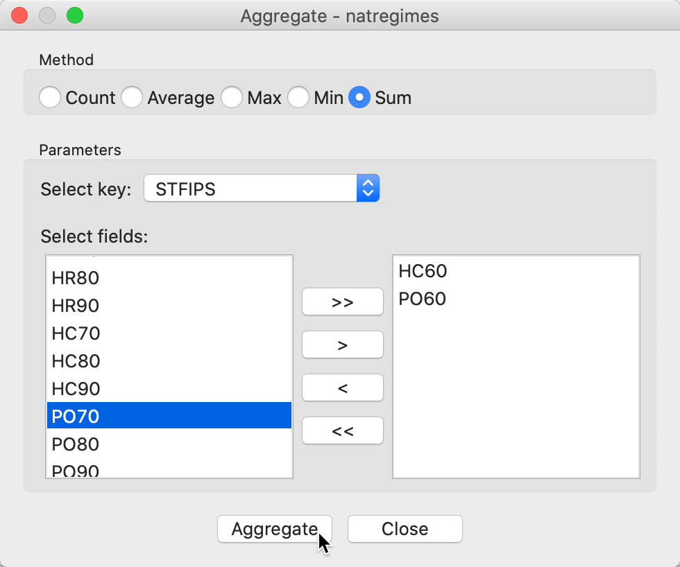
Figure 24: Aggregate dialog
Multi-Layer Support
So far, we have focused on a single spatial layer. GeoDa has limited functionality to handle
multiple layers.
The functionality is limited in that any selection, transformation or other manipulation only applies to the
current map layer, i.e., the layer that is loaded first. The data table associated with this layer is
the only
data that can be changed.
There is limited support for interaction between layers, in the form of spatial join and
highlighted assocations,
discussed in the last two sections. In the current section, we present the basics of the multiple layer logic
in GeoDa.
Loading multiple layers
We start by loading the supermarket point layer from the chicago_sup.shp file. The resulting base map is as in Figure 25. We add a second layer by clicking on the Add Map Layer icon in the toolbar, the + sign as the third item from the left.
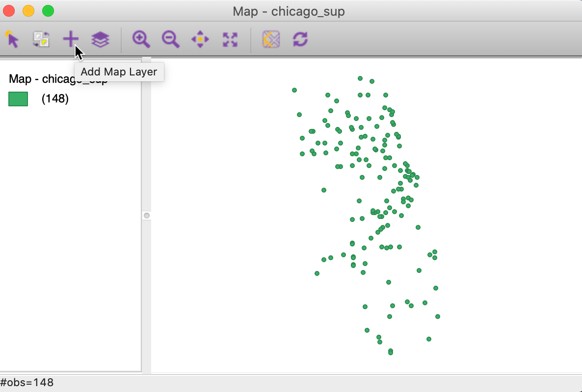
Figure 25: Add map layer icon
This brings up the usual data input interface, to which we load the projected community area file from commpop_proj.shp. We now have two layers, as in Figure 26. The interaction between the two layers is managed by the Map Layer Settings dialog, invoked from the fourth icon from the left on the toolbar. This lists the layers in the order in which they appear on the map. In our example, this is the point layer on top and the area layer below. The dialog also clearly indicates which is the main or current map layer, i.e., chicago_sup.
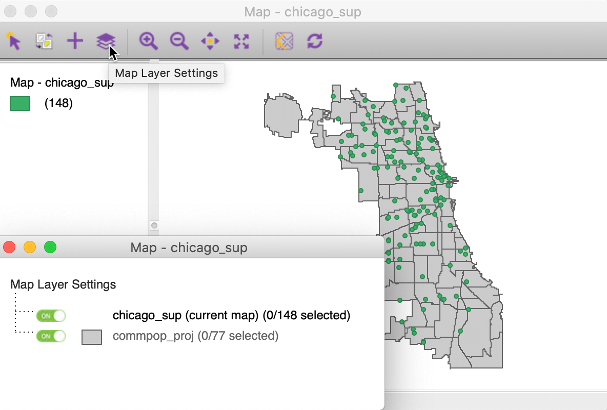
Figure 26: Map layer settings
The properties of the top layer, such as fill color and outline color are set in the standard manner, by clicking on the green rectangle in the legend. In order to set the properties of the other layers, we need to click on the small rectangle in the Map Layer Settings dialog that corresponds to the layer of interest. This provides access to the Fill Color and Outline Color, as in Figure 27. In addition to the color, it may be necessary to adjust the opacity in order to make sure that the relevant information is visible. The interface also includes options to set the association highlight, which we discuss in a later section. The final item in the dialog allows us to Remove the layer.
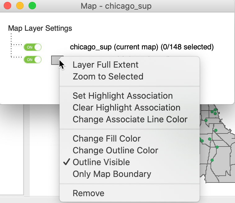
Figure 27: Customizing the second map layer
Automatic reprojection
In the previous example, we made sure to combine two layers that were expressed in the same projection.
However, as long as layers have projection information associated with them, GeoDa will
automatically
reproject any later layers to the projection of the current layer. This is for visualization
only, it
does not change the projection information of the reprojected layers.
For example, in Figure 28, we first loaded the commpop layer which was not projected, but expressed in lat-lon coordinates. However, since we included the projection information with the layer, the points from the second layer, chicago_sup, are automatically turned into lat-lon as well. We see the slightly more spread out pattern in Figure 28 compared to Figure 26. Note that we had to change the opacity of the top layer (the community areas) to 0 in order to make the points visible.
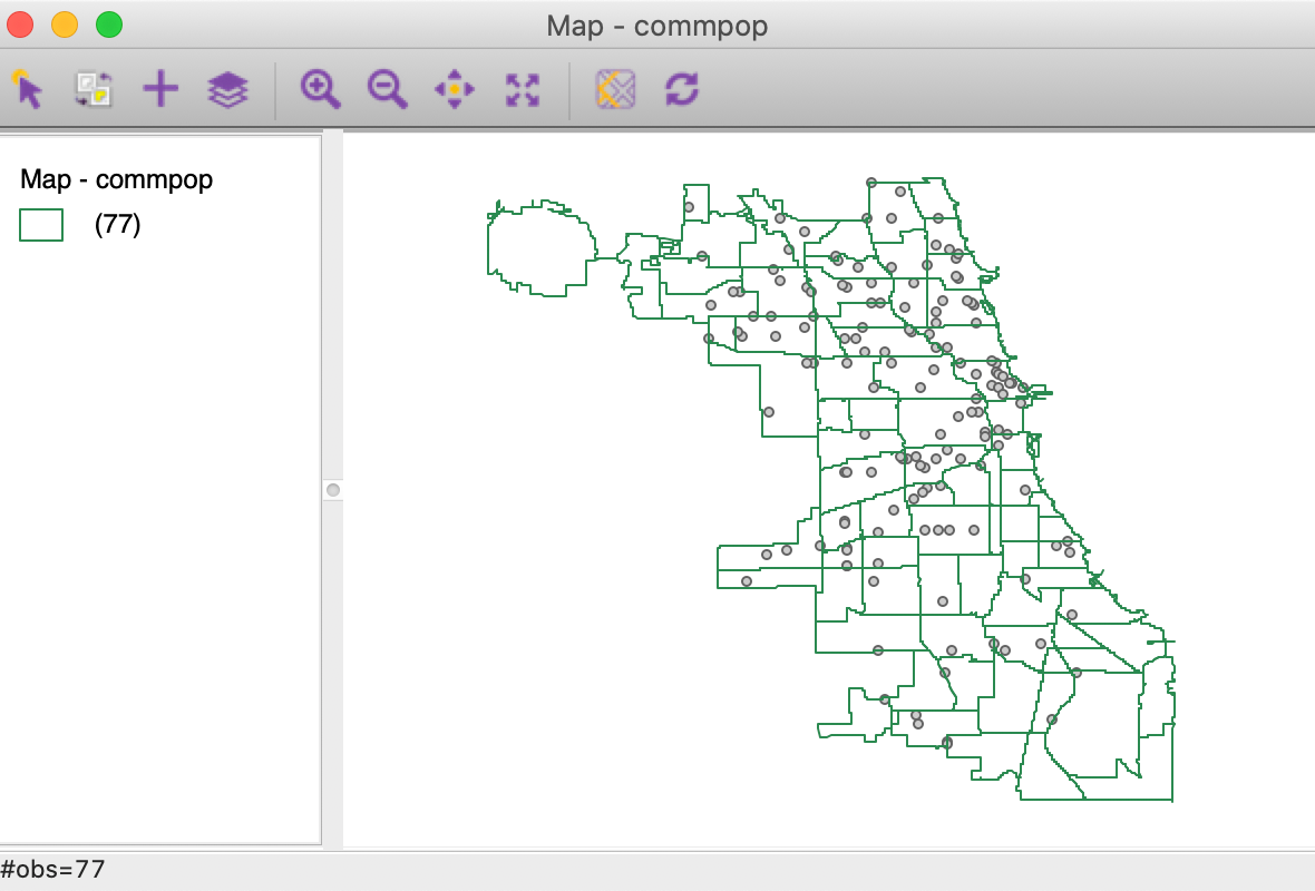
Figure 28: Points reprojected to lat-lon
Layer position
The position of the layers can be altered by means of the Map Layer Settings interface. One grabs the entry for a layer and drags it to a different position. For example, in Figure 29, we have moved the point layer on top of the community area layer. However, even though the point layer is now on top, the community area layer remains the current map layer, since it was loaded first.
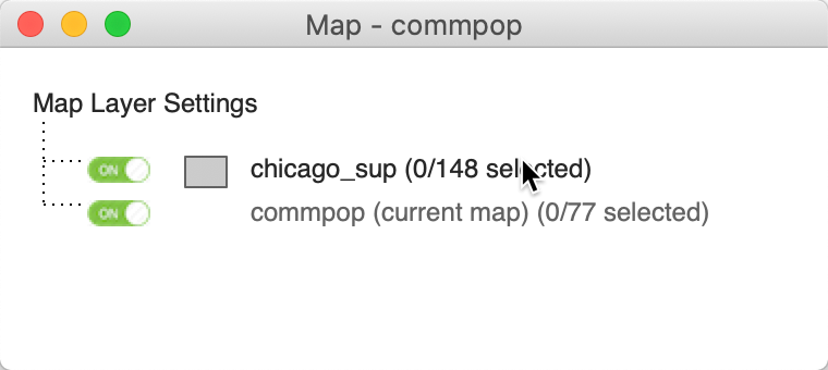
Figure 29: Change the position of the map layers
The result is the map in Figure 30. Note how, in contrast to Figure 28, we now do not need to change the opacity of the community area layer. Since the point layer is on top, it is drawn after the community area, so the points will always be visible.
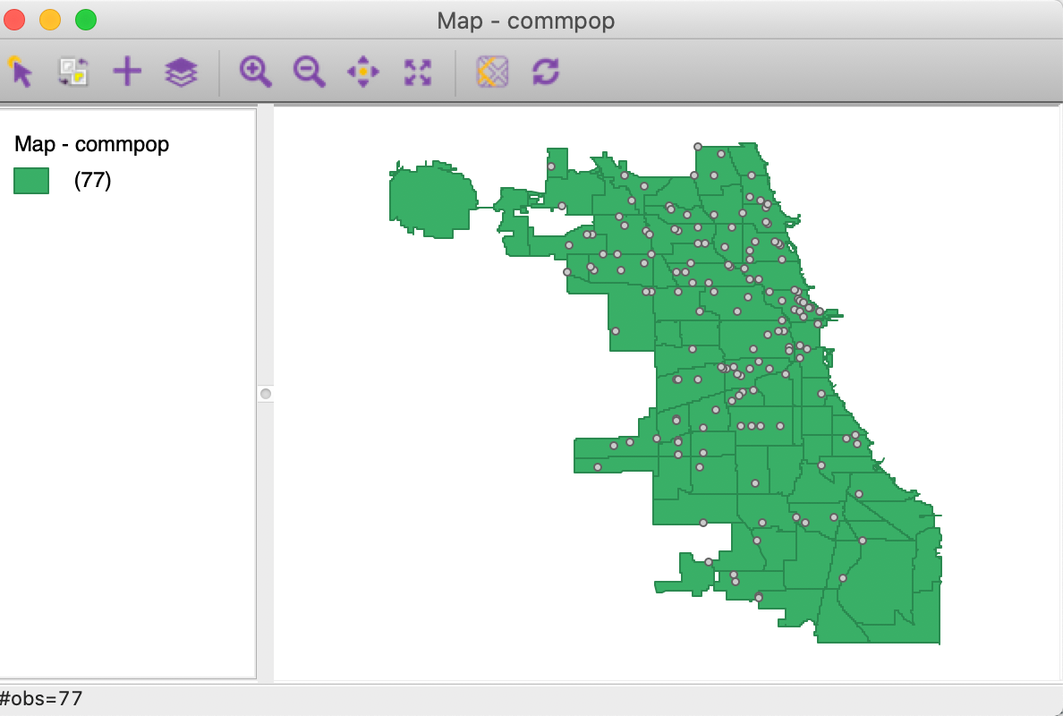
Figure 30: Points layer moved to top
Selection
It is important to keep in mind that any selection only pertains to the current map layer, which may or may not also be the top layer. For example, in Figure 31 (based on the setup shown in Figure 26), the current map layer is the points layer chicago_sup, which is also on top. Any selection highlights points and provides the same selection in any other open map or graph through the linking capacity (discussed in more detail in later chapters).
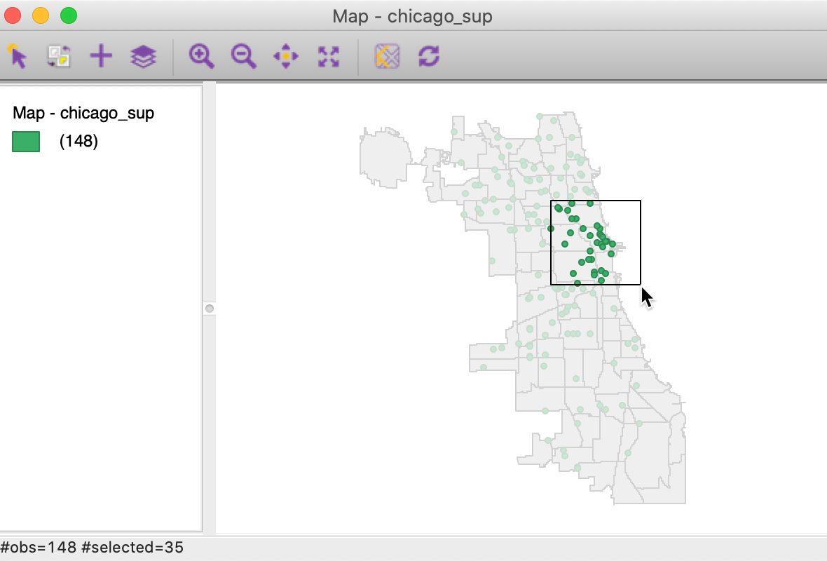
Figure 31: Select on current points layer – points on top
In contrast, in Figure 32 (based on the setup in Figure 30), the selection
pertains to the community areas, which is the current map layer, even though the point layer
is on top.
This may seem a bit counter-intuitive at first, but it is based on the linking and brushing architecture
implemented
in GeoDa. Currently, this logic works only for a single layer, which is always the first loaded
layer.
For example, when the selection is initialized in a different single layer map, this map will pertain to the community areas and not to the added point layer. In the section on Linked Multi-Layers, we describe a way to connect the selection between two layers.
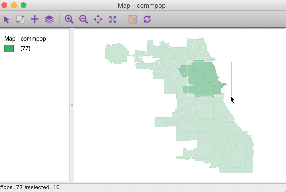
Figure 32: Select on current area layer – points on top
Spatial Join
The multi-layer infrastructure allows for the calculation of variables for one layer, based on the observations in a different layer. This is an example of a point in polygon GIS operation. There are two applications of this process. In one, the ID variable (or any other variable) of a spatial area is assigned to each point that is within the area’s boundary. We refer to this as Spatial Assign. The reverse of this process is to count (or otherwise aggregate) the number of points that are within a given area. We refer to this as Spatial Count.
Even though the default application is simply assigning an ID or counting the number of points, more complex assignments and aggregations are possible as well. For example, rather than just counting the point, an aggregate over the points can be computed for a given variable, such as the mean, median, standard deviation, or sum.
It is important to keep in mind the order in which the layers are loaded into the multi-layer setup. For spatial assign, the point layer is first, since the community area ID (or other variable) is assigned to each point. As mentioned before, only the table of the first loaded layer is available for manipulation or analysis. So, in order to add the ID code to the point layer table, it must be loaded first.
For spatial count, the reverse it the case. We need to first load the polygon layer, since the number of points (or any other aggregation) is added to the table for the areal units.
Spatial assign
We start the process illustrating the Spatial Assign operation by first loading the Chicago supermarkets point layer, chicago_sup.shp, followed by the projected community area layer, commpop_proj.shp (using the + icon in the toolbar). This yields the base map shown in Figure 33.
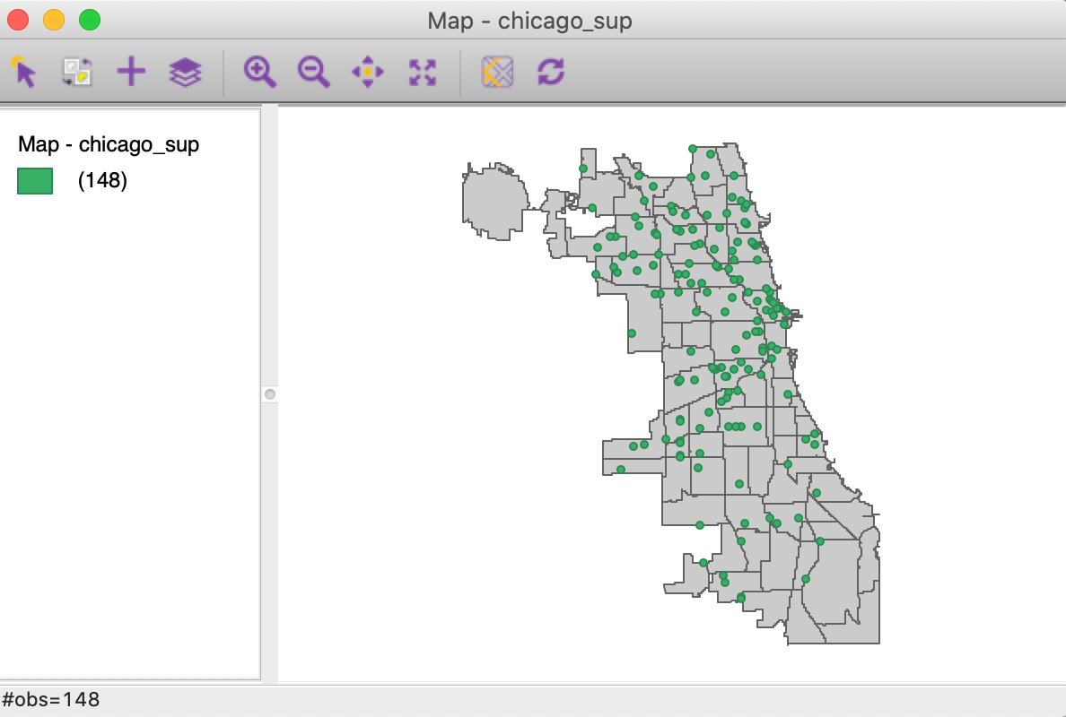
Figure 33: Supermarket point layer on top of community areas
We invoke the point in polygon operation from the menu as Tools > Spatial Join, or from the Tools icon on the toolbar, in the usual way. This brings up the main dialog, which differs between the spatial assign and the spatial count functions.
Figure 34 shows how the current map layer, chicago_sup is joined to another layer. In our example, there is only one other layer, i.e., commpop_proj, but in general, there could be several layers to select from. The ID Variable contains the value that will be assigned to each point. In our example, this is the community area id, NID.
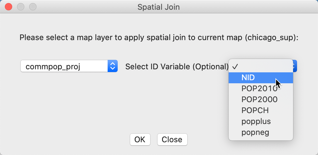
Figure 34: Spatial join dialog – community area for point
Clicking OK brings up the dialog for the variable name of the spatial assign variable, which is SA by default. As shown in Figure 35, we keep the default in our example.
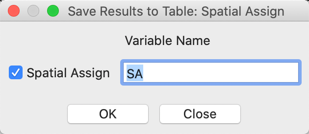
Figure 35: Spatial assign – community area variable
After this, the community area ID is added to the point data table as the variable SA, as in Figure 36.
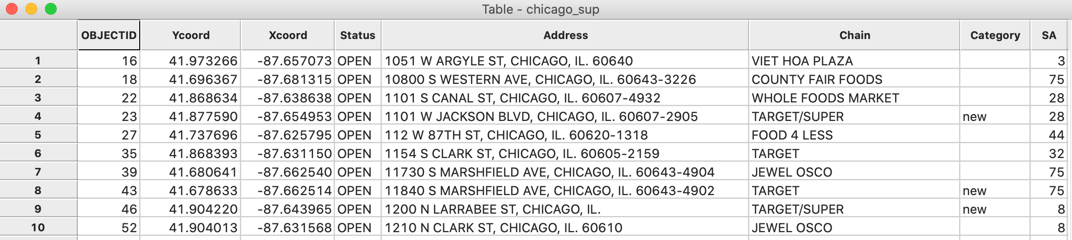
Figure 36: Community area in point table
We can now readily identify the supermarkets that are located within a given community area. For example, in Figure 37, we used the Selection Tool on the point layer to select the supermarkets with NID = 41, the community area code for Hyde Park. The three points are clearly identified on the map.
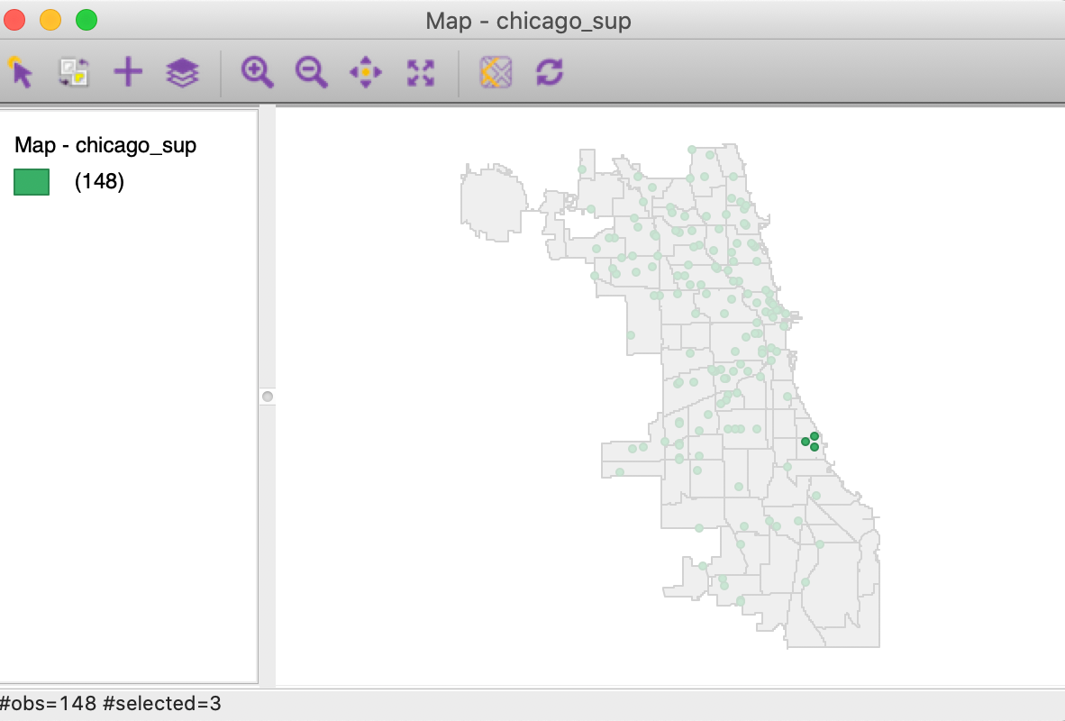
Figure 37: Grocery stores in Hyde Park
Spatial count
The Spatial Count process works in the reverse order. We first load the community area layer, commpop_proj.shp, followed by the supermarket point layer, chicago_sup.shp. In order to make the points visible (since the community area map is on top), we change the opacity of the Fill Color of the community areas to 0, and change the Fill Color of the point layer to blue. This yields the map in Figure 38.
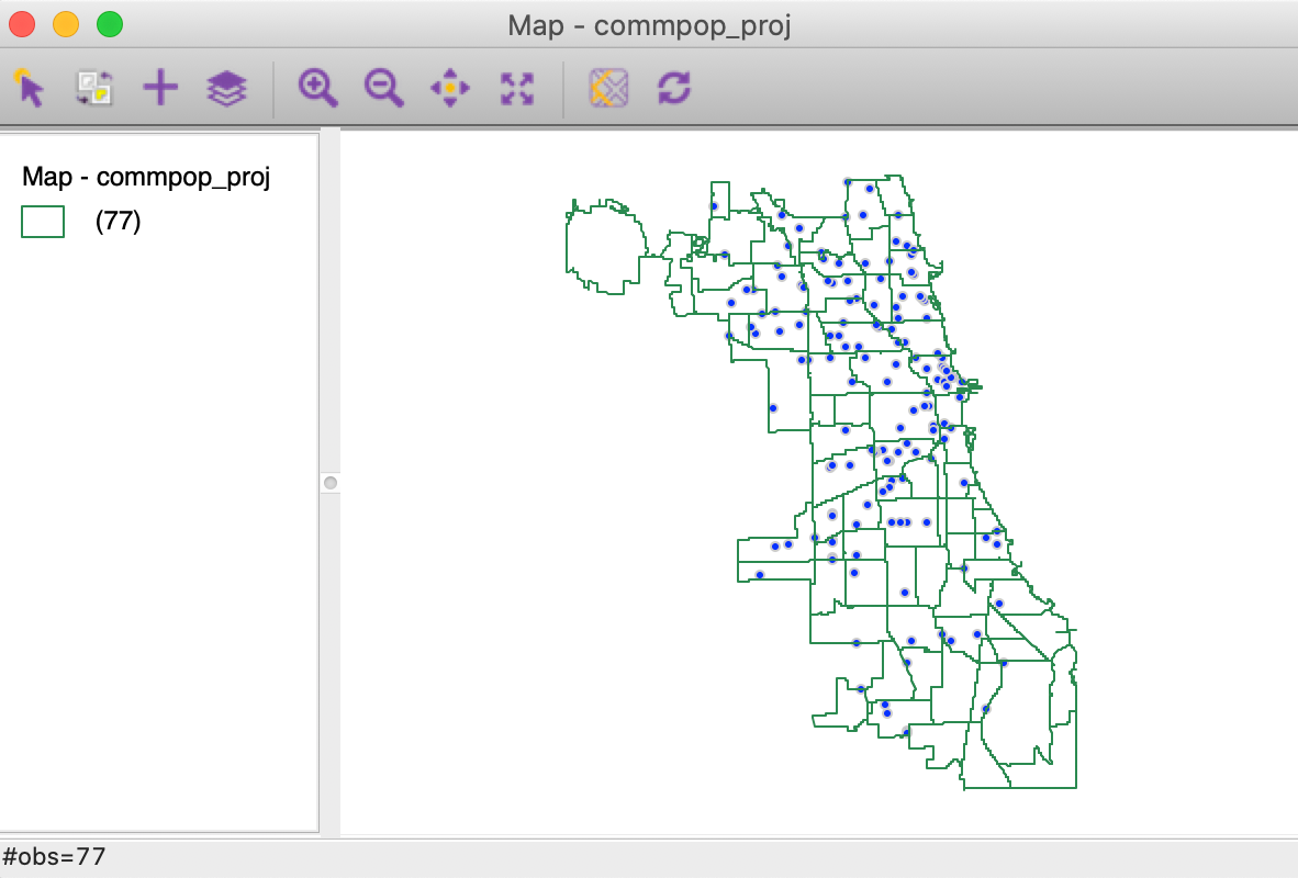
Figure 38: Community area layer on top of supermarkets
We again invoke the process as Tools > Spatial Join, but now the interface is slightly different, as in Figure 39. The current map is now the area layer, commpop_proj. Again, there is a drop down list to select the second layer, which in our example is simply chicago_sup. Since we are not carrying out any spatial aggregation on a specific variable, the radio button checked is left to the default Spatial Count.
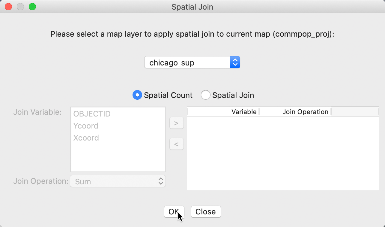
Figure 39: Spatial join dialog – points for community area
While we don’t illustrate this feature here, the spatial join operation can also carry out an aggregation over the points in each area. This allows us to select multiple variables that are available at the point level (in our example, there are no interesting variables other than location) and carry out one of the aggregation options Sum, Mean, Median and Standard Deviation, as listed in Figure 40.
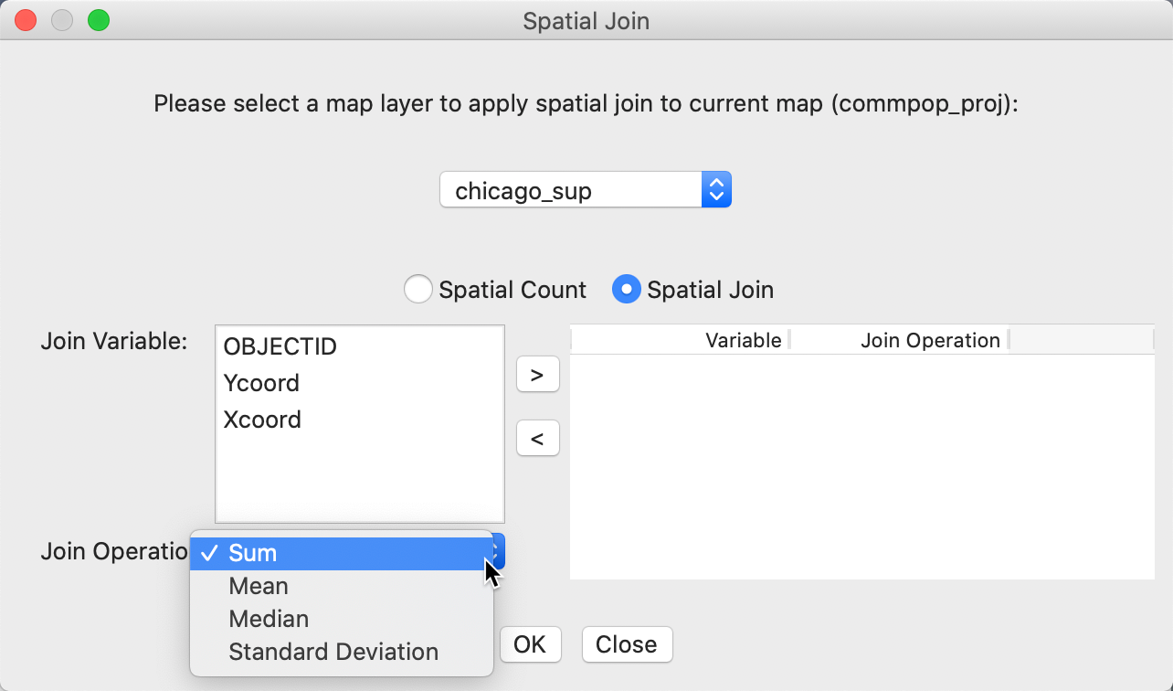
Figure 40: Spatial join dialog – aggregation options
In our example, we want a simple count of supermarkets by community area, so we leave the radio button to Spatial Count. Clicking OK brings up the dialog to select the spatial count variable. In Figure 41, we keep the default as SC.
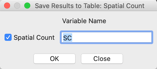
Figure 41: Spatial count – number of supermarkets
Figure 42 shows how the variable SC has been added as an additional column in the community area data table.
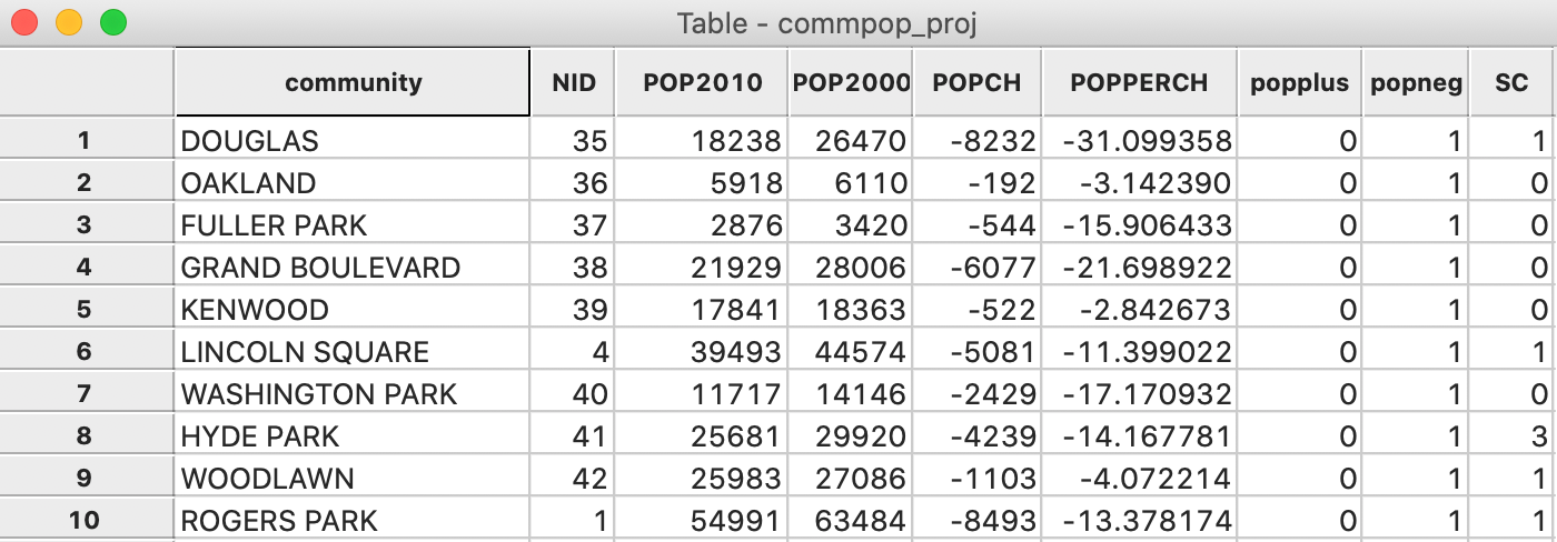
Figure 42: Grocery count in community area table
We can now use the Selection Tool on the community area layer to find out which community areas lack any supermarkets, by setting SC=0. The result is shown in Figure 43.
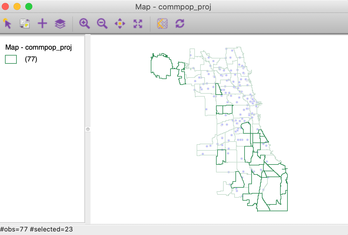
Figure 43: Community areas without supermarkets
As in any table operations, the results are not permanent until a Save command has been executed.
Linked Multi-Layers
In the previous example, we used the connection between two layers to compute a new variable. In addition, this connection can also be exploited to highlight the association between observations in one layer to observations in another layer, as long as these layers share a common key.
A typical application of this feature is to show the connection between two point layers, e.g., where one contains headquarters and the second branches, connected by a shared corporate ID.
Here, we will illustrate this functionality with the Home Sales sample data set, which contains house sale data for King county, Washington from the Kaggle competition. The aim of the competition was to develop the best predictor of house values. Each sale is associated with both a point location and a zip code. Our example illustrates a quality check, where we want to verify the correctness of the zip code zones (or the locations).
To understand the linkage logic, it is important to realize that the connection is from selected observations in the current map layer to another layer. If the main layer is house sale points, then the linkage is between points and associated zip code zones. With the main layer as zip code zones, the connection is between zones and associated sale locations.
From point to area
We start by loading the house sale location data from the kc_house.shp data set. Using the + icon, we add the King_county_zip.shp layer with the zip code zones. The point of departure is shown in Figure 44. The Map Layer Settings indicates that kc_house is the current map, i.e., the main layer.
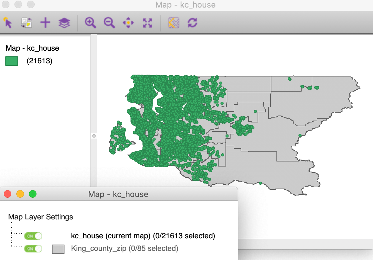
Figure 44: King county house sales with zip code zones
Right clicking on kc_house in the Map Layer Settings interface, triggers the options menu. From this, we select Set Highlight Association, as in Figure 45.
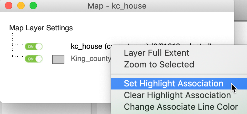
Figure 45: Set Highlight Assocation option
This brings up the Set Association Dialog for the from layer, i.e., kc_house (listed in parentheses), as shown in Figure 46. From the drop down list, we select the to layer, which is King_coun… in our example. Next, we need to specify the common key. In the area layer, the numeric zip code is contained in ZIP, whereas in the point layer, it is the variable zipcode. For now, we keep the Show connect line box unchecked.

Figure 46: Set association dialog – house sales
Clicking the OK button establishes the connection between a selection in the main layer and the associated observations in the other layer. For example, in Figure 47, we selected 806 house locations in the center of the map, and the associated zip code zones are highlighted. This contrasts with selection in the standard situation (without highlight association), where only the selected items for the main layer would be highlighted, as in Figure 31.
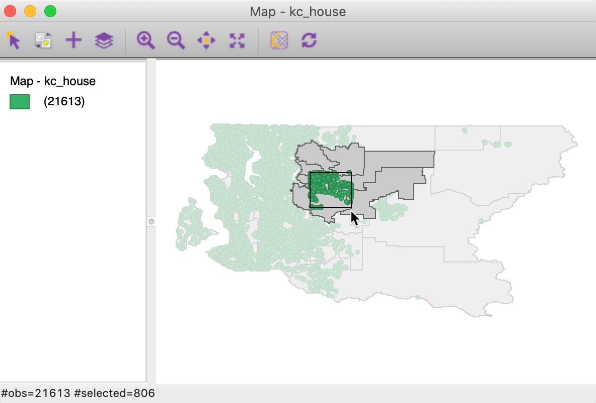
Figure 47: King county house sales selected with associates zip code zones
With the Show connect line box checked, the connection is visualized by means of lines between the selected points and a center point for the zip code zone. In Figure 48, we selected 16 observations in the remote eastern part of the county and show the associated links (to enhance visibility we changed the Associate Line Color for kc_house to red). If the codes were correct, we would expect the lines to go to the center point of the zip code zone in which the points are located. However, in this instance, the connection is to zones that are quite removed, suggesting a coding error, either in the zip code zone or in the lat-lon for the sales location.
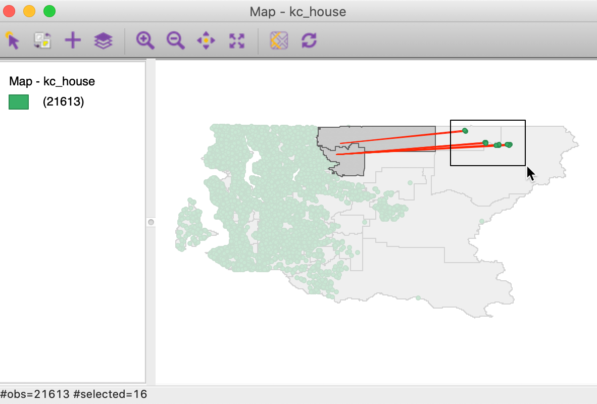
Figure 48: King county house sales with incorrect zip code zones
From area to point
We now illustrate the reverse logic. We start by loading the King_county_zip.shp layer and add the kc_house.shp data set. In order to make the points visible, we change the Opacity of the Fill Color of the zip code zone layer to 0 and the Outline Color for the points to blue. The result is shown in Figure 49.
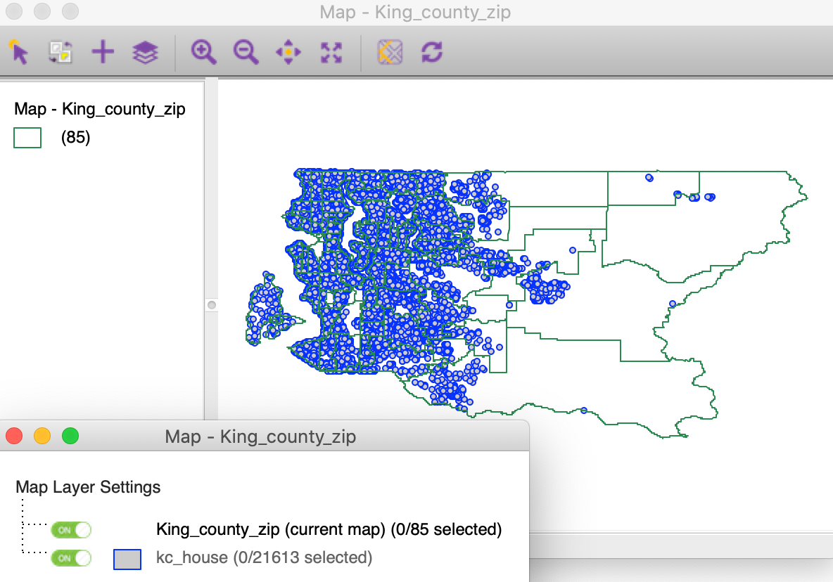
Figure 49: King county zip code zones with house sales
We again right click on the top layer (now the zip code zones) in the Map Layer Settings interface to select Set Highlight Association, in the same way as before. Now, the from layer in the Set Association Dialog is King_county_zip, as in Figure 50. We select the to layer as kc_house, and again the key variable is zipcode in the point layer and ZIP in the area layer. With the Show connect line box checked, this establishes the connection.

Figure 50: Set association dialog – zip code zones
Now, if we select an observation in the main layer of zip code zones, the links to the house sales are shown (again, changing the link color to red for visibility). Most of the sales connect to a central point of the zip code zone, but several are linked to locations well beyond, confirming the likely coding error we identified before.
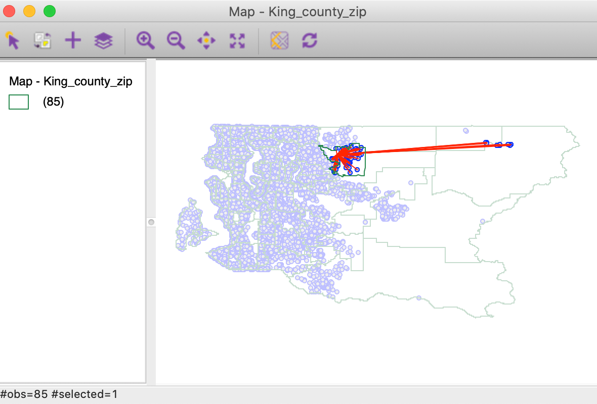
Figure 51: King county zip code zones incorrect house sales
Appendix
Prim’s Minimum Spanning Tree algorithm
We illustrate Prim’s MST algorithm by means of a small toy example consisting of 10 points. The coordinates of the points are given in Figure 52.
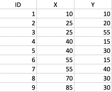
Figure 52: Toy example point coordinates
The corresponding inter-point distance matrix is given in Figure 53.
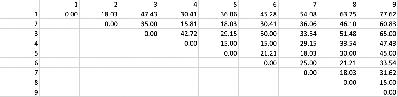
Figure 53: Inter-point distance matrix
We can now use the inter-point distances to construct a connectivity graph for a distance band that ensures that each point is connected to at least one other point. In our example, this distance is 29.15.4 The corresponding graph representation is given in Figure 54, where each point is a node and the vertices show the connections and associated distances.
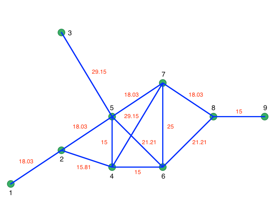
Figure 54: Connectivity graph
Prim’s algorithm proceeds by starting at a random node and selecting the shortest vertex to the next node. Let’s say we start at node 1. Since there is only a single vertex, the first path is from node 1 to 2. At node 2, there are two vertices, 2-4 with length 15.81, and 2-6 with length 18.03. We therefore connect 2 to 4. So far, our shortest path follows the red lines as in Figure 55.
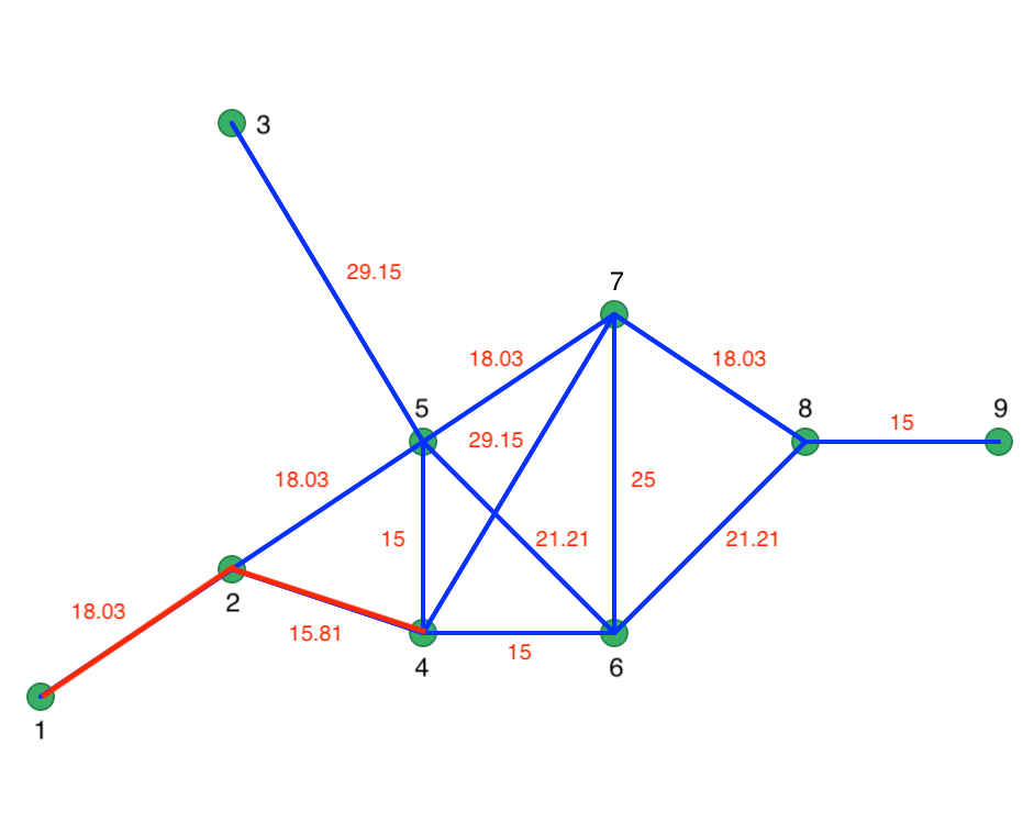
Figure 55: Initial steps in Prim’s algorithm
At node 4, the two vertices have the same length, so we can connect 4 to either 6 or 5. The order is immaterial, since the length of 15 is the smallest in the network and will have priority over any other vertex. At this point, the path consists of 1-2, 2-4, 4-6, and 4-5. The next step connects 5 to 7 (18.03), then 7 to 8 (18.03), and 8 to 9 (15). The only remaining unconnected point is 3, which is linked to 5 (29.15). The resulting MST follows the red lines in Figure 56. Every point is visited and the total distance of the path is minimized.
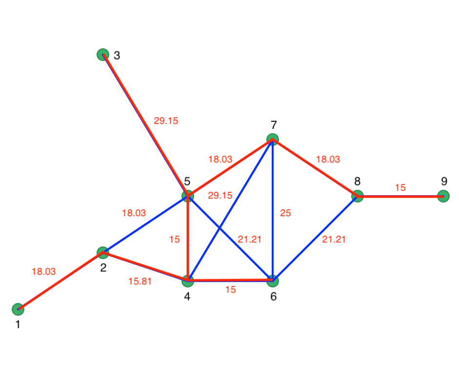
Figure 56: Minimum spanning tree
References
Kessler, Fritz C., and Sarah E. Battersby. 2019. Working with Map Projections: A Guide to Their Selection. Boca Raton, FL: CRC Press.
Snyder, John P. 1993. Flattening the Earth: Two Thousand Years of Map Projections. Chicago, IL: University of Chicago Press.
-
University of Chicago, Center for Spatial Data Science – anselin@uchicago.edu↩︎
-
For more details on the fundamentals behind the UTM projection, see, for example, the GISGeography site.↩︎
-
The fractional values for HC60 follow from the fact that the homicide counts are averages over three years.↩︎
-
Connectivity graphs are discussed in more detail in the chapters dealing with spatial weights.↩︎