Exploratory Data Analysis (2)
Multivariate Exploration
Luc Anselin1
09/29/2020 (updated)
Introduction
In this Chapter, we continue to explore the EDA functionality in GeoDa, but now focus on methods
to deal with multiple variables, such as the scatter plot matrix, bubble chart, 3D scatter plot, parallel
coordinate plot and conditional plots.
We will continue to use the by now familiar data set with demographic and socio-economic information for 55 New York City sub-boroughs.
Objectives
-
Interpreting a scatter plot matrix
-
Interpreting bubble charts and 3D scatter plots
-
Interpreting parallel coordinate plots
-
Interpreting conditional plots
GeoDa functions covered
- Explore > Scatter Plot Matrix
- changing the variable order in a scatter plot matrix
- smoothing and brushing the scatter plot matrix
- Explore > Bubble Chart
- bubble chart classification schemes
- bubble size
- Explore > 3D Scatter Plot
- rotating and zooming the 3D scatter plot
- projecting onto one axis
- selection in the 3D scatter plot
- Explore > Parallel Coordinate Plot
- changing the classification theme for the PCP
- changing the order of the axes
- brushing the PCP
- Explore > Conditional Plot
- conditional scatter plot
- conditional histogram
- conditional box plot
- conditional scatter plot option
- changing the condition breakpoints
- LOWESS smoother in conditional plots
Preliminaries
We will continue to illustrate the various operations by means of the data set with demographic and
socio-economic information for 55 New York City sub-boroughs that comes built-in with GeoDa. It
is also
contained in the GeoDa Center data set collection.
- nyc: socio-economic data for 55 New York City sub-boroughs
As before, since the data set is built-in, there is no real need to download the sample data, although it is useful in order to preserve any changes.
Scatter Plot Matrix
Principle
A scatter plot matrix visualizes the bivariate relationships among several pairs of variables. The individual scatter plots are stacked such that each variable is in turn on the x-axis and on the y-axis. When applied to standardized variables (with mean zero and variance one), it is the visual counterpart of a correlation matrix.
In general, however, while the scatter plot matrix shows the linear association between variables, the graphs are not symmetric. The main interest is in the magnitude and sign of the slope in each of the scatter plots, and the extent to which this points to a significant bivariate relationship, similar to the insight provided by a correlation matrix.
Even though this method is included in this Chapter, it is not really a multivariate exploration, but rather a collection of bivariate explorations for multiple variables.
In GeoDa, the diagonal elements also contain a histogram for the variable in the corresponding
row/column
to provide a sense of the univariate distribution.
Creating a Scatter Plot Matrix
We start the scatter plot matrix by selecting the corresponding icon on the toolbar (part of the EDA icons), as in Figure 1, or by choosing Explore > Scatter Plot Matrix from the menu.
Figure 1: Scatter Plot Matrix toolbar icon
This brings up a dialog through which variables can be added or removed, shown in Figure 2. The design of the interface is such that one selects a variable from the list on the left and clicks on the right arrow > to include it in the list on the right (alternatively, one can double click on the variable name to move it to the right-hand column). The left arrow < is there to remove a variable from the Include list.
As soon as two variables are selected, the scatter plot matrix is rendered in the background. As new variables are added to the list on the right, the matrix in the background is updated with the additional scatter plots.
In our example in Figure 2, we selected average people per household in 2000 (hhsiz00), the percentage households with children under 18 in 2000 (kids2000), the average number of years lived in the current residence in 2002 (yrhom02), and the percentage households receiving public assistance in 2000 (pubast00). The order of the variables can be changed by means of the Up and Down buttons in the dialog.
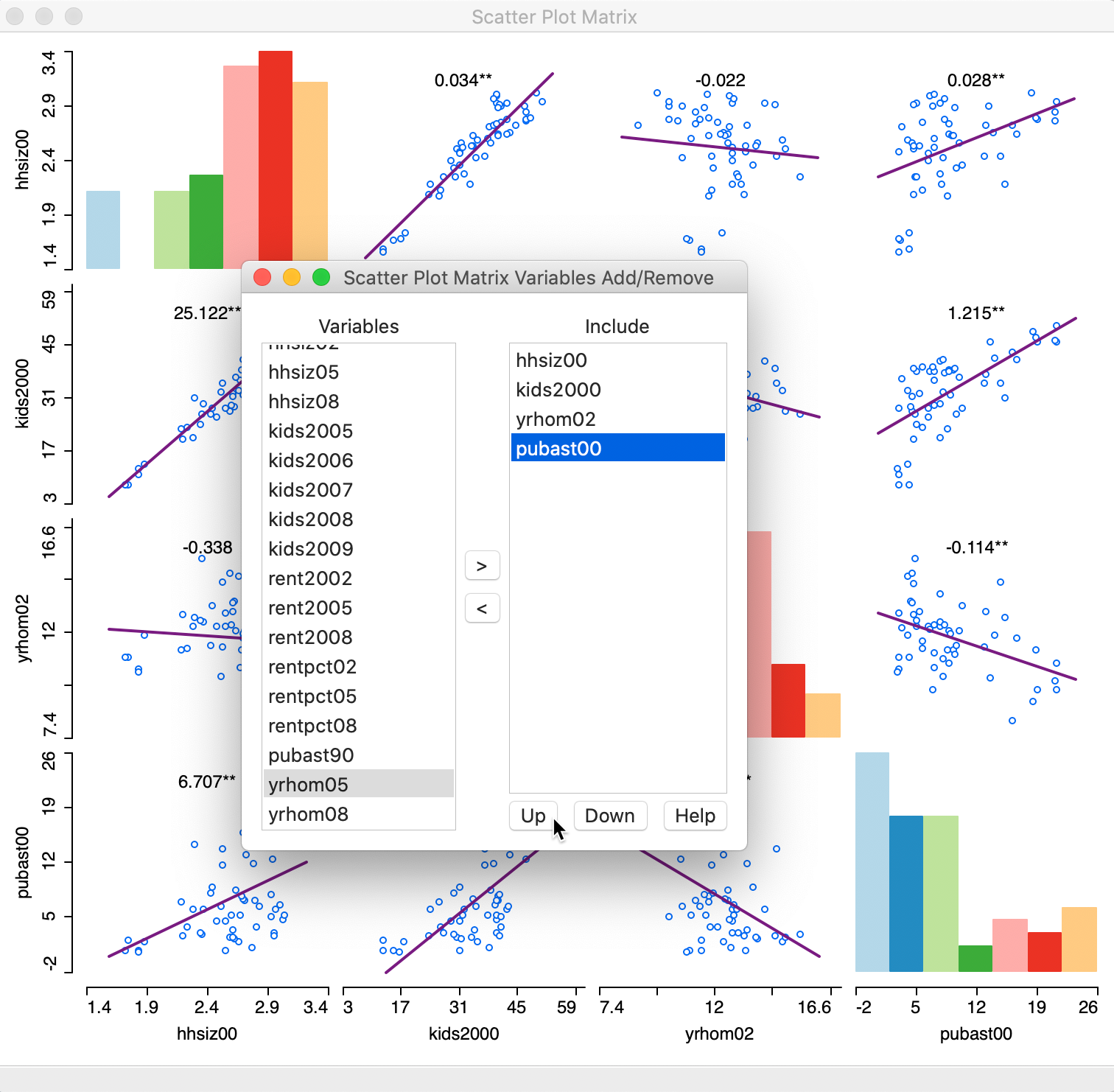
Figure 2: Scatter Plot Matrix variables
Once we move the dialog aside, the full 4 x 4 scatter plot matrix is revealed, as shown in Figure 3.
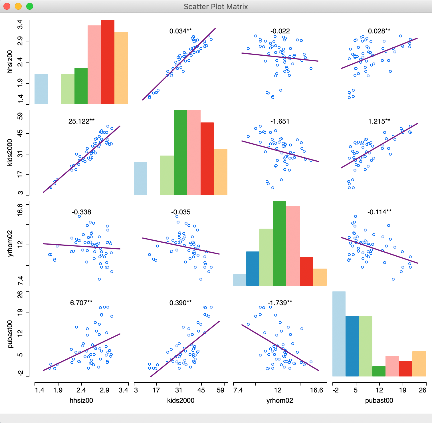
Figure 3: Scatter Plot Matrix
The graph shows both positive and negative associations, as well as non-significant ones. Above each scatter plot, the slope of the linear fit is listed, with significance indicated by one * (p < 0.05) or two ** (p < 0.01). The histograms in the diagonal provide a sense of the shape of the univariate distribution for each variable.
Among others, the graph reveals a strongly significant and positive relationship between the percentage households with kids and public assistance (as we saw before in the scatter plot), and a strong negative and significant relationship between number of years in the residence and public assistance. The relationship between years in residence and percent households with kids is not significant.
Scatter Plot Matrix options
As is customary, a right click (or control click) brings up the options for the scatter plot matrix, shown in Figure 4. The defaults are a linear fit (Smoother > Show Linear Smoother), with linking and brushing disabled (View > Regimes Regression unchecked), and the slope values displayed. Selecting Add/Remove Variables bring back the variable selection dialog.
Several of these options are familiar and have the same items as for the single scatter plot. This includes Selection Shape, Data, View, and Color. In addition, the scatter plot can also be saved as an image, in the usual fashion. We do not discuss these topics further here.
Two options warrant some further attention. First, in addition to the linear fit, the scatter plot matrix also supports a LOWESS fit, with the same parameter editing capability as in the standard scatter plot. This is invoked by selecting Smoother > Show LOWESS Smoother, as shown in Figure 4.
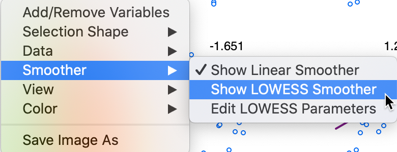
Figure 4: Scatter Plot Matrix smoothing options
A LOWESS smoother (with bandwidth 0.40) reveals considerable non-linearity in some of the bivariate relationships, as illustrated in Figure 5.
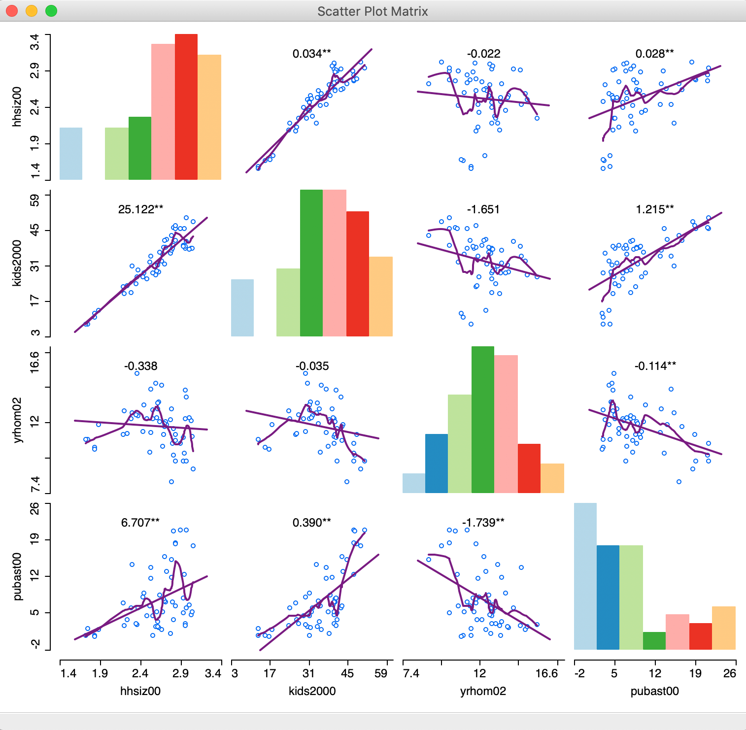
Figure 5: Scatter Plot Matrix with LOWESS smoothing
Finally, with the brushing and linking functionality enabled (View > Regimes Regression checked), potential structural breaks can be further investigated dynamically (for ease of viewing, the LOWESS Smoother option is turned off). As in the standard scatter plot, the red linear fit corresponds to the selected observations, the blue line is for the unselected ones and the purple line is for the complete sample. As evidenced in Figure 6, the selected observations are also highlighted in the histograms on the diagonal, as well as in any other open windows/graphs.
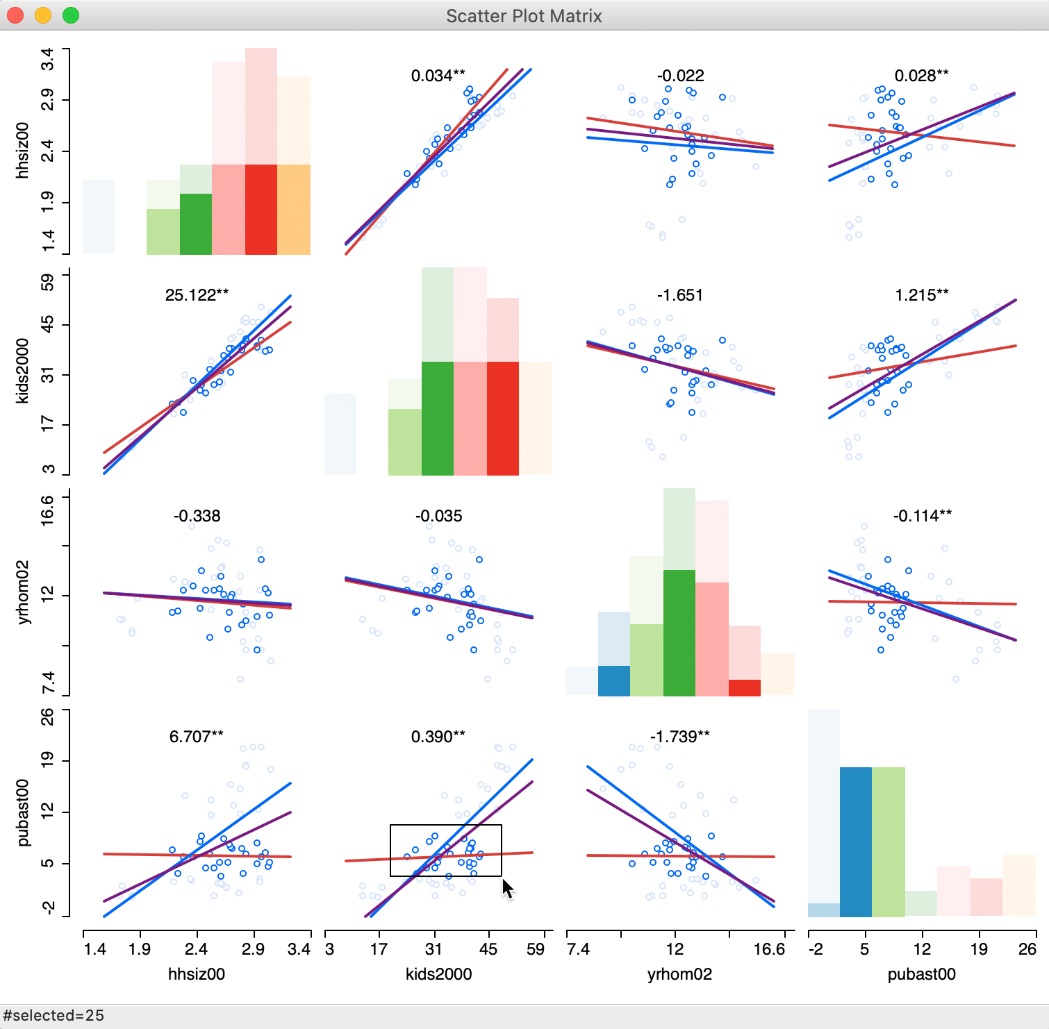
Figure 6: Scatter Plot Matrix with brushing
Three Variables: Bubble Chart and 3D Scatter Plot
Once we move beyond two variables, it becomes difficult to explicitly visualize the relationships among the variables in higher-dimensional space. Techniques to deal with such higher dimensions all boil down to reducing the dimensionality of the problem, i.e., attempting to show the relationships in a two-dimensional plane. In this section, we consider two of these techniques that work for situations in three dimensions (or, at most, four), the bubble chart and the 3-dimensional scatter plot.
Bubble chart
The bubble chart is an extension of the scatter plot to include a third and possibly a fourth variable into the two-dimensional chart. While the points in the two-dimensional scatter plot remain as showing the association between two variables, the size of the points (the bubble) is used to introduce a third variable. In addition, the color shading of the points can be used to consider a fourth variable as well, although this may stretch our perceptual abilities.
The bubble chart is invoked from the menu as Explore > Bubble Chart, and from the toolbar by selecting the fifth icon in the EDA group, shown in Figure 7.
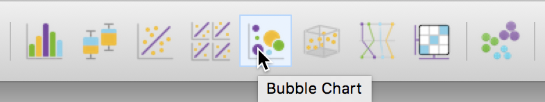
Figure 7: Bubble Chart toolbar icon
This brings up a dialog to select the variables for up to four dimensions: X-Axis, Y-Axis, Bubble Size and Bubble Color. In Figure 8, we take kids2000 (percentage households with children under 18), pubast00 (percentage households receiving public assistance), and rent2002 (median rent) as the three variables. We take the color for the bubble to be the same as the bubble size (rent2002).
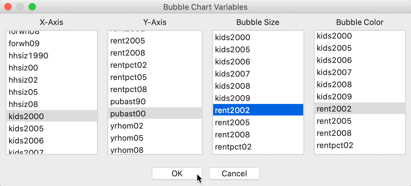
Figure 8: Bubble Chart variable selection
The resulting graph, illustrated in Figure 9 (after resizing the window somewhat), shows the same scatter plot as before, but now with the size and color of the circle reflecting the magnitude of the rent (red is high, blue is low). We see that the higher rents (larger bubbles) are situated in the lower left corner of the scatter plot. This suggests an interaction between the three variables, e.g., the higher median rent tends to be in sub-boroughs with a small percentage of households with children or receiving public assistance. This interaction between the three variables is not something we might have expected a priori (or, maybe it is, but the graph brings it out more explicitly). The null case would be that there is no structural relationship between the two original variables and the third, resulting in a graph with the size/color of the bubbles randomly distributed throughout.
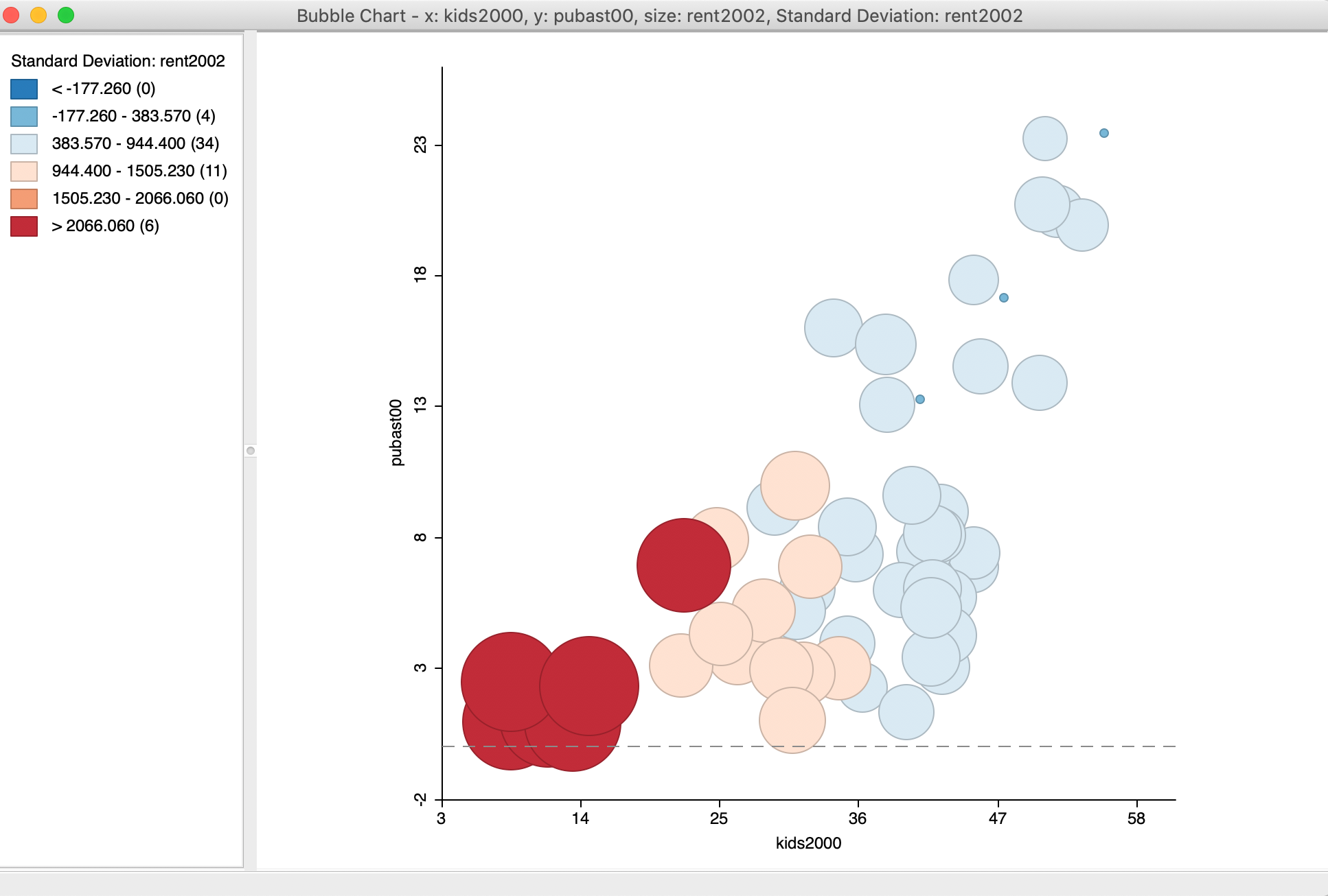
Figure 9: Bubble Chart
Bubble chart options
In addition to the usual options we have seen before, the bubble chart has a few unique features. The full list of main options is shown in Figure 10.
An option specific to the bubble chart is to set the size of the bubble, with Adjust Bubble Size (the bottom item in the menu in Figure 10).
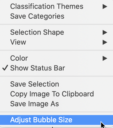
Figure 10: Bubble Chart size adjustment
This brings up a dialog with a slider to change the size of the circles, as in Figure 11. This is particularly useful when the default size overwhelms the graph. Note that the slider dialog must be closed before moving on.
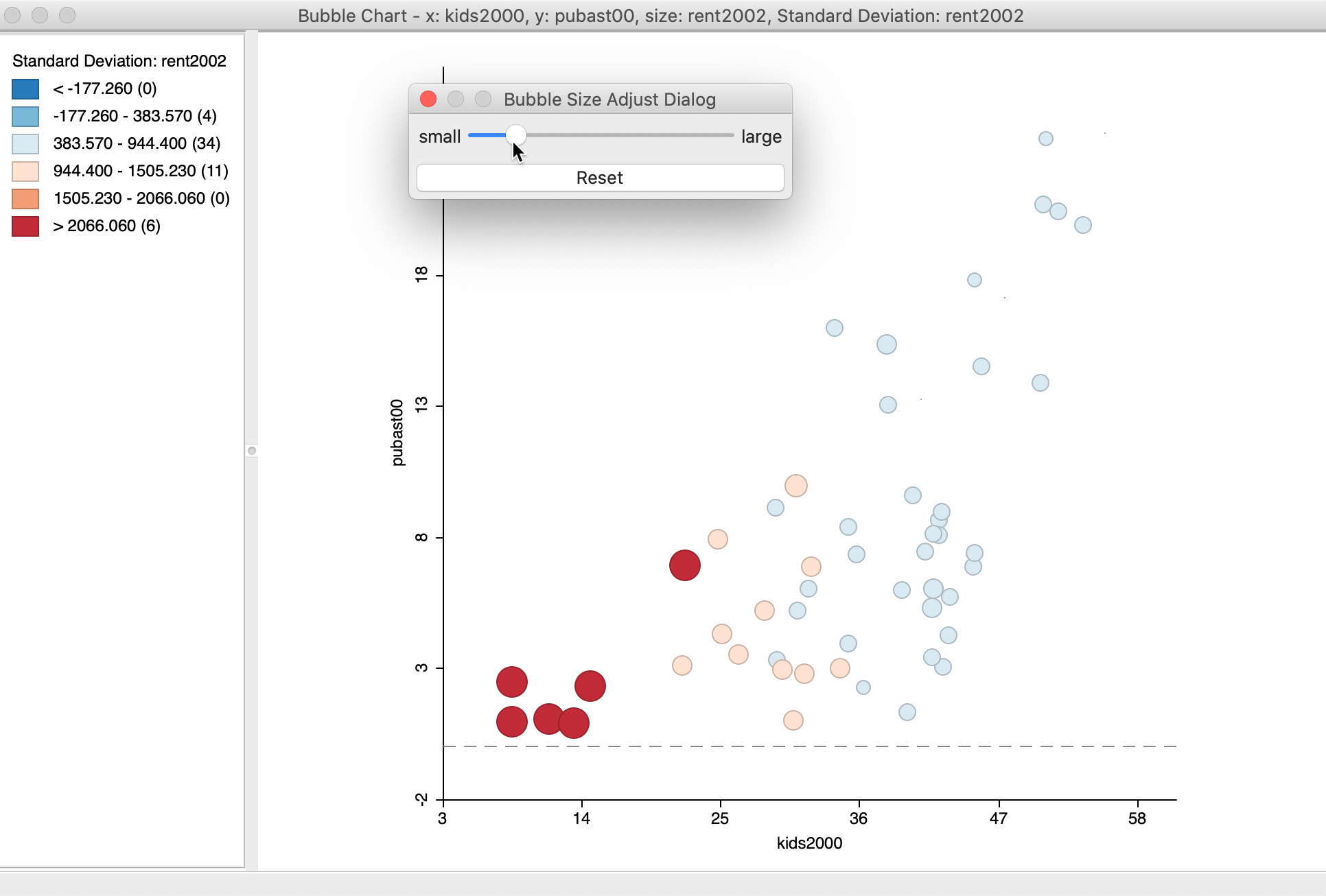
Figure 11: Bubble Chart size adjustment
Given the screen real estate taken up by the circles in the bubble chart, this is a technique that lends itself particularly well for small to medium sized data sets. For large size data sets, this particular graph is less appropriate.
Bubble chart using categorical variables
Another useful option is to select one of many Classification Themes. The default is the Standard Deviation theme, where the colors correspond to standard deviational units away from the mean (red colors above the mean, blue colors below the mean). The list of options contains the same classifications we encountered in the map Chapter, including custom categories.
One particular useful feature is the Unique Values classification, in combination with setting the Size to a constant value. This is yet another way to show potential structural change in the data.
Before we can illustrate this, we need to do some preliminary work. We first create a constant variable in the data table, by means of the Calculator – first use Add Variable to specify a name for the constant term (set it as an integer). In the Calculator, select Univariate and ASSIGN to set the constant value (e.g., 1).
We also create a categorical variable, say manbronx, for the observations in Manhattan and the Bronx. We can again use the Selection Tool to first select all observations with bor_subb between 301 and 310 (inclusive), for Manhattan, and then Append to Current Selection the observations with values between 101 and 110 (the Bronx). Finally, Save Selection as the manbronx variable.
We create a new bubble chart and continue with kids2000 and pubast00 as the x and y-axis variables. However, now we set Bubble Size to the constant variable and Standard Deviation Color to manbronx. At this point, we select the option Classification Themes > Unique Values for the color. The resulting bubble chart shows a scatter plot of the two variables of interest, with the bubble color corresponding to the values of the categorical variable, as in Figure 12. We can change the actual color of the bubble to create some more contrast by right clicking on the rectangle next to the category of interest and adjusting the Fill Color.
Figure 12: Bubble Chart with categorical variable for color
This use of a bubble chart to address structural change is particularly effective when more than two categories are involved. In such an instance, the binary selected/unselected logic of scatter plot brushing no longer works. Using the bubble chart in this fashion allows for an investigation of structural changes in the bivariate relationship between two variables along multiple categories, each represented by a different color bubble.
3D Scatter Plot
An explicit visualization of the relationship between three variables is possible in a three-dimensional scatter plot, a direct extension of the principles used in two dimensions to a three-dimensional data cube. Each of the dimensions of the cube corresponds to a variable, and the observations are shown as a point cloud in three dimensions (of course, projected onto the two-dimensional plane of our screen).
This method is invoked as Explore > 3D Scatter Plot from the menu, or by selecting the corresponding icon on the toolbar, as shown in Figure 13 (the third from the right in the EDA group).
Figure 13: 3D Scatter Plot toolbar icon
The choice brings up a variable selection dialog for the variables corresponding to the X, Y and Z dimensions. We stay with the same variables as before: kids2000, pubast00, and rent2002, as in Figure 14.
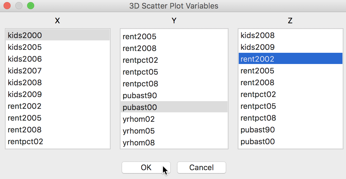
Figure 14: 3D Scatter Plot variable selection
The default 3D scatter plot in Figure 15 shows the data cube with the y-axis as vertical, and the z and x-axes as horizontal.
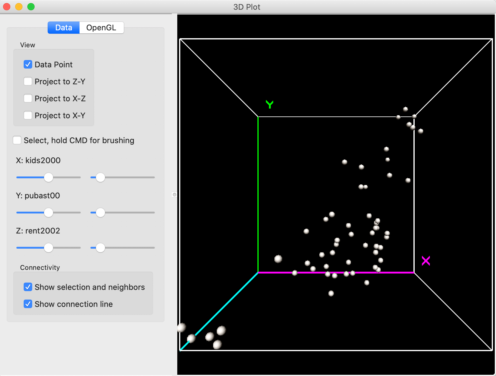
Figure 15: 3D Scatter Plot
Interacting with the 3D scatter plot
The data cube can be re-sized by zooming in and out. It is sometimes a bit ambiguous what is meant by these terms. For our purposes, we refer to zooming out as making the cube smaller, and zooming in as making the cube larger (getting into the cube, so to speak).
The zoom functionality is carried out by pressing down on the track pad with two fingers and moving up (zoom out) or down (zoom in). Alternatively, one can press Control and press down on the track pad with one finger and move up or down. With a mouse, move the middle button up or down.
In addition, the cube can be rotated by means of the pointer (click anywhere in the window and move the pointer to a different location by dragging the cube). The controls on the left-hand side of the view allow for the projection of the point cloud onto a given two-dimensional pane, and the construction of a selection box by checking the relevant boxes and/or moving the slider bar (see more below)
For example, in Figure 16, the cube has been zoomed out and the axes rotated such that Z is now vertical. With the Project to X-Y box checked on the left, a 2-dimensional scatter plot is projected onto the X-Y plane, i.e., showing the linear relationship between kids2000 and pubast00.
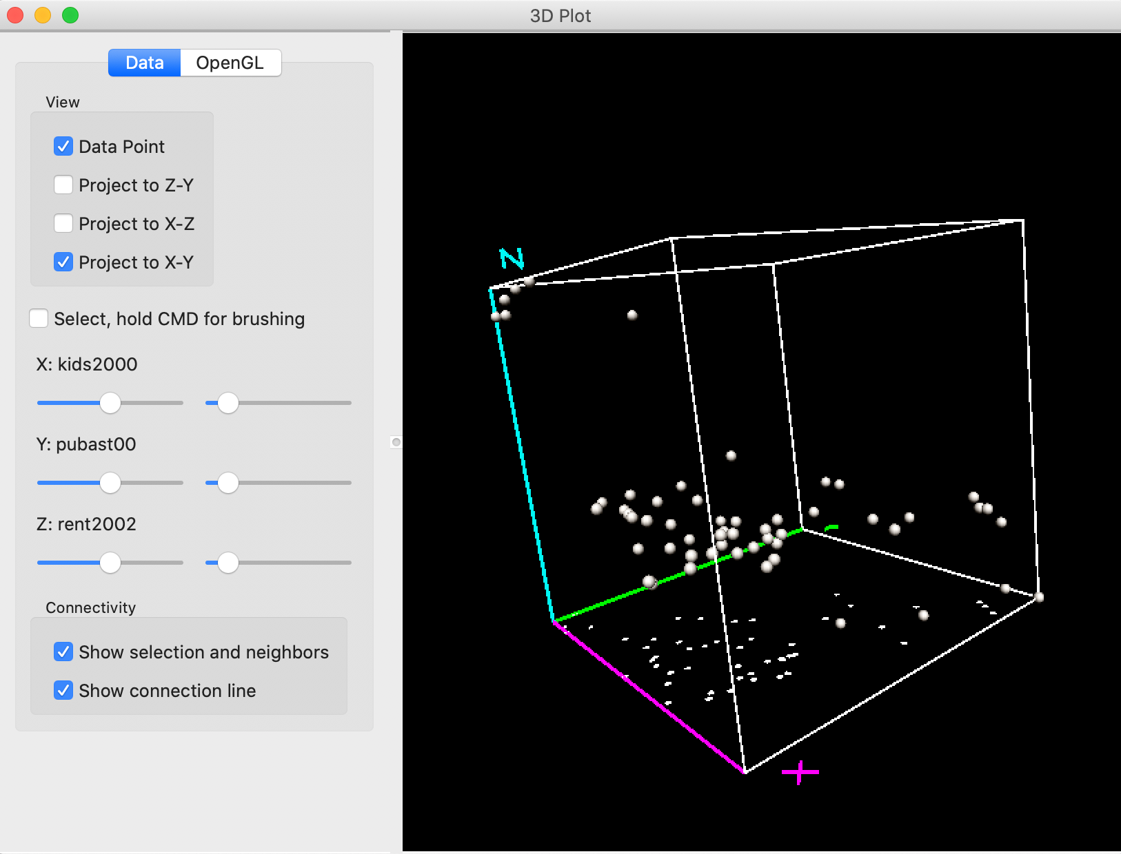
Figure 16: 3D Scatter Plot zoom and project
Selection in the 3D scatter plot
Selection in the three dimensional plot (or, rather, its two-dimensional projection) is a little tricky and takes some practice. The selection can be done either manually, by pressing down the command key while moving the pointer, or by using the guides under the selection check box.
Checking the box next to Select creates a small red selection cube in the graph. This can be moved around with the command key pressed, or can be moved and resized by using the controls to the left.
The first set of controls (to the left) move the box along the matching dimension, e.g., up or down the X values for larger or smaller values of the percentage households with kids, and the same for the other two variables. The control to the right changes the size of the box in the corresponding dimension (e.g., larger along the x dimension). The combination of these controls moves the box around to select observation points, with the selected points colored yellow.
The most effective way to approach this is to combine moving around the selection box and rotating the cube. The reason for this is that the cube is in effect a perspective plot, and one cannot always judge exactly where the selection box is located in three-dimensional space.
For example, let’s say we would like to select the observations in the very top of the Z corner in Figure 16. We rotate the cube to get a better view of the relevant points and design a selection box, as in Figure 17. It seems like we are close to the points in question, but, in fact, only one observation is selected, as indicated by the yellow color.
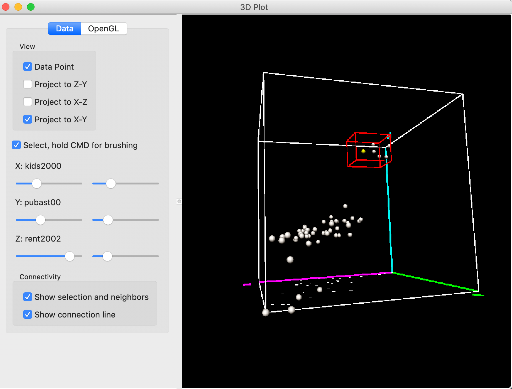
Figure 17: 3D Scatter Plot selection – 1
Rotating the cube some more reveals what is going on. As shown in Figure 18, we are way too far from the points on the Y-axis, and need to move to smaller values for Y (lower percent public assistance).
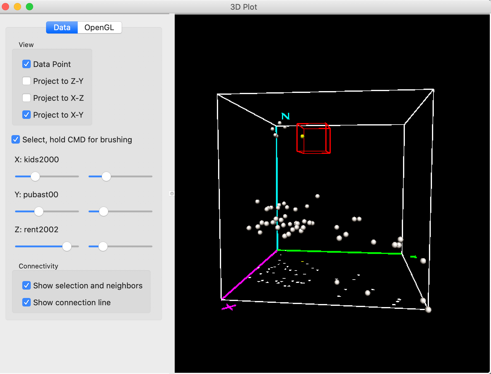
Figure 18: 3D Scatter Plot selection – 2
Some further rotation and movement of the selection box eventually ends up with six selected (yellow) points, as in Figure 19. These points correspond to sub boroughs with high rent (high Z), low percent children (low X) and low percent public assistance (low Y).
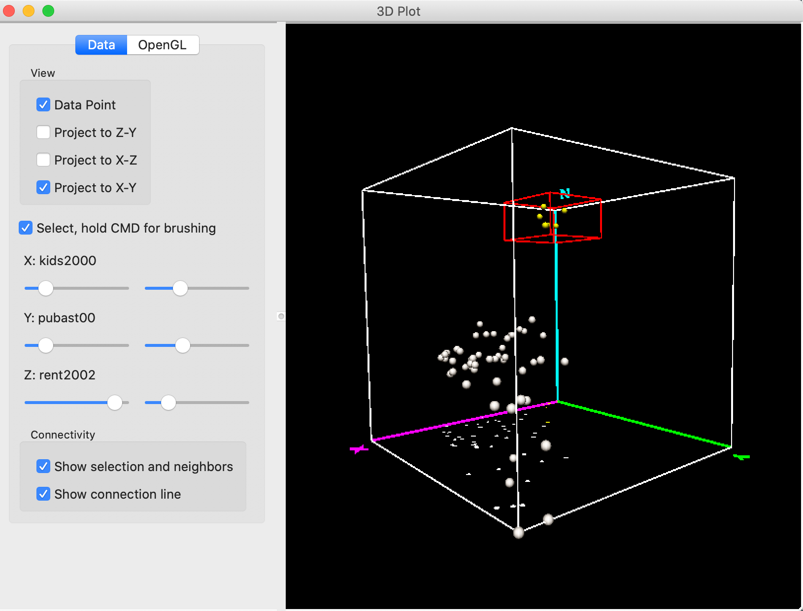
Figure 19: 3D Scatter Plot selection – 3
From our earlier exploration of these data, we already know that these locations are in lower Manhattan.
Indeed, the linking feature of GeoDa selects these same six observations in the map and in the
bubble chart we just constructed. This confirms the association between low percentage kids, low assistance
and high rent that we found earlier.
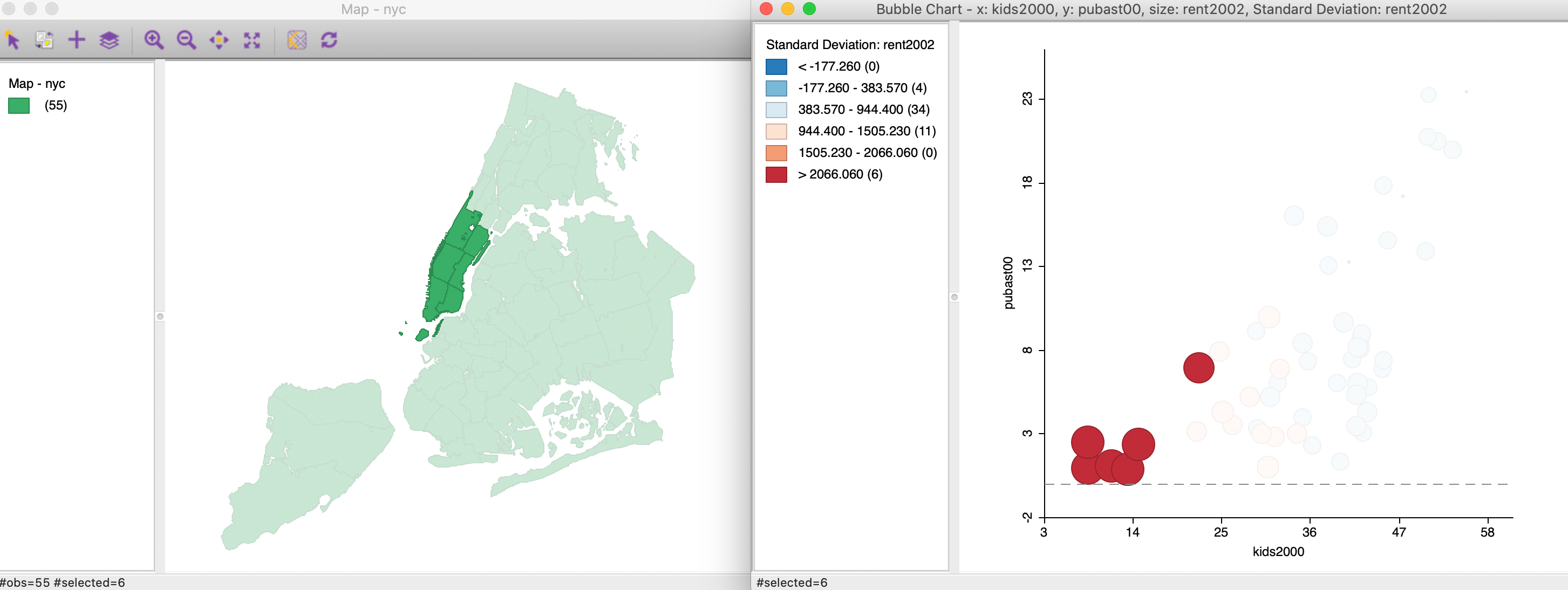
Figure 20: 3D Scatter Plot selection cube
The linking and brushing feature also works in the reverse, where we can brush in any open view and the associated selection will be shown in the 3D scatter plot.
Similar to what we observed for the bubble chart, the 3D scatter plot is most useful for small to medium sized data sets. For larger numbers of observations, the point cloud quickly becomes overwhelming and is no longer effective for visualization.
3D scatter options
The 3D scatter plot has a few specialized options, available either on the Data pane (which we have considered exclusively so far), or on the OpenGL pane. The latter gives the option to adjust the rendering quality of the points, their radius and the line thickness. These are fairly technical options that basically affect the quality of the graph and the speed by which it is updated. In most situations, the default settings are fine.
Finally, under the Data button, there are the Show selection and neigbhors and Show connection line options. These items are relevant when a spatial weights matrix has been specified. We will return to this in later Chapters.
True Multivariate EDA: Parallel Coordinate Plot and Conditional Plots
Once we move beyond three variables, it becomes difficult to visualize the actual multi-dimensional cloud plot that corresponds to the observations. Instead, we need to resort to creative ways to reduce the dimensionality to something we can show in a standard two-dimensional view. Two methods that take a different approach to this problem are the parallel coordinate plot (PCP) and conditional plots.
Parallel Coordinate Plot (PCP)
Principle
The parallel coordinate plot or PCP is designed to visually identify clusters and patterns in a multi-dimensional variable space. Originally suggested by Inselberg (1985; see also Inselberg and Dimsdale 1990), it has become a main feature in many visual data mining frameworks (e.g., Wegman 1990; Wegman and Dorfman 2003).
In a PCP, each variable is represented as a (parallel) axis, and each observation consists of a line that connects points on the axes. Clusters are identified as groups of lines (i.e., observations) that follow a similar path. This is equivalent to points that are close together in multidimensional variable space. Unlike the latter, which can only be visualized for up to three dimensions (e.g., in the 3D scatter plot), the PCP can be applied to a large number of variables. The only limitation is human perception and screen real estate.
Outliers in a PCP are lines that show a very different pattern from the rest, similar to outlying points in a multi-dimensional cloud.
Creating a PCP
The PCP functionality is invoked from the menu as Explore > Parallel Coordinate Plot, or by means of the PCP toolbar icon, shown in Figure 21.
Figure 21: PCP toolbar icon
In the familiar way, clicking on this icon brings up a variable selection dialog. In the same manner as for the scatter plot matrix, we move variables from the left column to the right Include column using the arrows (or by double clicking on the variable name).
In our example, shown in Figure 22, we will start with the same three variables as before, kids2000, pubast00, and rent2002, in order to illustrate the similarity between lines in the PCP and points in the 3D scatter plot.
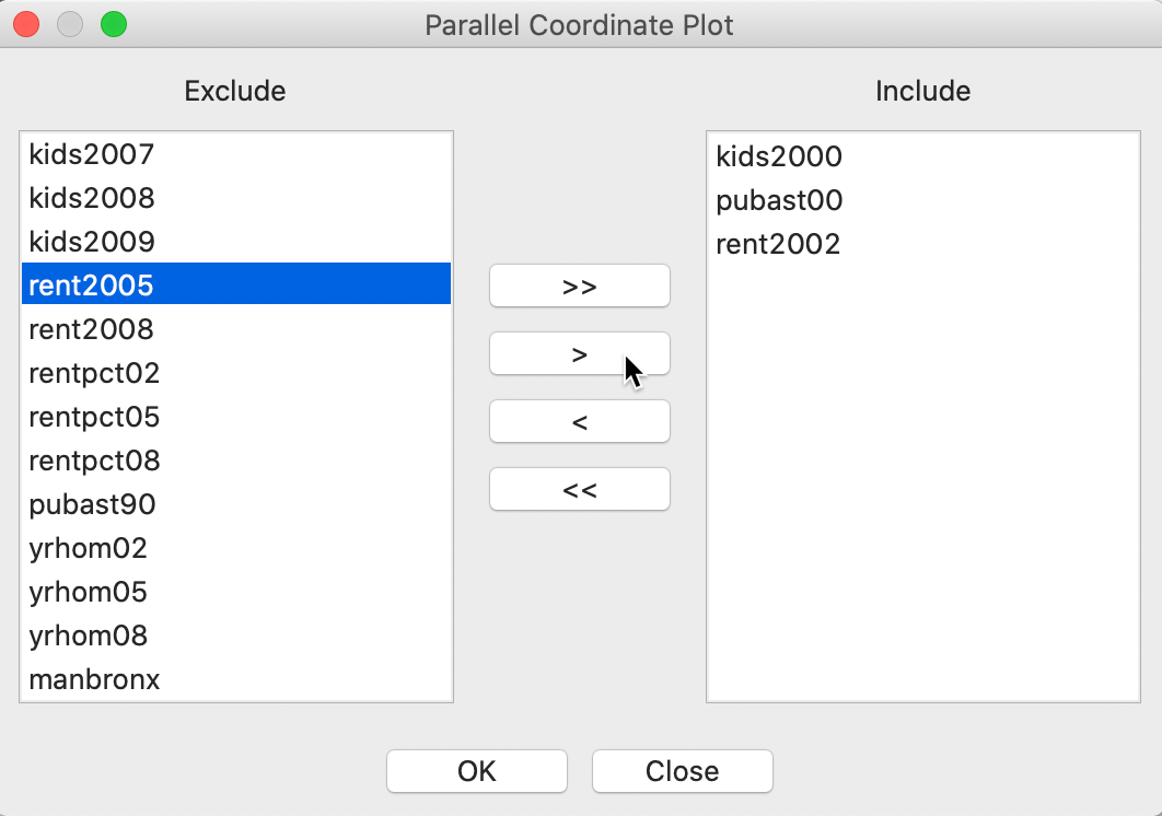
Figure 22: PCP variable selection
Pressing OK brings us the default PCP. Each axis in the plot corresponds to one observation. In our example, shown in Figure 23, the top line represents kids2000, the middle line pubast00, and the bottom line rent2002.
On each axis, an observations is represented by a point. The points for the same observation are connected between the axes. Each line thus corresponds with a point in three-dimensional attribute space.
The default PCP in GeoDa has the basic green colors, similar to the Themeless
base map. Next to each
axis, some descriptive statistics (mean, standard deviation) are
listed (this is the default, but it can be changed with the Display option).
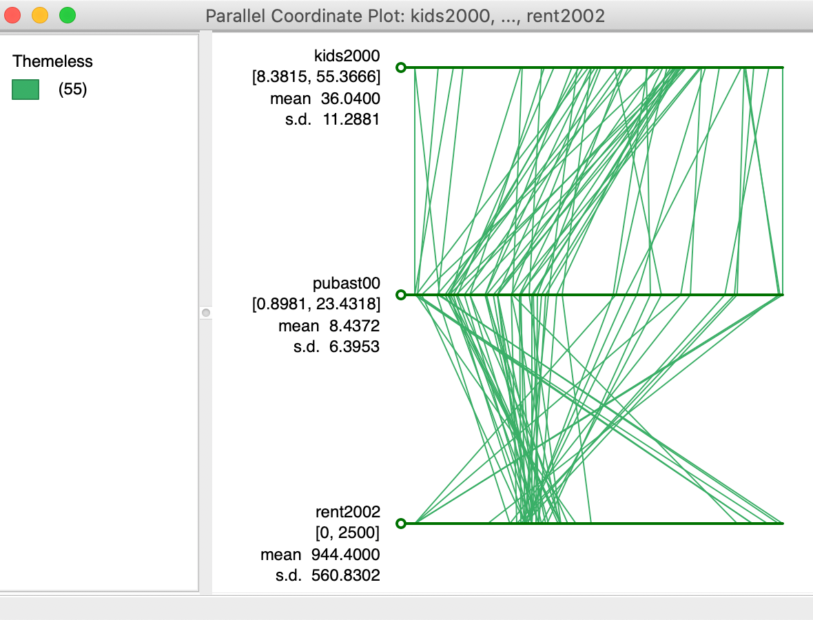
Figure 23: Default PCP
Clusters and outliers in PCP
In order the illustrate the match between lines in the PCP and points in multi-attribute variable space, we consider again the six selected observations from the 3D scatter plot. We noticed that five of these six sub-boroughs in Manhattan were very similar, as evidenced by their location close together in the corner of the 3D scatter plot, with one point slightly further away. This is evidenced in the right hand panel of Figure 24, obtained by zooming in on the selected points in the 3D data cube.
Due to the linking feature, the six selected points are shown as six selected lines in the PCP, in the left hand panel of Figure 24. This illustrates the match between the six lines in the PCP and the six points in the 3D scatter plot.
Five of the lines closely follow the same pattern, i.e., they cluster. This corresponds to a tight clump of points in the 3D scatter plot. The point that is slightly further away is shown as a line that does not quite follow the overall path of the other five.
Visual cluster detection (e.g., Wegman and Dorfman 2003) consists of locating groups of lines in the PCP that follow a similar path.
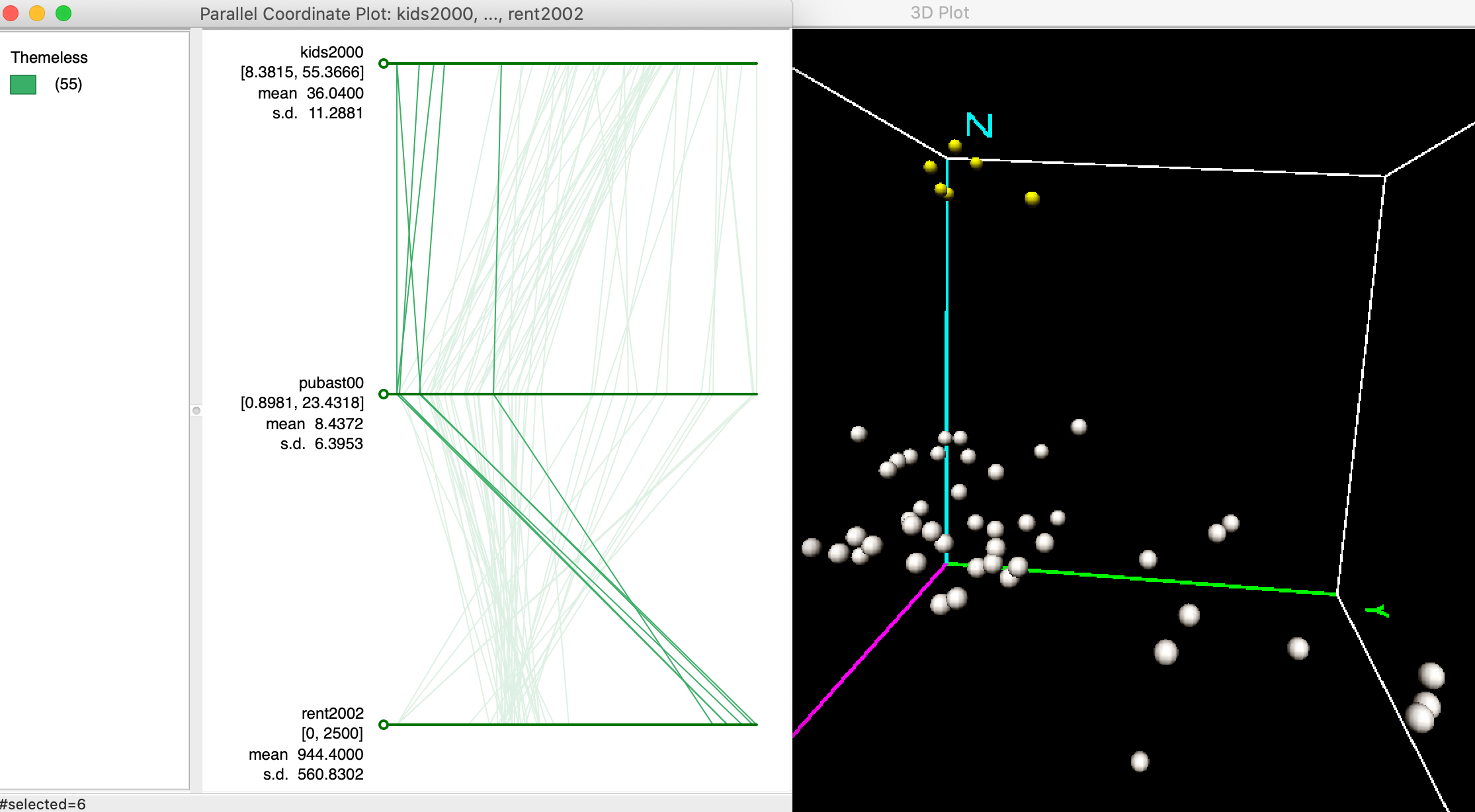
Figure 24: Clusters in PCP and 3D scatter plot
Similarly, we can identify outlier observations as lines in the PCP are are very far from the general pattern. These correspond to data points that are far from the main data cloud in the 3D scatter plot.
For example, in Figure 25, we identify an observation that is located in the very far corner of the data cube, highlighted in yellow, somewhat removed from the main data cloud. This point corresponds to a line in the PCP that moves from one extreme on both kids2000 and pubast00 axes (i.e., high values), to the other extreme on the rent2002 axis (i.e., low value). In other words, this is a neighborhood with a high proportion of children, a lot of public assistance and low rent (although possibly the low rent is due to a suspicious value of zero, as we have seen earlier).
The main point is that outliers in multi-attribute variable space correspond to lines that do not follow the overall trend or paths in the PCP.
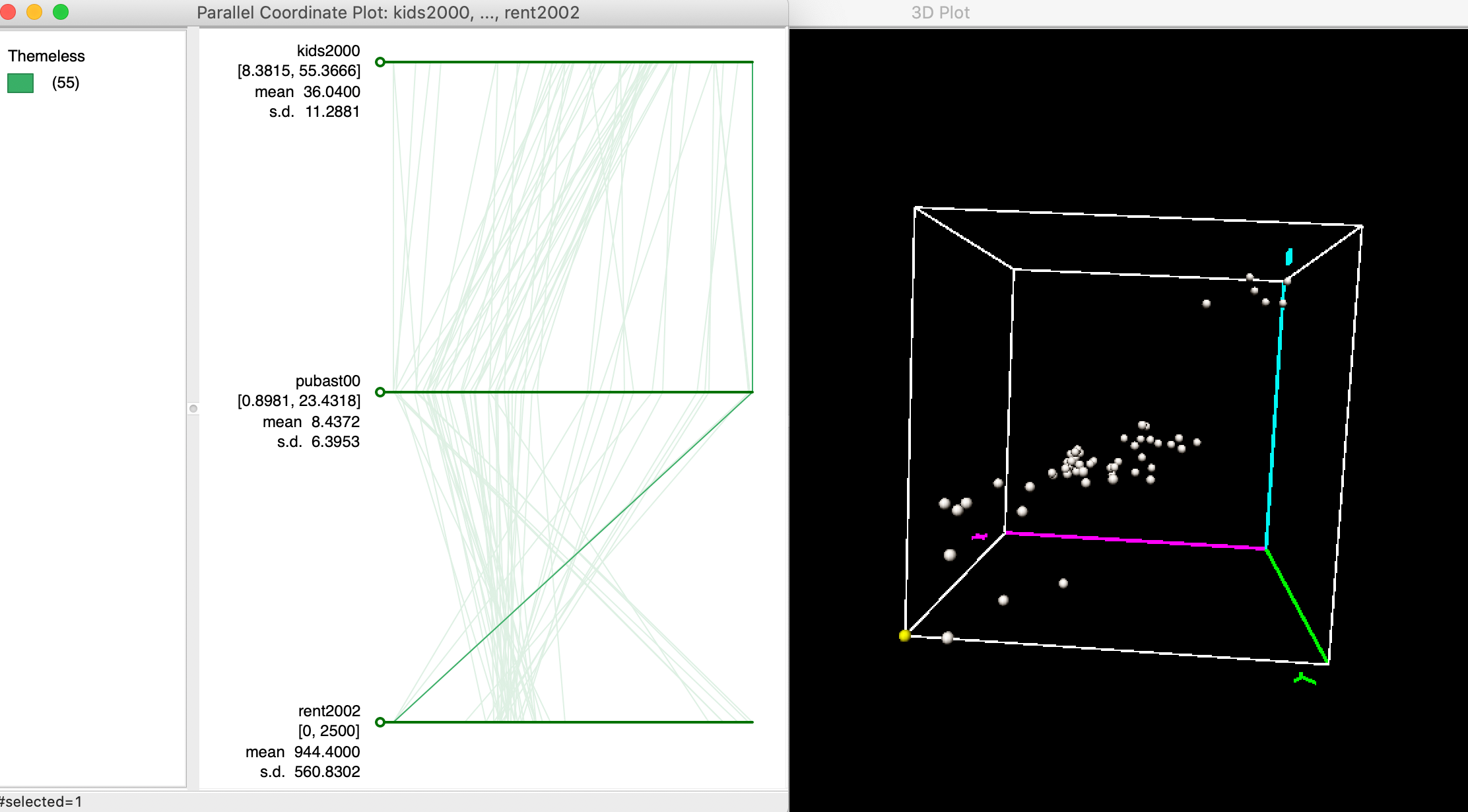
Figure 25: Outlier in PCP and 3D scatter plot
Multi-variable PCP
The real power of the PCP is when multiple variables are considered, when effective visualization of the multi-attribute data hypercube is no longer possible. To illustrate this, we use five different variables: rent2008, kids2008, rentpct08, yrhom08, and hhsiz08. In Figure 26, we selected four observations that follow a strikingly similar path on these five variables. As it turns out, these are sub-boroughs in lower Manhattan that also cluster together on these variables following a k-means clustering routine. In a later chapter, we show how PCP can thus be used to illustrate the variable structure underlying the clusters, but here we move in the opposite direction. Of course, finding these patterns visually can be quite a challenge.
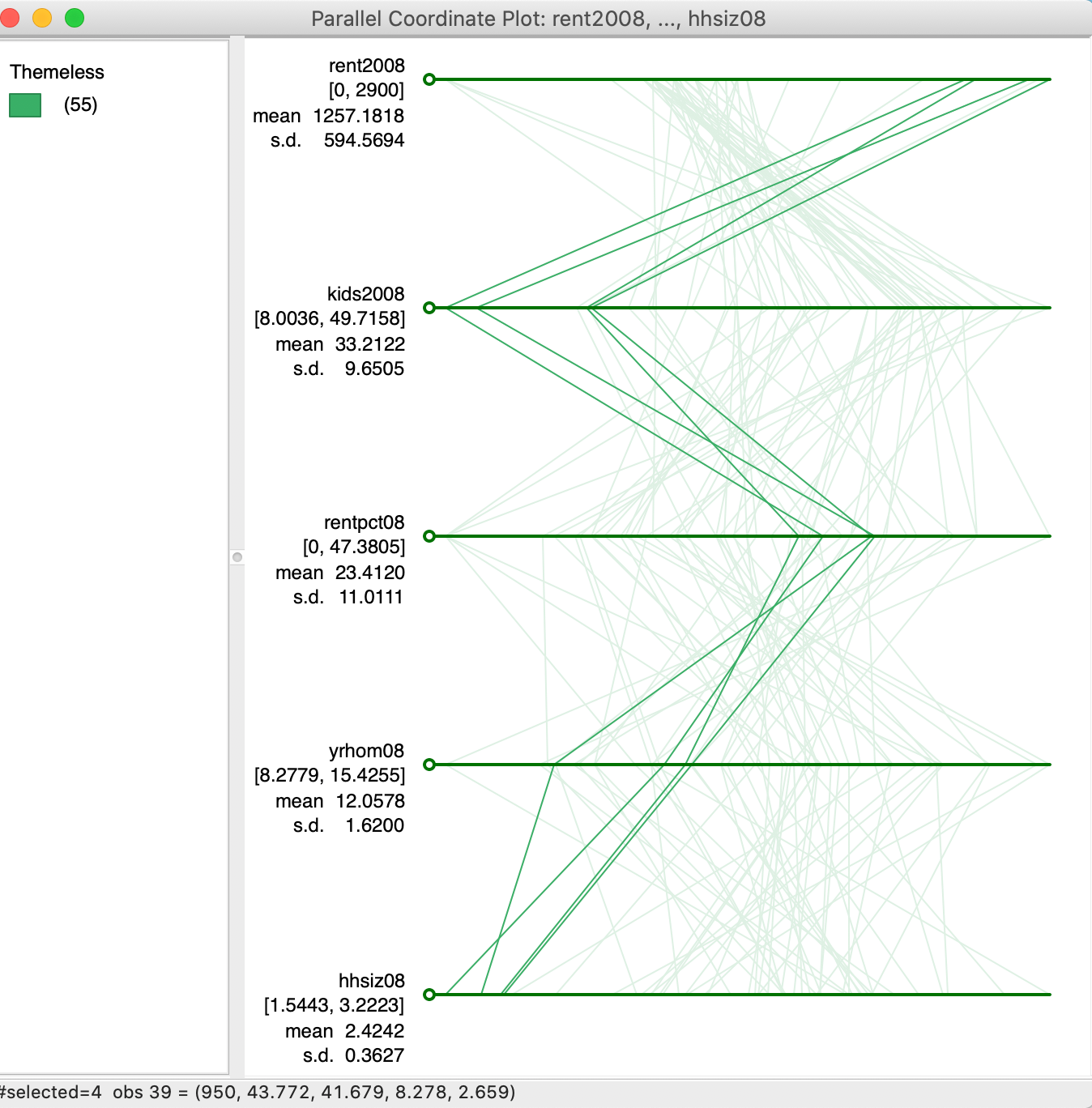
Figure 26: Multi-variable PCP
PCP options
The options for the PCP, listed in Figure 27, include all the standard features we have seen before. We do not discuss them again.
One special feature is the choice of Classification Themes. This allows for all of the themes available for choropleth maps to be applied to the variable listed originally at the top in the PCP.
Changing the color theme may make it a little easier to compare the pattern of the observations for one variable to the relative order of those observations for other variables, although colors are notoriously poor in distinguishing subtle variation in values.2 Therefore, as shown in Figure 27, the default of Themeless is preferred.
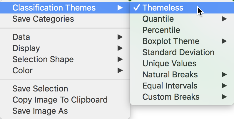
Figure 27: PCP options
It often makes sense to change the order of the axes (variables) to bring out patterns of clustering (or outliers) more clearly. This is accomplished by dragging the circle associated with each axis to a different location. For example, in Figure 28, we drag the circle associated with yrhom08 up to move it to the second spot, above rentpc08.
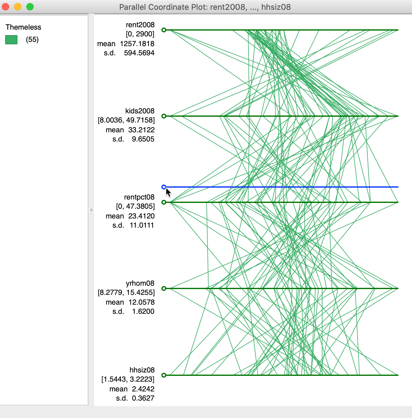
Figure 28: Moving the axes for PCP
The result is shown in Figure 29. Realligning the axes in this manner can often bring out patterns in the data. However, in practice, it is not always clear which is the optimal alignment.
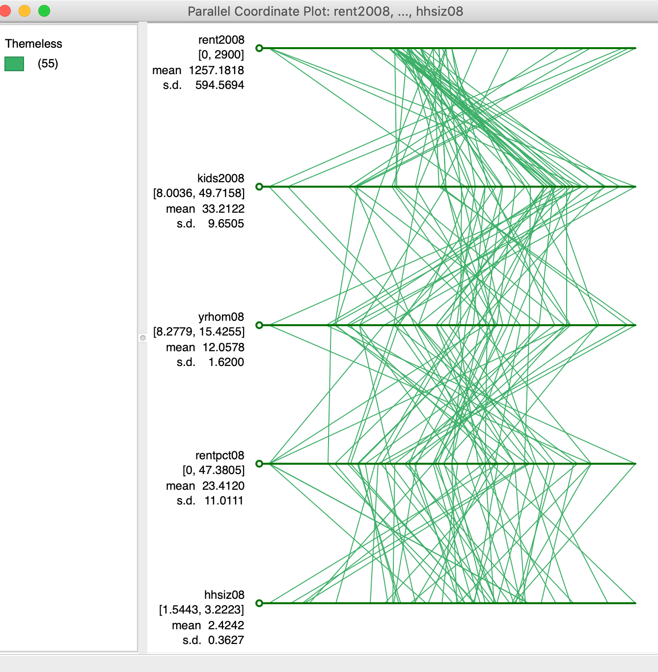
Figure 29: PCP with axes moved
Brushing the PCP
Just like the scatter plot, the PCP can be brushed. In Figure 30, using a rectangular selection shape, the six highest values for rent2008 are selected. The pattern that results (only the selected observations, or lines, are highlighted in the graph), shows how these observations track closely for the variables considered here. This is a typical pattern for a visual cluster detected in the PCP. The rectangle can be moved along the axis for rent2008 to see how other clusters may reveal themselves. Alternatively, the brush can be created on any of the other axes to proceed in a similar way.
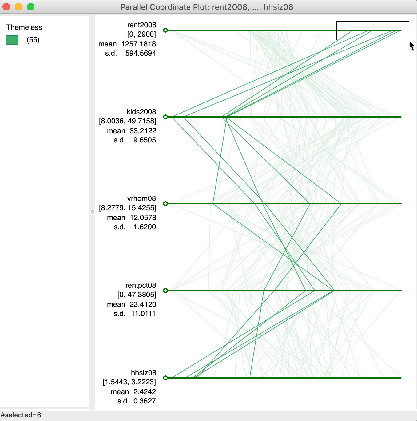
Figure 30: Brushing the PCP
As always, the selection in the PCP is immediately linked to all the other open views. The brushing process can also be initiated in any of the other open views.
Conditional Plots
Principle
Conditional plots, also known as facet graphs or Trellis graphs (Becker, Cleveland, and Shyu 1996), provide a means to assess interactions between more than two variables. Multiple graphs or maps are constructed for different subsets of the observations, obtained as a result of conditioning on the value of two variables. We have already covered conditional maps in the mapping Chapter. Here, we consider conditional scatter plots, histograms and box plots.
Creating conditional scatter plots
Each of the three conditional plots is started from the Conditional Plot icon on the toolbar, the right most icon in the EDA group. This brings up a list that provides four types of plot options, shown in Figure 31. Alternatively, the same can be accomplished from the menu, by means of Explore > Conditional Plot, followed by the choice of Histogram, Scatter Plot, or Box Plot (as we have seen, the conditional map functionality can also be started from the map menu, as Map > Conditional Map).
Figure 31: Conditional plot toolbar options
The four variables required are selected in the variables selection dialog shown in Figure 32. Not only are there the conditioning variables for the x and y axes that need to be chosen, but also the two variables for the scatter plot itself. In our example, we have taken hhsiz00 (median household size in 2000), yrhom02 (average number of years lived in current residence, for 2002) as the two conditioning variables. The scatter plot is constructed with kids2000 (% households with kids under 18 in 2000) on the x-axis and pubast00 (% households receiving public assistance in 2000) on the y-axis.

Figure 32: Conditional Scatter Plot variable selection
The default plot consists of a 3 x 3 arrangement. In our example in Figure 33, the subsetting is too fine grained for 55 observations, since several cells have only minimal observations (e.g., 2, 3 and 4).
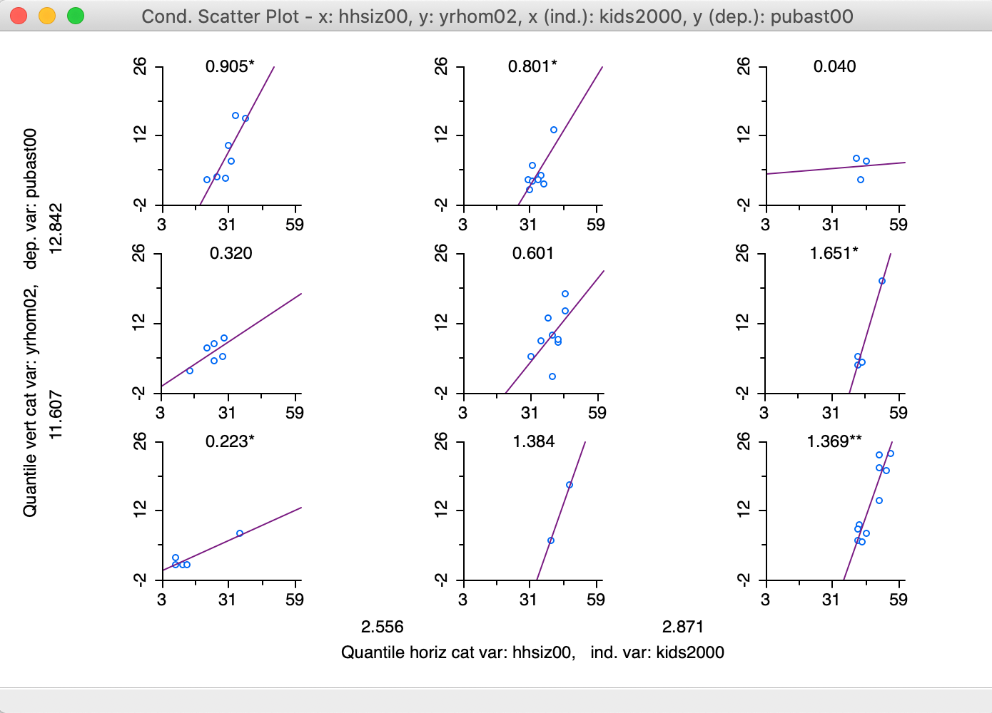
Figure 33: 3x3 Conditional Scatter Plot
Changing the conditioning
The options menu provides a way to change the number of categories as well as the break points. The Vertical Bins Breaks and Horizontal Bins Breaks contain all the standard interval conventions, as well as the possibility to create custom cut-off points.
In our example, illustrated in Figure 34, we switch from a 3x3 setup to a 2x2 arrangement by selecting the median (Quantile > 2) as the break point for each of the conditioning variables.3
More precisely, a breakpoint is chosen that splits the number of observations into two equal parts (as close as possible). However, since the median can itself correspond to an observation (for an uneven number of observations, as is the case in our example), the cut-off value shown in the graph can be slightly different from the actual median.
For example, the median for hhsiz00 (e.g., as obtained from the descriptive statistics listed with a box plot) is 2.7176, whereas the cut-off value shown for the horizontal axis of the graph is 2.703. In addition, when there are many tied observations, the break points are chosen such that the resulting categories are as close as possible to the specified requirements. In any event, the breaks can also be set explicitly by means of the Custom Breaks option, which was covered in the Mapping chapter.
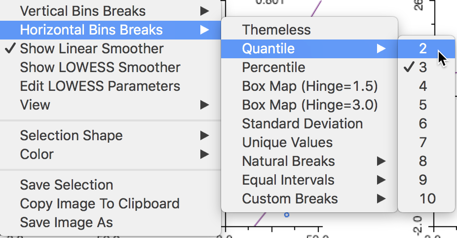
Figure 34: Adjusting bin breaks
By default, a linear fit is shown through the scatter plots (Show Linear Smoother), and for each plot, axes tick points (View > Display Axes Scale Values) and the slope value (View > Display Slope Values) are displayed by default. These settings are illustrated in Figure 35. As in the scatter plot matrix, the regression slopes are highlighted as significant by means of one (p < 0.05) or two asterisks (p < 0.01).
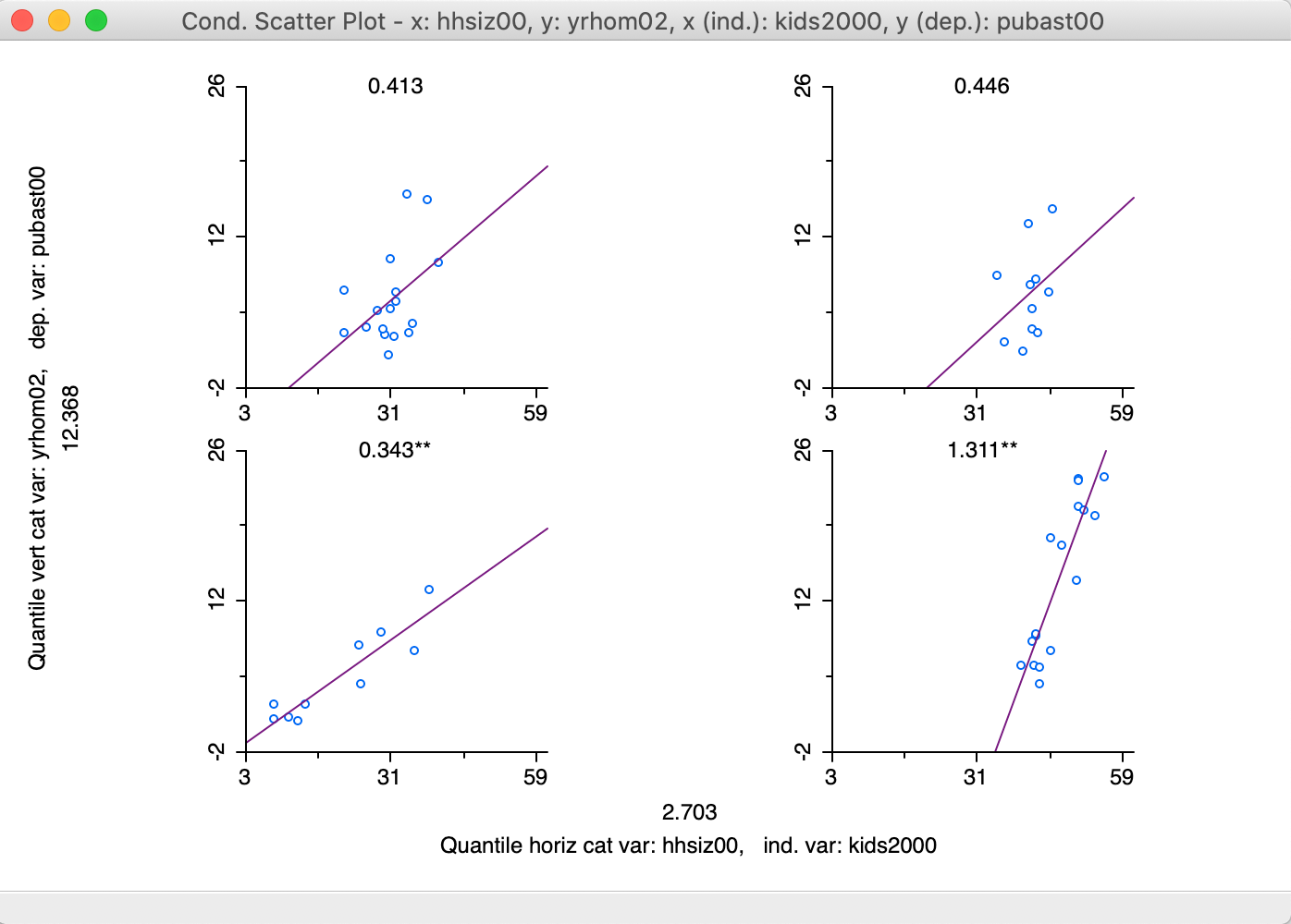
Figure 35: 2x2 Conditional Scatter Plot
The result in Figure 35 suggest a positive and significant slope between the number of kids and the degree of public assistance for those neighborhoods with more residential transition (smaller number of years lived in residence), as shown in the two graphs at the bottom. The slope is almost four times steeper in neighborhoods with larger household size (lower-right graph). However, the relationship is not significant for the more residentially stable neighborhoods (number of years lived in residence above the median), irrespective of the household size (top two graphs).
Finally, the options also allow for a LOWESS smoother to be applied to the scatter plot points (by checking Show LOWESS Smoother in the options). However, regimes regression is not available, since selection is reflected in the conditioning.
Conditional histogram
A conditional histogram follows the same principle and shows the distribution of a target variable for subsets of the data as determined by intervals for the conditional variables. It is selected as the second item in the list of conditional plots, shown in Figure 31.
We proceed in the same way as for the conditional scatter plot and select hhsiz00 and yrhom02 as the conditioning variables for the target variable pubast00, as illustrated in the variable selection dialog in Figure 36.
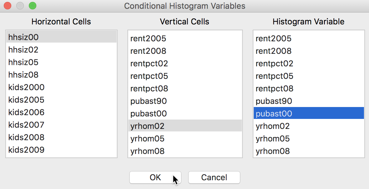
Figure 36: Conditional Histogram variable selection
In order to obtain a somewhat meaningful result, we again adjust the horizontal and vertical bin sizes to end up with the 2 by 2 plot shown in Figure 37.
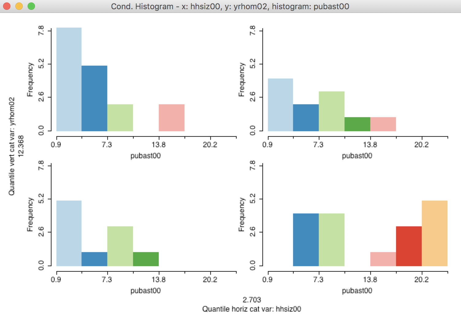
Figure 37: 2x2 Conditional Histogram
We cannot distinguish a meaningful difference between the plots in the top part of the graph, i.e., for those sub-boroughs with a higher percentage of long-term residents, the distributon of the percentage public assistance does not seem to depend on the median household size. However, in the bottom part of the graph, there is a suggestion that in sub-boroughs characterized by a higher turnover in residents and with larger median household size, there is a higher percentage public assistance.
As always in an exploratory exercise, this is just a suggestion, and it would need to be further quantified in the form of a precise hypothesis test.
Conditional box plot
A final conditional plot is the box plot, invoked as the last item in the list in Figure 31. This is an alternative to the conditional histogram to portray a univariate distributions conditioned on two other variables.
In addition, the conditional box plot is particularly useful when the conditioning is only on one dimension and the conditioning variable is categorical. This is yet another way to investigate the potential for spatial heterogeneity, when the conditioning variable is an indicator or categorical variable that corresponds to spatial subsets of the data.
For example, in Figure 38, we illustrate the variable selection with the conditioning variable as manbronx, the same indicator variable we used before. The second conditioning variable is left blank. As a result, the conditioning pertains only the horizontal dimension. We choose the variable of interest as kids2000. Note how the variable for the Vertical Cells is kept blank, ensuring a one-dimensional conditioning.
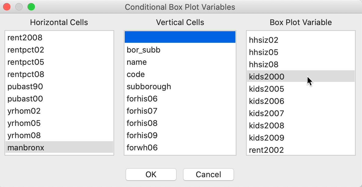
Figure 38: Conditional box plot variable selection
The first result is not very good. As we saw earlier for other graphs, the binning on the conditioning axes is designed for continuous variables and needs to be adjusted for categorical or binary variables. As shown in Figure 39, we fix this problem by selecting Unique Values as the classification.
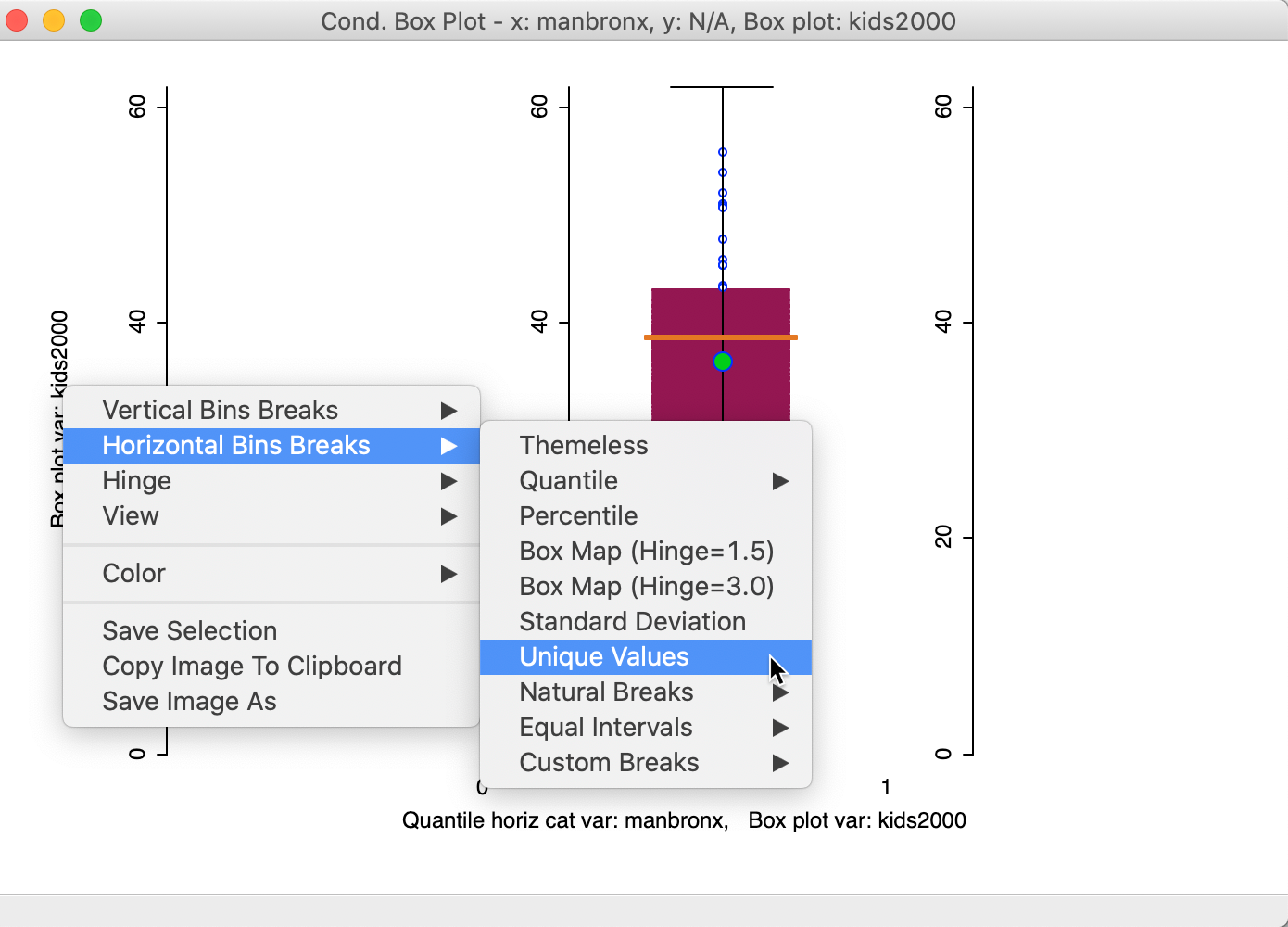
Figure 39: Conditional box plot unique value classification
The new graph in Figure 40 now shows the distribution for kids2000 in side by side box plots for the percentage households with children for the neighborhoods in Manhattan and the Bronx (1) and the rest of the city (0). While both the mean and median are clearly lower in Manhattan-Bronx, the spread of the distribution is such that the difference is unlikely to be significant. This is confirmed by a difference in means test using the Averages Chart (not shown), which yields a p-value of 0.142.
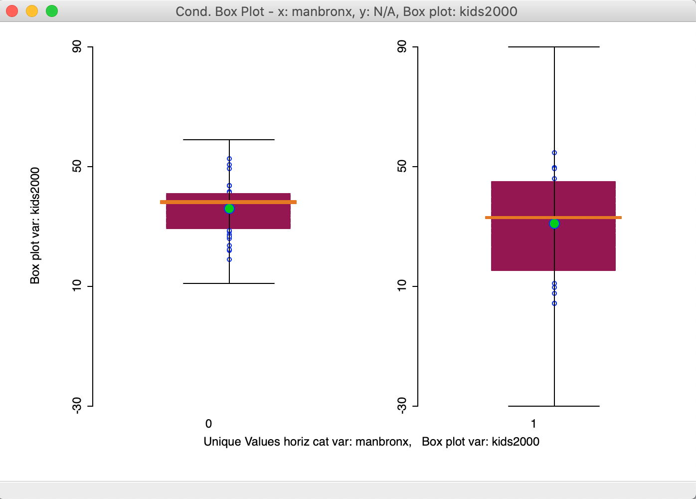
Figure 40: Conditional box plot for two subregions
In contrast, if we create an indicator variable for just Manhattan (bor_subb in the 300 range), the result is much more convincing, as in Figure 41. Here, the mean and median are clearly different between the two distributions, providing a more visual alternative to the Averages Chart difference in means test shown in the previous Chapter.
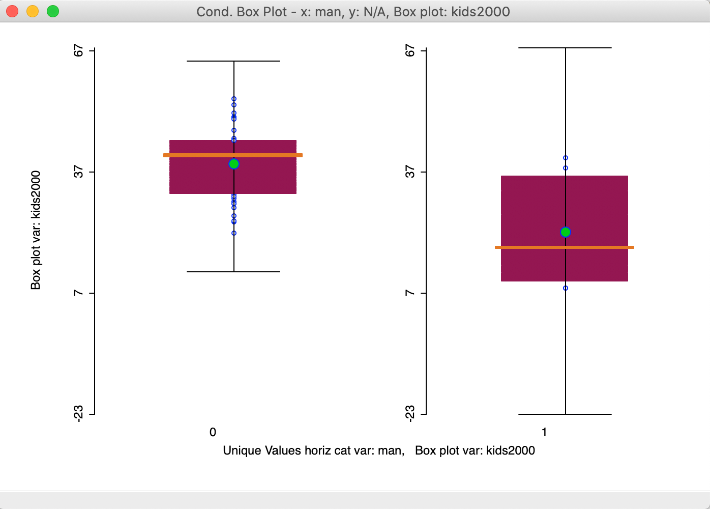
Figure 41: Conditional box plot for Manhattan and rest
A particularly useful application of the conditional box plot is to show the distribution for a variable across different cluster categories, indicated by a categorical variable. We return to this in a later Chapter.
References
Becker, Richard A., W. S. Cleveland, and M-J. Shyu. 1996. “The Visual Design and Control of Trellis Displays.” Journal of Computational and Graphical Statistics 5: 123–55.
Inselberg, A. 1985. “The Plane with Parallel Coordinates.” Visual Computer 1: 69–91.
Inselberg, Alfred, and B. Dimsdale. 1990. “Parallel Coordinates: A Tool for Visualizing Multi-Dimensional Geometry.” Proceedings of the IEEE Visualization 90, 361–78.
Wegman, Edward J. 1990. “Hyperdimensional Data Analysis Using Parallel Coordinates.” Journal of the American Statistical Association 85: 664–75.
Wegman, Edward J., and Alan Dorfman. 2003. “Visualizing Cereal World.” Computational Statistics and Data Analysis 43 (4): 633–49.
-
University of Chicago, Center for Spatial Data Science – anselin@uchicago.edu↩︎
-
In addition, the color scheme remains attached to the variable that was originally listed at the top, even if the axis corresponding to that variables is later moved to a different position.↩︎
-
Note that the break point convention can be different for the horizontal and vertical axes, such as, 3 categories vertically and 2 horizontally.↩︎