Basic Mapping
Luc Anselin1
09/15/2020 (updated)
Introduction
In this Chapter, we will explore a range of mapping and geovisualization options. We start with a review of
common thematic map classifications and the way these are implemented in GeoDa. We next focus on
different statistical maps, in particular maps that are designed to
highight extreme values or outliers. We also illustrate maps for categorical variables
(unique value maps), and their extension to multiple categories in the form
of co-location maps. We close with a review of some special approaches to geovisualization, i.e., conditional
maps, the cartogram and map animation.
Even though there is substantial mapping functionality in GeoDa, it is worth noting that it is
not a cartographic software. The main objective is to use the maps as part of a framework
of dynamic graphics, to interact with the data as part of the exploration process. As a result, maps in
GeoDa do not have some standard cartographic features, such as a directional arrow, or a scale bar.
However, any map can be saved as an image file for further manipulation in specialized graphics software.
Objectives
-
Create commonly used thematic and statistical maps
-
Manipulate the map by zooming, panning, and selection
-
Add a background layer (base map) to a thematic map
-
Save the map as an image
-
Save map classifications as a categorical variable
-
Create custom intervals
-
Identify outliers using the box map and standard deviation map
-
Create a map for a categorical variable
-
Examine multivariate co-location patterns with a co-location map
-
Assess variable interaction effects using a conditional map
-
Construct and interpret a cartogram
-
Visually explore patterns using map animation
-
Use the project file in
GeoDa
GeoDa functions covered
- Map > Quantile Map
- select number of categories
- Map > Natural Breaks Map
- select number of categories
- Map > Equal Intervals Map
- select number of categories
- Map toolbar options
- Map selection
- select all observations in a legend category
- Map options
- Change current map type
- Save Categories
- Save the map as an image
- Change the look of a map
- Make map outlines invisible
- Map > Percentile Map
- Map > Box Map
- Set hinges as 1.5 or 3.0
- Map > Standard Deviation Map
- Map > Unique Values Map
- Map > Co-location Map
- Map > Create New Custom
- Category Editor
- applying a custom classification to a map
- applying a custom classification to a histogram
- File > Save Project
- saving a custom classification in the project file
- Map > Conditional Map
- adjusting the breaks for the conditioning variables
- Map > Cartogram
- improving the cartogram fit
- Map > Map Movie
- setting animation controls
Preliminaries
We will illustrate the various operations by means of the data set with demographic and socio-economic
information for 55 New York City sub-boroughs that comes built-in with GeoDa. It is also
contained in the GeoDa Center data set collection.
- nyc: socio-economic data for 55 New York City sub-boroughs
Since the data set is built-in, there is no real need to download the sample data, although it is useful in order to preserve any changes.
Thematic Maps – Overview
We start by closing any current project and load the NYC sub-borough data set from the Sample Data tab in the Connect to Data Source dialog. One click on the NYC Data icon brings up the green themeless map, shown in Figure 1. Alternatively, we can load the downloaded nyc.shp file.
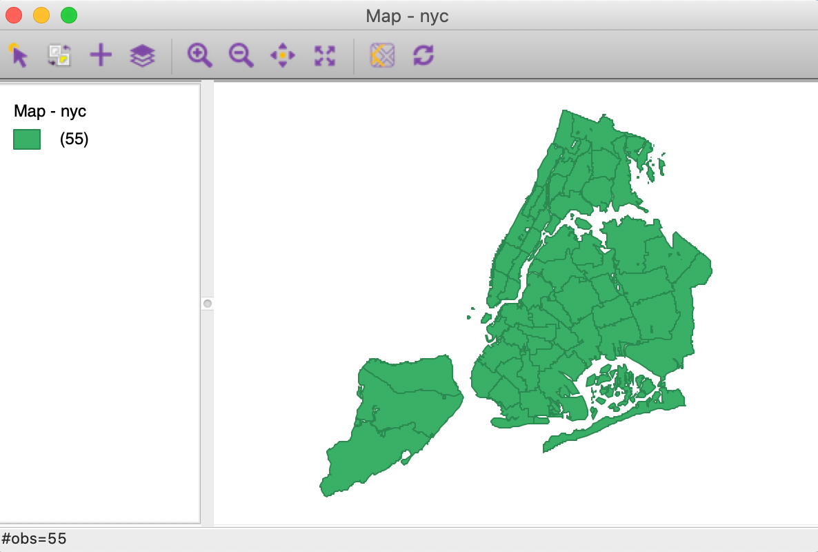
Figure 1: NYC sub-boroughs themeless map
To see the different mapping options, we select Map from the menu, or click on the Maps and Rates icon in the toolbar, shown in Figure 2.
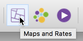
Figure 2: Map Toolbar icon
The selection brings up the list of map types that can be created in GeoDa, as given in Figure 3.
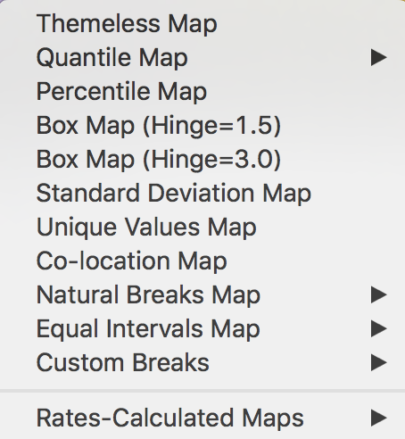
Figure 3: Map type options
We ignore the Rates-Calculated Maps item for now, which will be considered in the next Chapter. Among the other map types, there are four where an additional choice is required (the right pointing arrow) consisting of the number of intervals to be specified (choose the number from a drop down list). All the other options have pre-specified settings.
Common map classifications include the Quantile Map, Natural Breaks Map, and Equal Intervals Map. Specialized classifications that are designed to bring out extreme values include the Percentile Map, Box Map (with two options for the hinge), and the Standard Deviation Map. The Unique Values Map does not involve a classification algorithm, since it uses the integer values of a categorical variable itself as the map categories. The Co-location Map is an extension of this principle to multiple categorical variables. Finally, Custom Breaks allows for the use of customized classifications by means of the Category Editor.
We consider each in turn.
Common map classifications
Quantile map
A quantile map is based on sorted values for a variable that are then grouped into bins that each have the same number of observations, the so-called quantiles. The number of bins corresponds to the particular quantile, e.g., five bins for a quintile map, or four bins for a quartile map, two of the most commonly used categories.
To illustrate this functionality, we select Quantile Map > 4 from the list of options shown in Figure 4 to create a quartile map (four categories).
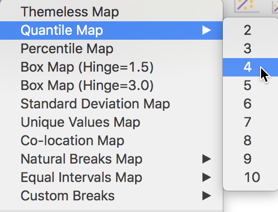
Figure 4: Quartile map
In the variable selection dialog that follows, illustrated in Figure 5 , we select rent2008, for the median rent in 2008.
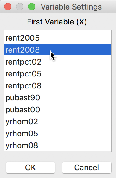
Figure 5: Variable selection dialog
This brings up the quartile map, shown in Figure 6, with four categories in the legend, each matching a quartile in the data. The values in parentheses give the number of observations in each category.
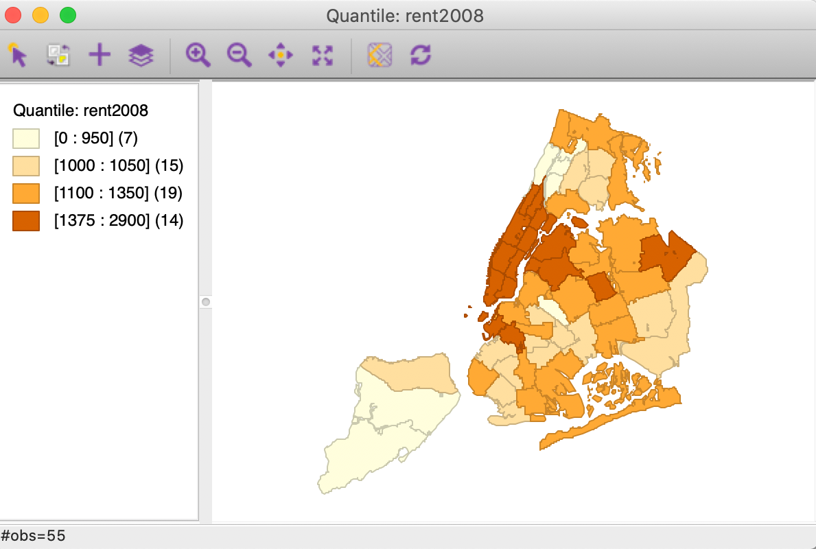
Figure 6: Quartile map for median rent in 2008
Upon closer examination, something doesn’t seem to be quite right. With 55 total observations, we should expect roughly 14 (55/4 = 13.75) observations in each group. But the first group only has 7, and the third group has 19!
This illustrates a common problem with quantile maps whenever ties are present. If we open up the Table (click on the table icon if it is not open) and sort on the variable rent2008 (click on the field name), we see in Figure 7 where the problem lies.
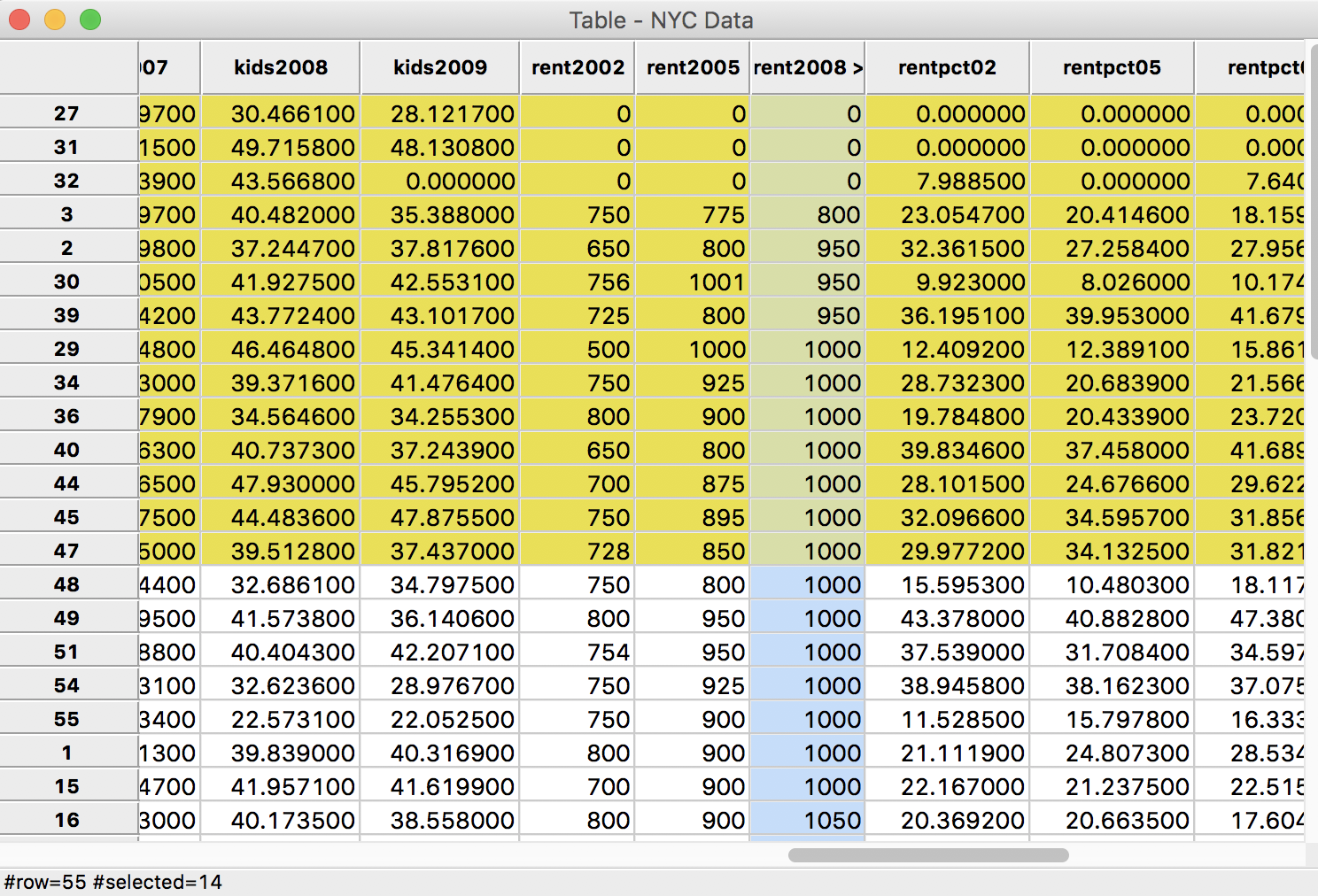
Figure 7: Sorted median rent in 2008
Ignoring the zero entries for now (those are a potential problem in their own right), we see that observations starting in row 8 up to row 21 all have a value of 1000. The cut-off for the first quartile is at 14, highlighted in yellow in the graph. In a non-spatial analysis, this is not an issue, the first quartile value is given as 1000. But in a map, the observations are locations that need to be assigned to a group (with a separate color). Other than an arbitrary assignment, there is no way to classify observations with a rent of 1000 in either category 1 or category 2. To deal with these ties, GeoDa moves all the observations with a value of 1000 to the second category. As a result, even though the value of the first quartile is given as 1000 in the map legend, only those observations with rents less than 1000 are included in the first quartile category. As we see from the table, there are seven such observations.
Any time there are ties in the ranking of observations that align with the values for the breakpoints, the classification in a quantile map will be problematic and result in categories with an unequal number of observations.
Natural breaks map
A natural breaks map uses a nonlinear algorithm to group observations such that the within-group homogeneity is maximized, following the pathbreaking work of Fisher (1958) and Jenks (1977). In essence, this is a clustering algorithm in one dimension to determine the break points that yield groups with the largest internal similarity.
To create such a map with four categories, we select Natural Breaks Map > 4 from the list of options and again choose rent2008 as the variable, in the same way as for the quantile map. This yields a natural breaks map, shown in Figure 8.

Figure 8: Natural breaks map for median rent in 2008
In comparison to the quartile map, the natural breaks criterion is better at grouping the extreme observations. The three observations with zero values make up the first category, whereas the five high rent areas in Manhattan make up the top category. Note also that in contrast to the quantile maps, the number of observations in each category can be highly unequal.
Equal intervals map
An equal intervals map uses the same principle as a histogram to organize the observations into categories that divide the range of the variable into equal interval bins. This contrasts with the quantile map, where the number of observations in each bin is equal, but the range for each bin is not. For the equal interval classification, the value range between the lower and upper bound in each bin is constant across bins, but the number of observations in each bin is typically not equal.
Using Equal Intervals Map > 4 and rent2008 for the variable provides the result illustrated in Figure 9.
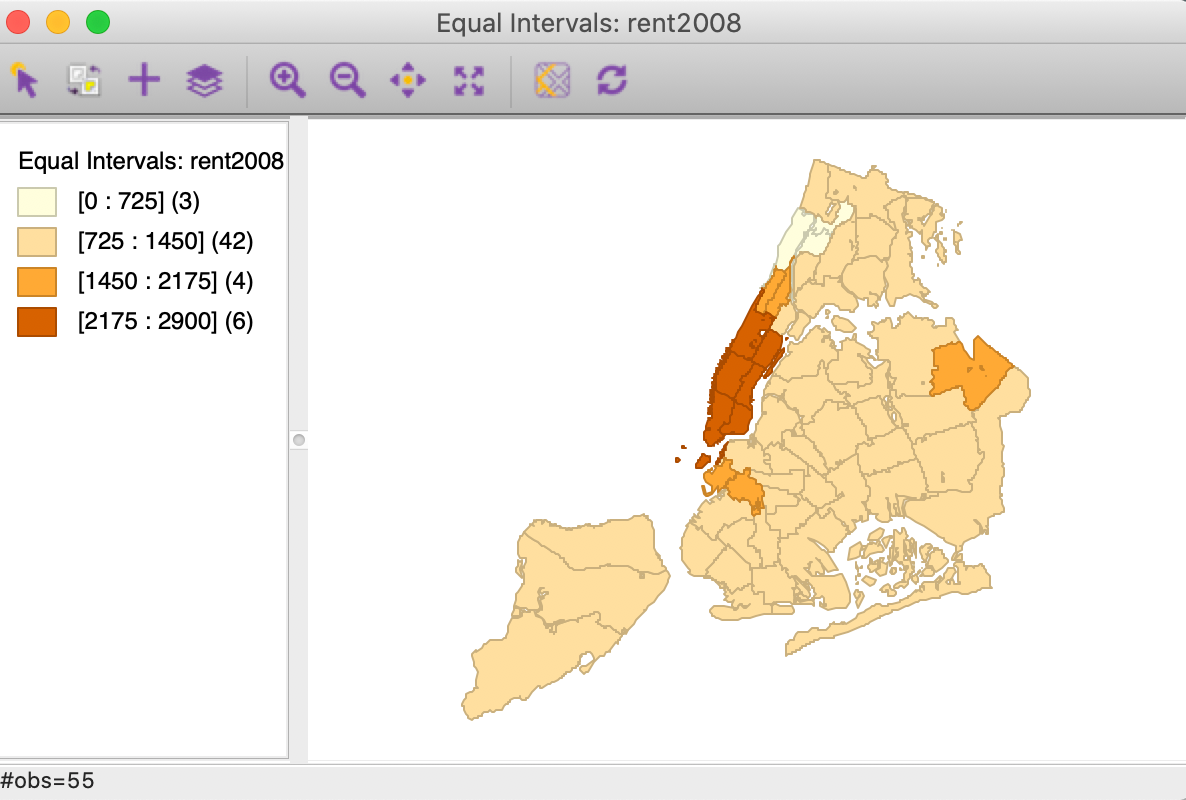
Figure 9: Equal intervals map for median rent in 2008
As in the case of natural breaks, the equal interval approach can yield categories with highly unequal numbers of observations. In our example, the three zero observations again get grouped in the first category, but the second range (from 725 to 1450) contains the bulk of the spatial units (42).
To illustrate the similarity with the histogram, we select Explore > Histogram for rent2008 and set the Choose Intervals option to 4. Also, set View > Display Statistics. The resulting histogram in Figure 10 has the exact same ranges for each interval as the equal intervals map. The number of observations in each category is the same as well. The values for the number of observations in the descriptive statistics below the graph match the values given in parentheses in the map legend.
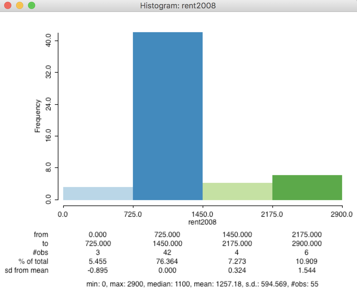
Figure 10: Histogram (4) for median rent in 2008
Finally, we illustrate the equivalence between the two graphs by selecting a category in the map legend. To accomplish this, we click on the rectangle in the map legend associated with the chosen category. In the right-hand panel of Figure 11, this is shown for the highest category (the dark brown rectangle in the legend). This selects the corresponding observations in the map, and, through linking, in the histogram as well (left-hand panel in Figure 11). As expected, the selected bins match completely.
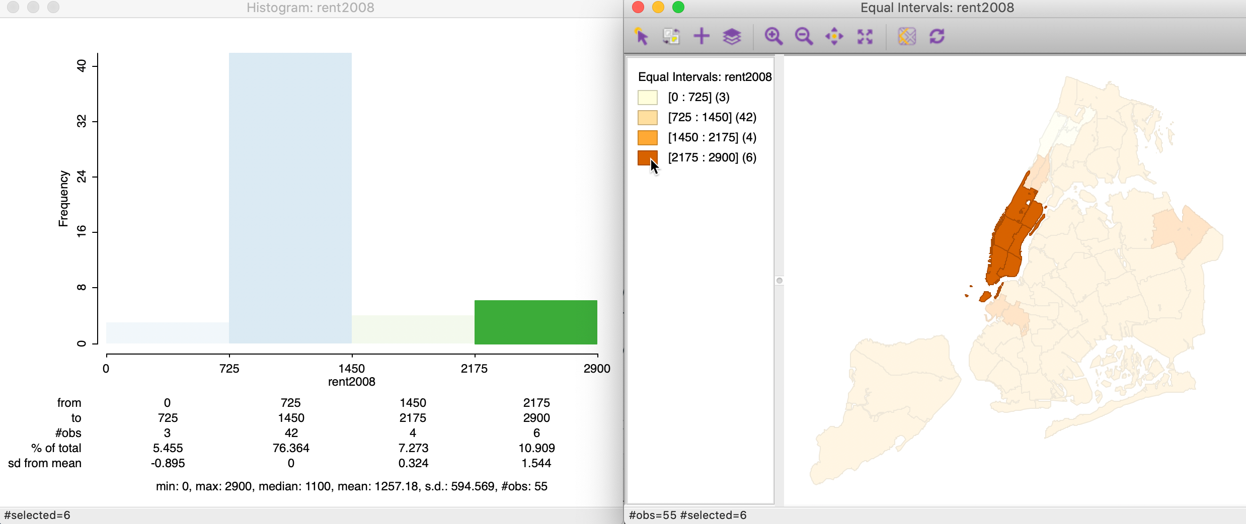
Figure 11: Histogram-Equal Intervals map equivalence
Map options
Once a map is created, there are two types of options available. One set pertains directly to the manipulation of the map and is implemented by means of the icons on the map toolbar. The second set of options is triggered by right clicking on the map window, which invokes the options dialog shown in Figure 12.
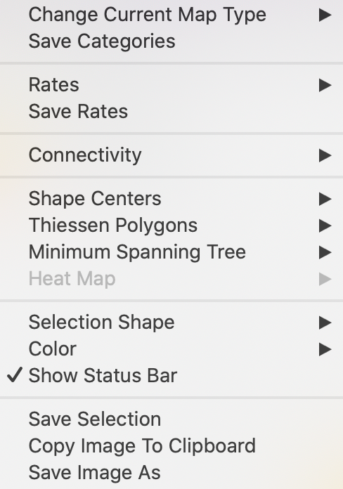
Figure 12: Map options
The top item (Change Current Map Type) brings up the same list with map types as invoked by clicking on the Map icon on the main toolbar. Selecting a different map type from a current map in this fashion precludes the need to choose a variable, but it also overwrites the current map.
We consider the various features in further detail below, except for the rates functions (Rates and Save Rates), and operations related to the spatial weights (Connectivity), which are covered in later chapters. Also, we skip the items in the fourth group of options (Shape Center etc.), which were introduced earlier in the Data Wrangling chapter.
The map toolbar
The map toolbar contains ten icons that facilitate selection and viewing of the map, as shown in Figure 13.

Figure 13: Map toolbar
From left to right, the icons allow the following actions:
-
Select, to select one or more (using shift click) observations, or an observation region when using a selection shape (the default is a rectangle); this is the default operation and works in the same fashion as selection on any graph in
GeoDa -
Invert Select, switches to the complement of the current selection (same functionality as Table > Invert Selection)
-
Add Map Layer, add another layer to the map window, discussed in Data Wrangling (2)
-
Map Layer Settings, multiple map layer interface, discussed in Data Wrangling (2)
-
Zoom In, zooms in on the map by drawing a rectangle for the new map extent
-
Zoom Out, zooms out of the map by repeatedly clicking on the map
-
Pan, implements panning by dragging the map in any given direction with the pointer
-
Full Extent, returns the map to its default full extent
-
Base Map, allows the map to be superimposed onto a base layer that contains roads and other realistic geographic features
-
Refresh the image (in case something went wrong)
These functions are mostly standard and self-explanatory, except for the base map, to which we turn next.
Map base layer (base map)
The choropleth maps created by GeoDa are abstractions and lack context. To provide some
context, a base layer can be added behind the map. The base layer is similar to a Google map, and
contains roads, rivers and lakes, and other recognizable geographic features. Currently, GeoDa
supports a number of base layers from several sources.
The various options are listed in a dialog
that is activated after clicking on the Base Map icon in the map toolbar, as shown
in Figure 14. The default setting is No Basemap.
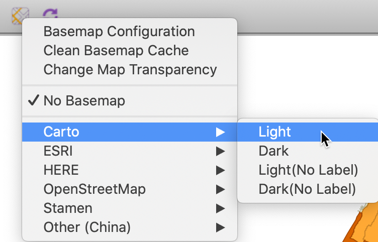
Figure 14: Map base layer options
For each provider, different types of base layers are available. For example, for Carto, this is Carto Light and Carto Dark, as well as these types without labels. For ESRI, the options are WorldStreetMap, WorldTopoMap, WorldTerrain and Ocean.
For example, the default map created by selecting Carto Light (as in Figure 14) is illustrated in Figure 15 for the natural breaks map of the rent data. Note that, in practice, it may be necessary to adjust the zoom level to get a satisfactory framing of the map and the base layer.2
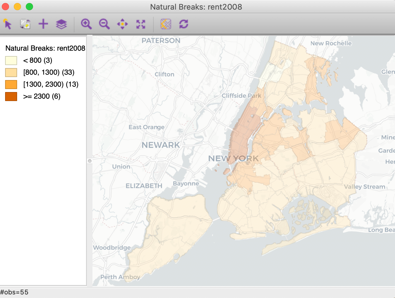
Figure 15: Carto Light base map
The relative transparency of the base layer versus the choropleth map can be adjusted by means of the Change Map Transparency option. This provides a slider bar to change the transparency of the base layer (a smaller value gives more importance to the choropleth map relative to the base layer). In the example shown in Figure 16, we have moved the slider from its starting value of 0.69 over to 0.10, in order to make the map itself more pronounced.
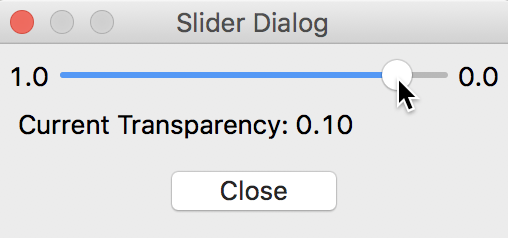
Figure 16: Change base layer transparency
The outcome is illustrated in Figure 17.
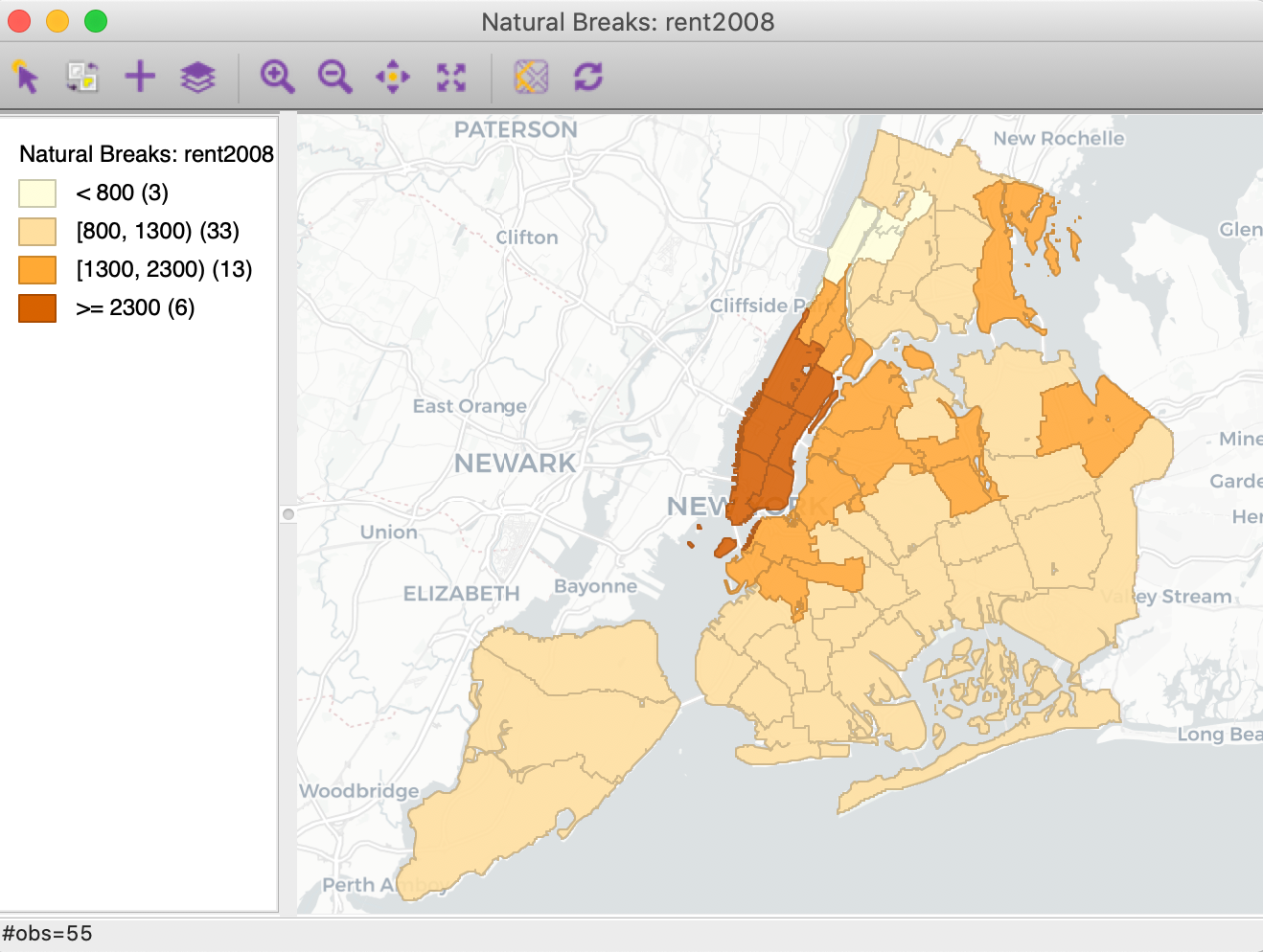
Figure 17: Carto Light base map – transparency 0.10
Other base layers can take on quite a different look. For example, in Figure 18, the HERE > Day option is illustrated for the same natural breaks map.
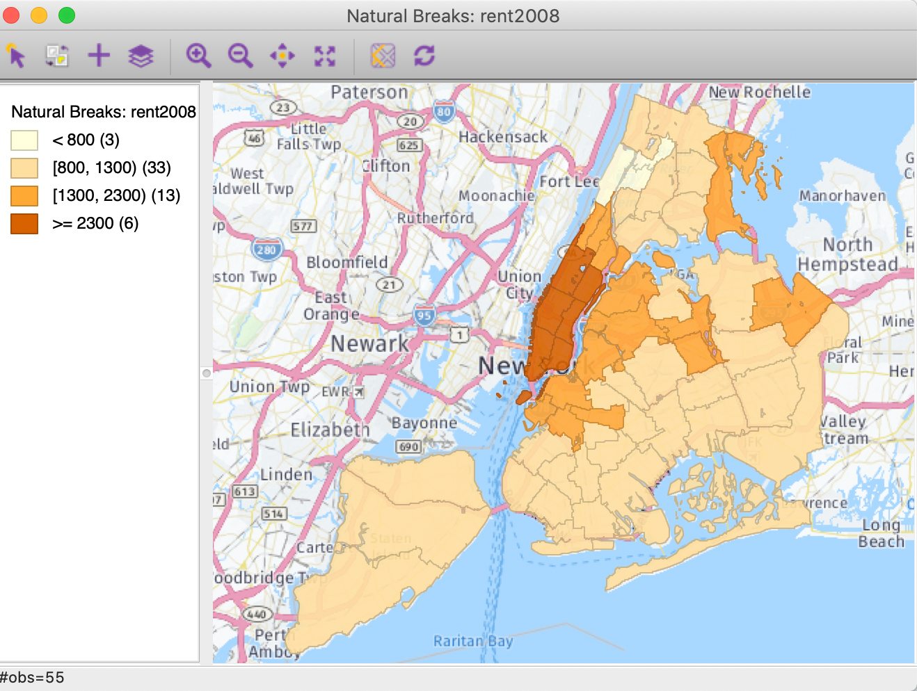
Figure 18: Nokia Day base map
The HERE base map support is provided under a generic account for all GeoDa users. This account has general usage restrictions, so users may want to set up their own accounts for the HERE platform. This can be accomplished by means of the Basemap Configuration option.3
Finally, in a pinch, it may be necessary to use the Clean Basemap Cache option when things go wrong.
Saving the classification as a categorical variable
The classification associated with a given map can be added to the data table as a new categorical variable by means of the Save Categories option. This brings up a variable selection dialog in which we can specify the name for the new variable (the default is CATEGORIES). In our example, we use natbreak, as in Figure 19.
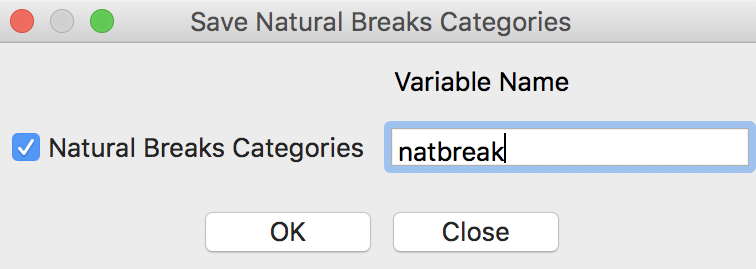
Figure 19: Map categories variable
Upon selecting OK, a new field is added to the data table, as shown in Figure 20.4 The categories are labeled from low to high, starting with the value 1. The resulting categorical variable can be used as input into a Unique Values Map or a Co-location Map (see below).
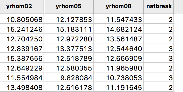
Figure 20: Map categories variable in table
Note that there is no metadata associated with this new variable. As a result, all information is lost on the variable in question, the ranges from which the categories were derived, the type of legend (e.g., sequential, diverging), or, for that matter, the type of classification itself (unless those characteristics are somehow reflected in the variable name).
Saving the map as an image
The first option at the bottom of the list provide a way to Save Selection, as outlined in the Data Wrangling chapter. Also, we can Copy Image to Clipboard, and Save Image As. The latter is a useful way to create an image file that can then be further manipulated in graphic software.
This option brings up a dialog that allows for some limited customization of the alignment of the different map parts, shown in Figure 21. The legend box can be moved around and resized, or not shown at all. Also, the image dimensions can be set precisely and the resolution specified (in dpi - the default is 300).
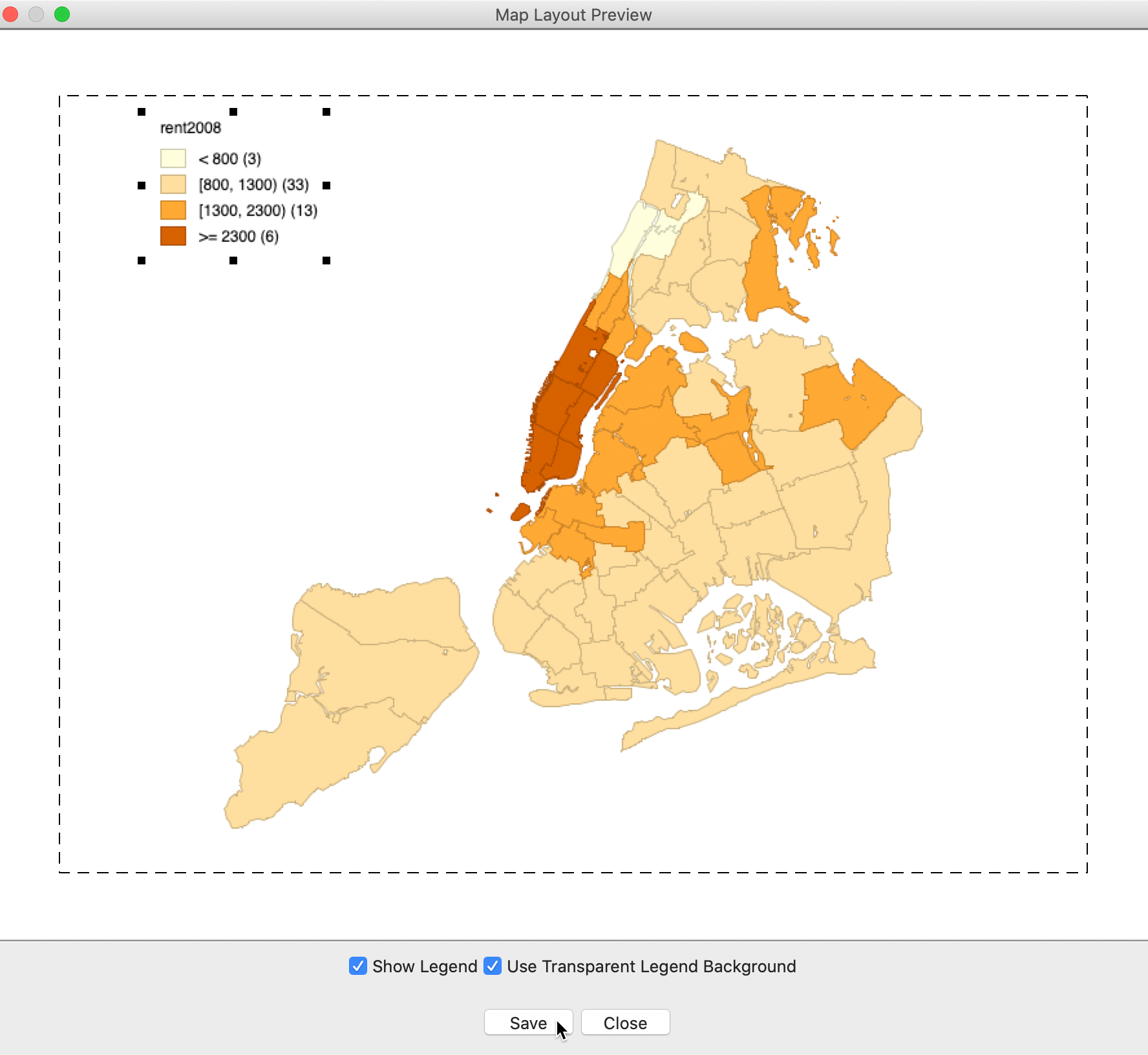
Figure 21: Saved Image As dialog
The resulting map image can be saved as three different formats: png (the default), bmp, and SVG. For example, using Save Image As for the natural breaks map in our example yields the png image shown in Figure 22.
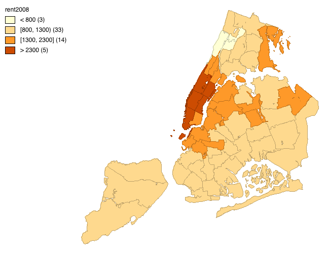
Figure 22: Saved map image
Other map options
The remainig three options pertain to the look of the map view. Show Status Bar is on by default, which means that the number of observations, the number of selected observations, etc., will be displayed on the status bar. The Selection Shape is set by default to Rectangle, with the other two options as Circle and Line. This allows for the selection of observations on the map that lie within the specified shape, as drawn by the pointer. As we have seen earlier, through the process of linking, any selection is instantaneously identified in all other views as well.
Finally, the Color options determine how the map is displayed. By default, the polygon outlines (i.e., in our example, the boundaries of the sub-borough neighborhoods) are shown, with Outlines Visible checked, as in Figure 23.
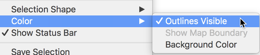
Figure 23: Map appearance options
By unchecking this option, the outlines disappear. This is particularly helpful when the map contains many small areas that will tend to be dominated by their boundary lines. In our example in Figure 24, this results in an impression of larger regions, because many adjoining sub-boroughs ended up in the same category of the natural breaks classification.
Figure 24: Map without outlines visible
One further option is to Show Map Boundary, only available with Outlines Visible turned off. This option is particularly useful when only a few polygons are colored in a map with many observations, for example, in the local cluster maps we will consider in a later chapter. Turning off the outlines in such an instance makes the polygons floating in white space. With the Show Map Boundary option turned on, the initial outline of the map is retained.
The Background Color determines the background against which the map is drawn. In most instances, the default of white is the best choice.
Extreme Value Maps
Extreme value maps are variations of common choropleth maps where the classification is designed to highlight extreme values at the lower and upper end of the scale, with the goal of identifying outliers. These maps were developed in the spirit of spatializing EDA, i.e., adding spatial features to commonly used approaches in non-spatial EDA (Anselin 1994).
GeoDa currently supports three such map types in the Map menu: a percentile map,
a box map, and a
standard deviation map. These are briefly described below. Only their distinctive features are highlighted,
since they share all the same options with the other choropleth map types.
Percentile map
The percentile map is a variant of a quantile map that would start off with 100 categories. However, rather than having these 100 categories, the map classification is reduced to six ranges, the lowest 1%, 1-10%, 10-50%, 50-90%, 90-99% and the top 1%. This is shown in Figure 25 for the rent2008 variable. We select Map > Percentile Map from the map menu or the map toolbar icon and choose the variable to create the map.
Figure 25: Percentile map
Note how the extreme values are much better highlighted, especially at the upper end of the distribution. The classification also illustrates some common problems with this type of map. First of all, since there are fewer than 100 observations, in a strict sense there is no 1% of the distribution. This is handled (arbitrarily) by rounding, so that the highest category has one observation, but the lowest does not have any.
In addition, since the values are sorted from low to high to determine the cut points, there can be an issue
with ties. As we have seen, this is a generic problem for all quantile maps. As pointed out,
GeoDa handles ties by moving observations to the next highest category. For example, when there
are a lot of observations with zero values (e.g., in the crime rate map for the U.S. counties), the lowest
percentile can easily end up without observations, since all the zeros will be moved to the next category.
Box map
A box map (Anselin 1994) is the mapping counterpart of the idea behind a box plot. The point of departure is again a quantile map, more specifically, a quartile map. But the four categories are extended to six bins, to separately identify the lower and upper outliers. The definition of outliers is a function of a multiple of the inter-quartile range (IQR), the difference between the values for the 75 and 25 percentile. As we will see in a later chapter in our discussion of the box plot, we use two options for these cut-off values, or hinges, 1.5 and 3.0. The box map uses the same convention.
For example, we invoke this map using Map > Box Map (Hinge=1.5) from the menu or the map icon on the toolbar. After selecting rent2008 as the variable, the map shown in Figure 26 is created.
Figure 26: Box map, hinge=1.5
Compared to the quartile map in Figure 6, the box map in Figure 26 separates the three lower outliers (the observations with zero values) from the other four observations in the first quartile. They are depicted in dark blue. Similarly, it separates the six outliers in Manhattan from the eight other observations in the upper quartile. The upper outliers are colored dark red.
To illustrate the correspondence between the box plot and the box map, we put the two side by side (Explore > Box Plot) in Figure 27. In the right-hand panel, we select the upper outliers in the box plot. Only the matching six outlier locations in the box map are highlighted. Note that the outliers in the box plot do not provide any information on the fact that these locations are also adjoining in space. This the spatial perspective that the box map adds to the data exploration.
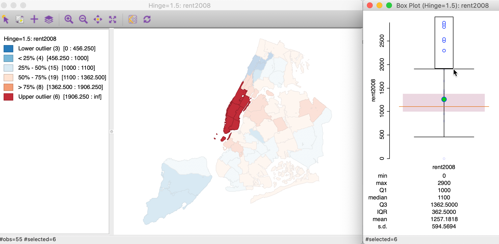
Figure 27: Outliers in box plot and box map
From the current map, we can switch the box map between the hinge criterion of 1.5 and 3.0 by opening the options menu (right click on the map) and selecting Change Current Map Type > Box Map (Hinge = 3.0). Alternatively, we can also open a new map window from the main menu or map toolbar icon and select Box Map (Hinge=3.0) as the option. The resulting box map, shown in Figure 28, no longer has lower outliers and has only five upper outliers (compared to six for the 1.5 hinge).
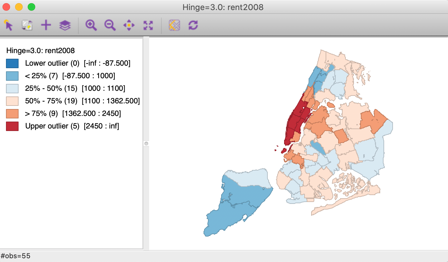
Figure 28: Box map, hinge=3.0
The box map is the preferred method to quickly and efficiently identify outliers and broad spatial patterns in a data set.
Standard deviation map
The third type of extreme values map is a standard deviation map. In some way, this is a parametric counterpart to the box map, in that the standard deviation is used as the criterion to identify outliers, instead of the inter-quartile range.
In a standard deviation map, the variable under consideration is transformed to standard deviational units (with mean 0 and standard deviation 1). This is equivalent to the z-standardization we have seen before.
The number of categories in the classification depends on the range of values, i.e., how many standard deviational units cover the range from lowest to highest. It is also quite common that some categories do not contain any observations (as in the example in Figure 29).
We continue with the variable rent2008 and bring up a standard deviation map by means of Map > Standard Deviation Map from the main menu or from the map toolbar icon.
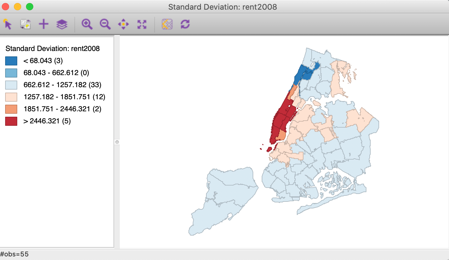
Figure 29: Standard deviation map
In the map in Figure 29, there are five neighborhoods with median rent more than two standard deviations above the mean, and three with a median rent less than two standard deviations below the mean. Both sets would be labeled outliers in standard statistical practice. Also, note how the second lowest category does not contain any observations (so the corresponding color is not present in the map).
Mapping Categorical Variables
So far, our maps have pertained to continuous variables, with a clear order from low to high.
GeoDa also contains some functionality to map categorical variables, for which the numerical values
are distinct, but not necessarily meaningful in and of themselves. Most importantly, the numerical values
typically do not imply any ordering of the categories. The two relevant functions in GeoDa are the
unique value map, for a single variable, and the co-location map, where the categories for
multiple variables are compared.
Unique Value map
To illustrate the categorical map, we first create a box map (with hinge 1.5) for each of the variables kids2000 (the percentage households with kids under 18) and pubast00 (the percentage households receiving public assistance). In each of these maps, we save the categories (Save Categories in the options menu), respectively as kidscat and asstcat. The category labels go from 1 to 6, but not all categories necessarily have observations. For example, the map for public assistance does not have either lower (label 1) or higher (label 6), outliers, only observations for 2–5. For the kids map, we have categories 1–5.
At this point, we ignore the meaning of the categories and create a categorical map for the classifications in the box map for the kidscat variable by means of Map > Unique Value Map from the main menu or from the map toolbar icon. This yields the map shown in Figure 30.
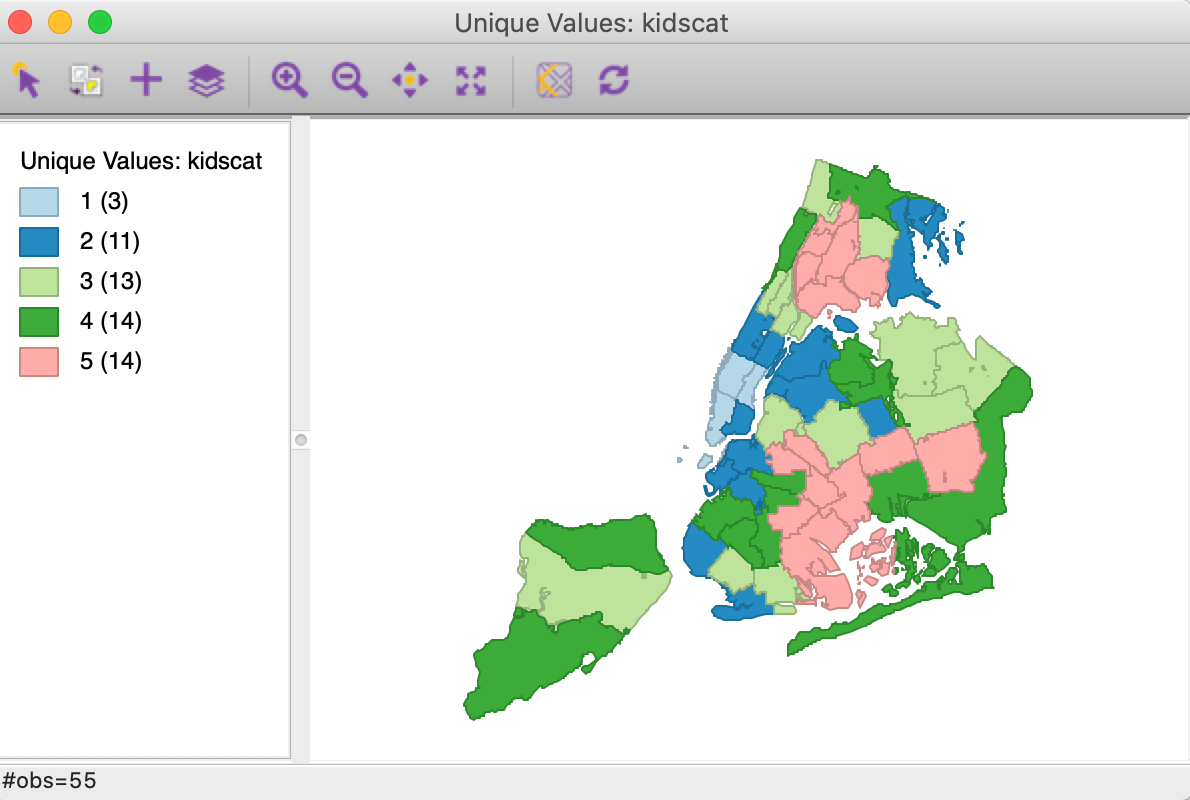
Figure 30: Unique value map
The categorical map has values in the legend from 1 to 5, but unlike for the box map from which they originated, they do not imply any ordering. This is also reflected in the colors, which are generated from the ColorBrewer categorical map palette.
It is also possible to change the colors for the categories. This is carried out by dragging the legend label up or down (the category value to the right, not the rectangle on the left). In the example in Figure 31, we drag the label 5 (associated with the rosy color) up to the next level, where the color is green and the label is 4.
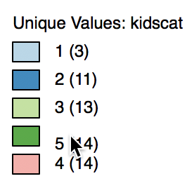
Figure 31: Switching categories
As soon as we release the label, shown in Figure 32, it becomes 4 again. This emphasizes that the label in and of itself is meaningless in terms of value.
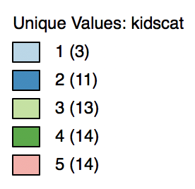
Figure 32: Categories switched
As a result of the switch in labels, all observations that used to be colored rosy (or, labeled 5) in Figure 30 are now colored dark green (and, labeled 4), and vice versa, as illustrated in Figure 33.
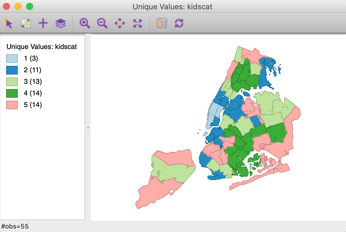
Figure 33: Unique value map with relabeled categories
It is important to keep in mind that in a categorical map, the labels have no meaning other than to distinguish between categories. So, whether we label the same group as 5 or 4 is irrelevant, only the grouping matters. Furthermore, the values in the legend are represented as integers for convenience, but they could just as well have been A, B, C, etc., or other descriptors. This is a fundamental difference between the categorical maps and the other choropleth map types.
Co-location map
The idea behind a co-location map is the extension of the unique value map concept to a multivariate context. In essence, it is the implementation of ideas related to the principles of map overlay or map algebra applied to categorical maps.5
In a co-location map, the labels for different categorical variables are compared and the matches identified on the map. It is up to the user to ensure that the categories across variables are meaningful, since the co-location is based on the variables having the same code. For example, this is useful when comparing the extent to which the quartiles across different variables occur at the same locations. Or, as we will see later, whether significant patterns of local spatial autocorrelation match across several variables. But it is also very easy to generate nonsensical results, for example, when the labels are not comparable.
The co-location map is invoked as Map > Co-location Map from the main menu or from the map toolbar icon. This brings up a dialog, shown in Figure 34, that allows for the selection of the different categorical variables in the top panel. If there are matches between the codes for the variables, these are displayed at the bottom, with the labels and a proposed color scheme.
In our example, we select kidscat and asstcat as the two categories we want to compare. Four labels match between the two variables, and their values and a proposed color theme are listed in the bottom panel of Figure 34.
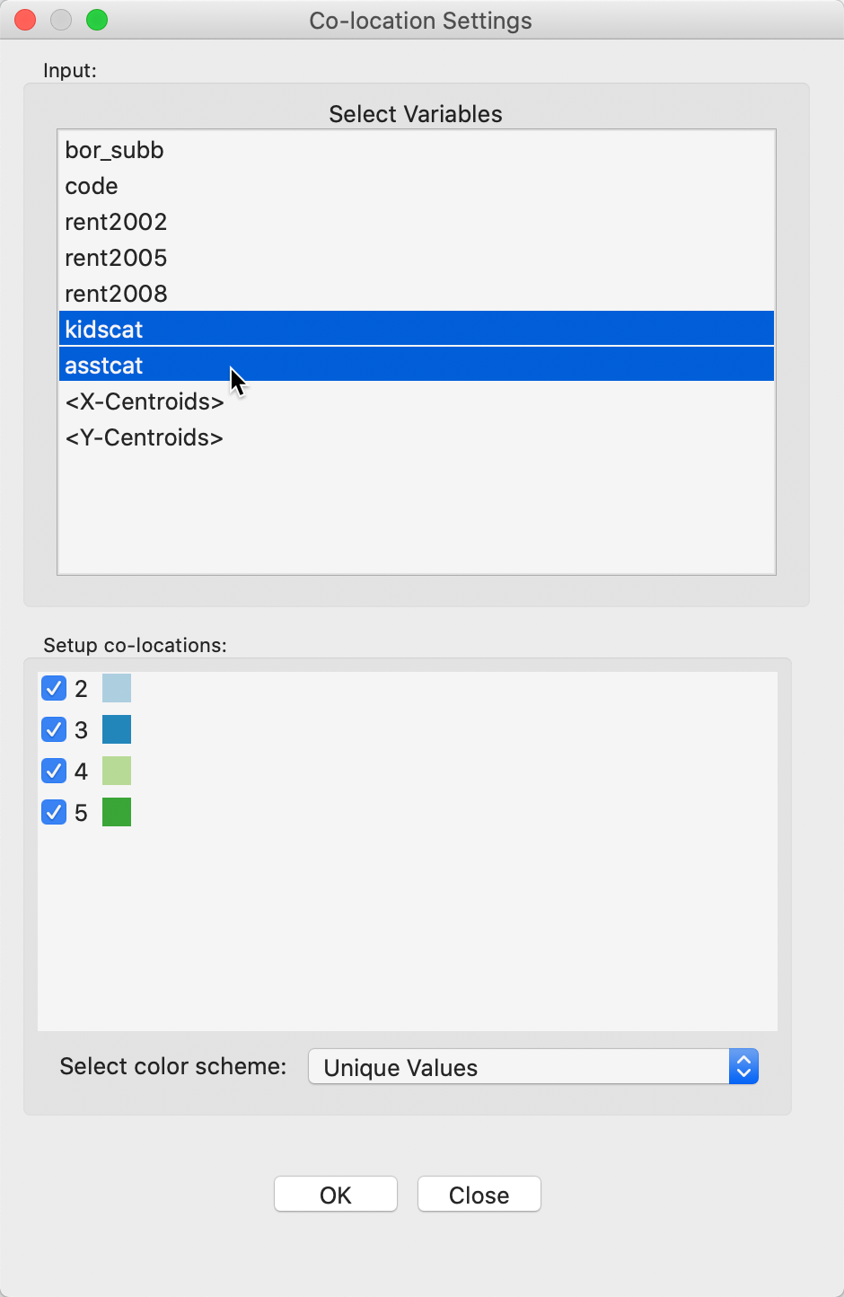
Figure 34: Co-location map variable selection
The proposed color scheme is Unique Values by default. But in this example, that is not the appropriate shading, since we are comparing the classifications between two box maps (or, equivalently, box plots). The Select color scheme drop down list provides a set of pre-coded color schemes for a range of likely comparisons between categories. For our example, we select Box Map, as shown in Figure 35.
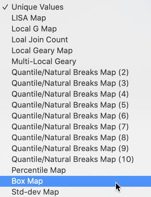
Figure 35: Co-location map color schemes
This changes the proposed color scheme in the bottom panel of Figure 34 to match the palette for a box map, as in Figure 36. Note that since only four categories had any matches, only four of the six available colors are being used.
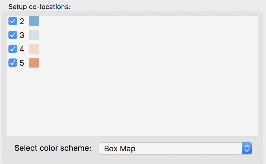
Figure 36: Co-location map box map color schemes
Clicking on the OK button brings up the co-location map, shown in Figure 37.
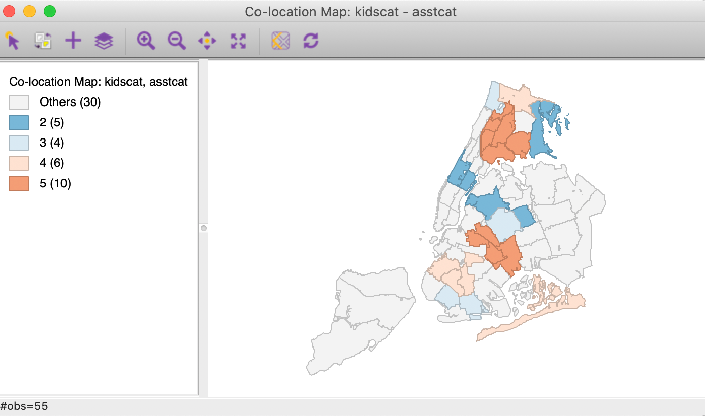
Figure 37: Co-location map
In our example in Figure 37, 25 of the 55 sub-boroughs have observations in matching categories for the two variables. The 30 that do not are shaded light grey. The matching observations are shaded in the color of the box map category to which they belong. We find that 10 (out of the 14) neighborhoods belong to the upper quartile (> 75%, but not outliers) for both variables, suggesting an association. In contrast to assessing a bivariate relationship by means of a scatter plot (see the chapter on EDA), the co-location map can be applied to categorical variables. It can also easily be extended to more than two variables.
Custom Classifications
In addition to the range of pre-defined classifications available for choropleth maps
in GeoDa, it is also possible to create a custom classification. This is often useful
when substantive concerns dictate the cut points, rather than data driven criteria.
For example, this may be appropriate when specific income categories are specified for
certain government programs.
A custom classification may also be useful when comparing the spatial distribution of a variable over time. All included pre-defined classifications are relative and would be re-computed for each time period. For example, when mapping crime rates over time, in an era of declining rates, the observations in the upper quartile in a later period may have crime rates that correspond to a much lower category in an earlier period. This would not be apparent using the pre-defined approaches, but could be visualized by setting the same break points for each time period.
The Category Editor in GeoDa is a complex tool that allows for the creation of a
fully customized classification scheme. It is invoked from the map options menu, as
Change Current Map Type > Custom Breaks > Create New Custom, as shown in Figure 38.
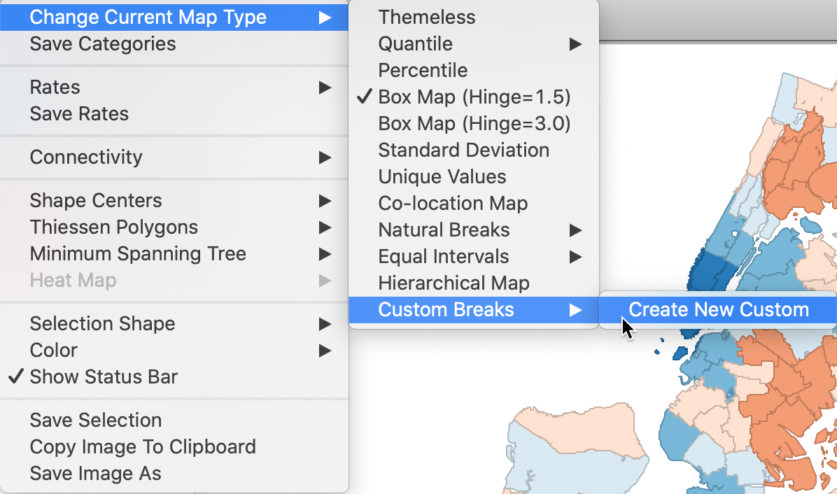
Figure 38: Custom category
Alternatively, the category editor can also be invoked directly by selecting the corresponding icon from the toolbar, immediately to the left of the histogram icon, shown in Figure 39.
Figure 39: Category Editor toolbar icon
Category editor
Default setup
There are slight differences between the category editor dialog, depending on whether it is invoked from the toolbar, or as an option from an existing map. The main difference is that in the latter case, the associated map will be updated as a new classification is being developed. When invoked from the toolbar, this is not the case. We illustrate the map option in what follows.
For example, in Figure 40, the Create New Custom option is invoked from a box map for the kids2000 variable. The dialog requests a name for the new category and shows a five classification histogram with the corresponding box map colors (there are no observations for the upper outlier category). The default name suggested is Custom Breaks (kids2000).6
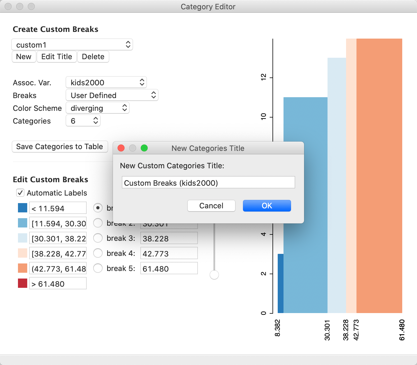
Figure 40: Category editor initialization
We continue by specifying the name for the new classification as custom1, as in Figure 41.
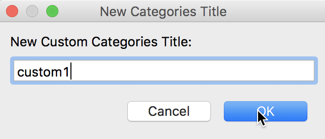
Figure 41: Specifying a custom category name
After clicking OK, the category editor dialog is updated with the name for the new classification, which will appear in the drop down list below Create Custom Breaks. Note how the associated variable (Assoc Var.) is listed as kids2000, which is where the interface draws the values and category breakpoints from. When invoked from the toolbar, the associated variable will be the first variables in the data table (bor_sub), which is not always meaningful.
The other settings in the dialog define the classification.7 In Figure 40, this is User Defined for the Breaks, diverging for the Color Scheme, and 6 for the number of Categories. The panel on the right shows a histogram with the current classification applied to the associated variable. Moving the pointer over a bar in the histogram displays some summary statistics in the status bar, such as the range and its associated number of observations. Also, as soon as the custom editing process is initiated, the map from which it was started is synchronized with the current state of the category editor. In our example, initially, there is not change in the classification.
Besides the number of categories, the two main criteria to define a new classification are the break points and the associated colors. Each item has a number of options in a drop down list. For the Breaks, the five options consist of four traditional criteria, and one User Defined item. The latter is the default, shown in Figure 42.
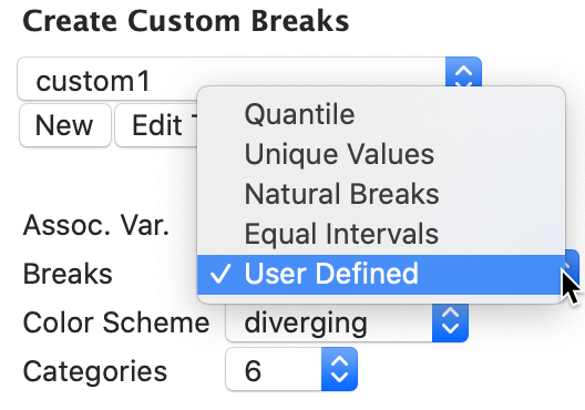
Figure 42: Breaks dialog
The associated colors are selected from the Color Scheme drop down list, and include sequential, diverging, thematic (or, categorical), and custom. The custom colors are defined by clicking on the colored boxes next to each category under the heading Edit Custom Breaks. In our example, we will use a sequential coloring scheme, as in Figure 43.
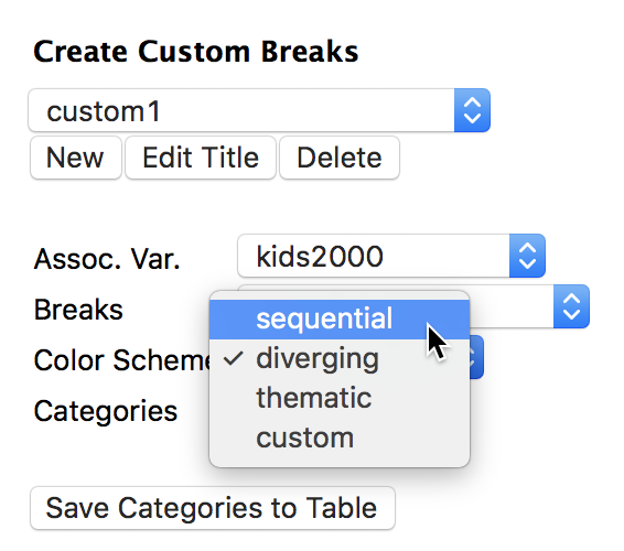
Figure 43: Color scheme dialog
As we adjusted the classification criteria, the histogram in the right-hand panel is immediately updated to reflect the latest selection, illustrated in Figure 44 (and so is the synchronized map). The categories are still the same, but the associated color has been changed to a sequential pattern.
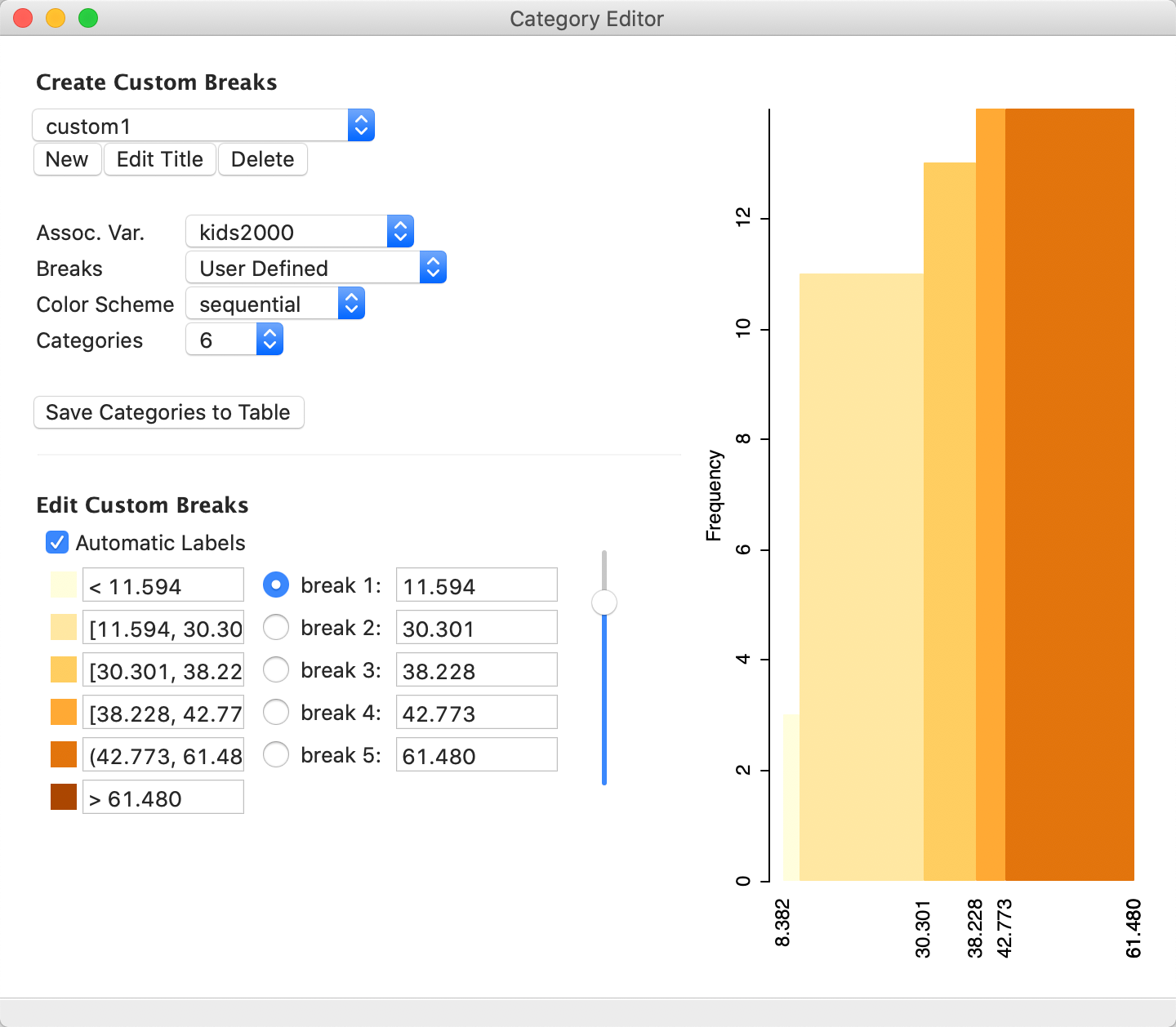
Figure 44: Updated category editor dialog
Editing break points
We are now ready to edit the break points. There are two approaches to carry this out. One is to use the handle in the vertical slider next to the list of button breaks. One break is dealt with at a time, selected by means of the matching radio button to the left. In our example, since we currently only have five effective categories, even though Categories is set to 6, we start by adjusting the upper cut off point.
With the Button break 5 radio button checked, we move the slider up, which decreases the value of the last break point and starts to grow a sixth category on the right of the histogram. However, it is difficult to set a precise value. For example, in Figure 45, it is set at 49.984. As the slider moves up or down, the histogram (and the map) is instantaneously updated to reflect the new break points. With Automatic Labels checked (the default), the category labels are updated as well.
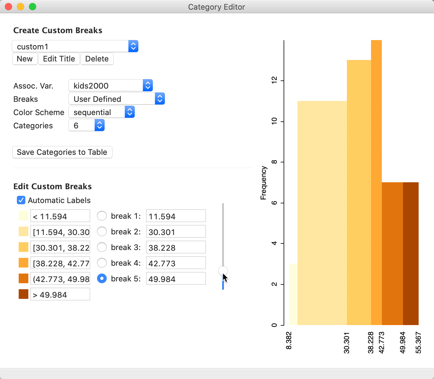
Figure 45: Edit custom breaks – pointer
A second, more effective approach to edit the break points is to type them in directly. For example, we enter 20, 30, 40, 45 and 50 as the new break points, to end up with the break points as given in Figure 46. Again, as new values are entered, the histogram, map and labels are updated.
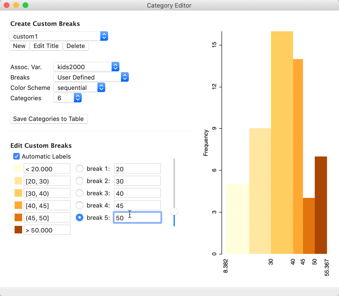
Figure 46: New categories defined
The corresponding map classification, shown in Figure 47, has the updated labels and categories. Note how the legend heading indicates the use of custom1 as the classification for the variable kids2000.

Figure 47: Updated map classification
Custom category labels
Finally, even though in the current application it is not actually needed, we uncheck the Automatic Labels box to illustrate the custom labels feature. In the boxes, we enter cat1, cat2, etc. as the labels. The labels in the map in Figure 48 are updated accordingly.
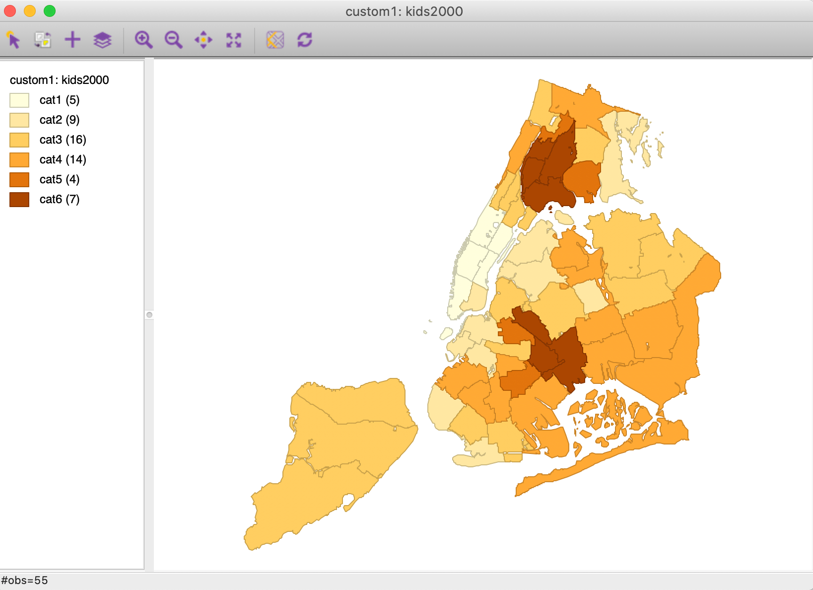
Figure 48: Custom category labels
To proceed further, we check the Automatic Labels again to return to the more informative labels that show the range for each bin.
Applications of custom categories
Once created, the custom classification becomes available to any application where classification is involved. Most directly, this is the mapping functionality, where now the custom category will be listed as an option under the Custom Breaks when selecting Change Current Map Type. However, it currently cannot be used to create a map from scratch. In other words, one needs to first create a map using one of the built-in classifications, and then change the map type to the customized category.
This custom1 classification could be used to track the spatial distribution of the kids variable over time. For example, we can create a box map (with hinge 1.5) for the kids2005 variable, and proceed with Change Current Map Type to select custom1. The resulting map, shown in Figure 49, reflects the new custom categories. We observe an overall shift towards the lower categories, i.e., more sub-boroughs have a smaller share of households with children in 2005 compared to 2000.
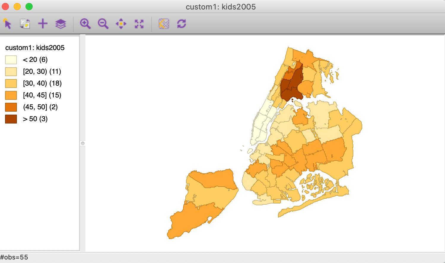
Figure 49: kids2005 with custom classification
In addition, the custom classification becomes available to other graphs, such as the histogram and the conditional plots, covered in the chapter on EDA. In many ways, using customized break points is the preferred way to implement conditional plots (see also below).
Saving the custom categories – the Project File
GeoDa has the ability to save a so-called Project File that contains
information on various variable transformations and other operations. We will revisit the project file in more
detail when we discuss spatial weights. One useful feature of the project file is that it also contains the
definition of any custom categories that were created. If this definition is not saved in a project file, then
it will be lost, and will need to be recreated from scratch the next time the data set is analyzed.
The project file is created from the menu as File > Save Project, as in Figure 50.
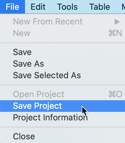
Figure 50: Save Project
This is followed by the usual file name dialog. The file is saved with a file extension of gda. It is a text file that includes XML encoding. For example, when we examine the just created project file with a text editor, we can locate the section pertaining to custom_classifications, as shown in Figure 51.
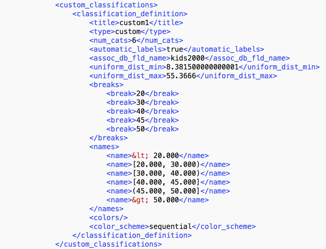
Figure 51: Custom category definition in project file
The custom classification section contains all the aspects needed for the definition of the custom category.
Once a project file has been saved, GeoDa should be started by loading the gda
file, rather than the shape file or any other data set. This ensures that all the meta-information is taken
into account, all variable transformations updated and custom categories stored. The options menu for any map,
histogram or conditional plot will now contain custom1 as one of the available categories.
Once we move to more complex analyses, with multiple variable transformations, spatial weights, and other items created during various operations, the most efficient way to operate is to always save and use a project file.
Conditional Map
We consider conditional plots more in depth in the treatment of EDA, but one option is to use a map. This is also known as a conditioned choropleth map, or a micromap matrix, discussed at length in Carr and Pickle (2010). A micromap matrix is a matrix of maps that each pertain to a subset of the observations, determined by the conditioning variables on the horizontal and vertical axes. Each map shows the spatial distribution of the variable of interest, but only for those observations that fall into the associated categories of the conditioning variables.
The main objective behind this conditioning is to detect any potential interaction between the conditioning variables and the topic of interest. The point of departure (or, null hypothesis) is that there is no interaction. If this were indeed the case, then the patterns shown on all the micromaps should be essentially the same. If there is interaction, then we would see high or low values of the variable of interest systematically associated with specific categories of the conditioning variables.
This functionality is the first of the options associated with the conditional plot toolbar icon, illustrated in Figure 52. Alternatively, it can be invoked from the menu as Map > Conditional Map.
Figure 52: Conditional Map from Conditional Plot icon
Selecting this option brings up a variable selection dialog containing three columns, as was the case for the conditional histogram plots. The first column pertains to the conditioning variable for the horizontal axis, the second defines the conditioning variable for the vertical axis. The third column, Map Theme, selects the variable that will be mapped.
In our example, in Figure 53, we use forhis08 (% of Hispanic population not born in the U.S.) and hhsiz08 (average number of people per household) as the two conditioning variables, and rent2008 (median rent) as the focus variable. All values are for 2008. Note that the second column also contains an empty category, which can be used when only conditioning on one dimension.
Figure 53: Conditional Map variable selection
Clicking OK brings up the default conditional map, shown in Figure 54. The matrix of micromaps contains three categories (quantiles) for each of the conditioning variables, and thus nine micromaps in total. On the horizontal axis, forhis08 is listed with two break points. The vertical axis variable is given as hhsiz08, also with two break points. The maps themselves are box maps for the median rent variable. Each of the micro maps contains only those observations that match the categories on the horizontal and vertical axes.
Note that, as in the other conditional plots, the break points listed may be slightly different from the quantiles given in a quantile map. This is to ensure that the categories are completely separated. For example, a quantile map with three categories for the horizontal conditional variable forhis08 would give the first category ending at 31.829 and the second starting at 31.972. The first breakpoint listed in the micromap matrix is 31.900, which is exactly the midpoint between the two values, ensuring complete separation.
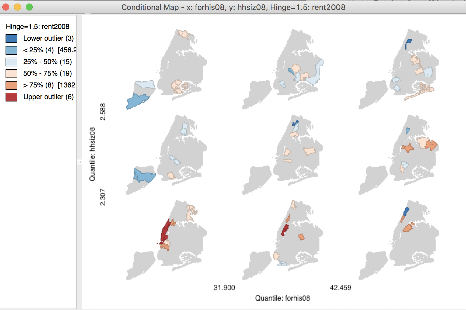
Figure 54: 3x3 Conditional Map
Since there are only 55 observations in our example, the sample size for each of the subsets tends to be very small. Therefore, we use the Options menu (right click) to change the classification. This menu includes the option to change the conditioning bins through Vertical Bins Breaks and Horizontal Bins Breaks. There are seven preset classifications, as well as the option to create custom breaks by means of the category editor. Note that if you continued with the previous example, the custom category custom1 will be included as one of the Custom Breaks options.
In the illustration in Figure 55, the vertical and horizontal break points were changed from the default 3 quantiles, to 2. The result is a 2 x 2 matrix of micro maps
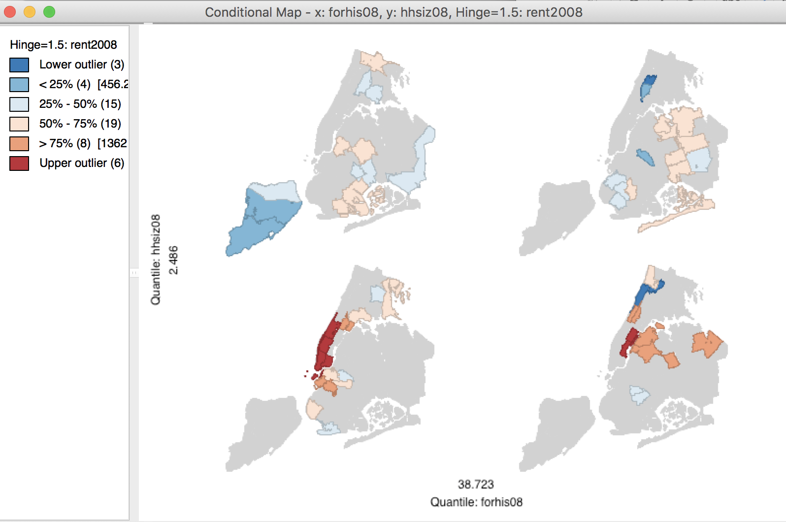
Figure 55: 2x2 Conditional Map
The classification suggests that sub-boroughs with larger household size tend to have lower rents (the two maps at the top), whereas there does not seem to be an effect of the % Hispanic that is foreign-born (the maps on the left and right do not seem to be drastically different in the range of values they contain). By manipulating the break points, further insight can be gained into the presence of interaction effects (or lack thereof). This can be further investigated more formally by means of an analysis of variance.
Cartogram
Principle
A cartogram is a map type where the original layout of the areal unit is replaced by a geometric form (usually a circle, rectangle, or hexagon) that is proportional to the value of the variable for the location. This is in contrast to a standard choropleth map, where the size of the polygon corresponds to the area of the location in question. The cartogram has a long history and many variants have been suggested, some quite creative. In essence, the construction of a cartogram is an example of a nonlinear optimization problem, where the geometric forms have to be located such that they reflect the topology (spatial arrangement) of the locations as closely as possible (see Tobler 2004, for an extensive discussion of various aspects of the cartogram).
GeoDa implements a circular cartogram, in which the areal units are represented as circles,
whose size (and color) is proportional to the value observed at that location.
The changed shapes remove the misleading effect that the area of the unit might have on perception of
magnitude.
For example, in the case of median rent in NYC sub-boroughs, some of the smaller areas in Manhattan have the highest rent, and consequently they can barely be noticed in a standard choropleth map.
Creating a cartogram
The cartogram is invoked by its toolbar button, situated in the center of the three mapping icons (Figure 56), or by selecting Map > Cartogram in the Map menu.
Figure 56: Cartogram icon
Next follows the Cartogram Variables dialog that contains two columns, one for the Circle Size and one for the Circle Color. It is highly recommended to select the same variable for both. In our example, shown in Figure 57, we again select rent2008. Note that the circle color variable can be different from the circle size variable, but then it may be difficult (and sometimes confusing) to keep the two separate.

Figure 57: Cartogram variable selection
Clicking OK brings up the cartogram view. The default, shown in Figure 58, is to use the Box Map classification for the circle colors (with hinge at 1.5 IQR). Note how the multilayer and base map options are not available in a cartogram.
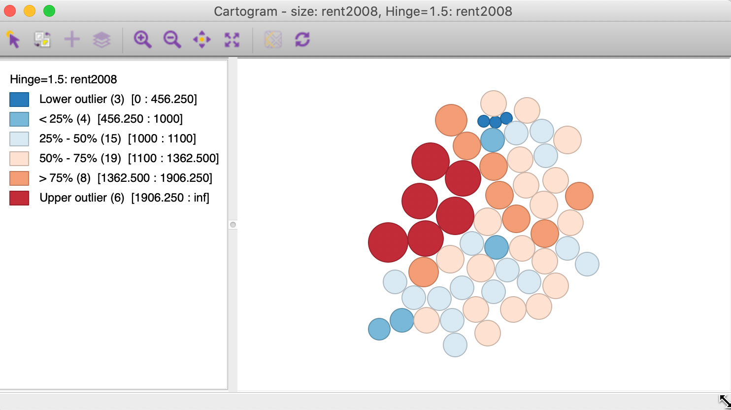
Figure 58: Cartogram
The cartogram is most insightful when used in conjunction with a regular choropleth map. Selecting an observation in the cartogram then immediately links it with the corresponding area in the choropleth map, illustrated in Figure 59 for one of the Manhattan neighborhoods.
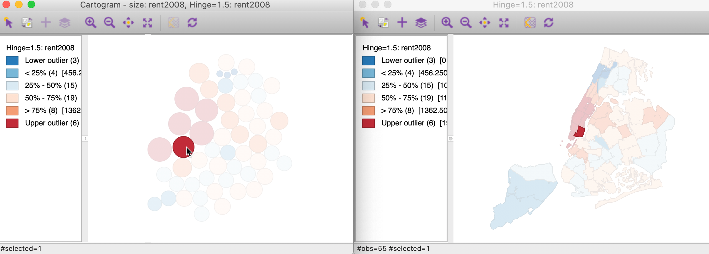
Figure 59: Linked Cartogram and map
Except for multi-layer and base map, the cartogram has all the same options as a regular choropleth map, with one addition. The positioning of the circles in the cartogram is the result of a non-linear optimization algorithm. This tries to locate the center of the circle as close as possible to the centroid of the areal unit with which it corresponds, while respecting the contiguity structure as much as possible. There is no unique solution to this problem, and it is often good practice to experiment with further iterations that will slightly reposition the circles. This is implemented in the Improve Cartogram option, shown in Figure 60. A number of different iteration options are listed, together with the estimated time. The latter is particularly useful for larger data sets (but not in our example).
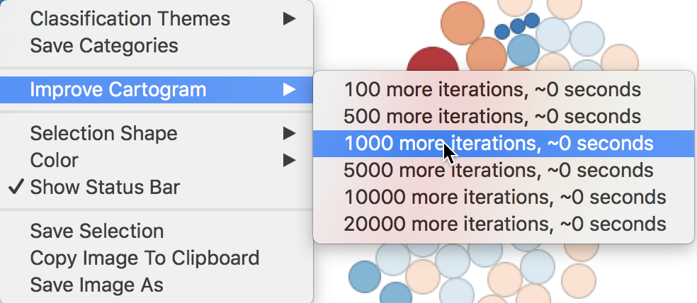
Figure 60: Improve Cartogram
Map Animation
In GeoDa, map animation, or, more generally, any kind of animation is carried out through the
animation tool. This is invoked by the Map Movie toolbar icon, shown in Figure 61, or from the Menu, as
Map > Map Movie.
Figure 61: Map Movie icon
This brings up the Animation dialog, the control center through which the various aspects of the animation are controlled. The first item to specify is the Variable from the drop down list. We continue with rent2008, shown in Figure 62.
At the bottom of the dialog are the main controls: the start > button, step-by-step forward >> or backward <<, whether the animation loops or stops at the end, an option to Reverse the progress, the speed of the animation, and whether the order followed is ascending or descending. The defaults are usually good, with Cumulative checked (i.e., the selection grows as the animation progresses) and Ascending order.
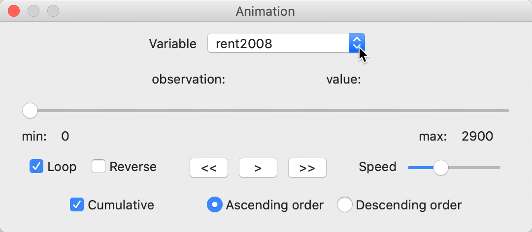
Figure 62: Map Movie variable selection
Once the forward button is activated, each observation is selected in turn, starting with the lowest value. This selection is not only for the map (the term map movie is a left-over from earlier versions), but for all currently active windows. The slider in the Animation dialog moves from left to right. Under the variable name, the currently selected observation and its value are listed. In our example, after 17 steps, the dialog looks as in Figure 63.
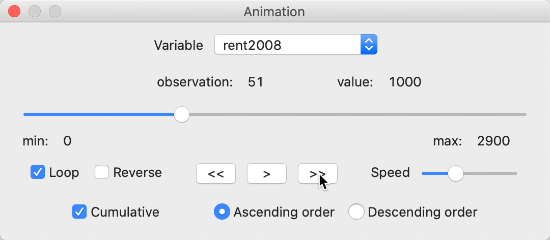
Figure 63: Animation tool
The current selected observation is listed as 51, with a value of 1000. The 17 lowest valued observations are highlighted in all currently open views, such as in the box map in Figure 64 (note how the status bar confirms that 17 observations were selected).
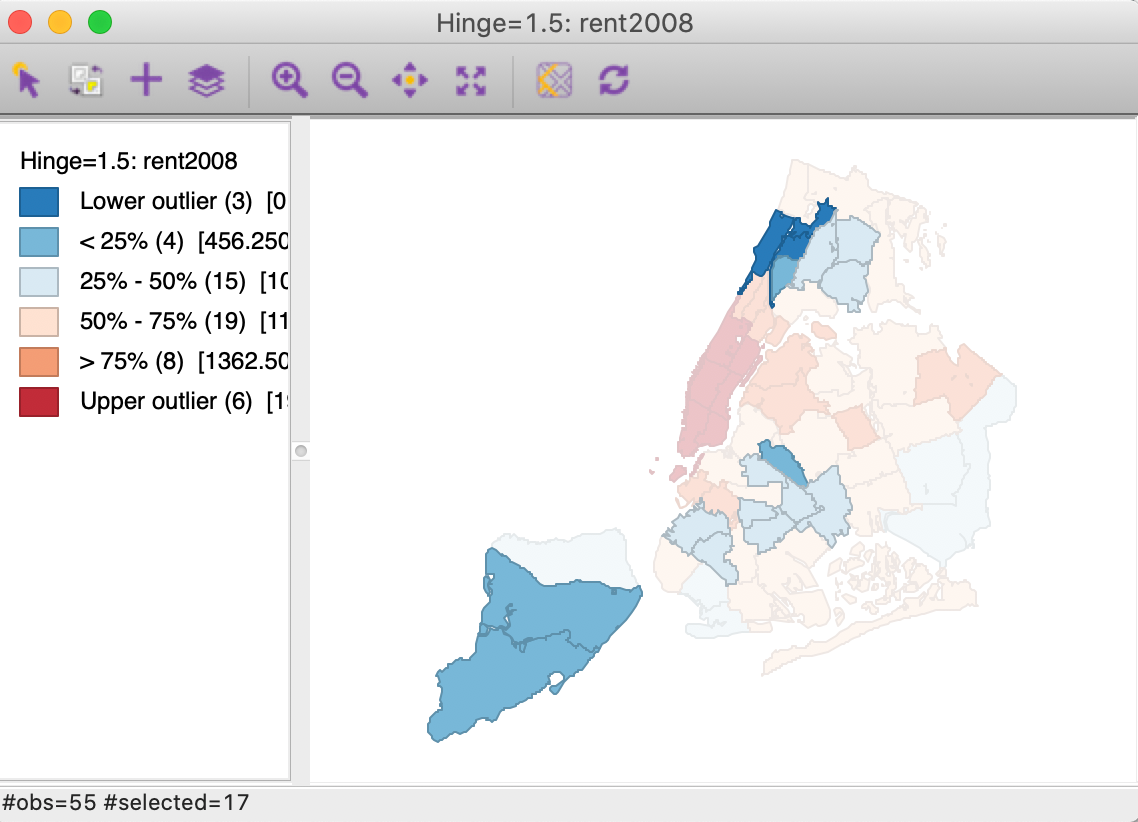
Figure 64: Map animation
The animation tool can be paused at any point, reversed, changed from continuous change to step-by-step, etc., using the controls provided. The main point of the animation is to visually check for any patterns, such as all the lowest or highest values occurring in one location, or an increase in value that follows a given spatial trend (e.g., core-periphery, or East-West). Of course, this visual impression is only that, and will need to be confirmed with the more formal pattern detection methods that we will cover later.
References
Anselin, Luc. 1994. “Exploratory Spatial Data Analysis and Geographic Information Systems.” In New Tools for Spatial Analysis, edited by Marco Painho, 45–54. Luxembourg: Eurostat.
Carr, Daniel B., and Linda Williams Pickle. 2010. Visualizing Data Patterns with Micromaps. Boca Raton, FL: Chapman & Hall/CRC.
Fisher, W. D. 1958. “On Grouping for Maximum Homogeneity.” Journal of the American Statistical Association 53: 789–98.
Jenks, G. F. 1977. “Optimal Data Classification for Choropleth Maps.” Occasional. Paper no. 2. Lawrence, KS: Department of Geography, University of Kansas.
Tobler, Waldo. 2004. “Thirty Five Years of Computer Cartograms.” Annals of the Association of American Geographers 94: 58–73.
Tomlin, C. Dana. 1990. Geographic Information Systems and Cartographic Modeling. Englewood Cliffs, NJ: Prentice-Hall.
-
University of Chicago, Center for Spatial Data Science – anselin@uchicago.edu↩︎
-
The base layer is based on a tile technology, which determines the map extent shown.↩︎
-
A free HERE account can be obtained from https://developer.here.com. The basemap can then be configured with the App ID and App Key.↩︎
-
Note that you may need to restore the table to the original order to get the exact same results as shown in Figure 20. The current state of your table may still be sorted on the rent2008 variable.↩︎
-
Map algebra tends to be geared to applications for raster data, i.e., regular grids. However, since the polygons for the different variables are identical, the same principles can be applied in the context of the categorical maps. The classic reference on the principles of map algebra is Tomlin (1990).↩︎
-
When invoked frome the toolbar, the default name is simply Custom Breaks.↩︎
-
If another classification was created earlier, the settings will inherit from that classification.↩︎