Distance-Band Spatial Weights
Luc Anselin1
10/08/2020 (updated)
Introduction
In this Chapter, we will continue to deal with the spatial weights functionality in GeoDa,
but now we will focus on weights that use the notion of distance. Intrinsically, this
is most appropriate for point layers, but we will see that it can readily be
generalized to polygons as well.
We will initially use a data set with point locations of house sales for Cleveland, OH, but later return to our U.S. county Homicides data to illustrate the polygon case.
We will compute the distance between points to create distance-band weights, as well as k-nearest neighbor weights. We will examine the weights characteristics and pay particular attention to the issue of neighborless locations, or isolates. We also consider generalizing the concept of contiguity to points (using Thiessen polygons), and the notion of distance-based weights for polygons (using their centroids to compute the distances). In addition, we consider the use of the weights functionality to create a general distance or dissimularity matrix derived from multiple variables. Finally, we consider some ways to manipulate different spatial weights matrices, such as intersection and union.
Objectives
-
Construct distance band spatial weights
-
Understand the contents of a gwt weights file
-
Assess the characteristics of distance-based weights
-
Assess the effect of the max-min distance cut-off
-
Identify isolates
-
Construct k-nearest neighbor spatial weights
-
Making a k-nearest neighbor weights matrix symmetric
-
Construct contiguity weights for points and distance weights for polygons
-
Understand the use of great circle distance
-
Create a general dissimilarity matrix based on multiattribute distance
-
Investigate commonalities among spatial weights (intersection and union)
GeoDa functions covered
- Legend > set color for category
- Preferences > Use classic yellow cross-hatching to highlight selection in maps
- Weight File Creation dialog
- distance-band weights
- k-nearest neighbor weights
- great circle distance option
- Weights Manager
- Connectivity Histogram, Map and Graph
- Intersection, Union
- Make symmetric
Preliminaries
To begin, we will use a data set that contains the location and sales price of 205 homes in a core area of Cleveland, OH for the fourth quarter of 2015. The data set is included in the GeoDa Center data set collection:
- cleveland: sample of home sales in Cleveland, OH for 2015
After downloading, this yields a folder with four shape files with file name clev_sls_154_core and the usual four file extensions (shp, shx, dbf and prj).
For polygon-based distance weights, we will continue to use the ncovr data set that is comes
built-in with GeoDa and is also
contained in the GeoDa Center data set collection.
- ncovr: homicide and socio-economic data for 3085 U.S. counties
Customizing the point map
We get started by clearing the previous project and dropping the file clev_sls_154_core.shp into the Drop files here rectangle of the connect to data source dialog. This yields a themeless base map.
We make three minor modifications to improve the visibility of the points and to put them into context in the city. First, we change the color of the points themselves (actually, drawn as tiny circles). This is one of the options in the legend panel of the map. We need to right click on the green box to the left of (205) in the themeless base map, and set Fill Color for Category to white and Outline Color for Category to black.
Next, we change the way selected and unselected points are
displayed. The default is to use transparency to distinguish them, but for points this
often does not provide a clear distinction, in the sense that the unselected points
may be hard to see. Instead, we go back to the old way of highlighting selected observations
in GeoDa, which is to use a different color.
We set this option in the System tab of the GeoDa Preferences Setup. The first item under Maps pertains to the way in which map selections are highlighted. The default is to have the check box off, but we change that so that the box is checked, as shown in Figure 1.
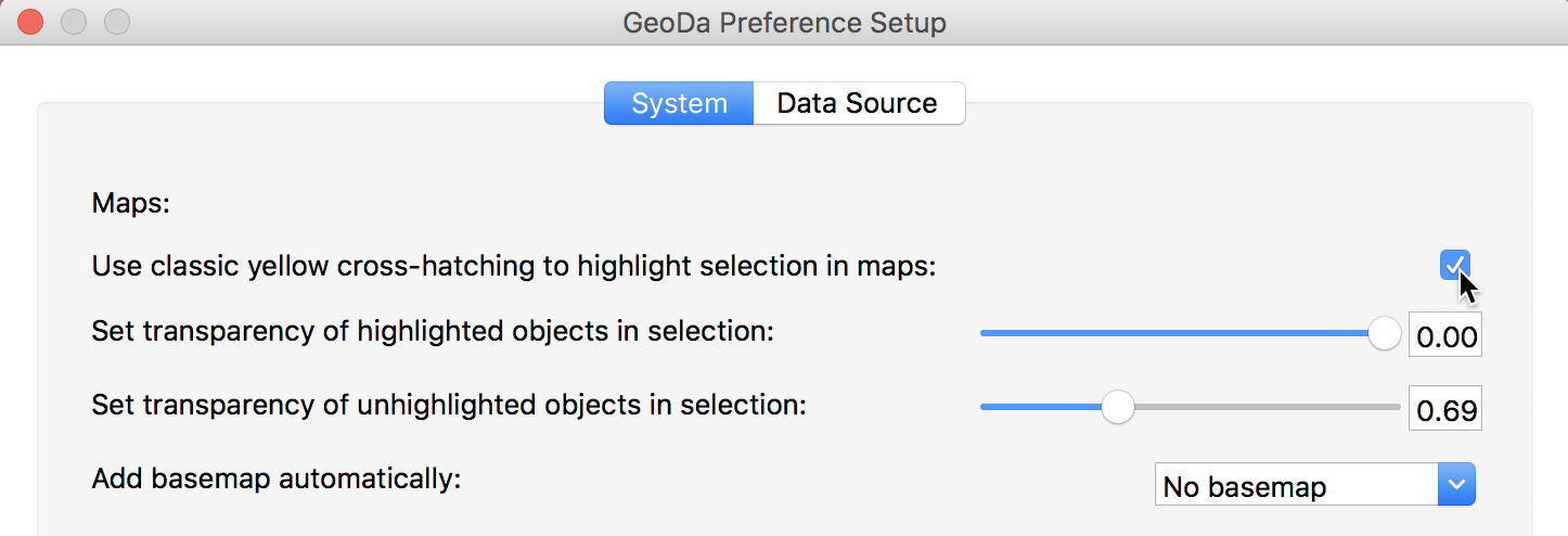
Figure 1: GeoDa selection preferences
Finally, we add a base map, using the ESRI > WorldStreetMap option. The transparency may need some adjustment to make the points easier to see (use Change Map Transparency from the base map icon options menu). The final result is as in Figure 2.
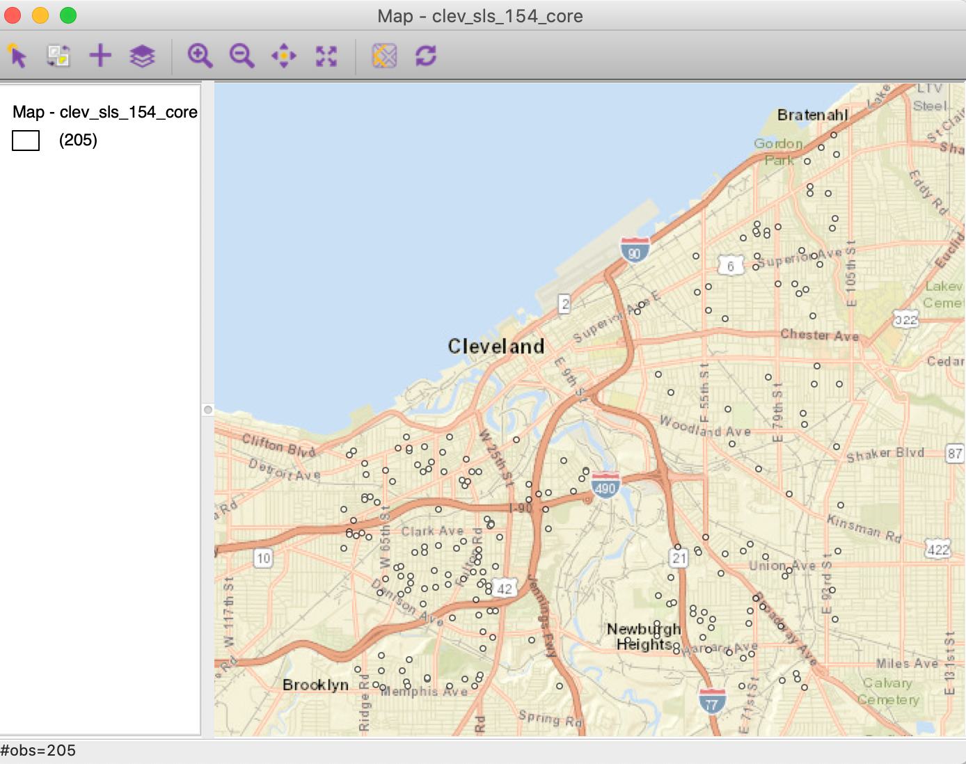
Figure 2: Cleveland home sales base map
Distance-Band Weights
Concepts
Distance metrics
The core input into the determination of a neighbor relation for distance-based spatial weights is a formal measure of distance, or a distance metric. The most familiar case is the Euclidean or straight line distance, \(d_{ij}\), as the crow flies: \[\begin{equation*} d_{ij} = \sqrt{(x_{i} - x_{j})^{2} + (y_{i} - y_{j})^{2}}, \end{equation*}\] for two points \(i\) and \(j\), with respective coordinates \((x_{i},y_{i})\) and \((x_{j},y_{j})\).
An alternative to Euclidean distance that is sometimes preferred because it lessens the influence of outliers is the so-called Manhattan distance. This metric only considers movement along the east-west and north-south directions, as in the city blocks of Manhattan. Formally, this metric is: \[\begin{equation*} d_{ij}^m = | x_{i} - x_{j}| + | y_{i} - y_{j}|. \end{equation*}\]
Great circle distance
Euclidean inter-point distances are only meaningful when the coordinates are recorded on a plane, i.e., for projected points.
In practice, one often works with unprojected points, expressed as degrees of latitude and longitude, in which case using a straight line distance measure is inappropriate, since it ignores the curvature of the earth. This is especially the case for longer distances, such as from the East Coast to the West Coast in the U.S.
The proper distance measure in this case is the so-called arc distance or great circle distance. This takes the latitude and longitude in decimal degrees as input into a conversion formula.2 Decimal degrees are obtained from the degree-minute-second value as degrees + minutes/60 + seconds/3600.
The latitude and longitude in
decimal degrees are converted into radians as:
\[\begin{eqnarray*}
\mbox{Lat}_r &=& (\mbox{Lat}_d - 90) * \pi/180\\
\mbox{Lon}_r &=& \mbox{Lon}_d * \pi/180,
\end{eqnarray*}\]
where the subscripts \(d\) and \(r\) refer
respectively to decimal
degrees and radians, and \(\pi = 3.14159 \dots\).
With \(\Delta \mbox{Lon} = \mbox{Lon}_{r(j)} - \mbox{Lon}_{r(i)}\), the
expression for the arc distance is:
\[\begin{eqnarray*}
d_{ij} &=& \mbox{R} * \arccos [ \cos ( \Delta \mbox{Lon} )
* \sin \mbox{Lat}_{r(i)} *
\sin \mbox{Lat}_{r(j)} )\\
&&+ \cos \mbox{Lat}_{r(i)} * \cos \mbox{Lat}_{r(j)} ],
\end{eqnarray*}\]
or, equivalently:
\[\begin{eqnarray*}
d_{ij} &=& \mbox{R} * \arccos [ \cos ( \Delta \mbox{Lon} )
* \cos \mbox{Lat}_{r(i)} *
\cos \mbox{Lat}_{r(j)} )\\
&&+ \sin \mbox{Lat}_{r(i)} * \sin \mbox{Lat}_{r(j)} ],
\end{eqnarray*}\]
where R is the radius of the earth. In GeoDa, the arc distance is obtained in
miles with R = 3959, and in kilometers with R = 6371.
These calculated distance values are only approximate, since the radius of the earth is taken at the equator. A more precise measure would take into account the actual latitude at which the distance is measured. In addition, the earth’s shape is much more complex than a sphere, but the approximation serves our purposes.
Distance-band weights
The most straightforward spatial weights matrix constructed from a distance measure is obtained when \(i\) and \(j\) are considered neighbors whenever \(j\) falls within a critical distance band from \(i\). More precisely, \(w_{ij} = 1\) when \(d_{ij} \le \delta\), and \(w_{ij} = 0\) otherwise, where \(\delta\) is a preset critical distance cutoff.
In order to avoid isolates (islands) that would result from too stringent a critical distance, the distance must be chosen such that each location has at least one neighbor. Such a distance conforms to a max-min criterion, i.e., it is the largest of the nearest neighbor distances.3
In practice, the max-min criterion often leads to too many neighbors for locations that are somewhat clustered, since the critical distance is determined by the points that are furthest apart. This problem frequently occurs when the density of the points is uneven across the data set, such as when some of the points are clustered and others more spread out. We revisit this problem in the illustrations below.
Further technical details on distance-based spatial weights are contained Chapters 3 and 4 of Anselin and Rey (2014),
although the software illustrations are for an earlier GeoDa interface design.
Creating distance-band weights
As we did for contiguity weights, we invoke the Weights Manager and click on the Create button to get the process started. In the Weights File Creation interface, after specifying the ID variable (unique_id), we focus on the right-most button, Distance Weight. This generates the dialog for the two types of distance metrics, either computed from Geometric centroids (the default), or computed as multi-attribute distance for a series of Variables. For now, we focus on the use of coordinates.
In addition to the two types of variables, there are three methods: Distance band, K-Nearest neighbors, and Kernel. In this Chapter, we focus on the first two options.
Distance band weights are initiated by selecting the Distance band button in the interface, as shown in Figure 3. This is also the default option. The max-min distance (largest nearest neighbor distance) is given in the box next to Specify bandwidth, in units appropriate for the projection used. In our example, the distance of 3598 is expressed in feet.
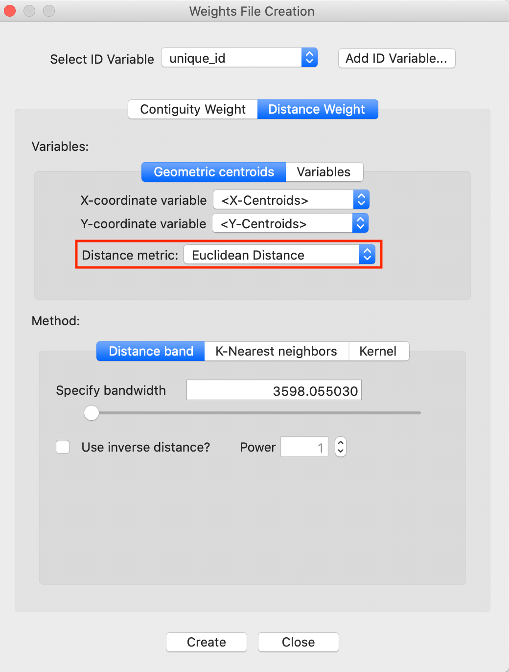
Figure 3: Distance band default setting
Note the importance of the Distance metric, highlighted in Figure 3. Since our data is projected, it is appropriate to use Euclidean (straight line) distance. However, many data sets come in simple latitude-longitude, for which a great circle distance (or arc distance) must be used instead. We will revisit this shortly.
The critical distance for our point data is about 3598 feet, or roughly 0.7 miles. This is the distance that ensures that each point (house sale) has at least one neighbor. After clicking on the Create button and specifying a file name, such as clev_sls_154_cored_d (the GWT file extension is added automatically), the new weights and their summary properties are listed in the Weights Manager, as in Figure 4.
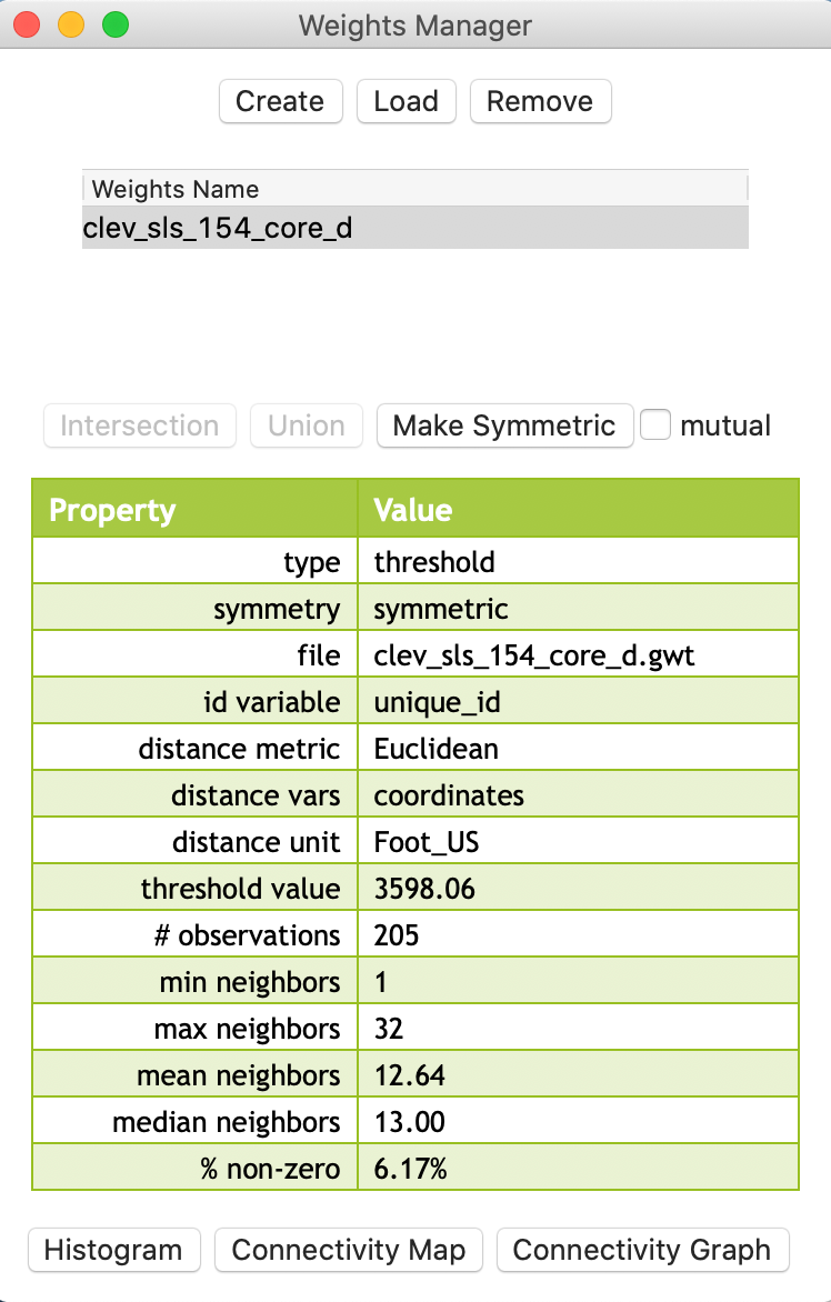
Figure 4: Distance weights in weight manager
An important aspect of the metadata in the weights manager is the threshold value. This information will also be included in any Project File that is saved. This is the only reliable way to remember which distance cut-off was used for the distance bands in the weights.
GWT file
Distance-based weights are saved in files with a GWT file extension. This format,
illustrated in Figure 5, is slightly different from the GAL format used for
contiguity weights. It was first introduced in SpaceStat in 1995, and later adopted by
R spdep and other software packages. The header line is the same as for GAL files,
but each pair of neighbors is listed, with the ID of the observation, the ID of its neighbor and the distance
that separates them. This distance is currently only included for informational purposes, since
GeoDa does not use the actual distance value in any statistical operations
(spatial weights are also row-standardized by default).
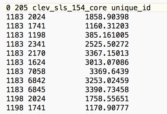
Figure 5: GWT file contents
Weights characteristics
In the same way as for contiguity weights, we can assess the characteristics of distance-based weights by means of the Connectivity Histogram, the Connectivity Map, and the Connectivity Graph, available through the buttons at the bottom of the weights manager.
Connectivity histogram
The shape of the connectivity histogram for distance-band weights is typically very different from that of contiguity-based weights (as in any histogram, we can bring up descriptive statistics through the View > Display Statistics option). As illustrated in Figure 6, we see a much larger range in the number of neighbors, as well as extremes, with some observations having only one neighbor, and others having 32.
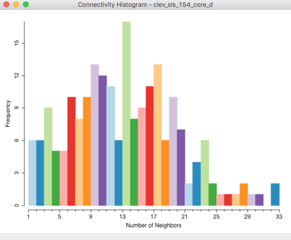
Figure 6: Connectivity histogram – default distance band
We also observe the descriptive statistics in the property list shown in Figure 4. Compared to contiguity weights, the mean (12.64) and median (13.00) number of neighbors are much higher, and the matrix is also much denser (% non-zero = 6.17%).
The range in the number of neighbors is directly related to the spatial distribution of the points. Locations that are somewhat isolated will drive the determination of the largest nearest neighbor cut-off point (their nearest neighbor distance will be large), whereas dense clusters of locations will encompass many neighbors using this large cut-off distance.
Finding the locations separated by the max-min distance
In the Cleveland example, we can examine the GWT file to find the observation pair separated by the critical distance cut-off (3598). As shown in Figure 7, this turns out to be the observation pair with unique_id 11359 and 10014.
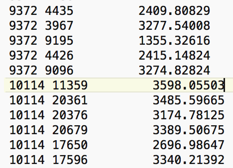
Figure 7: Cut off distance in GWT file
In the Table, a selection of observation with unique_id 11359 will result in the corresponding location to be highlighted in red in the point map, as indicated with the pointer in Figure 8.4
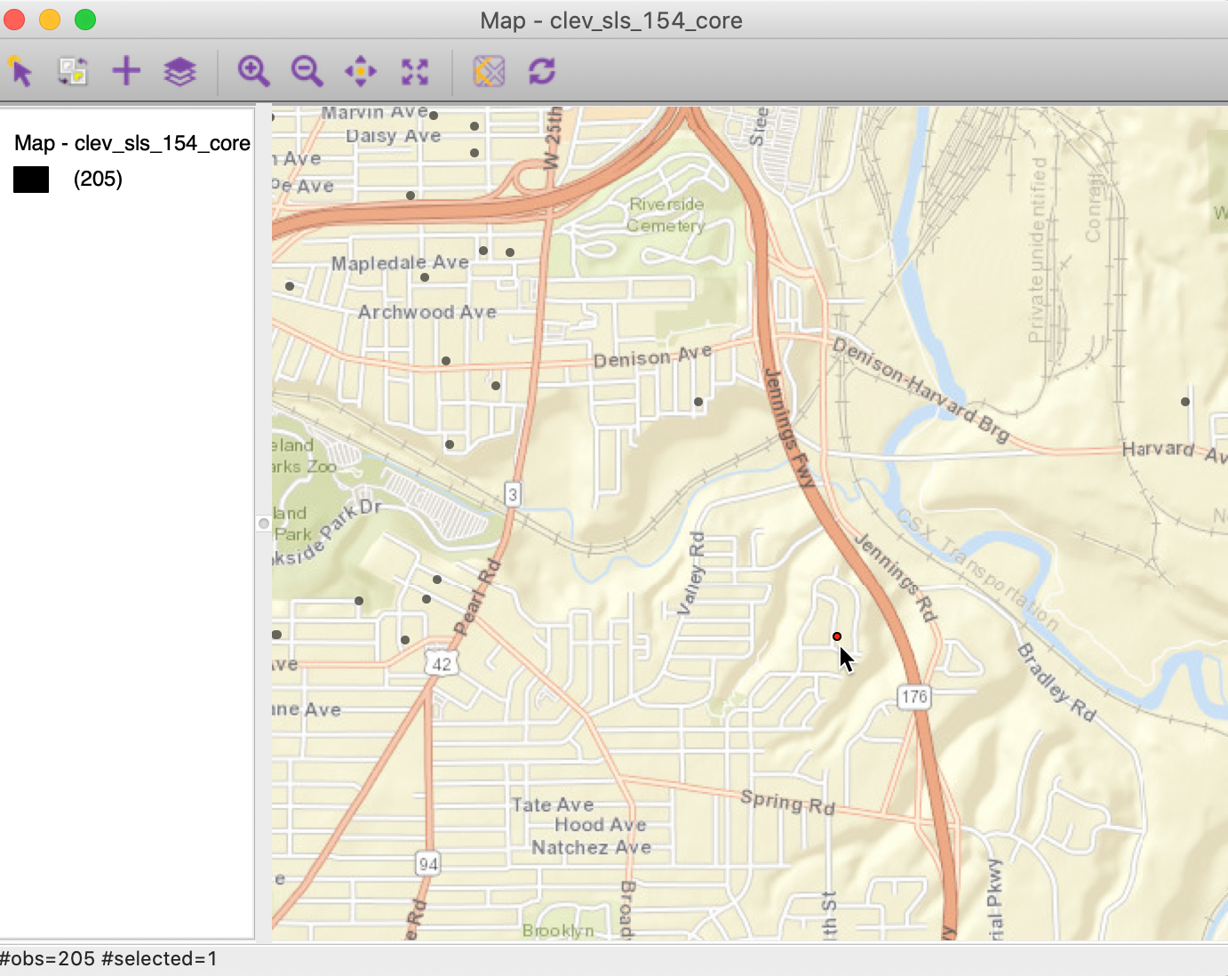
Figure 8: Selected max-min location
We now open the Connectivity Map, shown in Figure 9. Since this map is a regular themeless map, we can customize it in the same way as the original point map by adding a base layer (ESRI > WorldStreetMap). As the current selection, the point with unique_id 11359 will be highlighted in red. With the pointer hovering over the selected point, the status bar of the connectivity map will show the selected observation (11359) and its one neighbor (10114) highlighted as in Figure 9.
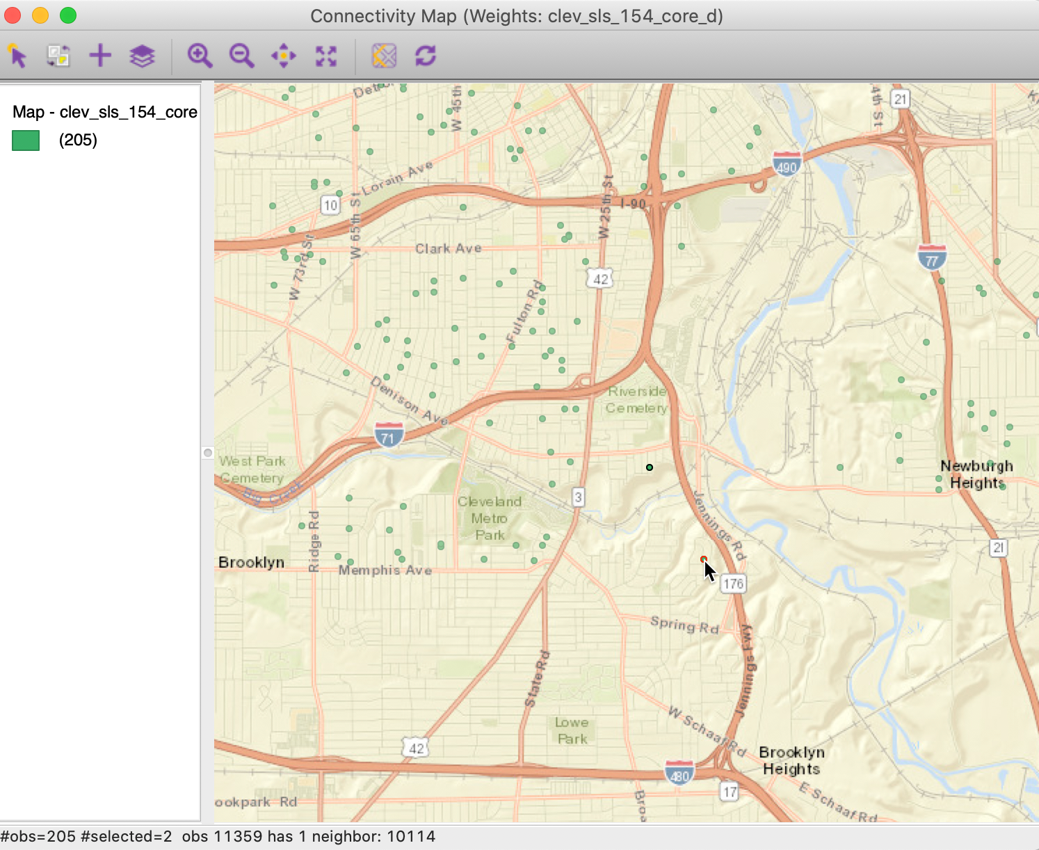
Figure 9: Selected max-min location in Connectivity Map
Finding the most connected observations
We can examine the effect of the large distance cut-off on more densely distributed point locations. For example, selecting the right-most bar in the Connectivity Histogram will highlight the two most connected observations in the map. The connectivity histogram shows that these have 32 neighbors. The two points are highlighted in red in the map in Figure 10.
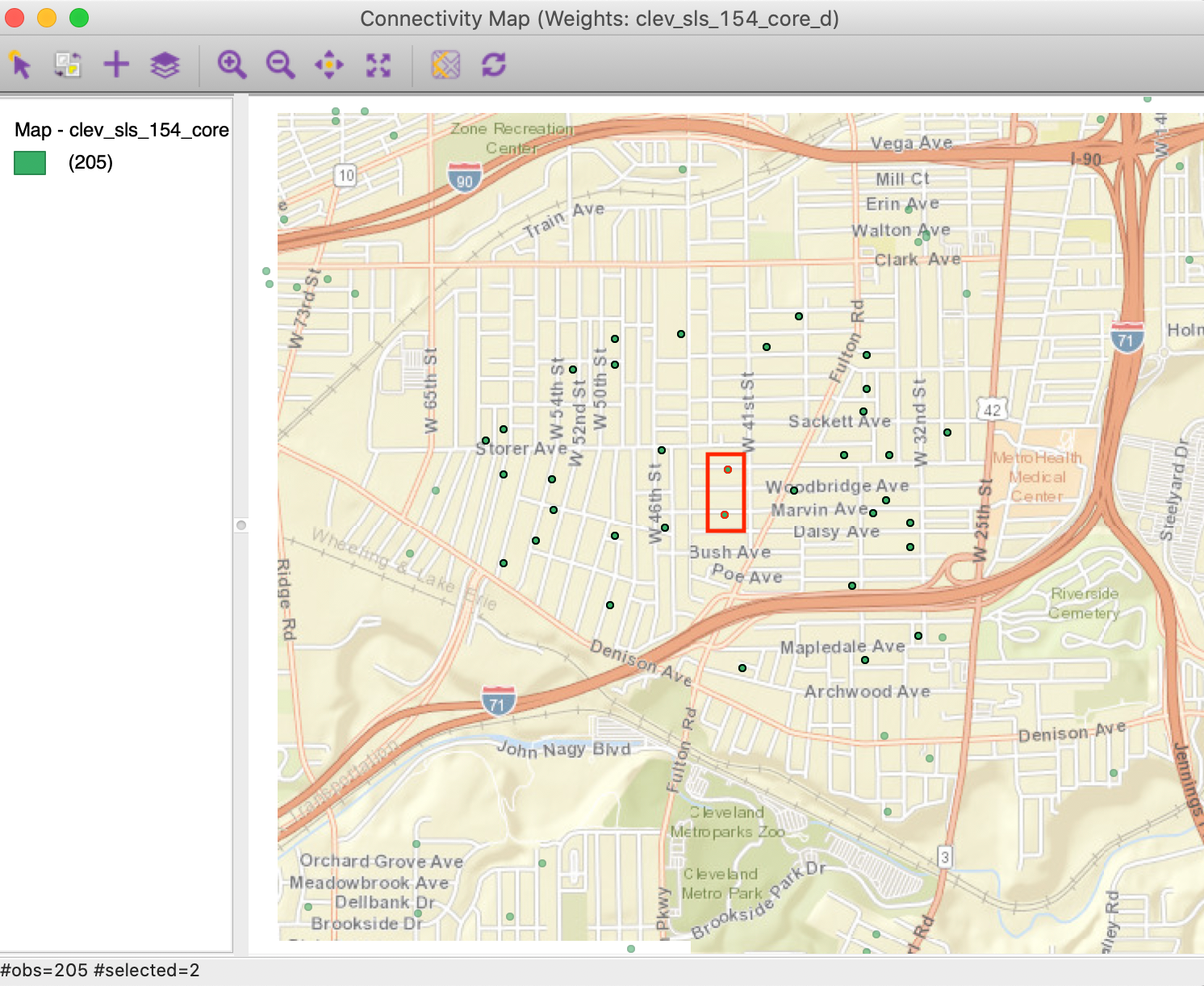
Figure 10: Most connected observations
As expected, the two points in question are in the center of a dense cluster of sales transactions. Through linking, they are also selected in the Connectivity Map. We can find their unique_id values from the table (Move Selected to Top). For example, for the observation with unique_id=19785, we see in the connectivity map that this point has 32 neighbors, highlighted as black circles in Figure 11.
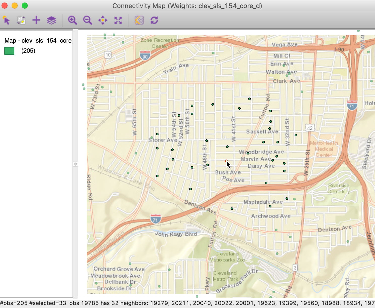
Figure 11: Most connected observations in connectivity map
The unequal distribution of the neighbor cardinality in distance-band weights is often an undesirable feature. Therefore, when the spatial distribution of the points is highly uneven, distance-band weights should be avoided, since they could provide misleading impressions of (local) spatial autocorrelation. We examine some alternatives below.
Connectivity graph
The properties of the distance band weights can be further investigated by means of the Connectivity Graph. As before, this is invoked through the right-most button at the bottom of the weights manager.
The pattern shown in Figure 12 highlights how the connectivity divides the points into two interconnected subgraphs and two pairs of points. The different sub-networks have no connection between them. We can also identify a few locations that are only connected with their nearest neighbor, but not with any other locations.
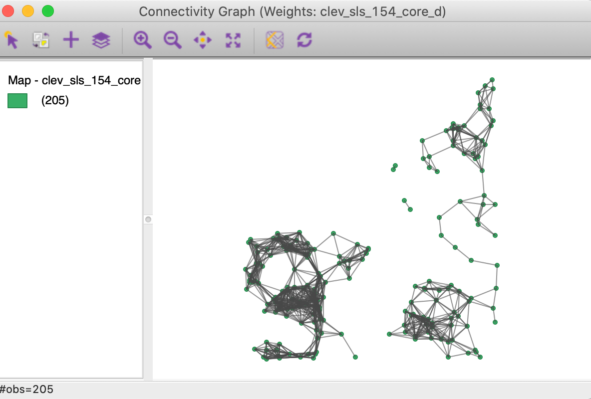
Figure 12: Connectivity graph for distance band weights
Isolates
So far, we have used the default cut-off value for the distance band. However, the dialog is flexible enough that we can type in any value for the cut-off, or use the moveable button to drag to any value larger than the minimum. Sometimes, theoretical or policy considerations suggest a specific value for the cut-off that may be smaller than the max-min distance.
For example, say we want to use 1500 ft. as the distance band. After typing in that value in the dialog, shown in Figure 13, we proceed in the usual way to create the weights.
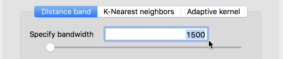
Figure 13: Distance band set to 1500
However, a warning appears, as in Figure 14, pointing out that the specified cut-off value is smaller than the max-min distance needed to ensure that each observation has at least one neighbor.
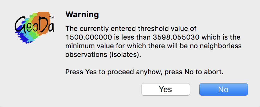
Figure 14: Isolates warning message
If we proceed and click Yes in the dialog, the properties of the new weights are listed in the weight manager, as in Figure 15. This includes the threshold value of 1500, but also shows a much sparser distribution, with %non-zero as 1.48% (compared to 6.17% for the default). In addition, the minimum number of neighbors is indicated to be 0. In other words, one of more observations do not have neighbors when a distance band of 1500 feet is used.
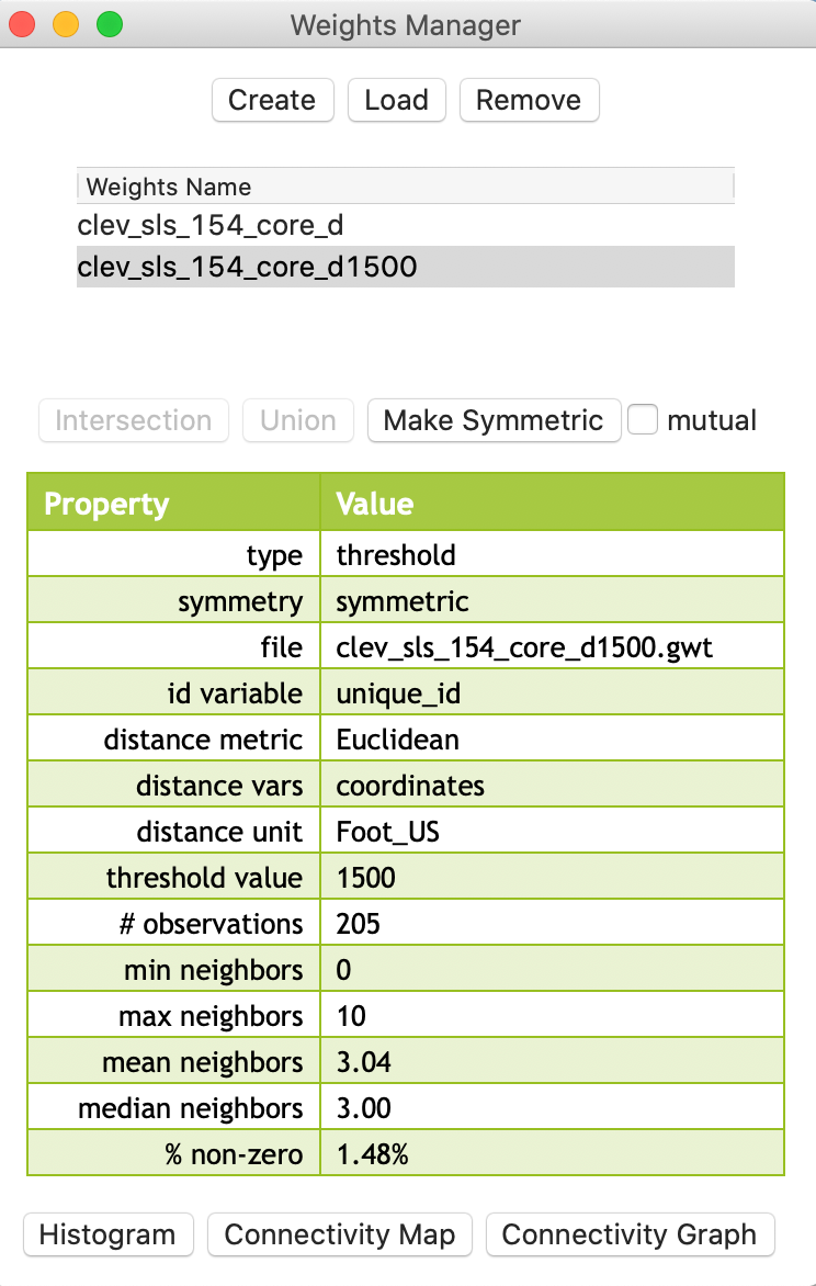
Figure 15: Distance threshold 1500 properties
Isolates in the connectivity histogram
The connectivity histogram shown in Figure 16 reveals a much more compact distribution of neighbor cardinality (compared to the max-min criterion). However, it also suggests the existence of 24 isolates, i.e., observations without neighbors. This is given as a warning at the top of the histogram (highlighted in red in the figure), but can also be seen by hovering the pointer over the first bin. The status bar reveals that the range 0-1 has 24 observations.
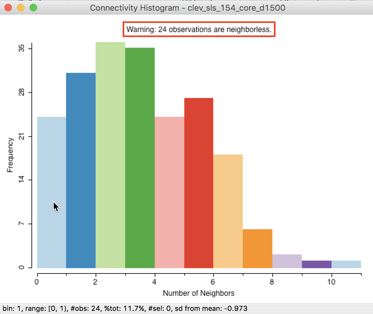
Figure 16: Isolates in connectivity histogram
When selecting the left-most bar in the histogram, we can locate the isolated points in the map, as in Figure 17 (the red points are the selected observations). The selected points are indeed locations that are far away from the other points (more than 1500 feet).
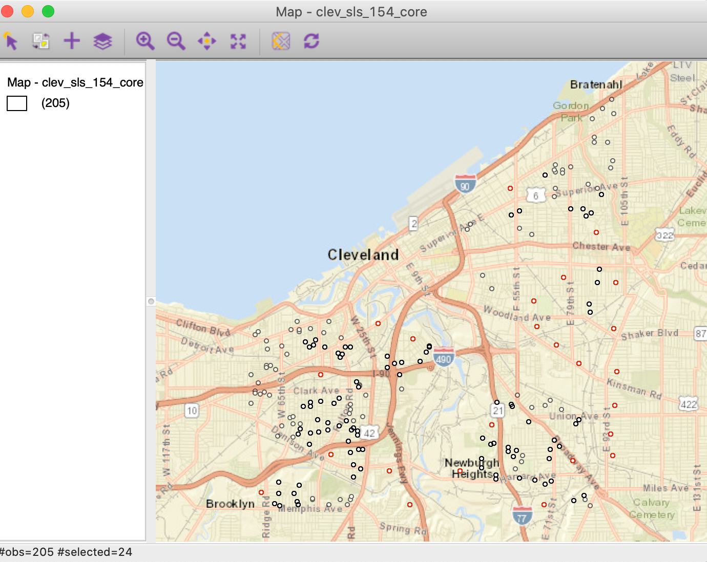
Figure 17: Isolates in point map
Isolates in the connectivity graph
The most dramatic visualization of the isolates is given by the Connectivity Graph, shown in Figure 18. The 24 points without an edge in the graph to another point are easily identified.
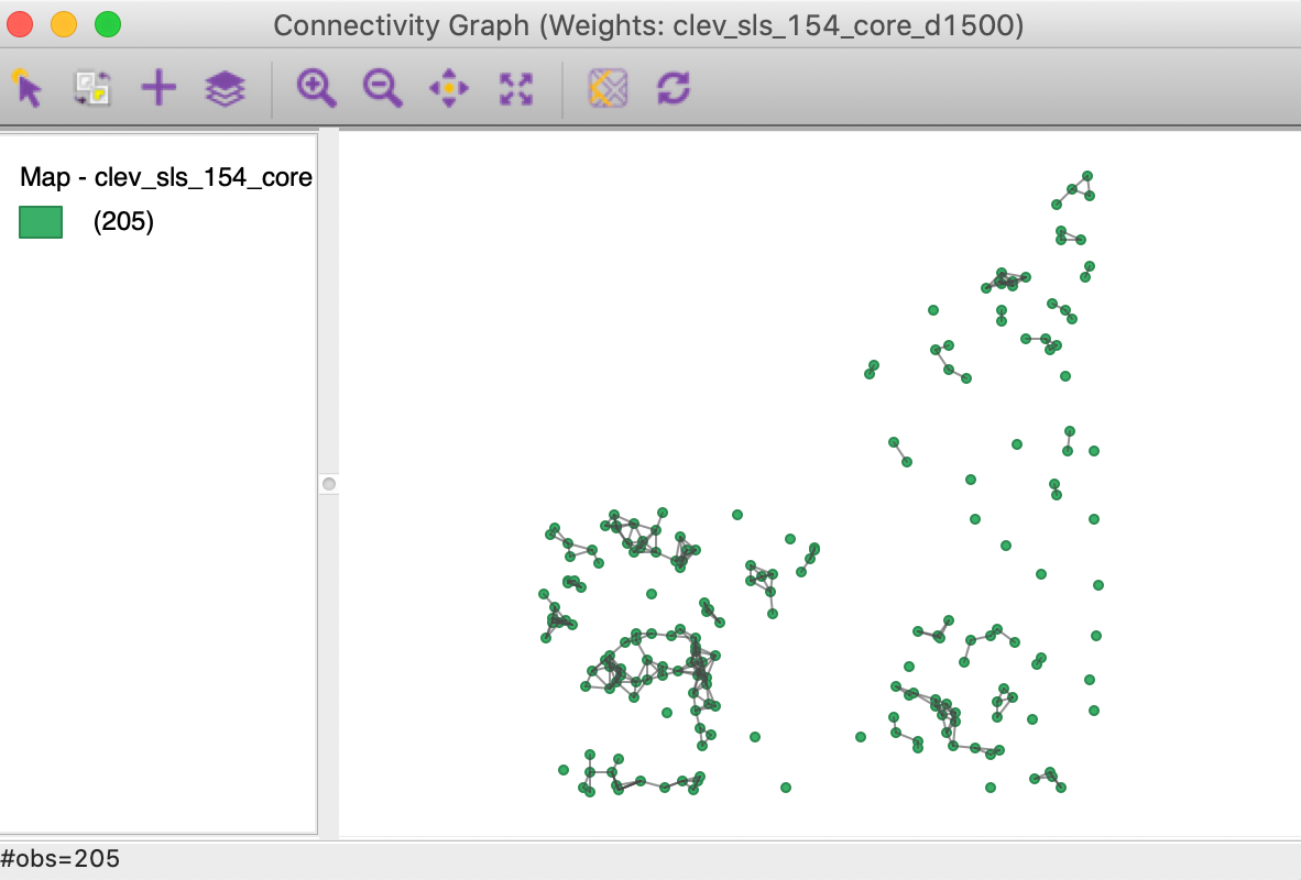
Figure 18: Connectivity graph for distance band set to 1500
How to deal with isolates
Since the isolated observations are not included in the spatial weights (in effect, the corresponding row in the spatial weights matrix consists of zeros), they are not accounted for in any spatial analysis, such as tests for spatial autocorrelation, or spatial regression. For all practical purposes, they should be removed from such analysis. However, they are fine to be included in a traditional non-spatial data analysis.
Ignoring isolates may cause problems in the calculation of spatially lagged variables, or measures of local spatial autocorrelation. By construction, the spatially lagged variable will be zero, which may suggest spurious correlations.
Alternatives where isolates are avoided by design are the K-nearest neighbor weights and contiguity weights constructed from the Thiessen polygons for the points. They are discussed next.
K-Nearest Neighbor Weights
Concept
As mentioned, an alternative type of distance-based spatial weights that avoids the problem of isolates are \(k\)-nearest neighbor weights. In contrast to the distance band, this is not a symmetric relation. The fact that B is the nearest neighbor to A does not imply that A is the nearest neighbor to B. There may be another point C that is actually closer to B than A. This asymmetry can cause problems in analyses that depend on the instrinsic symmetry of the weights (e.g., some algorithms to estimate spatial regression models). We revisit this below.
A potential issue with \(k\)-nearest neighbor weights is the
occurrence of ties, i.e., when more than one location \(j\) has the
same distance from \(i\). A number of solutions exist to break
the tie, from randomly selecting one of the \(k\)-th order
neighbors, to including all of them. In GeoDa,
random selection is implemented.
Creating KNN weights
KNN weights are computed by selecting the corresponding button in Distance Weight panel of the Weights File Creation interface. The value for the Number of neighbors (k) is specified in the box shown in Figure 19. The default is 4, but in our example, we have selected 6.
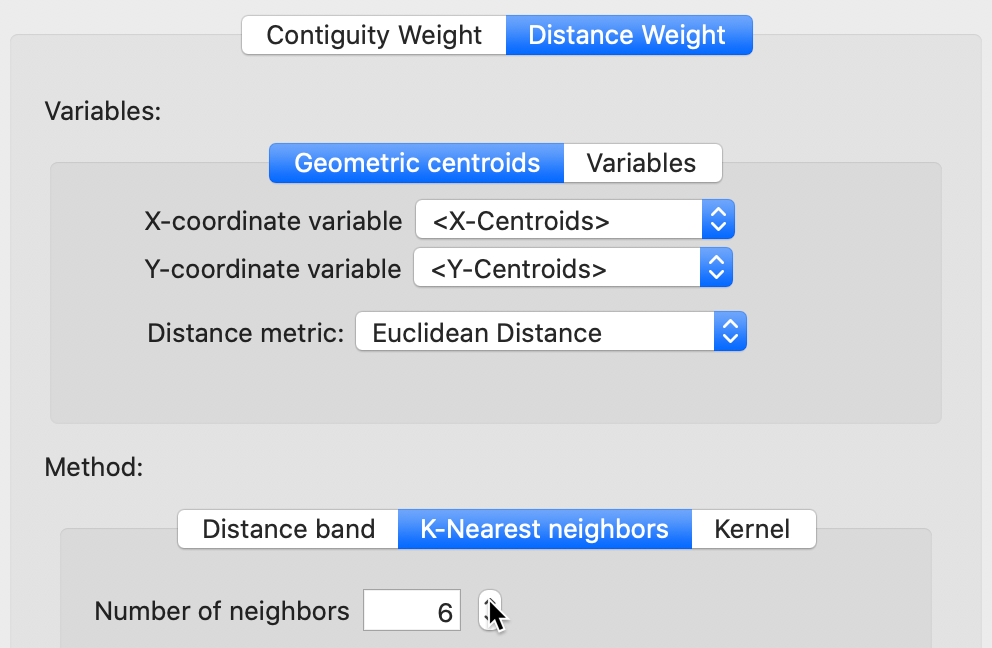
Figure 19: K nearest neighbor weights
The weights (saved as the file clev_sls_154_core_k6) are added to the collection contained in the weights manager. In addition, all its properties are listed, as illustrated in Figure 20. Note that the properties now include the number of neighbors (instead of the distance threshold value, as is the case of distance-band weights). Also, symmetry is set to asymmetric, which is a fundamental difference with distance-band weights.
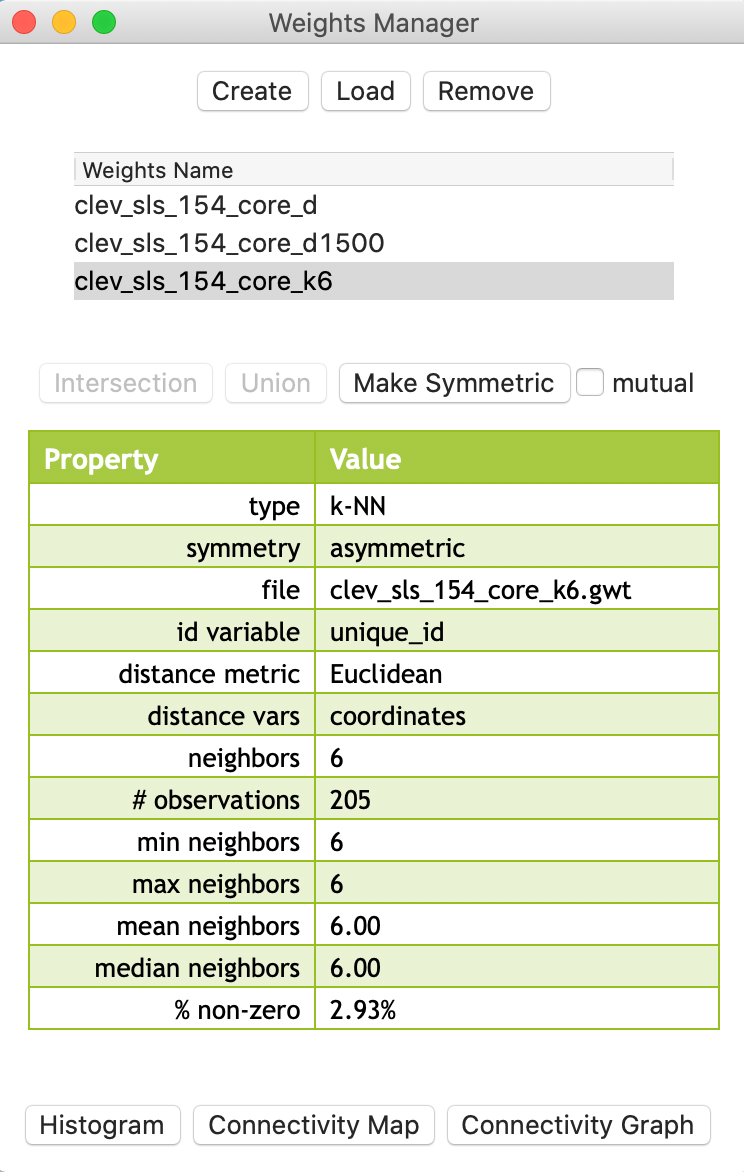
Figure 20: KNN-6 weights properties
Properties of KNN weights
The properties listed in the weights manager also include the mean and median number of neighbors, which of course equal k (in our example, they equal 6). The resulting weights matrix is much sparser than the distance-band weights (2.93% compared to 6.17%).
Again, we can also use the connectivity histogram and the connectivity map to inspect the neighbor characteristics of the observations. However, in this case, the histogram doesn’t make much sense, since all observations have the same number of neighbors (by construction), as shown in Figure 21.
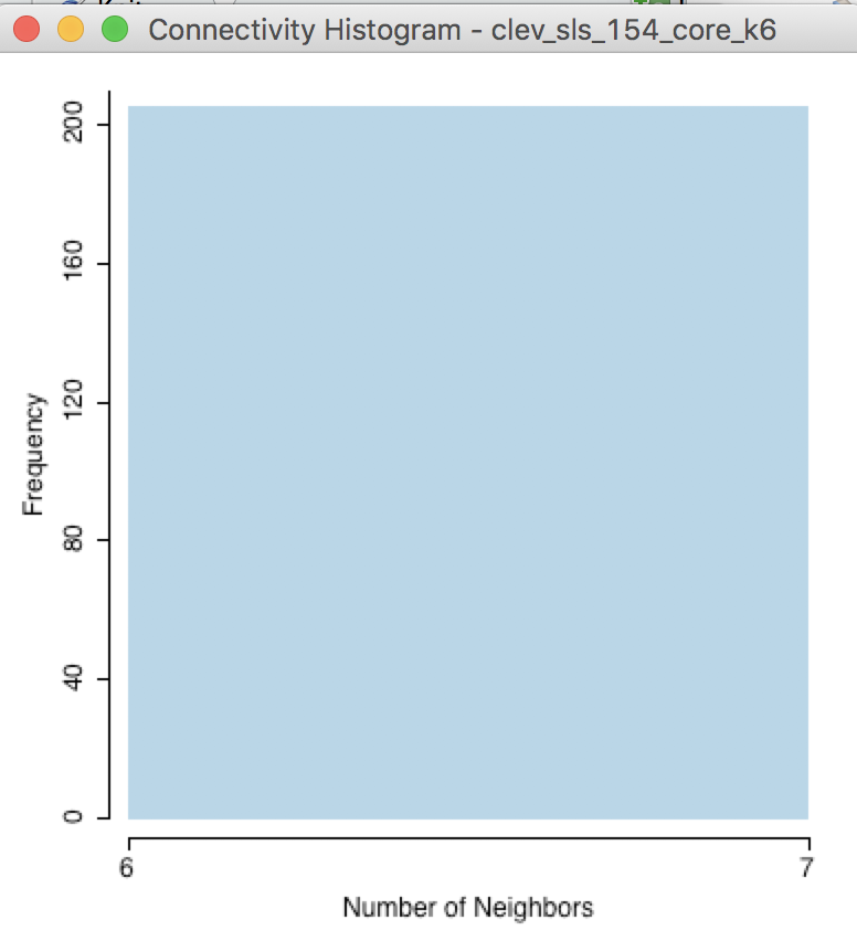
Figure 21: KNN-6 connectivity histogram
In contrast, the connectivity graph, shown in Figure 22, clearly demonstrates how each point is connected to six other points. In our example, this yields a fully connected graph instead of the collection of sub-graphs for the distance band.
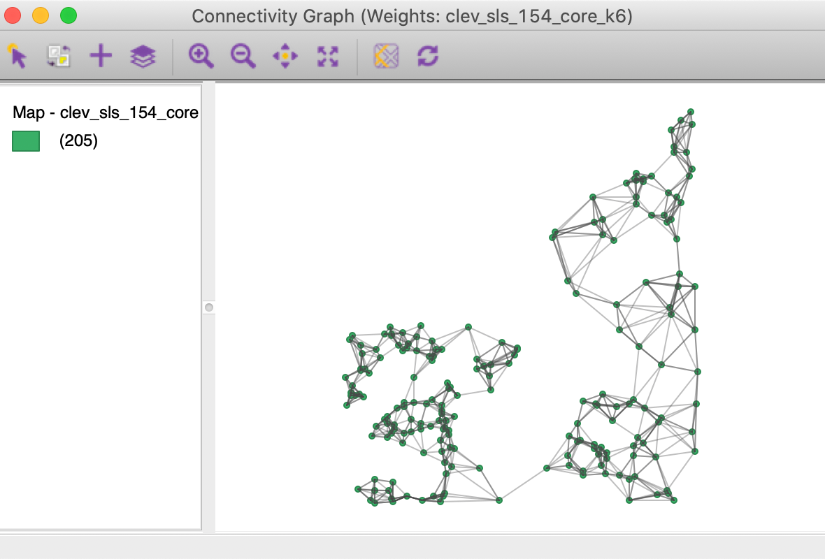
Figure 22: KNN-6 connectivity graph
KNN and distance
One drawback of the k-nearest neighbor approach is that it ignores the distances involved. The first k neighbors are selected, irrespective of how near or how far they may be. This suggests a notion of distance decay that is not absolute, but relative, in the sense of intervening opportunities (e.g., you consider the two closest grocery stores, irrespective of how far they may be).
This can be illustrated in the Cleveland example by selecting an observation in the western part of the map, where the house sales are densely distributed in space. With the pointer on one of the circles in the connectivity map, we distinguish six selected observations close by, as shown in Figure 23.
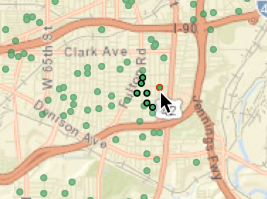
Figure 23: KNN-6 close neighbors
By contrast, if we move to the eastern part of the data set and similarly select an observation with the pointer, the six neighbors are much farther apart, as in Figure 24.
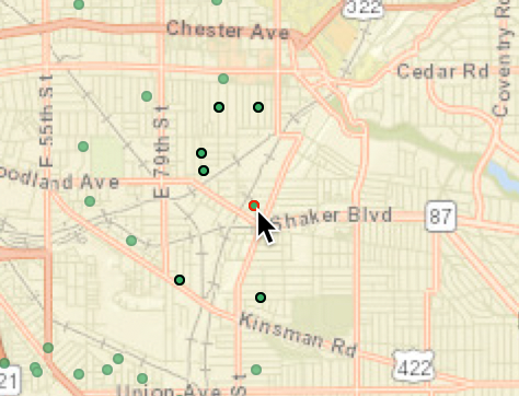
Figure 24: KNN-6 far neighbors
This relative distance effect should be kept in mind before mechanically applying a k-nearest neighbor criterion.
Making KNN weights symmetric
We pointed out that the knn weights are not guaranteed to be symmetric.
One solution is to replace the original weights matrix \(\mathbf{W}\) by
\((\mathbf{W + W'})/2\), which is symmetric by construction.5 Each
new weight is then \((w_{ij} + w_{ji})/2\). Another approach is to set both
\(w_{ij}\) and \(w_{ji}\) to one whenever
either one is non-zero. This is referred to as mutual symmetry. Since
GeoDa doesn’t actually use the weights as such, the two approaches will yield the same result.
The outcome is a GAL format weights matrix that contains the mutual contiguities.
This transformation is invoked from the Weights Manager, by selecting the Make Symmetric button, as shown in Figure 25. Note how the transformation changed the average number of neighbors to 7.34, with a range from 6 to 12. As a result, the weights matrix is also slightly denser.
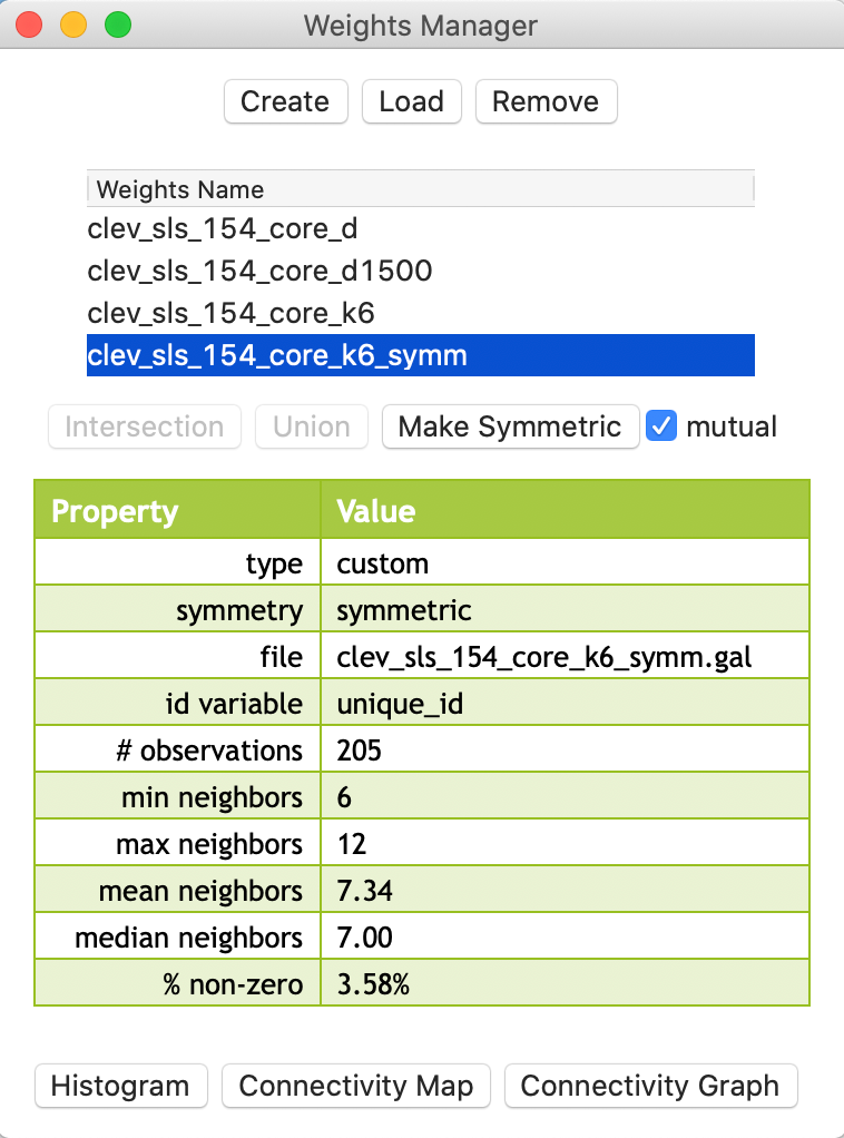
Figure 25: KNN-6 weights transformed to symmetry
Generalizing the Concept of Contiguity
In GeoDa, the concept of contiguity can be generalized to point layers by converting
the latter to a tessellation, specifically Thiessen polygons. Queen or rook contiguity
weights can then be created for the polygons, in the usual way.
Similarly, the concepts of distance-band weights and k-nearest neighbor weights can be generalized to polygon layers. The layers are represented by their central points and the standard distance computations are applied.
These operations can be carried out explicitly, by actually creating a separate Thiessen polygon
layer or centroid point layer, and subsequently loading it into GeoDa as a new project. However,
this is not necessary, since
the computations happen under the hood. In this way, it is possible
to create contiguity weights for points or distance weights for polygons directly
in the Weights File Creation dialog.
We briefly consider these options.
Contiguity-based weights for points
Thiessen polygons
An alternative solution to deal with the problem of the uneven distribution of neighbor cardinality for distance-band weights is to compute a measure of contiguity. This is accomplished by turning the points into Thiessen polygons. These are also referred to as Voronoi diagrams or Delaunay triangulations, discussed at length in Chapter 2 on data wrangling.6
To repeat, in general terms, a Thiessen polygon is a tessellation (a way to divide an area into regular subareas) that encloses all locations that are closer to the central point than to any other point. In economic geography, this is a (simplistic) notion of a market area, in the sense that all consumers in the polygon would patronize the seller located at the central point. The polygons are constructed by combining lines perpendicular at the midpoint of a line that connects a point to its nearest neighbors. From this, the most compact polygon is created.
Contiguity weights for Thiessen polygons
When selecting rook or queen contiguity in the Contiguity Weight panel of the weights file creation dialog, the Thiessen polygons are constructed in the background and the contiguity criteria applied to them. For example, for our Cleveland point data, we can create a queen contiguity weights file in the standard way (e.g., as clev_sls_154_core_q). The file name subsequently shows up in the weights manager list, as illustrated in Figure 26.
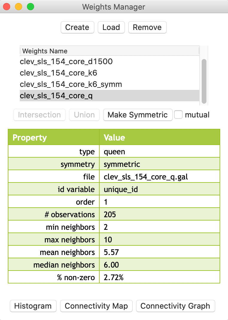
Figure 26: Queen contiguity for points
The descriptive statistics in the properties list as well as the associated connectivity histogram illustrate why this approach may be a useful alternative to distance-band or k-nearest neighbor weights. In Figure 27, the connectivity histogram is shown with the statistics displayed.
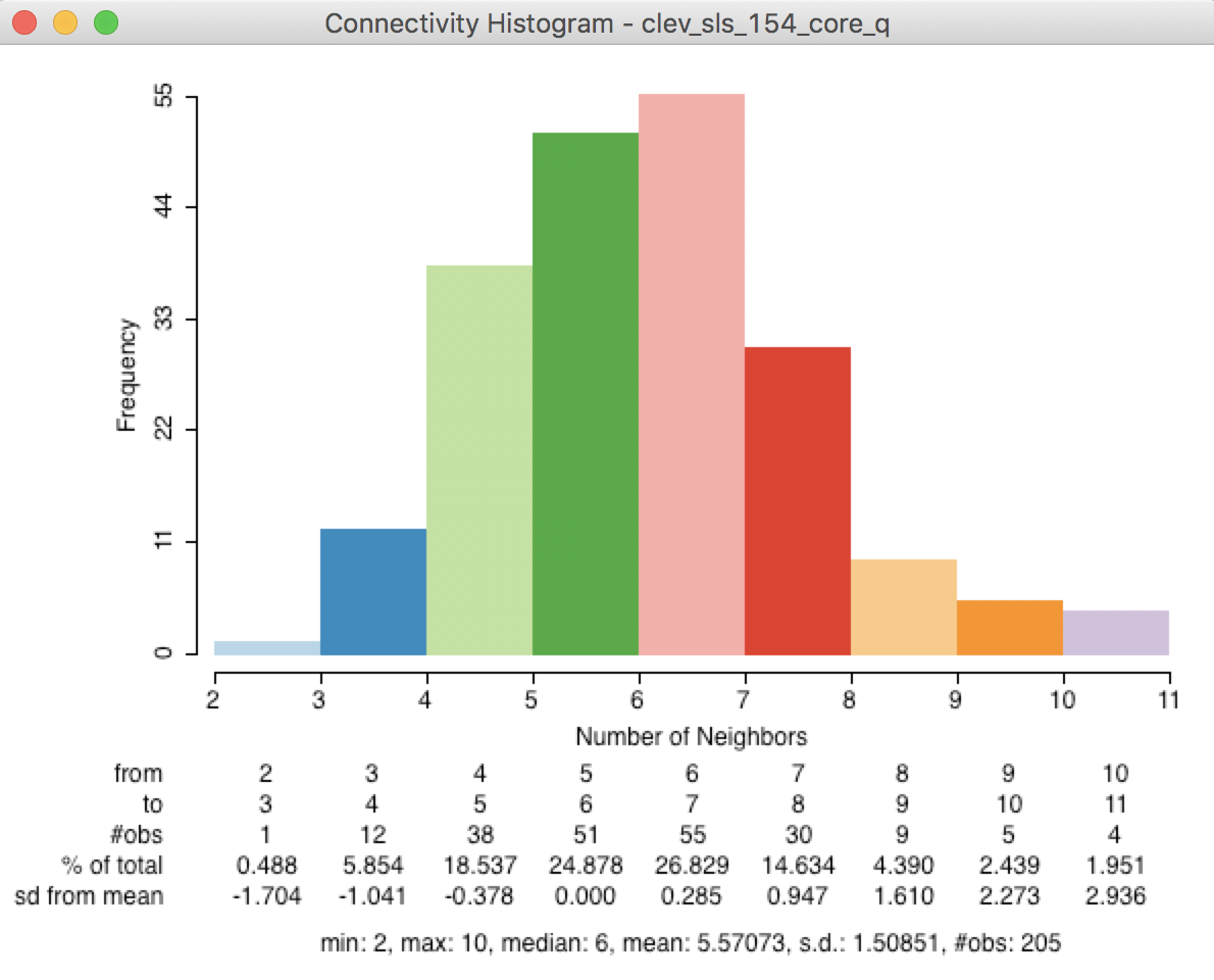
Figure 27: Points-based queen connectivity histogram
The histogram represents a much more symmetric and compact distribution of the neighbor cardinalities, very similar to the typical shape of the histogram for first order contiguity between polygons. The median number of neighbors is 6 and the average 5.6, with a limited spread around these values. In many instances where the point distribution is highly uneven, this approach provides a useful compromise between the distance-band and the k-nearest neighbors.
This is further illustrated by the connectivity graph for the queen contiguity, shown in Figure 28. The more balanced structure is reflected by the fully connected graph.
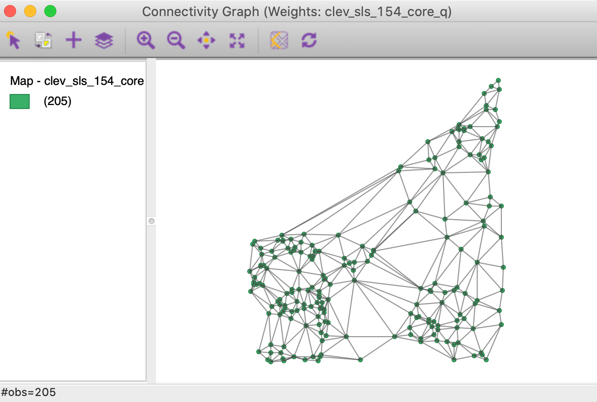
Figure 28: Connectivity graph for Thiessen queen contiguity
Before moving on to the next option, we save the weights information in a Project File (e.g., clev_sls_154_core.gda), using File > Save Project.
Distance-based weights for polygons
To illustrate the application of distance-based weights to polygons, the current project needs to be cleared and the U.S. county homicide file (natregimes) loaded, either as a shape file (natregimes.shp, without any weights information), or from a previously created project file (natregimes.gda, with the weights information).
As we have seen before, the polygon layer has a series of Shape Center options to add the centroid or mean center information to the data table, display those points on the map, or save them as a separate point layer.
In order to create distance weights for polygons, such as the U.S. counties, there is no need to explicitly save or display the centroids. The calculation happens in the background, whenever a distance option is chosen in the weights file creation dialog.
We proceed as usual, and select the Distance Weight option in the Weights File Creation dialog. With FIPSNO as the ID variable and Distance Band as the type of weight, the Specify bandwidth box will show a cut-off distance of 1.465776, as in Figure 29.
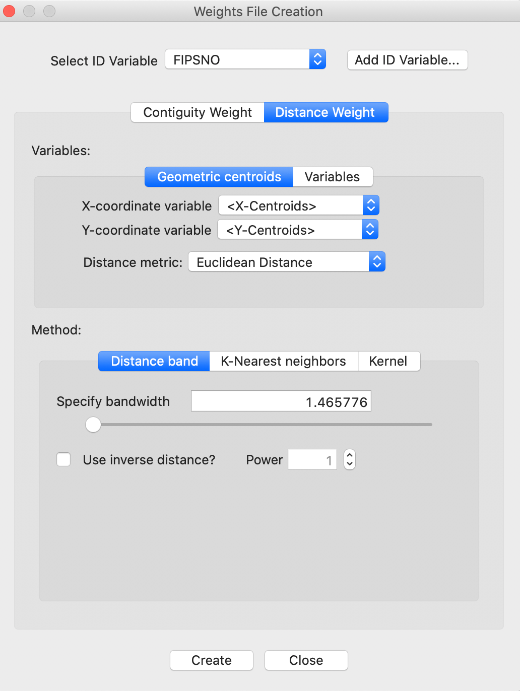
Figure 29: Distance cut-off in decimal degrees
Distance metric warning
The distance cut-off listed in the dialog is for the default setting of Euclidean Distance. For the U.S. counties, the geographic layer is provided in latitude-longitude decimal degrees (i.e., the coordinates are unprojected). Consequently, the use of a straight line Euclidean distance is inappropriate (at least, for larger distances).
If we proceed anyway, a warning will be generated that the coordinates specified are not projected, as shown in Figure 30. Note that this warning only works if the projection information is included with the geographical layer. In our example, the prj file specifies that the coordinates are in decimal degrees, hence the warning.
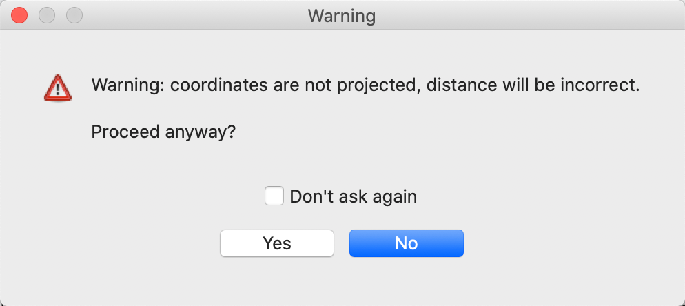
Figure 30: Warning for lack of projection with Euclidean distance
Great circle distance
Instead of using Euclidean distance, for decimal degrees the great circle distance or arc distance needs to be computed. So far, we have only considered Euclidean distance (the default), but the drop down list in the weights file creation interface also includes Arc Distance (in miles or in kilometers), as shown in Figure 31.
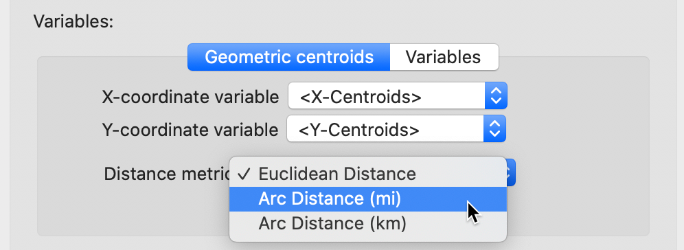
Figure 31: Arc distance option
With the Arc Distance (mi) option checked, the threshold distance becomes about 91 miles, as displayed in the dialog in Figure 32.
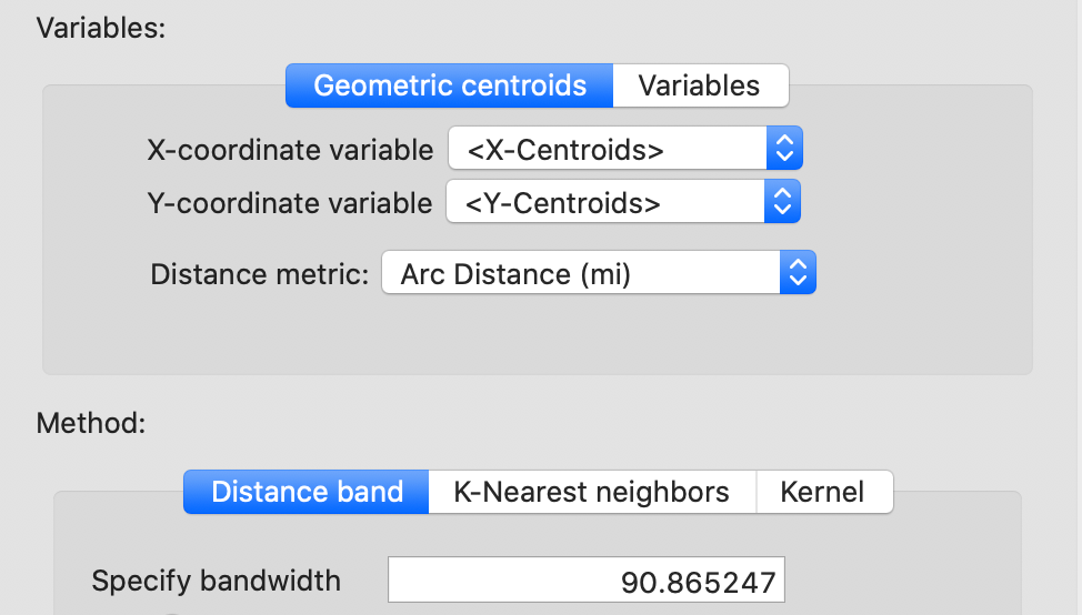
Figure 32: Arc distance cut-off distance
Proceeding in the usual fashion (and saving the weights as natregimes_darc) adds the properties of the new weights to the list in the weights manager, shown in Figure 33. Note how the properties include the distance unit (mile), the points for which the distances were computed (centroids), as well as the threshold value, with the distance metric now set to arc.
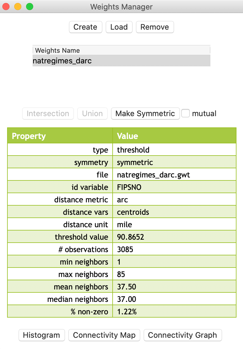
Figure 33: Arc distance weights properties
Distance weight properties for polygons
The resulting weights clearly demonstrate the pitfalls of using a distance-band when polygons (such as U.S. counties) are of widely varying sizes. This is similar to the issues encountered for points with different densities. From the property list in Figure 33, we see that the range of weights goes from 1 to 85. The connectivity histogram in Figure 34 illustrates the extensive range of neighbor cardinalities, very similar to what we obtained for the Cleveland data in Figure 6.
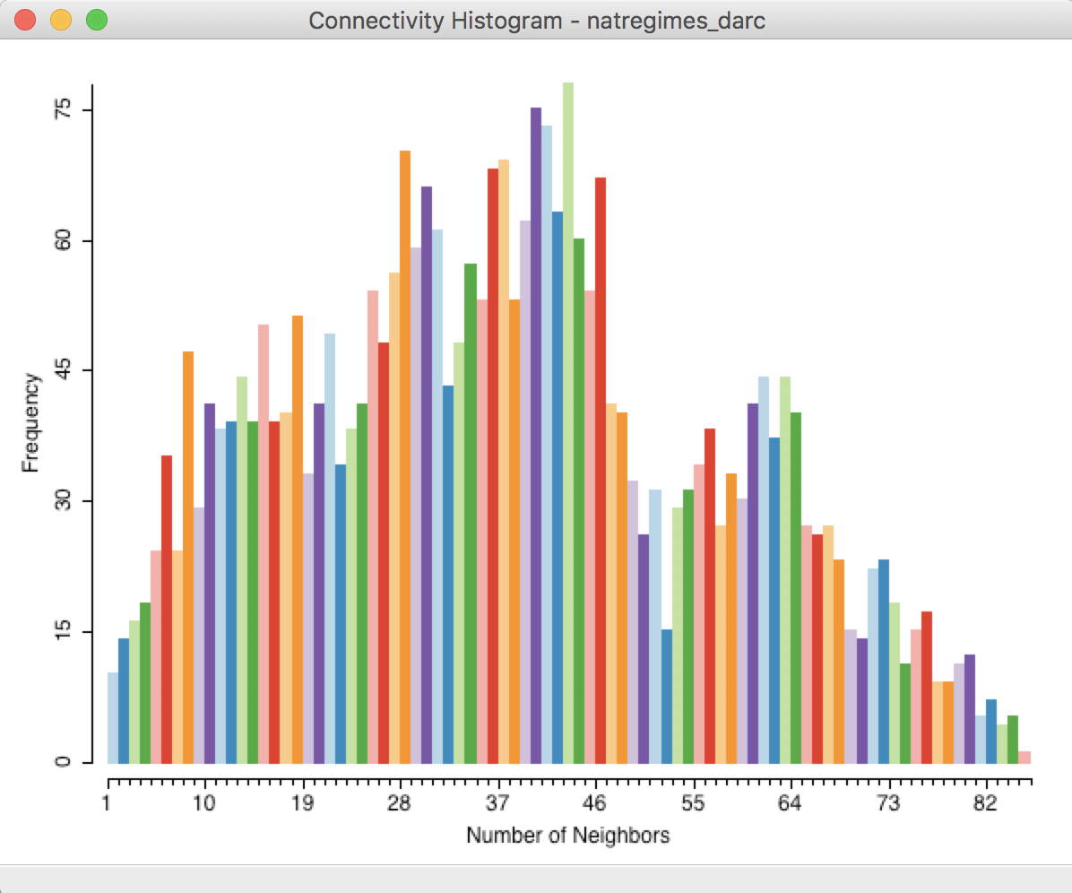
Figure 34: Connectivity histogram for arc distance weights
To illustrate the problem with the max-min cut-off distance, we search in the GWT file for the pair of observations that are a distance of 90.8652 apart. As shown in Figure 35, the cut-off distance is between the centroids of FIPSNO 32007 (Elko county, NV) and FIPSNO 16083 (Twin Falls, ID).
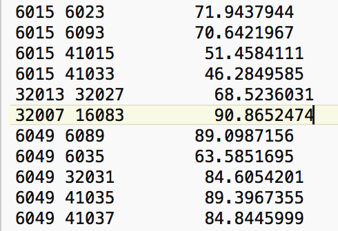
Figure 35: Max nearest neighbor distance for US counties
Selecting the observation with FIPSNO 32007 in the Table (using the Selection Tool) highlights this location in all the open views. With the Connectivity Map open, we find that there is only one neighbor for the selected/highlighted Elko county, NV (FIPS code 32007).
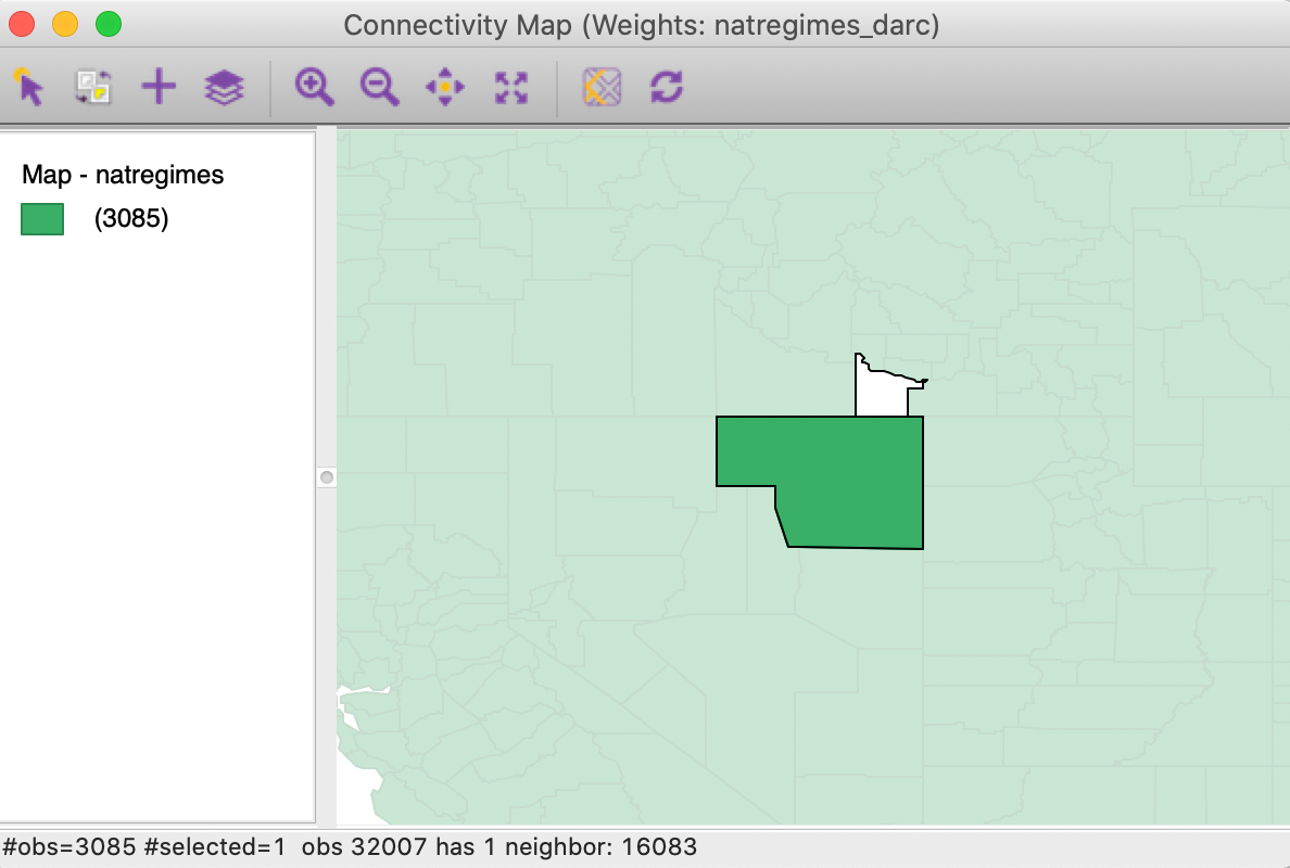
Figure 36: Elko county connectivity map
Clearly, the cut-off distance has major consequences for the smaller counties east of the Mississippi. As an illustration, we select the right-most bar in the connectivity histogram, the single location that has 85 neighbors. Checking the linked location in the table reveals that this selection refers to Jessamine county, KY, with FIPSNO 21113.7 We can now identify this county in the Connectivity Graph. As shown in Figure 37, we find that the roughly 91 mile range selects the 85 small counties that neighbor Jessamine county.
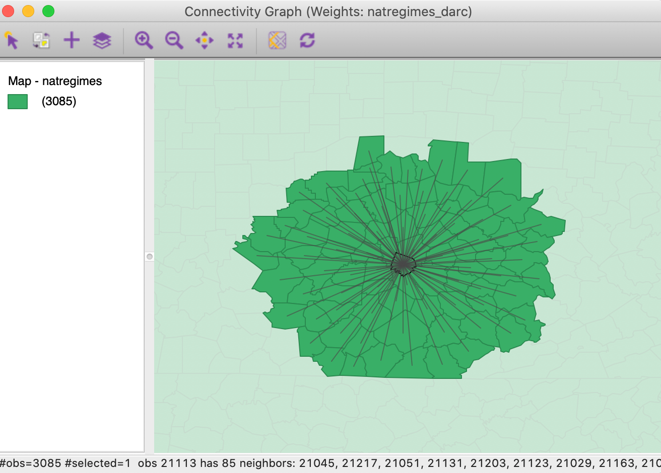
Figure 37: Connectivity graph for Jessamine county, KY
In practice, policy or theoretical considerations often dictate a given distance band (e.g., commuting distance). As we have seen, we need to be cautious before we uncritically translate these criteria into distance bands. Especially when the areal units in question are of widely varying sizes, there will be problems with the distribution of the neighbor cardinalities. In addition, isolates will result when the distance is insufficiently large.
General distance matrix
The Variables tab in the distance weights dialog also allows for the computation of a general distance matrix that is based on the distance between observations in multi-attribute space. As shown in Figure 38, a drop-down list with all the variables is available from which any number can be selected. In addition, the distance can be either Euclidean distance or Manhattan distance (absolute distances). Typically, the variables are first standardized, such that their mean is zero and variance one, which is the default setting.
All the standard options are available, such as specifying a distance band (in multiattibute distance units) or k-nearest neighbors. Such general distance matrices are often used as an input in multivariate clustering methods.
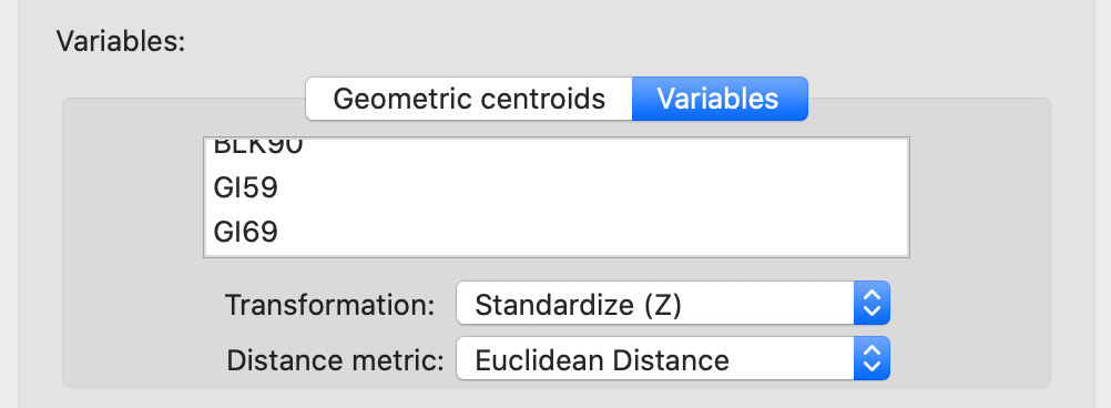
Figure 38: Distance computed from variables
Manipulating Weights Matrices
One final item that is available in the Weights Manager allows us to compute new weights by combining the information in two existing weights. Specifically, there is the Intersection and the Union between two spatial weights.
In order to illustrate these functions, we continue with the natregimes example. However, we must first create (or load from an earlier project file) first and second order contiguity (non-inclusive), as well as knn weights using k= 6 (with arc distance). The Weights Manager should include at least the following weights: natregimes_q, natregimes_q2, and natregimes_k6.
Intersection
We first specify natregimes_q and natregimes_k6 as the weights and select the Intersection button, as in Figure 39.
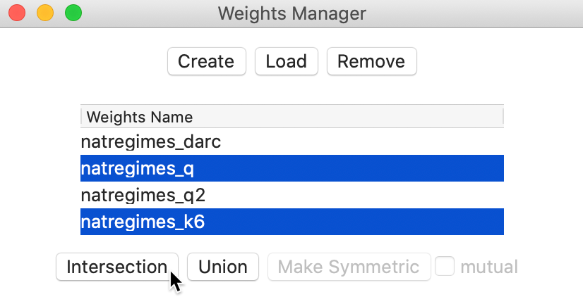
Figure 39: Spatial weights intersection
This brings up the usual dialog to specify a file name for the new weights and populates the weights manager with the properties of the intersection between first order queen contiguity and k-6 nearest neighbors. We can easily check that the number of neighbors for queen contiguity varies between 1 and 14, with an average of 5.89 neighbors and median of 6, whereas obviously the k-nearest weights all have 6 neighbors. The properties of the intersection are listed in Figure 40. Since it is an intersection operation, the maximum number of weights cannot exceed 6, which is indeed the maximum. For those observations, the six nearest neighbor weights are also included among the contiguity weights. This is by no means always the case, as indicated by the decrease in the average number of neighbors to 5.15 and the median to 5.
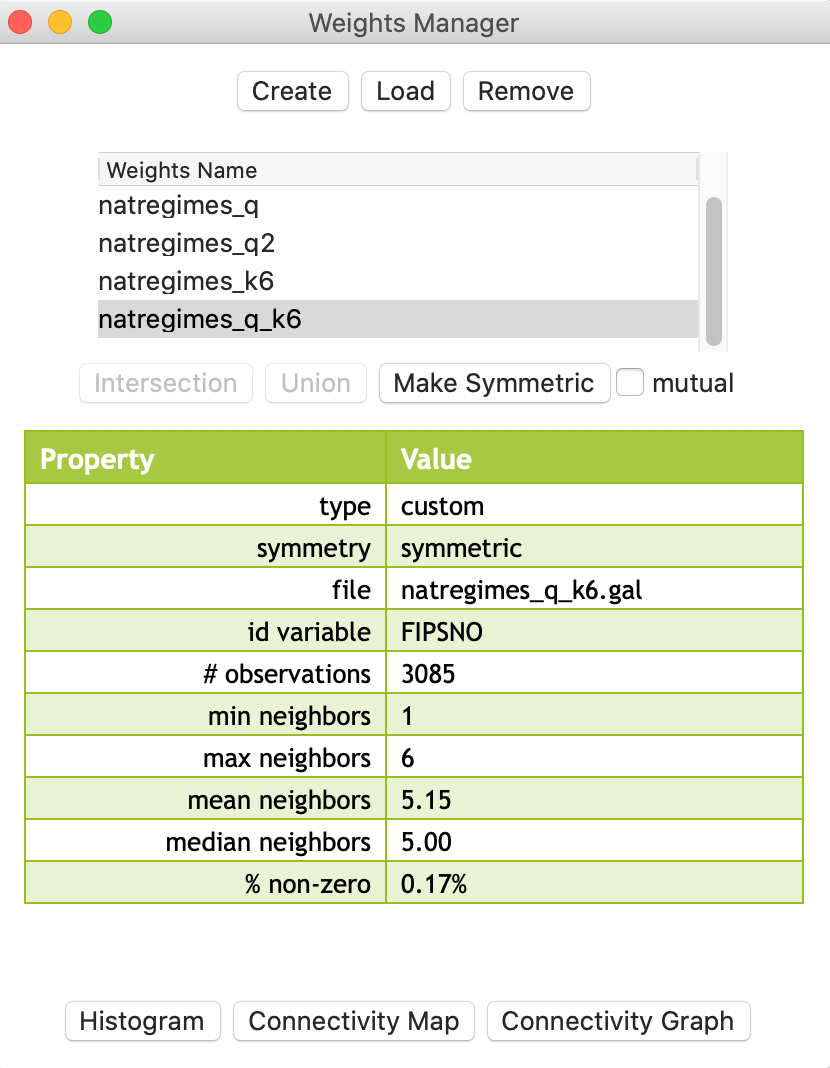
Figure 40: Properties of spatial weights intersection
Union
We illustrate the second type of operation by means of the first and second order queen contiguity, where the latter is non-inclusive. A Union operation on those two weights should yield second order contiguity that are inclusive of first order neighbors.
As evidenced by the results in Figure 41, we indeed obtain the identical properties to what we had in the previous chapter. The average number of neighbors has increased to 18.44 and the density at 0.60% is higher than either first order contiguity (0.19%) or pure second order contiguity (0.41%).
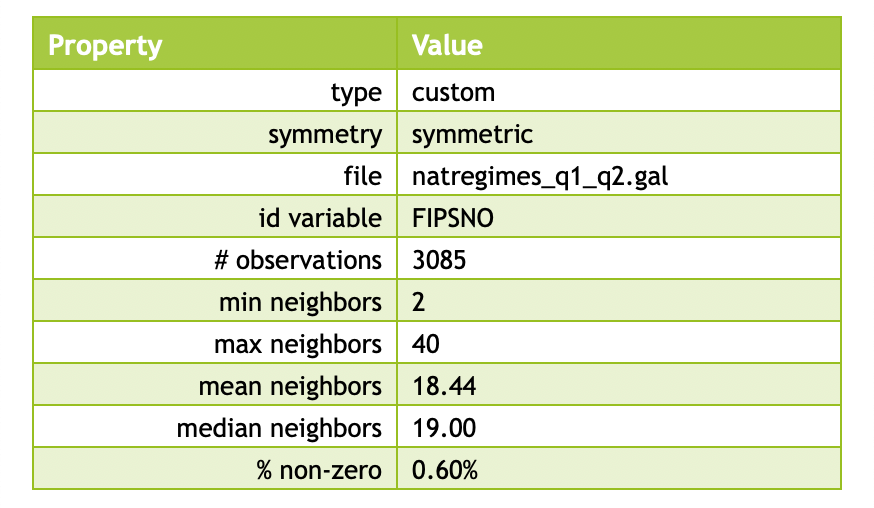
Figure 41: Properties of spatial weights union
References
Anselin, Luc, and Sergio J. Rey. 2014. Modern Spatial Econometrics in Practice, a Guide to Geoda, Geodaspace and Pysal. Chicago, IL: GeoDa Press.
Yamada, Ikuho. 2016. “Thiessen Polygons.” The International Encyclopedia of Geography, 1–6.
-
University of Chicago, Center for Spatial Data Science – anselin@uchicago.edu↩︎
-
The latitude is the \(y\) dimension, and the longitude the \(x\) dimension, so that the traditional reference to the pair (lat, lon) actually pertains to the coordinates as (y,x) and not (x,y).↩︎
-
The nearest neighbor distance is the smallest distance from a given point to all the other points, or, the distance from a point to its nearest neighbor.↩︎
-
The selection tool with unique_id = 11359 will select the observation in the table. Through the process of linking, it will also be highlighted in the map.↩︎
-
\(\mathbf{W'}\) is the transpose of the weights matrix \(\mathbf{W}\), such that rows of the original matrix become columns in the transpose.↩︎
-
For a more extensive technical discussion and historical background, see, e.g., Yamada (2016).↩︎
-
The county is easily identified by using the Move Selected to Top option in the table.↩︎