Global Spatial Autocorrelation (1)
Visualizing Spatial Autocorrelation
Luc Anselin1
10/09/2020 (revised and updated)
Introduction
In this Chapter, we will explore the analysis of global spatial autocorrelation measures, focusing on visualization. We will review the Moran scatter plot as a means to graphically express Moran’s I, as well as the non-parametric spatial correlogram and smoothed distance scatter plot to to assess the magnitude and the range of spatial autocorrelation. We will continue with the Cleveland house sales data set that we used in the analysis of distance-based spatial weights.
Objectives
-
Visualize Moran’s I by means of the Moran scatter plot
-
Carry out inference using the permutation approach
-
Make analyses reproducible using the random seed setting
-
Nonlinear LOWESS smooth of the Moran scatter plot
-
Brush Moran scatter plot to assess regional Moran’s I
-
Appreciate the difference between dynamic weights and static weights in Moran scatter plot regime regression
-
Analyze the range of spatial autocorrelation by means of a spatial correlogram
-
Analyze the range of spatial autocorrelation by means of the smoothed distance scatter plot
-
Address the sensitivity of the distance plots to the choice of maximum distance and number of bins
-
Address the computation of the distance plots for large(r) data sets by relying on random sampling
GeoDa functions covered
- Space > Univariate Moran’s I
- permutation inference
- setting the random seed
- LOWESS smoother of the Moran scatter plot
- brushing the Moran scatter plot
- save results (standardized value and spatial lag)
- Space > Spatial Correlogram
- variable selection
- selecting the number of bins
- selecting the maximum distance
- using a random sample of locations
- changing the smoothing parameters
- Space > Distance Scatter Plot
Preliminaries
We need the clev_sls_154_core.gda project file, which already has the spatial weights included, or, alternatively, load the clev_sls_154.shp shape file and then create queen contiguity, say as clev_sls_154_core_q.gal.
The Moran Scatter PLot
Concept
Moran’s I
Moran’s I statistic is arguably the most commonly used indicator of global spatial autocorrelation. It was initially suggested by Moran (1948), and popularized through the classic work on spatial autocorrelation by Cliff and Ord (1973). In essence, it is a cross-product statistic between a variable and its spatial lag, with the variable expressed in deviations from its mean. For an observation at location \(i\), this is expressed as \(z_i = x_i - \bar{x}\), where \(\bar{x}\) is the mean of variable \(x\).
Moran’s I statistic is then: \[I = \frac{\sum_i\sum_j w_{ij} z_i.z_j /S_0}{\sum_i z_i^2 / n} \] with \(w_{ij}\) as the elements of the spatial weights matrix, \(S_0 = \sum_i \sum_j w_{ij}\) as the sum of all the weights, and \(n\) as the number of observations.
Permutation inference
Inference for Moran’s I is based on a null hypothesis of spatial randomness. The distribution of the statistic under the null can be derived using either an assumption of normality (independent normal random variates), or so-called randomization (i.e., each value is equally likely to occur at any location). While the analytical derivations provide easy to interpret expressions for the mean and the variance of the statistic under the null hypothesis, inference based on them employs an approximation to a standard normal distribution, which may be inappropriate when the underlying assumptions are not satisfied.2
An alternative to the analytical derivation is a computational approach based on permutation. This calculates a reference distribution for the statistic under the null hypothesis of spatial randomness by randomly permuting the observed values over the locations. The statistic is computed for each of these randomly reshuffled data sets, which yields a reference distribution. This approach is not sensitive to potential violations of underlying assumptions, and is thus more robust, although limited in generality to the actual sample.
The reference distribution is used to calculate a so-called pseudo p-value. This is found as \[p = \frac{R+1}{M+1},\] where \(R\) is the number of times the computed Moran’s I from the spatial random data sets (the permuted data sets) is equal to or more extreme than the observed statistic. \(M\) equals the number of permutations. The latter is typically taken as 99, 999, etc., to yield nicely rounded pseudo p-values.
The pseudo p-value is only a summary of the results from the reference distribution and should not be interpreted as an analytical p-value. Most importantly, it should be kept in mind that the extent of significance is determined in part by the number of random pemutations. More precisely, a result that has a p-value of 0.01 with 99 permutations is not necessarily more significant than a result with a p-value of 0.001 with 999 permutations.
Moran scatter plot
The Moran scatter plot, first outlined in Anselin (1996), consists of a plot with the spatially lagged variable on the y-axis and the original variable on the x-axis. The slope of the linear fit to the scatter plot equals Moran’s I.
We consider a variable \(z\), given in deviations from the mean. With row-standardized weights, the sum of all the weights (\(S_0\)) equals the number of obsevations (\(n\)). As a result, the expression for Moran’s I simplifies to: \[I = \frac{\sum_i\sum_j w_{ij} z_i.z_j}{\sum_i z_i^2} = \frac{\sum_i (z_i \times \sum_j w_{ij} z_j)}{\sum_i z_i^2}. \] Upon closer examination, this turns out to be the slope of a regression of \(\sum_j w_{ij}z_j\) on \(z_i\).3 This is the principle underlying the Moran scatter plot.
An important aspect of the visualization in the Moran scatter plot is the classification of the nature of spatial autocorrelation into four categories. Since the plot is centered on the mean (of zero), all points to the right of the mean have \(z_i > 0\) and all points to the left have \(z_i < 0\). We refer to these values respectively as high and low, in the limited sense of higher or lower than average. Similarly, we can classify the values for the spatial lag above and below the mean as high and low.
The scatter plot is then easily decomposed into four quadrants. The upper-right quadrant and the lower-left quadrant correspond with positive spatial autocorrelation (similar values at neighboring locations). We refer to them as respectively high-high and low-low spatial autocorrelation. In contrast, the lower-right and upper-left quadrant correspond to negative spatial autocorrelation (dissimilar values at neighboring locations). We refer to them as respectively high-low and low-high spatial autocorrelation.
The classification of the spatial autocorrelation into four types begins to make the connection between global and local spatial autocorrelation. However, it is important to keep in mind that the classification as such does not imply significance. This is further explored in our discussion of local indicators of spatial association (LISA).
Creating a Moran scatter plot
To start the Moran scatter plot, we select the left-most button in the spatial analysis group on the toolbar, as shown in Figure 1.
Figure 1: Moran scatter plot toolbar icon
After selecting the toolbar icon, the next prompt is for the type of analysis. For now, we will stick to the Univariate Moran’s I option, first in the list shown in Figure 2. Alternatively, we can choose Space > Univariate Moran’s I from the menu.

Figure 2: Univariate Moran’s I
After the univariate Moran’s I analysis is initiated, the next prompt is for the variable name, to be selected from the Variable Settings dialog. In our example, we take sale_price. In the dialog, the Weights drop down list shows the currently active weights. As illustrated in Figure 3, in our example, this should be clev_sls_154_core_q, queen contiguity based on Thiessen polygons for the house sales locations.
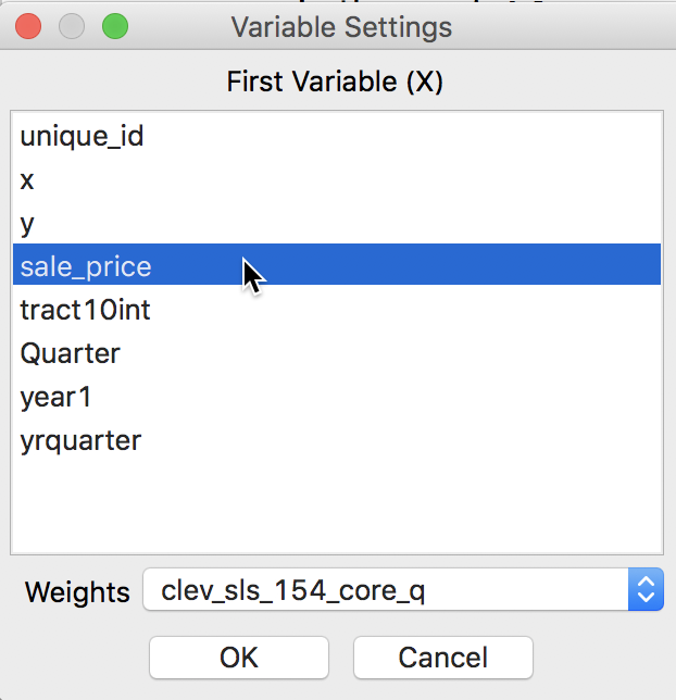
Figure 3: Moran’s I variable selection
Clicking OK brings up the Moran scatter plot, shown in Figure 4.
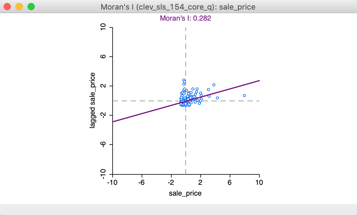
Figure 4: Moran scatter plot
Interpretation
In the Moran scatter plot in Figure 4, the points in the graph are a bit lopsided, because it is rendered as a square (the preferred approach when both axes are measured in the same units, to avoid distorting the data). The house prices are on the horizontal axis, and their spatially lagged counterparts on the vertical axis. Note that the house price values have been standardized, and are given in standard deviational units (the mean is zero and the standard deviation is one). Similarly, the spatial lag is computed for those standardized values.
In its default setting, the plot shows a linear fit through the point cloud. The slope of this line corresponds to Moran’s I, and its value (0.282) is listed at the top of the graph.
We can see that the shape of the point cloud is influenced by the presence of several outliers on the high end (e.g., larger than three standard deviational units from the mean). One observation, with a sales price of $527,409 (compared to the median sales prices of $20,000), is as large as 8 standard deviational units above the mean. On the lower end of the spectrum (to the left of the dashed line in the middle that represents the mean), there is much less spread in the house prices, and those points end up bunched together. By eliminating some of the outliers, one may be able to see more detail for the remaining observations, but we will not pursue that here.
Finally, we can select points in each of the quadrants (highlighted by the dashed lines) and identify locations in the map (or, in any other open view) associated with each of the four types of spatial autocorrelation.
Assessing significance
As such, the slope of the linear fit only provides an estimate of Moran’s I, but it does not reveal any information about the significance of the test statistic. This is obtained by means of the Randomization option.
The full list of options is generated by right clicking (or, control clicking) on the plot, in the usual fashion. This yields the list shown in Figure 5. We select Randomization and the number of permutations in the side panel. This value corresponds to the \(M\) in the expression for the pseudo p-value given above.
In our example, as shown in Figure 5, we select 999 Permutations, which is typically sufficient for reliable inference. The most extreme pseudo p-value possible under this scenario is 0.001, which means that none of the permuted data sets yielded a statistic larger than the one observed in the actual data.
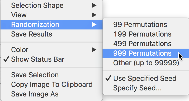
Figure 5: Randomization inference
Reference distribution
The result of the permutation operation is a reference distribution for the statistic, depicted as a histogram, as in Figure 6. The green line shows the value of the statistic for the actual data, placed at 0.282 in our example, well to the right of the reference distribution. This suggests a strong rejection of the null hypothesis.
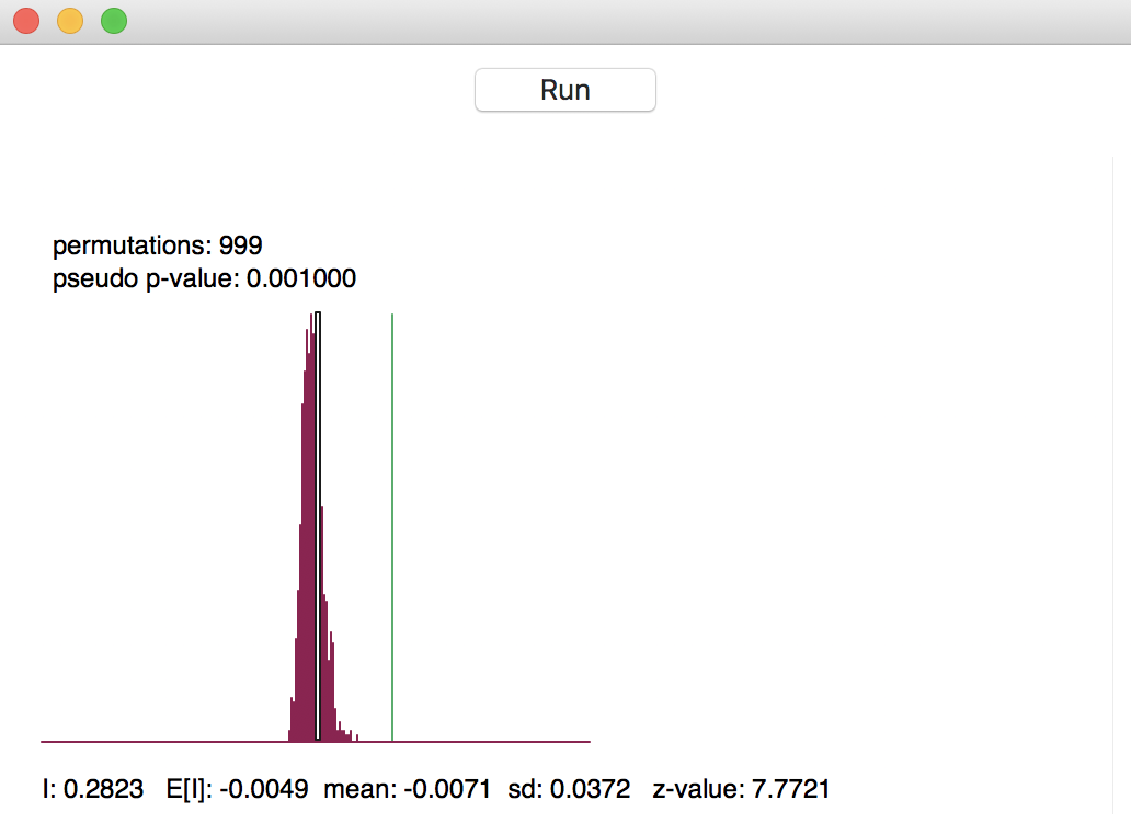
Figure 6: Reference distribution for Moran’s I
The graph contains several summary statistics. In the top left are shown the number of permutations used to construct the reference distribution (999) and the associated pseudo p-value. As mentioned, the latter is the ratio of the number of values for the statistic that are equal to or greater than the observed value (in our example, just 1 for the observed statistic itself) to the number of generated samples (999) + 1 (for the actual sample). Hence, the result is 1/(999+1) = 0.001.
As pointed out earlier, this is also the smallest (most extreme) p-value that can be obtained. It is important to keep this in mind when comparing results where a different number of permutations is used. For example, a pseudo p-value of 0.001 for 999 permutations is not necessarily more significant than a pseudo p-value of 0.01 for 99 permutations. In both cases, not a single statistic computed from the randomly generated samples exceeded the actual statistic. This contrasts with the usual interpretation of an analytically derived p-value.
In the status bar at the bottom of the graph appear several descriptive measures of the Moran’s I
statistic. First is the actually observed value, I = 0.2823. Next follows the theoretical expected value,
E[I], which equals -1/(n-1). The value of -0.0049 is indeed -1 / 204 (there are 205 observations in the data
set). The mean is the average of the reference distribution. In our example, this result is -0.0071,
slightly off from the theoretically expected value. The standard deviation of the reference distribution is
0.0372, compared to a theoretical value of 0.00158 under an analytical randomization approach (not computed
in GeoDa).
These summary statistics illustrate a common feature in empirical work, namely that the theoretical indication of precision may be overly optimistic (the standard deviation is smaller in the analytical derivation). The z-value that corresponds to the computed Moran’s I, its empirical mean and standard deviation is 7.7721 (the last item to the right on the status bar). Even though a normal approximation would not be accurate, the z-value does suggest strong rejection of the null hypothesis.
Clicking on the Run button in Figure 6 will generate a new empirical distribution. This allows for a sensitivity analysis of the results. Especially when only 99 permutations are used, the summary statistics may vary somewhat, but for 999 (and definitely for 99999, the largest possible value), they should be pretty stable.
Reproducibility - the random seed
In order to facilitate replication, the default setting in GeoDa is to use a specified
seed for the random number generator. This is evidenced by the check mark
next to Use Specified Seed in the options listed in Figure 5.
The default seed value used is shown when selecting the Specify Seed … box, where it also
can be changed.
The random seed can also be set globally
in the GeoDa Preferences, under the System tab, as shown in
Figure 7. At the bottom of the dialog, under the item
Method:, the
box for using the specified seed is checked by default, and the value 123456789 is used
as the default seed. This can be changed by typing in a different value.
The same random seed
is used in all operations in GeoDa that rely on some type of random permutations (i.e., all
flavors
of the Moran scatter plot, and all the local spatial autocorrelation statistics). This
ensures that the results will be identical for each analysis that uses the same
sequence of random numbers.
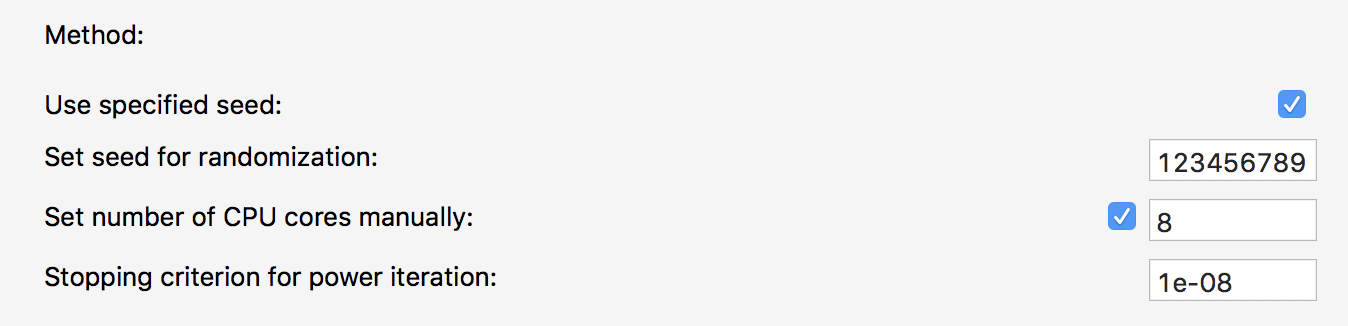
Figure 7: Random seed in GeoDa preferences
Using the same random seed ensures reproducibility on a particular machine. However, due to the way the random number generator is implemented, there may be differences depending on the hardware, specifically when a different number of CPU cores is used.4 In order to control for any such discrepancies, it is possible to manually set the number of CPU cores. For example, in Figure 7, the box next to Set number of CPU cores manually is checked, and the number of cores is given as 8.5
Moran scatter plot options
In the usual way, a right click in the plot brings up the available options, shown earlier in Figure 5.
Many of these are by now familiar. We have already discussed the Randomization option. We next briefly consider Save Results and View.
Saving scatter plot variables
When selecting the Save Results option, the dialog offers suggested variable names for the standardized variable (recall that the variable specified was sale_price, not its standardized version), with default name MORAN_STD, and for its spatial lag, with default name MORAN_LAG. This is illustrated in Figure 8. A click on OK will add these two variables to the data table.
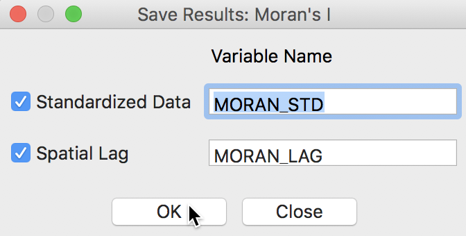
Figure 8: Saving variables from Moran scatter plot
We can quickly verify the results by using the Table > Calculator option to compute a standardized version of sale_price and its spatial lag. For the former, we use the Univariate tab and the STANDARDIZED (Z) operator (we first add M_ST as a new variable), as shown in Figure 9.6
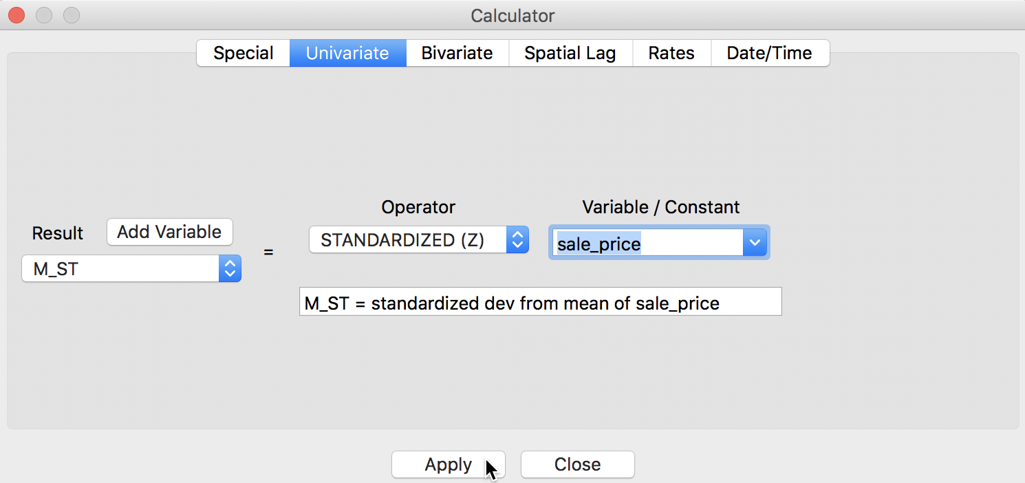
Figure 9: Standardized variable in calculator
For the spatial lag, we use the Spatial Lag tab, with the weights file clev_sls_154_core_q specified and the previously standardized variable M_ST (again, after adding M_LAG as the new variable), as in Figure 10.
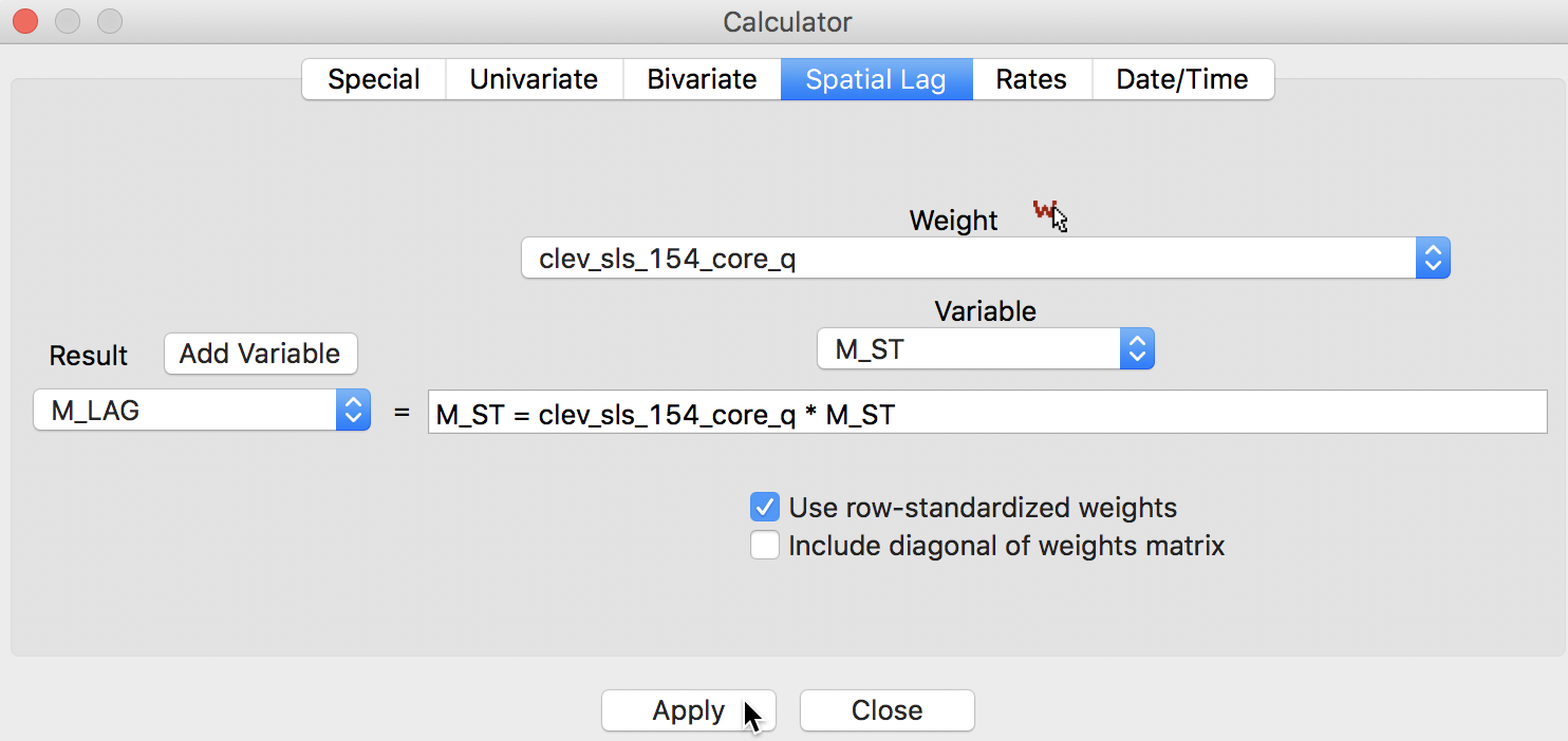
Figure 10: Spatially lagged variable in calculator
The table now has four extra columns, two generated by the Moran scatter plot option, and two calculated explicitly to replicate these results, shown in Figure 11. Clearly, the values are identical.
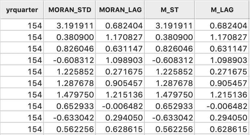
Figure 11: Variables added to table
Digression - creating a Moran scatter plot as a standard scatter plot
The preferred way to construct a Moran scatter plot is to use the designated functionality in the Space menu. However, it is perfectly possible to create a plot the hard way, as a special case of a standard bivariate scatter plot. To accomplish this, we select a variable (standardized) for the x-axis, and its spatial lag for the y-axis.
For example, in Figure 12, we use the standard scatter plot functionality (Explore > Scatter Plot) and select the just created MORAN_STD in the variable selection dialog for the x-axis, and its spatial lag MORAN_LAG as the y-axis (or, alternatively, M_ST and M_LAG).
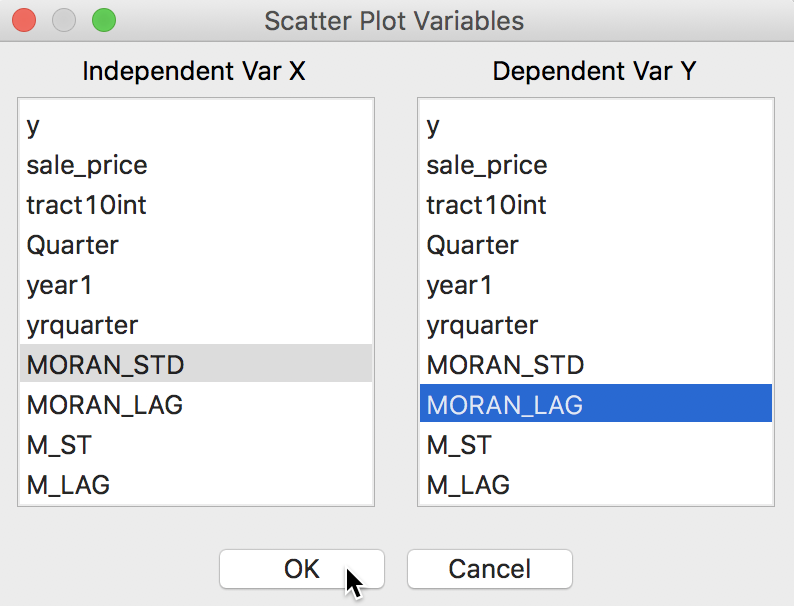
Figure 12: Scatter plot with spatial variables
This yields the standard scatter plot, shown in Figure 13. In contrast to the specific Moran scatter plot, here the statistics are displayed below the plot (the default setting for a standard scatter plot). This reveals the slope of the linear fit to be 0.282, the same as Moran’s I given by the Moran scatter plot.
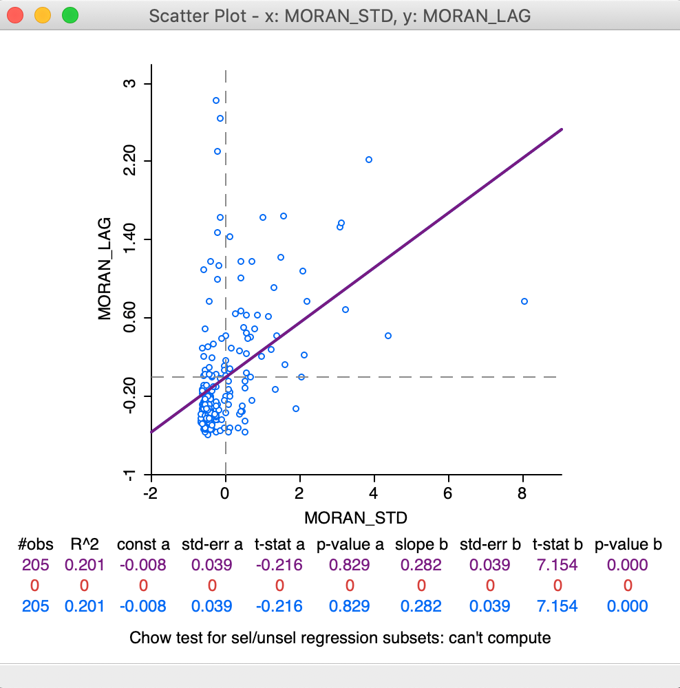
Figure 13: Moran as a standard scatter plot
We will revisit the plot in Figure 13 later when we consider the difference between regime regression in the Moran scatter plot compared to the standard scatter plot.
Apart from a purely pedagogic objective, there are some instances in practice when constructing a Moran scatter plot as a standard plot is the only way to obtain an estimate for Moran’s I (as the slope of the linear fit). One example we already encountered is when we use row-standardized weights derived from an inverse distance measure. Such weights can be employed to create a spatially lagged variable in the usual way, which can then serve as the y-axis in the scatter plot.
The current implementation of the Moran scatter plot functionality
in GeoDa ignores the specific values for the weights and only takes
into account the presence of connectivity (i.e., non-zero weights). This is the approach
taken for all spatial autocorrelation analyses in GeoDa. As a result,
in the computation
of the spatial lag in the Moran scatter plot, all the neighbors receive the same weight.
In our discussion of inverse distance weights, we observed that it is often of interest not to row-standardize the weights. Similarly, this is the case for weights that include a diagonal element (kernel weights). As long as the weights are row-standardized and do not include a diagonal element, the slope of a standard scatter plot of the spatial lag against the variable will still be Moran’s I.
However, this does not work correclty for inverse distance weights that are not row-standardized, or for weights that include the diagonal element. In the former case, the slope estimate is off by a factor \(S_0 / n\). So, in order to recuperate the value for Moran’s I, the slope estimate would have to be multiplied by \(n / S_0\). Moreover, the interpretation of Moran’s I for spatial weights that are not row-standardized may be difficult.
In any case, the slope of the linear fit in a standard scatter plot is only an estimate for Moran’s I, but does not provide any inference. The usual standard errors and t-statistics provided in the scatter plot are not appropriate in the spatial case. An explicity permutation procedure would need to be carried out separately.
LOWESS smoother
In addition to the traditional linear smoother, GeoDa also supports a Lowess smoother for the
Moran scatter plot (similar to the functionality in the standard scatter plot). This is accomplished by
selecting the View > LOWESS Smoother item in the options menu, illustrated in Figure 14.
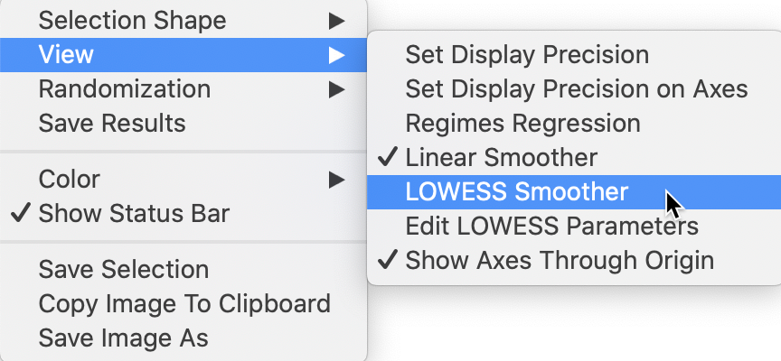
Figure 14: Moran scatter plot LOWESS option
With the View > Linear Smoother option turned off, only the nonlinear fit from the local regression is shown on the Moran scatter plot, as in Figure 15. The Lowess smoother can be explored to identify potential structural breaks in the pattern of spatial autocorrelation. For example, in some parts of the data set, the curve may be very steep and positive, suggesting strong positive spatial autocorrelation, whereas in other parts, it could be flat, indicating no autocorrelation. In our example, the flatter slope of the curve for the largest values of z suggests an effect of the outlier (pulling the Moran’s I slope down). This can be more formally assessed by means of outlier and leverage statistics, but here we do not pursue this further.
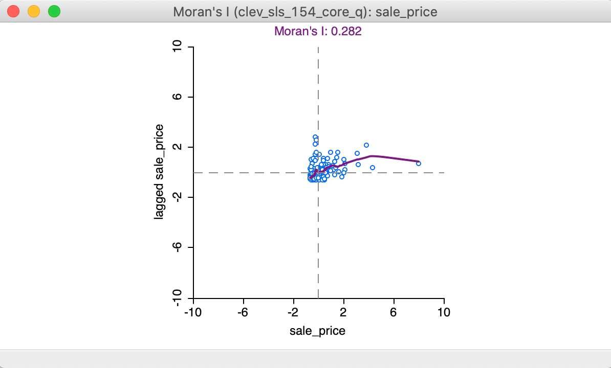
Figure 15: LOWESS smooth of Moran scatter plot
The local smoother is fit through the points in the Moran scatter plot by utilizing only those observations within a given bandwidth. As for the standard scatter plot, the default is to use 0.20 of the range of values. The bandwidth (as well as other, more technical parameters) can be specified by selecting the View > Edit LOWESS Parameters item in the options menu, as we have seen in the discussion of the standard scatter plot. All options work exactly the same as in the standard case.
Brushing the Moran scatter plot
An important option to assess the stability of the spatial autocorrelation throughout the data set, or, alternatively, to search for potential spatial heterogeneity, is the exploration of the scatter plot through dynamic brushing.
This is invoked by selecting Regimes Regression in the View option. As in the standard scatter plot, with this option selected, statistics for the slope and intercept are recomputed as observations are selected and unselected. We proceed with the LOWESS Smoother turned off and the Regimes Regression selected, as in Figure 16.
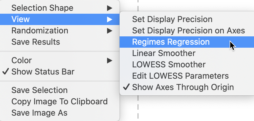
Figure 16: Moran scatter plot regimes
The initial setting for the brushing operation shows three Moran scatter plots, as illustrated in Figure 17. The one to the left (in red) is for the selected observations, currently empty, since no selection has been made. The one to the right is for the complement, referred to as unselected (in black), currently the same as the scatter plot in the center, which shows the slope for all observations.
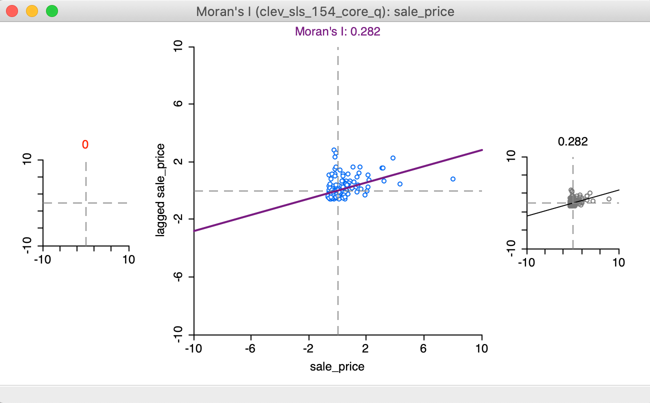
Figure 17: Regimes starting setup
We start the brushing operation by selecting a large rectangle with 51 observations (the number of selected observations is shown in the status bar) in the lower right of the point map, shown in the left panel of Figure 18. As soon as the selection is made, the red and black graphs are updated in the right panel of the Figure.

Figure 18: Brushing the Moran scatter plot - 1
The distinguishing characteristics of this brushing operation (or, any selection) is that the spatial weights are dynamically updated for both the selection and the unselected observations. More precisely, for each of the subset of observations, selected and unselected, the spatial weights are adjusted to remove links to observations belonging to the other subset. In other words, there are no edge effects and each subset is treated as a self-contained entity.
As a result, the slope of the Moran scatter plots on the left and the right are as if the data set consisted only of the selected/unselected points. This is a visual implementation of a regionalized Moran’s I, where the indicator of spatial autocorrelation is calculated for a subset of the observations (Munasinghe and Morris 1996).
In our initial selection, the selected observations show no spatial autocorrelation at all (a value of 0.02), whereas the complement (unselected) obtain a Moran’s I of 0.280, basically the same as the overall statistic of 0.282.
This finding would suggest the presence of spatial heterogeneity in the strength of the spatial autocorrelation, in the sense that the subset selected shows a very different degree of dependence than its complement (or the data set as a whole). Note that this is purely exploratory, and there is no actual test for the difference between the two statistics (this contrasts with the availability of the Chow test in the standard scatter plot). In our example, this would suggest very little spatial autocorrelation among the sales prices in the 51 selected observations, whereas the rest of the data shows the same pattern as the whole.
As we move the brush to the left in the point map, the selected and unselected scatter plots are updated in real time, showing the corresponding regional Moran’s I statistics in the panels of Figure 19.
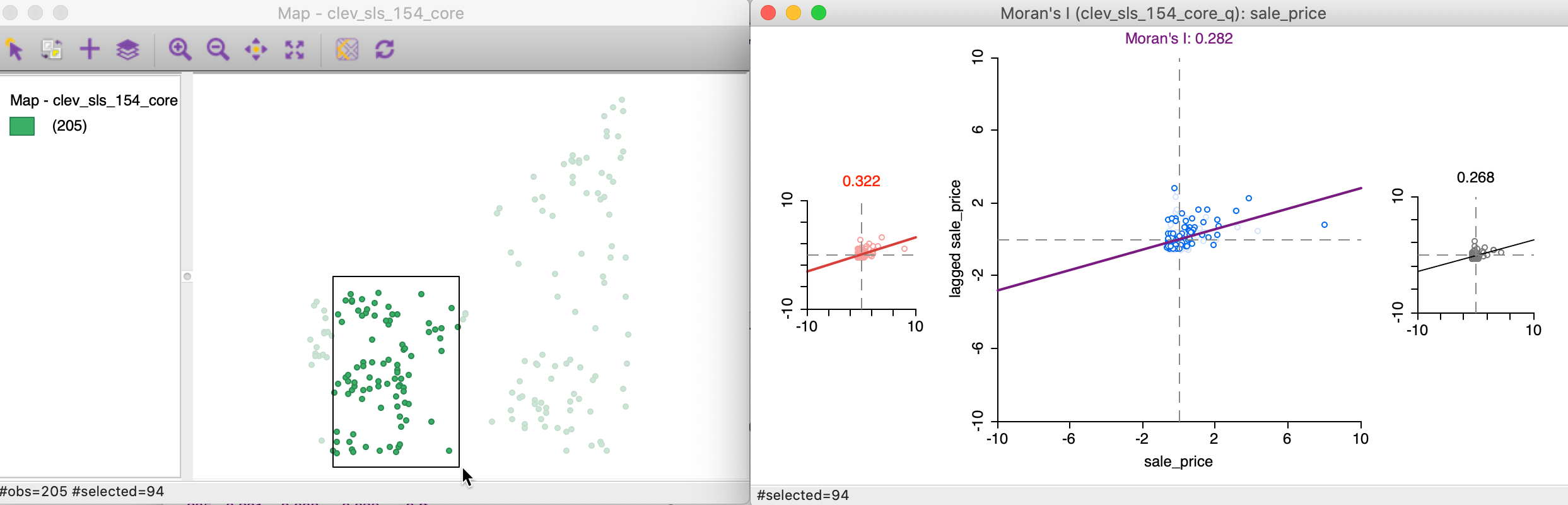
Figure 19: Brushing the Moran scatter plot - 2
In our example, the second selection shows much less evidence of spatial heterogeneity, with a Moran’s I of 0.322 for the selected observations and 0.268 for the complement, as shown at the top of each plot.
Static and dynamic spatial weights
In the example just shown, the spatial weights were updated dynamically, to remove any edge effects. In contrast, in the scatter plot in Figure 13, where the (standardized) sales price was plotted against its spatial lag, there is no such dynamic adjustment of the spatial weights.
More precisely, this means that the spatial lag for a selected/unselected observation consists of all its original neighbors, including the ones that belong to the other subset.
This is illustrated by the updated selection in the scatter plot, in Figure 20, which matches the selection of 51 observations in Figure 18. In the updated plot, the slope for the selected is found to be 0.170 (in red), a far cry from the 0.02 we found above. The slope for the unselected is 0.272, not that different from 0.280 above. The standard Chow test only provides weak evidence for spatial heterogeneity (p = 0.0517).
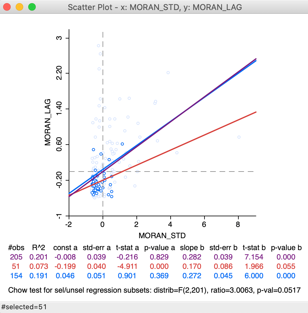
Figure 20: Brushing the standard spatial lag scatter plot
This result needs to be interpreted with caution, since the weights structure has not been adjusted to reflect the actual breaks within the data set. In addition, the Thiessen polygon contiguity weights may have introduced artificial neighbors, which are eliminated when dynamically adjusting the weights to exclude neighbors outside the selected subset.
The standard scatter plot ignores boundary effects
(in the sense that it includes neighbors outside the regimes), which, in some contexts,
may be the interpretation sought. GeoDa provides both options.
Spatial Correlogram
Concept
A non-parametric spatial correlogram is an alternative measure of global spatial autocorrelation that does not rely on the specification of a spatial weights matrix. Instead, a local regression is fit to the covariances or correlations computed for all pairs of observations as a function of the distance between them (for example, as outlined in Bjornstad and Falck 2001).7
With standardized variables \(z\), this boils down to a local regression: \[z_i.z_j = f(d_{ij}) + u,\] where \(d_{ij}\) is the distance between a pair of locations \(i-j\), u is an error term, and \(f\) is the non-parametric function to be determined from the data. Typically, the latter is a LOWESS or kernel regression.
GeoDa implements a spatial correlogram, i.e., the computation is based on
standardized variables such that the cross-products correspond to correlations.
The nonlinear curve is a LOWESS regression fit to the
average correlation for all pairs of observations
in a distance bin. This uses a similar logic as underlying the empirical variogram
of geostatistics, but with a non-linear smoother applied to the bin estimates.
Creating a spatial correlogram
The spatial correlogram functionality is invoked by clicking on the corresponding icon in the toolbar (the middle icon in the spatial analysis group, as in Figure 21) and choosing Spatial Correlogram, or, from the menu, by selecting Space > Spatial Correlogram (the item near the very bottom of the list of options).
Figure 21: Non-parametric correlogram icon
This brings up a dialog with the default parameter settings and a graph in the background, as shown in Figure 22. This graph is not informative at this point, since it shows a correlogram for the first variable, which is unique_id.
First, we need to choose the proper settings in the dialog.
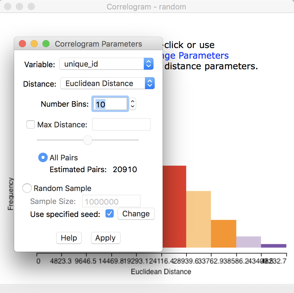
Figure 22: Initial correlogram dialog
The items at the top of the dialog are the Variable (available from a drop down list), the Distance metric (default is Euclidean, but Arc distance is also available), and the Number of Bins.
The non-parametric correlogram is computed by means of a local regression on the pairwise correlations that fall within each distance bin. The number of bins determines the distance range of each bin. This range is the maximum distance divided by the number of bins. The more bins are chosen, the more fine-grained the correlogram will be. However, this also potentially can lead to too few pairs in some bins (the rule of thumb is to have at least 30).
The number of elements in each bin is a result of the interplay between the number of bins and the maximum
distance. As the default, all pairs are used (in our example, with 205 observations, this yields: \([205^2 - 205]/2 = 20910\) pairs), and thus all the pairwise distances are taken
into account. However, in many instances in practice, this may not be a good choice. For example, when there
are many observations, the number of pairs quickly becomes unwieldy and GeoDa will run out of
memory. Also, the correlations computed for pairs that are far apart are not that meaningful (they should be
zero due to Tobler’s law). The bottom half of the dialog provides options for fine-tuning these choices.
First, we consider the default, which uses all pairs and does not impose any constraints in terms of maximum distance. The number of bins is set to 10. As before, the Variable we analyze is sale_price. These selections are shown in the dialog in Figure 23.
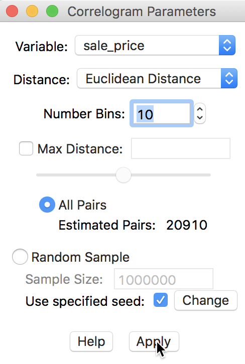
Figure 23: Variable setting for correlogram
Clicking the Apply button yields the spatial correlogram shown in Figure 24. Slight adjustments to the size of the window may be necessary in order to see all the detail on the horizontal axis, especially since the distances are expressed in feet (so they are large numbers).
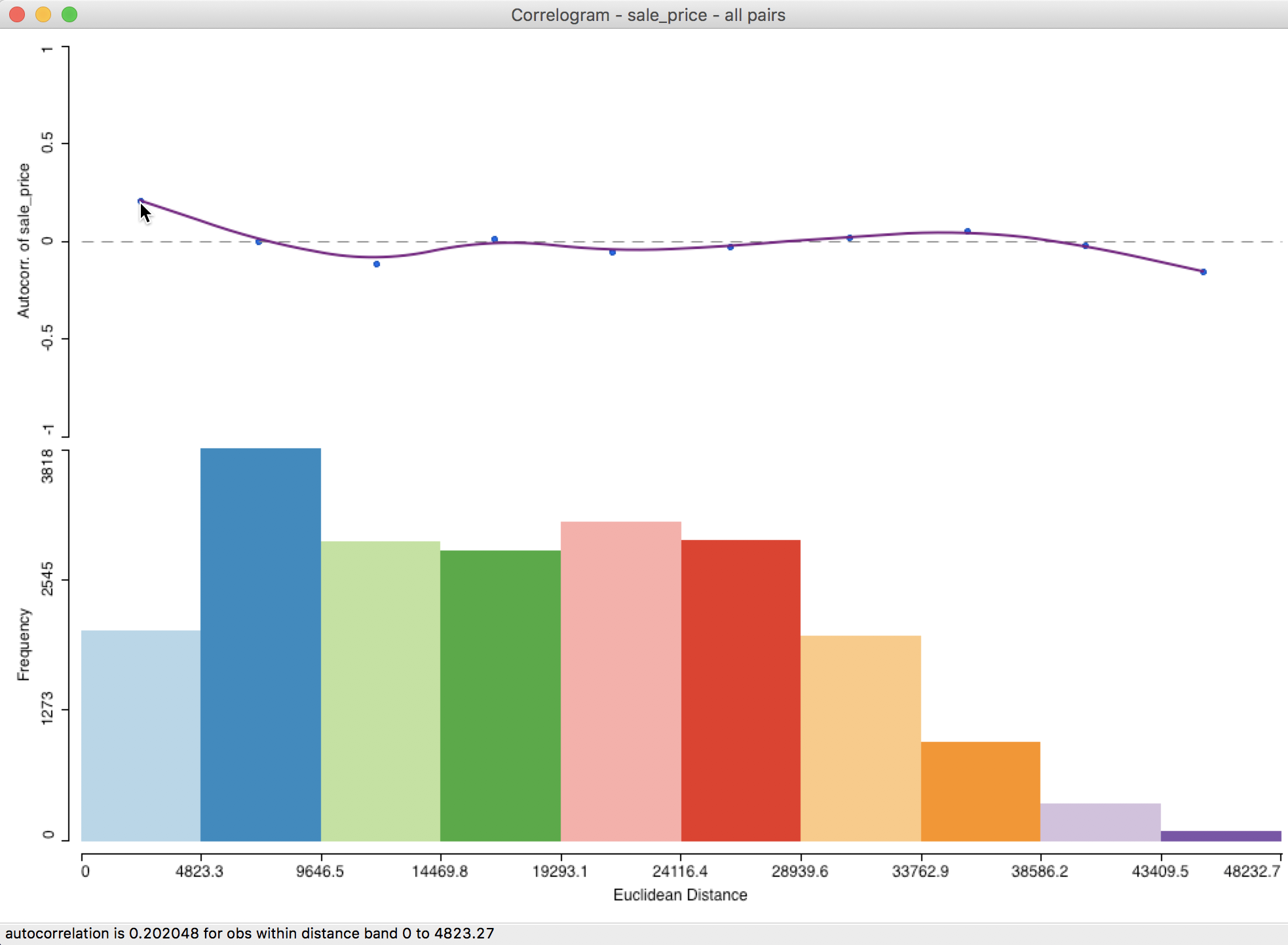
Figure 24: Default spatial correlogram
Interpretation
At the top of the graph in Figure 24 is the actual correlogram, depicting how the spatial autocorrelation changes with distance. Hovering the pointer over each blue dot, gives the spatial autocorrelation associated with that distance band in the status bar. In our example, the first dot corresponds to 0.202048 for distances between 0 and 4823 feet (or about 0.9 miles).
The intersection between the correlogram and the dashed zero axis (which determines the range of spatial autocorrelation) happens in the midpoint of the second range (4823 to 9647 feet), i.e., 7235, or roughly around 1.4 miles. Beyond that range, the autocorrelation is first negative and then fluctuates around the zero line.
At the bottom of the graph is a histogram that shows the number of pairs of observations in each bin. Hovering the pointer over a given bin shows how many pairs are contained in the bin in the status bar. In our example, each bin clearly has more than sufficient observation pairs. Even the last bin, which seems small (a function of the vertical scale), uses 75 pairs for the computation.
Further detail is provided when selecting the Display Statistics option (right click on the graph). As shown in Figure 25, for each bin, the computed autocorrelation is provided, as well as the distance range for the bin (lower and upper bound), and the number of pairs used to compute the statistic.
In addition, there is a summary with the minimum and maximum distance, the total number of pairs, and an estimate for the range (i.e., the distance at which the estimated autocorrelation first becomes zero). In our example, the latter is estimated to be about 7,225 feet (about 1.4 miles). Right after the listing of the value for the range, the lower and upper bound of the bin where the correlogram crosses the axis is given (this provides an alternative, but less precise approximation of the range).
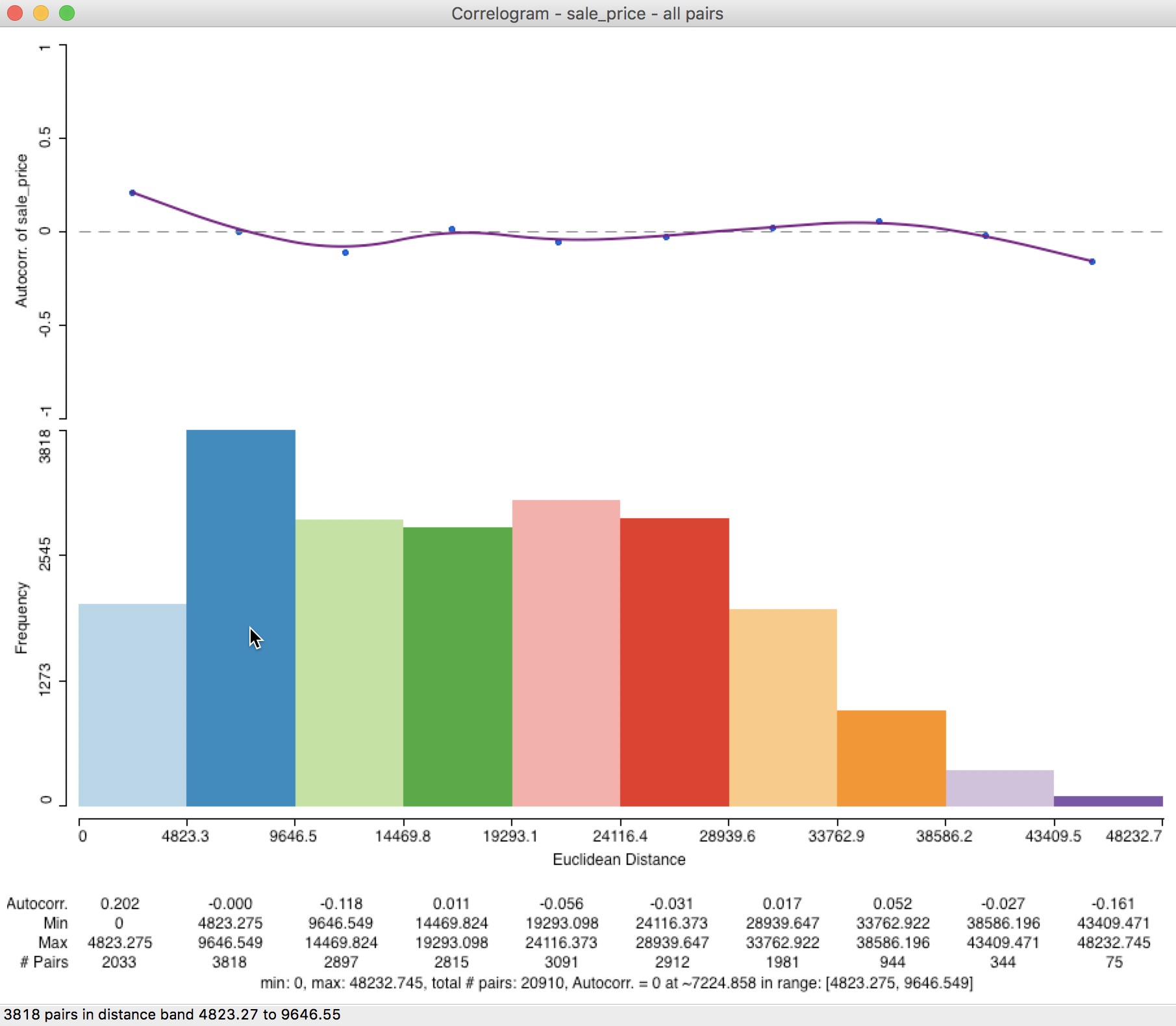
Figure 25: Spatial correlogram with statistics
Spatial correlogram options
In GeoDa, there are two sets of spatial correlogram options. One consists of the
parameters
of the model, as specified in the dialog shown in Figure 23. The other
set of options are invoked in the usual way, by right clicking on the graph. We already referred
to the Display Statistics option above. The full list of options is shown in Figure 26.
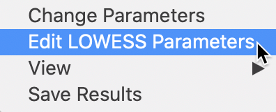
Figure 26: Spatial correlogram options
One interesting option is to Save Results. This provides a record of the descriptive statistics of the correlogram in a text file (with file extension csv). The file contains the information listed at the bottom of the graph when Display Statistics has been selected. This includes the estimates of the spatial autocorrelation, bin ranges, number of observations in the bins and the summary items.
LOWESS parameters
The selection highlighted in Figure 26 pertains to the LOWESS Parameters, i.e., the bandwidth and other technical options that can be specified for any LOWESS smoother. The default is to use a bandwidth of 0.20, which works well in most situations. As usual, a larger bandwidth will yield a (slightly) smoother curve, and a smaller bandwidth the opposite. This works in exactly the same way as for the standard LOWESS nonlinear smoother.
Distance settings
In most situations, the default use of all the distance pairs is too overwhelming. Also, there is a good reason to limit the maximum distance, since correlations at large(r) distances are both sparser (fewer pairs in a bin, which leads to less precise estimates) and supposed to be near zero (Tobler’s law).
There are several rules of thumb to set the maximum distance. GeoDa uses half of the
maximum distance as a point of departure. By checking the box next to Max Distance and
clicking on the button in the middle of the slider bar, half the maximum distance
(24131.4) is listed in the box, shown in Figure 27. This
reduces the number of pairs used to compute
the correlations almost by half, from 20910 to roughly 10557.8
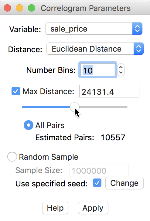
Figure 27: Adjusting maximum distance
The corresponding correlogram in Figure 28 emphasizes the autocorrelation pattern over the shorter distance ranges. It suggests a range for the correlation that is basically the same as the initial result, about 7,244 feet (compared to 7,225). The status bar lists the autocorrelation given by the point over which the pointer hovers (in our example, about -0.056 for the fourth bin).
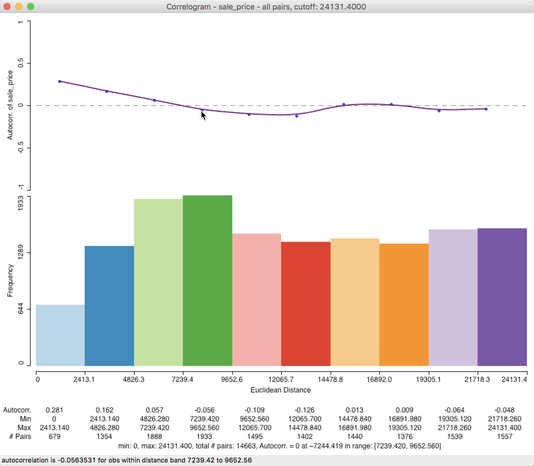
Figure 28: Correlogram with half max distance
In order to get an even more precise measure of the range, we can specify the maximum distance as 20000 feet (3.8 miles) by typing this value into the bin, and select 20 bins (there are plenty of observations, so there is no danger of having fewer than 30 pairs in any bin).
The resulting correlogram, shown in Figure 29, has a distance range for each bin of 1000 feet (about 0.2 miles). This provides a much finer grained measure of the range of spatial autocorrelation (this may require some expansion of the window to clearly see all the values on the horizontal axis and the displayed statistics).
The intersection between the correlogram and the zero axis is almost exactly in the middle of the 6000-7000 foot range, about 6775 feet (or 1.3 miles). In sum, by changing the correlogram parameters from the default to a much smaller value and increasing the number of bins, the estimate of our range of spatial interaction goes from about 7200 feet to about 6800 feet. This highlights the importance of sensitivity analysis and going beyond the default values.
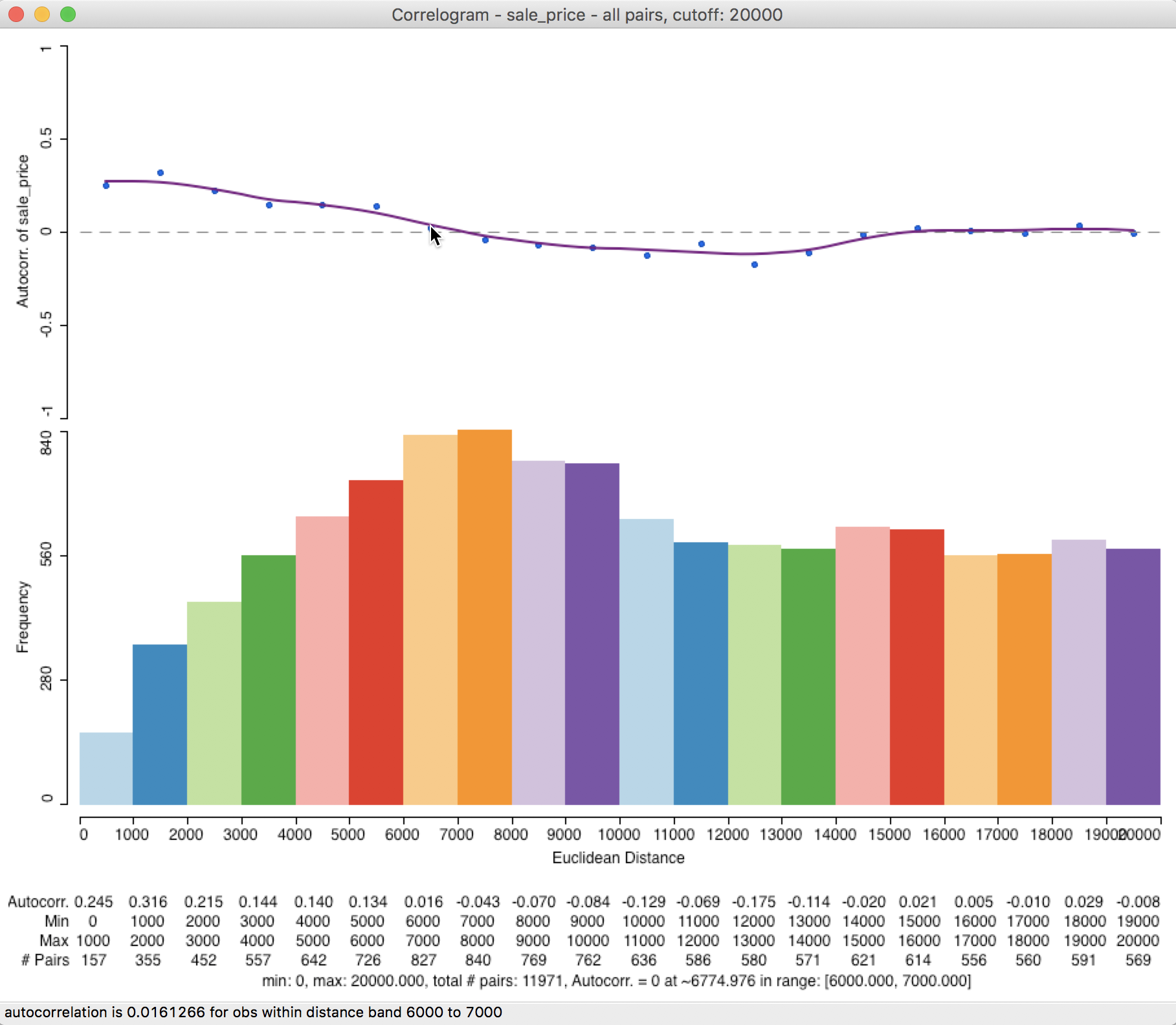
Figure 29: Custom distance and bins
Large(r) data issues – random sampling
A final feature of the correlogram in GeoDa is the ability to compute the spatial correlations
for a sample of locations, which reduces the number of pairs used in the calculations. This is especially
useful when the data set is large, in which case the number of pairs could quickly become prohibitive.
In our example, this is not really necessary, since the default sample size of 1,000,000 that is used to generate the random sample exceeds the current total number of pairs in the actual data. Nevertheless, to illustrate the process, we go back and use 20000 for the maximum distance, with 10 bins, and check the Random Sample radio button, with 10000 for the sample size, as in Figure 30. To allow exact replication, we make sure that the Use specified seed option is checked.
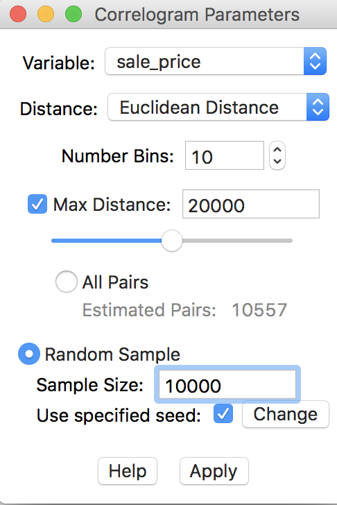
Figure 30: Randomly sampled observation pairs
In our example, the correlogram that results from the sampled observation pairs is not that different from the default case. As demonstrated in Figure 31, the first correlation is higher, at 0.513, but the range is again roughly 7000 feet. In general, the sampling approximation is quite good, as long as the selected sample size is not too small relative to the original data size.
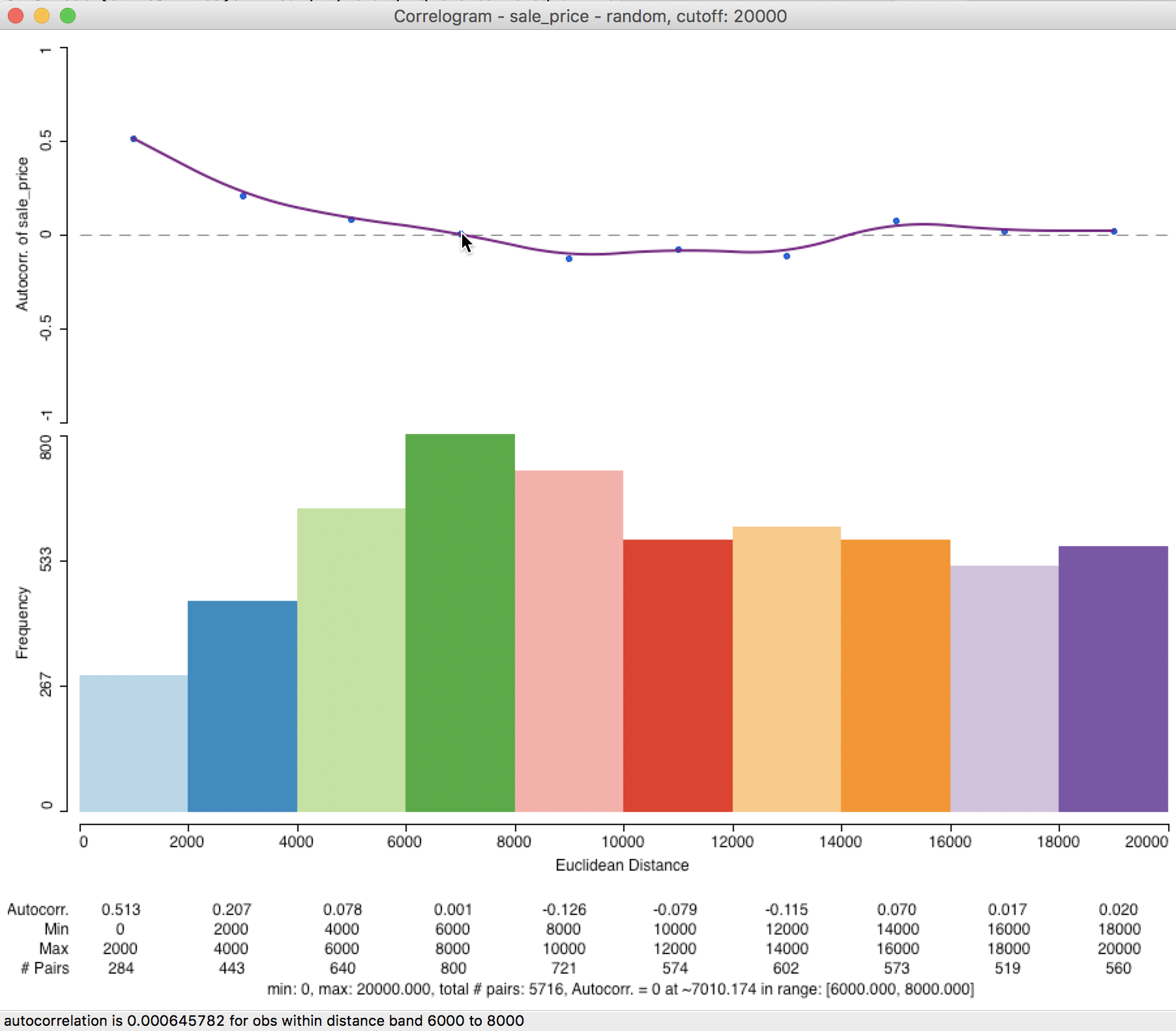
Figure 31: Correlogram for random observation pairs
Smoothed Distance Scatter Plot
Concept
The smoothed distance scatter plot, outlined in Anselin and Li (2020), provides yet another way to visualize global spatial autocorrelation. Instead of using a correlation measure, this approach employs the distance in (multi-)attribute space as a measure of dissimilarity. This is analogous in spirit to the approach taken for Geary’s c statistic. However, rather than using squared differences, the actual distance is employed, i.e., the square root of the squared distances. This also contrasts with the semi-variogram, where an estimate of the squared difference is used as well.
For a single variable, the attribute distance between observations for z at i and j is: \[v_{ij} = \sqrt{(z_i - z_j)^2}.\] In contrast to the correlation measures considered so far, this concept of distance in attribute space can readily be extended to multiple variables: \[v_{ij} = \sqrt{\sum_{h=1}^k (z_{ih} - z_{jh})^2},\] where \(h\) is an index for the variable under consideration, going from 1 to \(k\).
The idea of the distance scatter plot is to use the attribute distance measure on the vertical axis, with the usual Euclidean distance between observations on the horizontal axis: \[d_{ij} = \sqrt{(x_i - x_j)^2 + (y_i - y_j)^2},\] with \(x, y\) as the observation’s locational coordinates.
For any but the smallest data sets, the resulting scatter plot will have too many points (for all pairs) to be very insightful. Therefore, smoothing the scatter plot is critical.
In contrast to the approach taken in the correlogram, a local regression smoother is applied to the full scatter plot, and not to averages computed for distance bins. The resulting graph should increase with distance (Tobler’s law) up to a point where the range of interaction is reached. Beyond this distance, there is typically little relation between increases in Euclidean distance and increase in dissimilarity, suggesting a lack of spatial correlation.
A slightly different pattern occurs when similar subregions are distributed over space, in which case the curve can show alternating positive and negative slopes. The negative slope does not necessarily violate Tobler’s law, but suggests the presence of negative spatial autocorrelation at a larger scale, where similar subregions are spread out in space, separated by dissimilar areas. As a result, once the distance separating observations is large enough to reach the next similar subregion, the dissimilarity goes down.
Our main interest in this graph is to obtain an estimate of the range of interaction, i.e., the point where the curve begins to flatten out (or turns negative).
Creating a smoothed distance scatter plot
The smoothed distance plot is invoked as the second option from the spatial correlogram icon shown in Figure 21, or as Space > Distance Scatter Plot from the menu. The following dialog allows for the selection of the variable(s) and the parameters for the analysis. In our illustration, we only select sale_price, since the sample data set does not contain any other meaningful variables. However, the extension to multiple variables is straightforward. The corresponding distance measure is the distance in multi-attribute space.
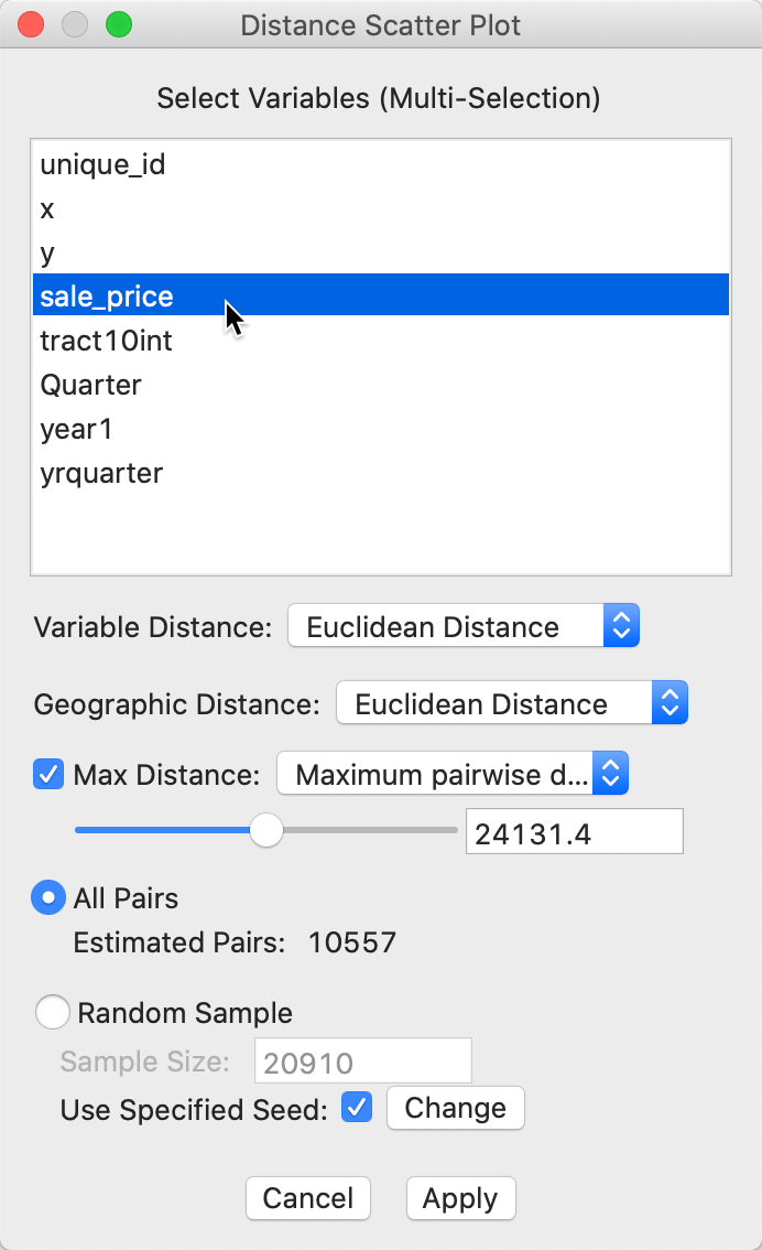
Figure 32: Distance scatter plot dialog
The main parameters are the choice of distance metric, i.e., Euclidean (the default) or Manhattan distance for either the attributes (variables) and geographic distance.
The other selections are the same as for the correlogram. The default distance range is 1/2 of the maximum distance, with the other built-in option as 1/2 the diameter of the bounding box. As before, this distance can be set manually as well. Finally, there is a choice between considering all observation pairs within the given distance range, or to use the same random sampling technique as for the spatial correlogram.
With all the options set to their default values, clicking on Apply yields the plot shown in Figure 33.
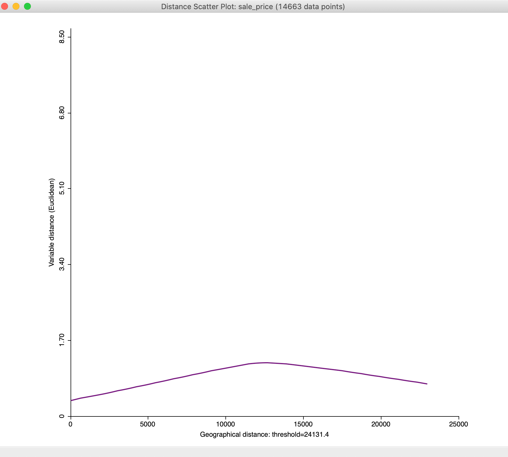
Figure 33: Default distance scatter plot
We will adjust the plot using the options to bring out the overall pattern more clearly, but in general the plot increases until a distance of about mid-way between 10,000 and 15,000 feet, after which it flattens out and even decreases.
Options
General options
In the usual fashion, a right click (or control-click) on the distance scatter plot window brings up the options, shown in Figure 34. Most of these are the same as for the spatial correlogram, and will not be further discussed.
One option that is particularly useful in this context is to customize the scale on the vertical axis. The default result does not always allow finer changes in the plot to be revealed.
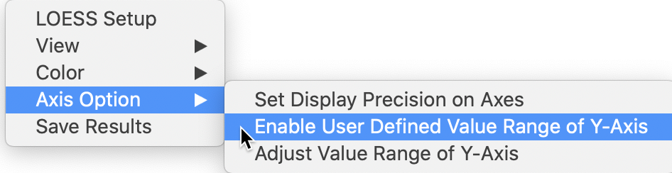
Figure 34: Distance scatter plot options
In the option, we select Enable User Defined Value Range of Y-Axis and then use Adjust Value Range of Y-Axis to set the maximum to 1.60. The result is the graph shown in Figure 35.
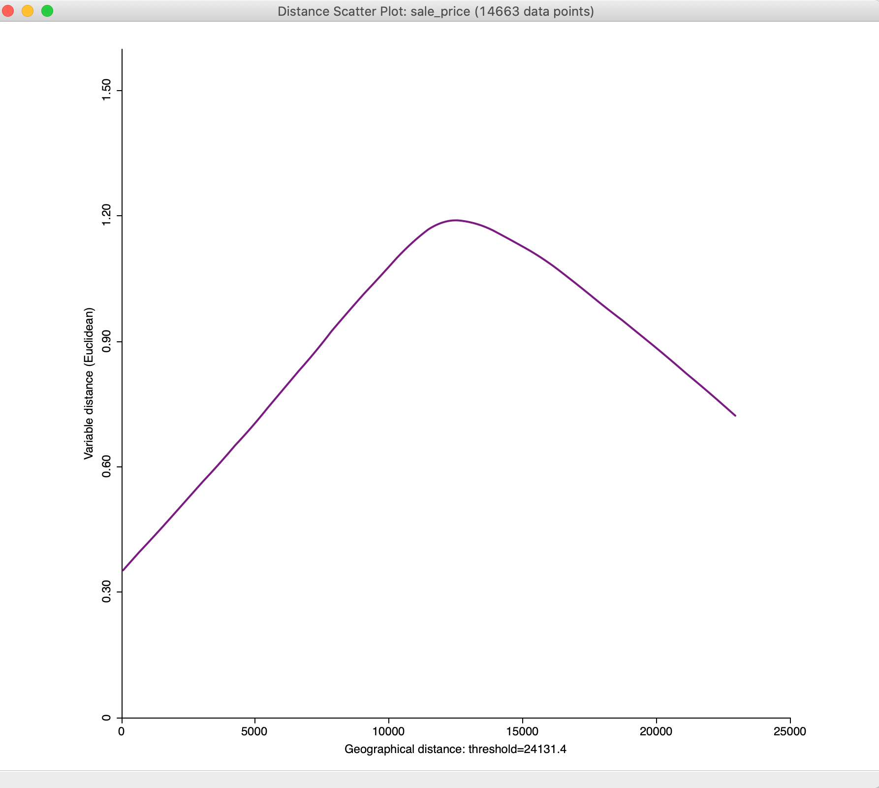
Figure 35: Distance scatter plot with adjusted y-axis
With the maximum distance set to 15,000, we obtain a much subtler view of the change of attribute distance with geographical distance at smaller distances, as illustrated in Figure 36
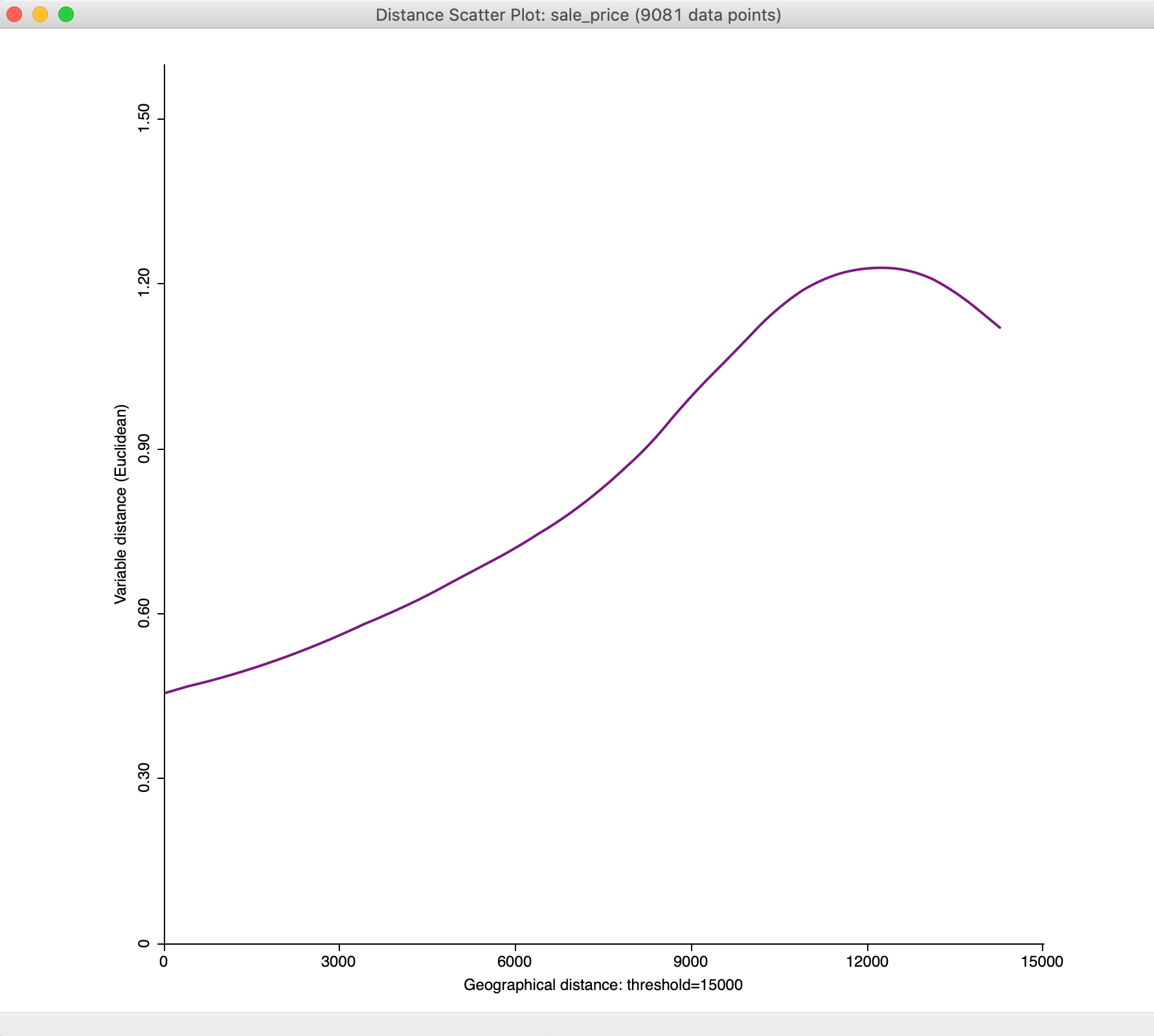
Figure 36: Distance scatter plot with 15,000 maximum distance
Smoothing options
The smoothing of the distance scatter plot is based on the local polynomial regression fitting by means of the LOESS algorithm. This operates in a slightly different way from the LOWESS approach, but is equally based on a moving fit over a subset of the observations, with observations that are further from the reference point downweighted.
The parameters of the LOESS smooth are set as one of the options. The details are shown in Figure 37. As before, the most important parameter is the bandwidth, referred to as the span in the LOESS context. The default value of 0.75 is usually appropriate (a smaller value yields a spikier smooth, a larger value a more linear one). Other choices are the degree for the polynomial, typically parabolic (2). The estimation method is set in the Family parameter, with the default as gaussian (i.e., least squares fit). An alternative option is a more robust M estimator (symmetric).
The default settings are appropriate in most circumstances.
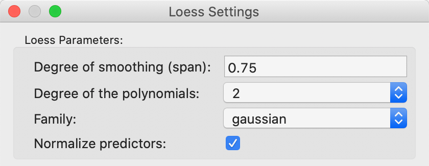
Figure 37: LOESS smoothing options
References
-
University of Chicago, Center for Spatial Data Science – anselin@uchicago.edu↩︎
-
See Cliff and Ord (1973) or Cliff and Ord (1981) for an extensive technical discussion.↩︎
-
In a bivariate linear regression \(y = \alpha + \beta x\), the least squares estimate for \(\beta\) is \(\sum_i (x_i \times y_i) / \sum_i x_i^2\). In the Moran scatter plot, the role of y is taken by the spatial lag \(\sum_j w_{ij} z_j\).↩︎
-
The implementation of the random numbers in
GeoDatakes advantage of multi-threading, a built-in form of parallel computing.↩︎ -
This is the number of software multithreading cores, typically twice the number of physical cores (the example shown is on a machine with 4 CPU hardware cores, which yield 8 multi-threading cores, the number listed).↩︎
-
The STANDARDIZED (Z) option is the usual standardization, based on subtracting the mean and dividing by the standard deviation. The Calculator also contains an alternative, based on the standardized mean absolute deviation, STANDARDIZED (MAD). This operation is not used in the Moran scatter plot.↩︎
-
See also Hall and Patil (1994) for a technical discussion of the general principle.↩︎
-
Since the estimated number of pairs is computed on the fly, as the maximum distance is adjusted by means of the slider, it is only an approximation. The actual number of pairs used in the calcuation of the pairwise correlations is given in the status bar of the correlogram.↩︎