Local Spatial Autocorrelation (1)
LISA and Local Moran
Luc Anselin1
10/12/2020 (updated)
Introduction
In this Chapter, we will begin our exploration of the analysis of local spatial autocorrelation statistics,
focusing
on the concept and its most common implementation in the form of the Local Moran statistic. We will explore how
it can be utilized to discover hot spots and cold spots in the data, as well
as spatial outliers. To illustrate these techniques, we will use the Guerry data set on
moral statistics in 1830 France, which comes pre-installed with GeoDa.
Objectives
-
Identify clusters with the Local Moran cluster map and significance map
-
Interpret the spatial footprint of spatial clusters
-
Assess the significance by means of a randomization approach
-
Assess the sensitivity of different significance cut-off values
-
Interpret significance by means of Bonferroni bounds and the False Discovery Rate (FDR)
-
Assess potential interaction effects by means of conditional cluster maps
GeoDa functions covered
- Space > Univariate Local Moran’s I
- significance map and cluster map
- permutation inference
- setting the random seed
- selecting the significance filter
- saving LISA statistics
- select all cores and neighbors
- local conditional map
Preliminaries
We again use a data set that is comes built-in with GeoDa and is also
contained in the GeoDa Center data set collection.
- Guerry: moral statistics of France in 1830
You can either load this data from the Sample Data tab, or, if you downloaded the files, drop
the guerry_85 shape file into the usual
Drop files here box in the dialog.
This brings up the familiar themeless base map, showing the 85 French departments.
To carry out the spatial autocorrelation analysis, we will need a spatial weights file, either created from scratch, or loaded from a previous analysis (ideally, contained in a project file). The Weights Manager should have at least one spatial weights file included, e.g., guerry_85_q for first order queen contiguity.
For this univariate analysis, we will focus on the variable Donatns (charitable donations per capita). This variable displays an interesting spatial distribution, as illustrated in a natural breaks map (using 6 categories), in Figure 1. The global Moran’s I is 0.353, using queen contiguity, and highly significant at p<0.001 (not shown here).
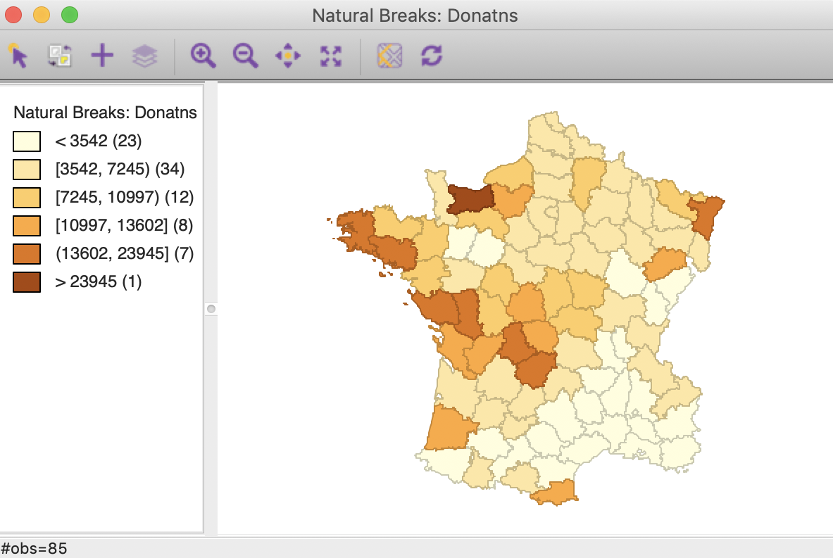
Figure 1: Donations – natural breaks map
We are now ready to proceed.
LISA Principle
As we have seen in the discussion of global spatial autocorrelation, such statistics (e.g., Moran’s I, Geary’s c) are designed to reject the null hypothesis of spatial randomness in favor of an alternative of clustering. Such clustering is a characteristic of the complete spatial pattern and does not provide an indication of the location of the clusters.
The concept of a local indicator of spatial association, or LISA was suggested in Anselin (1995) to remedie this situation. A LISA is seen as having two important characteristics. First, it provides a statistic for each location with an assessment of significance. Second, it establishes a proportional relationship between the sum of the local statistics and a corresponding global statistic.
Most global spatial autocorrelation statistics can be expressed as a double sum over the i and j indices, such as \(\sum_i \sum_j g_{ij}\). The local form of such a statistic would then be, for each observation (location) \(i\), the sum of the relevant expression over the \(j\) index, \(\sum_j g_{ij}\).
More precisely, we have seen that a spatial autocorrelation statistic consists of a combination of a measure of attribute similarity between a pair of observations, \(f(x_i,x_j)\), with an indicator for geographical or locational similarity, in the form of spatial weights, \(w_{ij}\). For a global statistic, this takes on the form \(\sum_i \sum_j w_{ij}f(x_i,x_j)\). A generic form for a local indicator of spatial association is then: \[\sum_j w_{ij}f(x_i,x_j).\] As there are many statistics for global spatial autocorrelation, there will be many corresponding LISA. In this Chapter, we focus on the local counterpart of Moran’s I.
Local Moran
Principle
The Local Moran statistic was suggested in Anselin (1995) as a way to identify local clusters and local spatial outliers.
With row-standardized weights, the sum of all weights, \(S_0 = \sum_i \sum_j w_{ij}\) equals the number of observations, n. As a result, as we have seen in the discussion of the Moran scatter plot, the Moran’s I statistic simplifies to: \[I = \frac{\sum_i \sum_j w_{ij} z_iz_j}{\sum_i z_i^2},\] with the \(z\) in deviations from the mean (or fully standardized, such that the variance equals one).
Using the logic just outlined, a corresponding Local Moran statistic would consist of the component in the double sum that corresponds to each observation \(i\), or: \[I_i = \frac{\sum_j w_{ij} z_iz_j}{\sum_i z_i^2}.\] In this expression, the denominator is fixed and can thus further be ignored. For notational simplicity, we replace it by \(c\), so that the Local Moran expression becomes \(c.\sum_j w_{ij} z_iz_j\). After some re-arranging, we obtain the expression: \[I_i = c. z_i \sum_j w_{ij} z_j,\] or, the product of the value at location \(i\) with its spatial lag, the weighted sum of the values at neighboring locations. A little bit of algebra shows that the sum of the local statistics is proporational to the global Moran’s I, or, alternatively, that the global Moran’s I corresponds with the average of the local statistics (for details, see Anselin 1995).
Significance can be based on an analytical approximation, but, as argued in Anselin (1995), this is not very reliable in practice. A preferred approach consists of a conditional permutation method. This is similar to the permutation approach considered in the Moran scatter plot, except that the value of each \(z_i\) is held fixed at its location \(i\). The remaining n-1 z-values are then randomly permuted to yield a reference distribution for the local statistic (one for each location).
This operates in the same fashion as for the global Moran’s I, except that the permutation is carried out for each observation in turn. The result is a pseudo p-value for each location, which can then be used to assess significance. Note that this notion of significance is not the standard one, and should not be interpreted that way (see also the discussion of multiple comparisons below).
Assessing significance in and of itself is not that useful for the Local Moran. However, when an indication of significance is combined with the location of each observation in the Moran Scatterplot, a very powerful interpretation becomes possible. The combined information allows for a classification of the significant locations as High-High and Low-Low spatial clusters, and High-Low and Low-High spatial outliers. It is important to keep in mind that the reference to high and low is relative to the mean of the variable, and should not be interpreted in an absolute sense.
Implementation
The Univariate Local Moran’s I is started from the Cluster Maps toolbar icon, shown in Figure 2.

Figure 2: Cluster map toolbar icon
It is included as the top level option in the resulting drop down list in Figure 3.
Figure 3: Univariate Local Moran from the toolbar
Alternatively, this option can be selected from the main menu, as Space > Univariate Local Moran’s I.
Either approach brings up the familiar Variable Settings dialog in Figure 4, which lists the available variables as well as the default weights file, at the bottom (guerry_85_q). We select Donatns as the variable name.
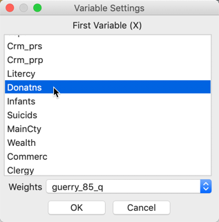
Figure 4: Univariate Local Moran variable settings
Significance map and cluster map
Clicking OK brings up a dialog to select the number and types of graphs to be created. The default is to provide the Cluster Map only, which is typically the most informative. This is shown in Figure 5. However, in addition, a Significance Map and a Moran Scatter Plot can be brought up as well. To continue, we select the Significance Map as well.
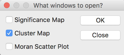
Figure 5: Windows options
The results, for the default setting of 999 permutations and a p-value of 0.05, is given in Figure 6, with the significance map in the left panel and the corresponding cluster map in the right panel.
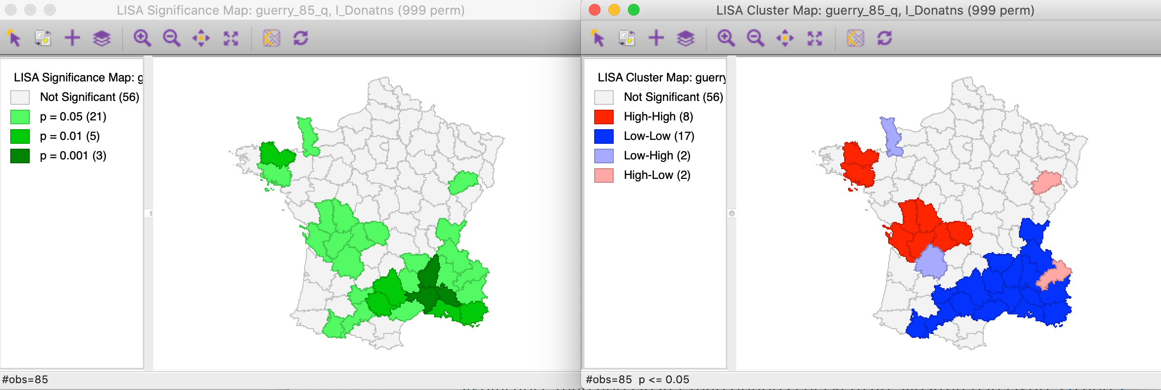
Figure 6: Default significance map (p<0.05)
The significance map shows the locations with a significant local statistic, with the degree of significance reflected in increasingly darker shades of green. The map starts with p < 0.05 and shows all the categories of significance that are meaningful for the given number of permutations. In our example, since there were 999 permutations, the smallest pseudo p-value is 0.001, with four such locations (the darkest shade of green).
The cluster map augments the significant locations with an indication of the type of spatial association, based on the location of the value and its spatial lag in the Moran scatter plot (see also the discussion below). In this example, all four categories are represented, with dark red for the high-high clusters (eight in our example), dark blue for the low-low clusters (seventeen locations), light blue for the low-high spatial outliers (two locations), and light red for the high-low spatial outliers (two locations).
Randomization options
The Randomization option is the first item in the options menu for both the significance map and the cluster map. It operates in the same fashion as for the Moran scatter plot. As shown in Figure 7, up to 99999 permutations are possible (for each observation in turn), preferably using a specified random seed to allow replication.
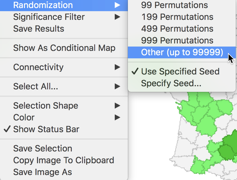
Figure 7: Randomization options
The effect of the number of permutations is typically marginal relative to the default of 999. In our example, selecting 99999 results in two minor changes, but the total number of significant locations remains the same. As shown in Figure 8, there are now 21 locations significant at p < 0.05, four at p < 0.01, three at p < 0.001, and one at p < 0.00001, as illustrated by different shades of green in the significance map in the left panel.
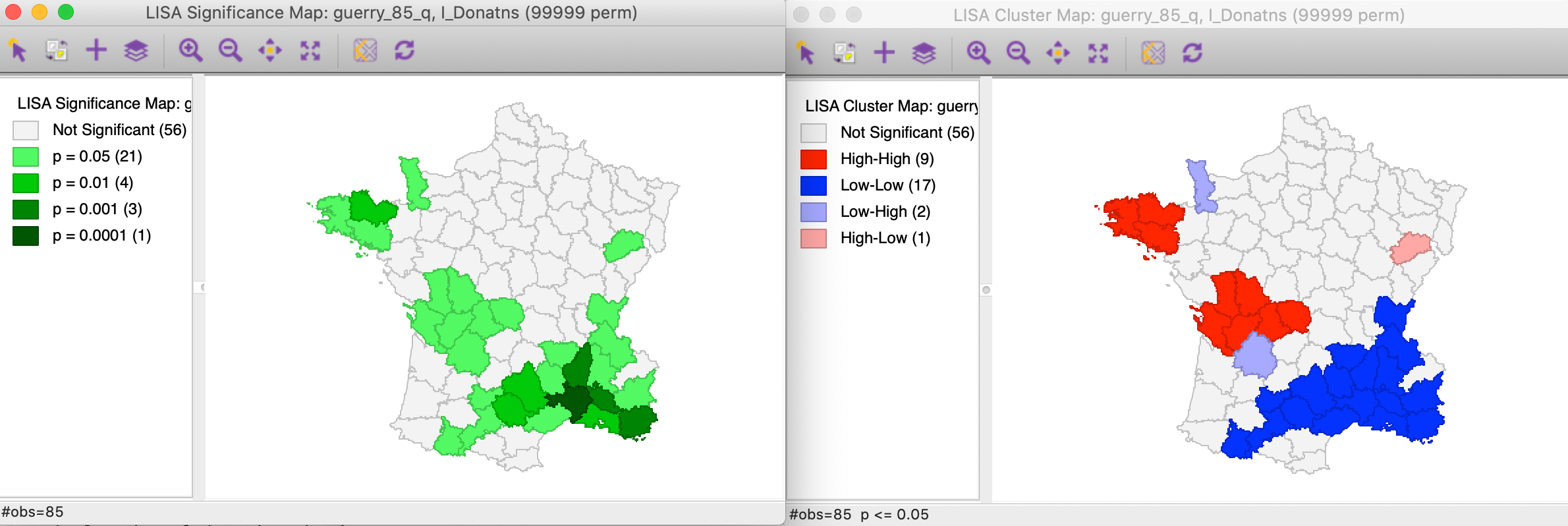
Figure 8: Significance and cluster map, 99999 permutations
The cluster map is affected in the same two locations, but now we can assess the effect on the four classifications. As illustrated in right panel of Figure 8, one of the High-Low spatial outliers disappears (adjoining the large Low-Low cluster in the south of the country, it was significant at p < 0.05 for 999 permutations), and one new High-High cluster is added (to the west of the existing High-High cluster in the Brittany region, also significant at p < 0.05). In general, it is good practice to assess the sensitivity of the significant locations to the number of permutations, although this typically only affects locations with a p-value of 0.05 (see below, for further discussion of the interpretation of significance).
Saving the Local Moran statistics
The Local Moran feature has the typical option to Save Results, selected as the third item in the options menu, shown earlier in Figure 7.
This brings up a dialog with three potential variables to save to the table, as in Figure 9. The Lisa Indices are the actual values for the local statistics, which are typically not that useful. The next two items are the Clusters and the Significance, i.e., the pseudo p-value.
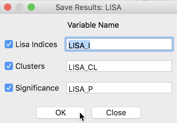
Figure 9: LISA variables options
The clusters are identified by an integer that designates the type of spatial association: 0 for non-significant (for the current selection of the p-value, i.e., 0.05 in our example), 1 for High-High, 2 for Low-Low, 3 for Low-High, and 4 for High-Low.
Finally, the significance is the pseudo p-value computed from the random permutations.
As before, default variable names are suggested. These would typically be changed, especially when more than one variable is considered (or different spatial weights for the same variable).
Clicking OK adds the variables to the table, as shown in Figure 10. The addition must be made permanent by means of a Save command.
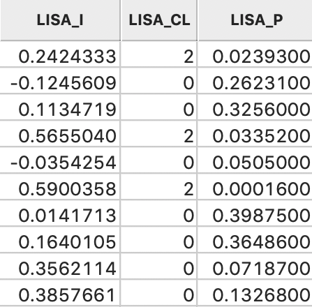
Figure 10: LISA variables in table
Clusters and Spatial Outliers
Before moving on to a discussion of significance, we highlight the connection between the Moran scatter plot and the cluster map. As discussed previously, the Moran scatter plot provides a classification of spatial association into four categories, corresponding to the location of the points in the four quadrants of the plot. These categories are referred to as High-High, Low-Low, Low-High and High-Low, relative to the mean, which is the center of the graph. It is important to keep in mind that there is a difference between a location (and its spatial lag) being in a given quadrant of the plot, and that location being a significant local cluster or spatial outlier.
Clusters
To illustrate this point, in the left panel of Figure 11, we select all the locations in the upper right quadrant of the Moran scatter plot. Using the linking feature, they are immediately highlighted in the corresponding cluster map in the right panel of the Figure. The selection is indicated by the red colors in the map, as well as the grey areas that match locations in the plot that are not significant in the map. Whereas there were 22 points selected in the scatter plot, there were only nine locations on the map that were significant (at p < 0.05).
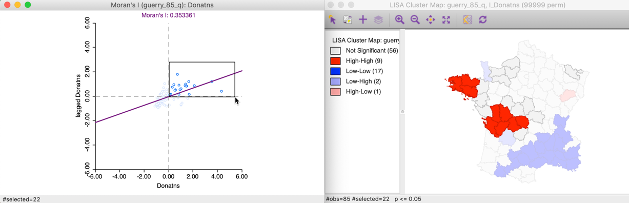
Figure 11: High-High Moran scatter plot locations
This can also be illustrated using the reverse logic, starting in the cluster map, by selecting those locations identified as significant High-High cluster centers. In the right hand panel of Figure 12, this is accomplished by clicking on the red rectangle in the legend, next to High-High. All the corresponding cluster centers are shown in red on the map, whereas the other locations are more transparent. Through linking, we can identify the matching nine points in the Moran scatter plot in the left hand panel.
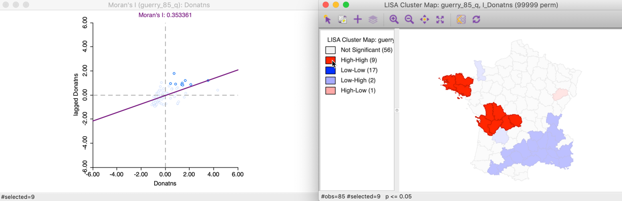
Figure 12: High-High cluster locations
To get a better sense of what these high-high clusters represent, we now link the significant locations in the cluster map with our original natural breaks map (Figure 1). In the left hand panel of Figure 13, we show both the cluster centers (with blue outlines) as well as their neighbors.2 The notion of a cluster is not always intuitive. Whereas in general, the selected locations correspond to darker colors, at times they are surrounded by light-colored observations as well. It should be kept in mind that the Local Moran statistic is constructed from the average of the neighbors, which is sensitive to the effect of outliers (e.g., a very large neighbor value pulling the overall average up).
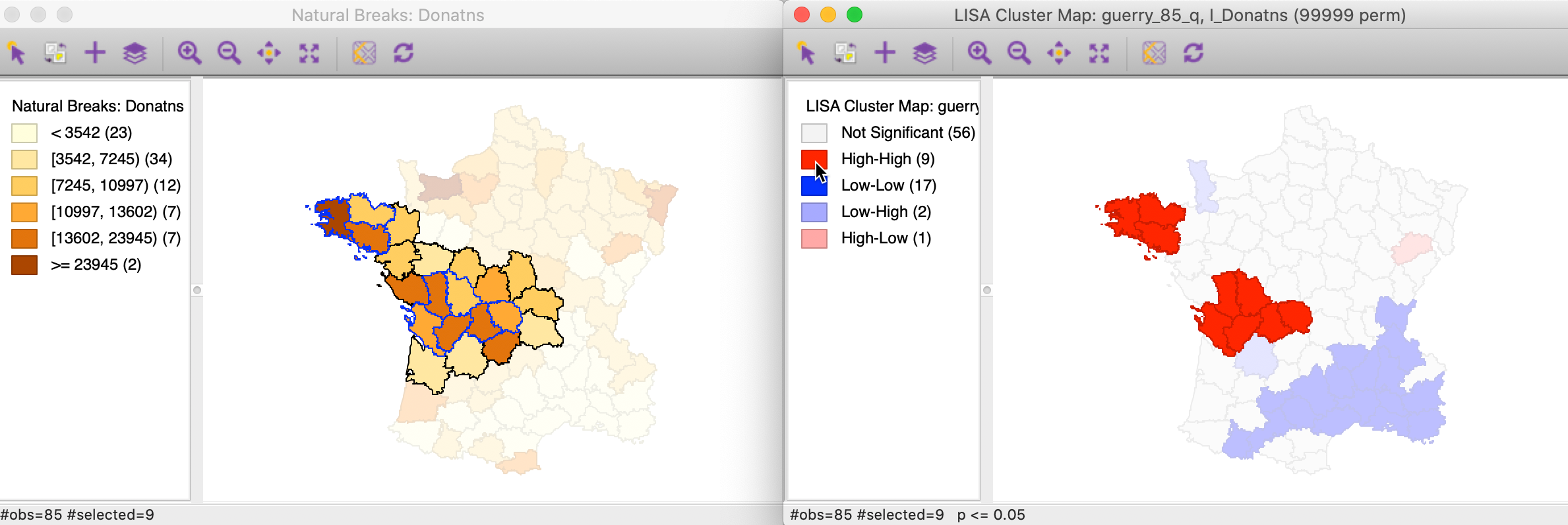
Figure 13: High-High cluster locations in map
We can apply the same perspective to the Low-Low cluster locations, which correspond to points in the lower left quadrant of the Moran scatter plot. In Figure 14, all 45 selected points are shown in the left hand panel. In the cluster map on the right, only 17 of those observations are actually significant, with a large swath of observations in the north and east not reaching that level.
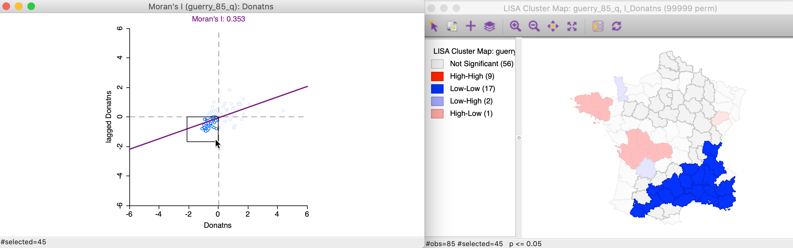
Figure 14: Low-Low scatter plot locations
Again, we can identify the locations that are significance Low-Low clusters by clicking on the dark blue rectangle in the legend. The matching 17 observations in the lower-left quadrant of the Moran scatter plot are shown in the left-hand panel of Figure 15.
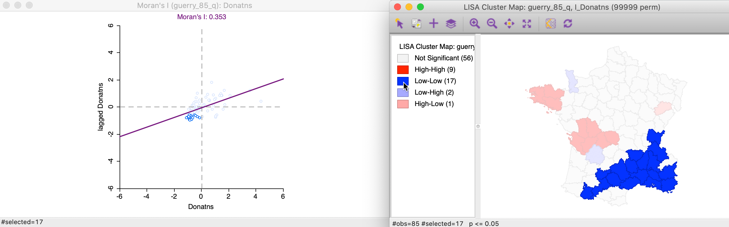
Figure 15: Low-Low cluster locations
In this example, the Low-Low clusters are much easier to interpret. In the left hand panel of Figure 16, the selected observations (with blue outline) clearly belong to locations with the lighted shade in the natural breaks map, surrounded by similarly light shaded locations, or a slightly darker shade at the edge of the cluster.
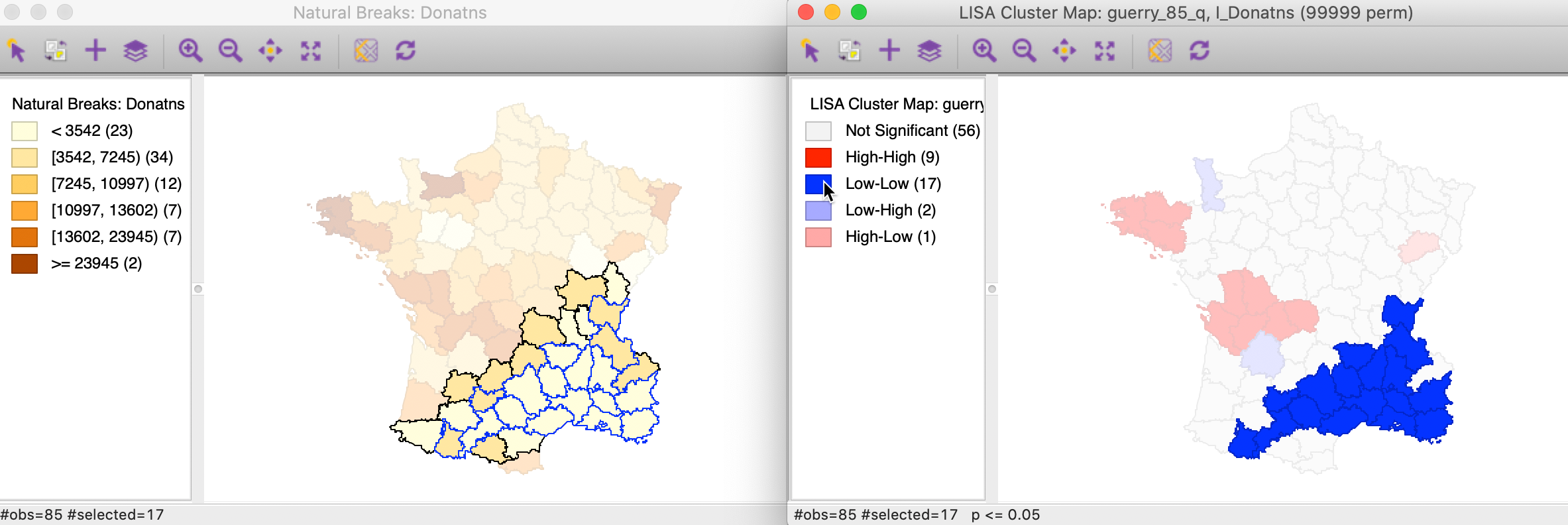
Figure 16: Low-Low cluster locations in map
Spatial outliers
Spatial outliers are observations located in the off-diagonal quadrants of the Moran scatter plot.
The 13 Low-High spatial outliers are in the upper left quadrant of the Moran scatter plot, shown as selected in the left-hand panel of Figure 17. In this case, only two of these outliers are deemed to be significant, highlighted in the right-hand panel (the grey areas are not significant).
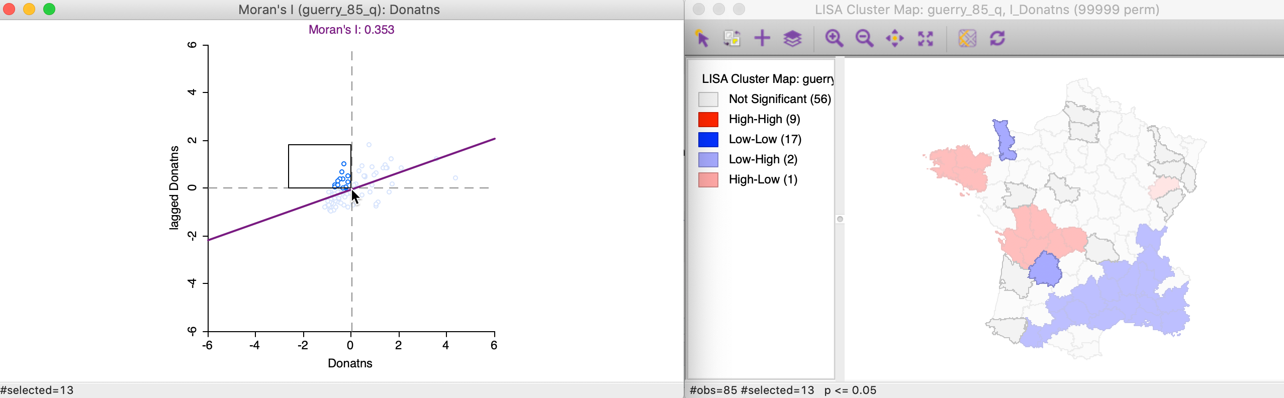
Figure 17: Low-High outlier locations in Moran scatter plot
Selecting these two Low-High outliers in the cluster map, highlights the corresponding two points in the upper left quadrant of the Moran scatter plot, as shown in Figure 18.
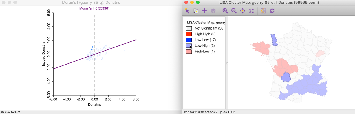
Figure 18: Low-High spatial outliers
The matching selection (with blue outline) in the natural breaks map is shown in Figure 19. In both instances, a low value (light shade) is surrounded by one or more dark colored areas. As a result, the average of the neighbors (the spatial lag) turns out to be much higher than would be the case under spatial randomness.
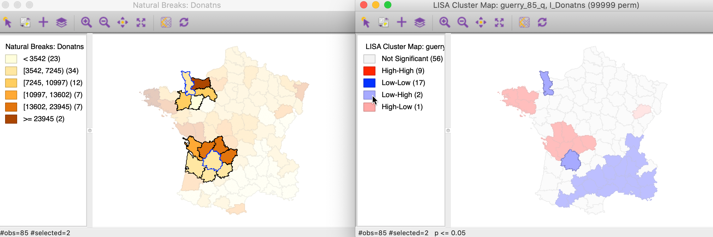
Figure 19: Low-High spatial outlier locations in map
The final case pertains to High-Low spatial outliers, which are located in the lower-right quadrant of the Moran Scatter plot. The selected observations are highlighted in the left-hand panel of Figure 20, with the matching locations in the cluster map on the right. In this instance, only one of the six observations turns out to be significant.
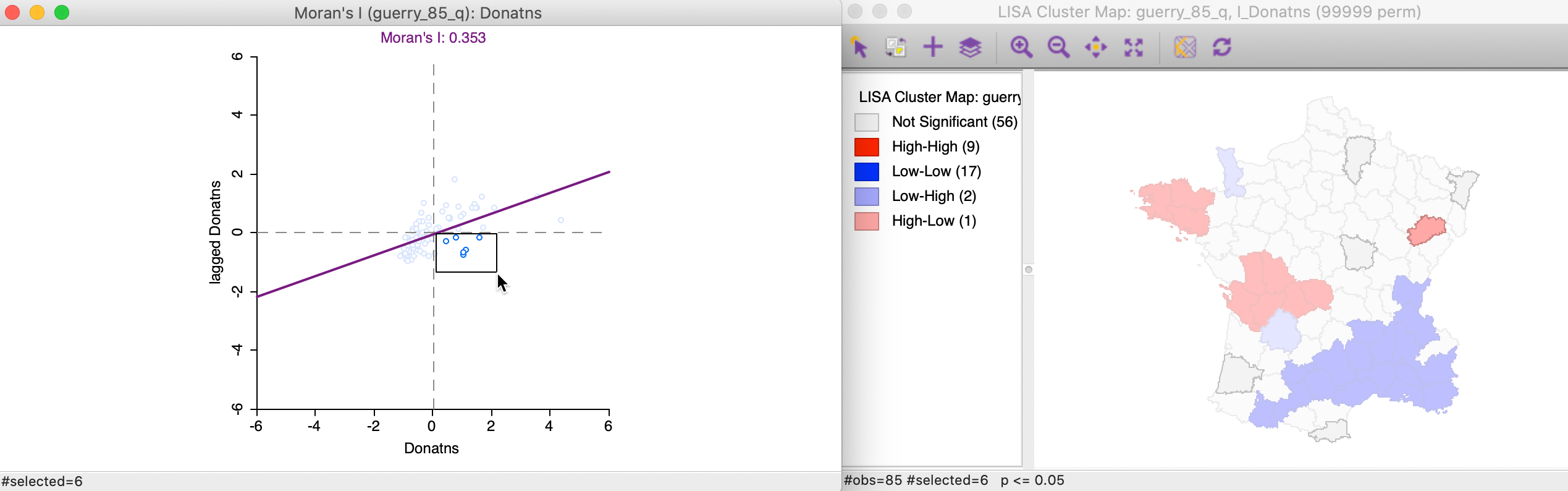
Figure 20: High-Low outlier locations in Moran scatter plot
We locate the significant outlier by selecting it in the cluster map. In Figure 21, the corresponding point is shown in the Moran scatter plot.
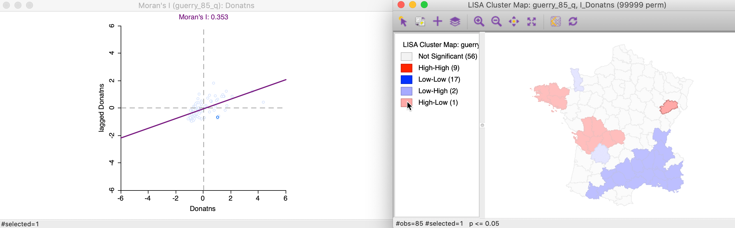
Figure 21: High-Low spatial outliers
In the natural breaks map in Figure 22, the corresponding location has a dark shade (but not the darkest), but is surrounded by several locations with the lightest shade. Again, this results in an average for the neighbors that is much smaller than would have been expected under spatial randomness.
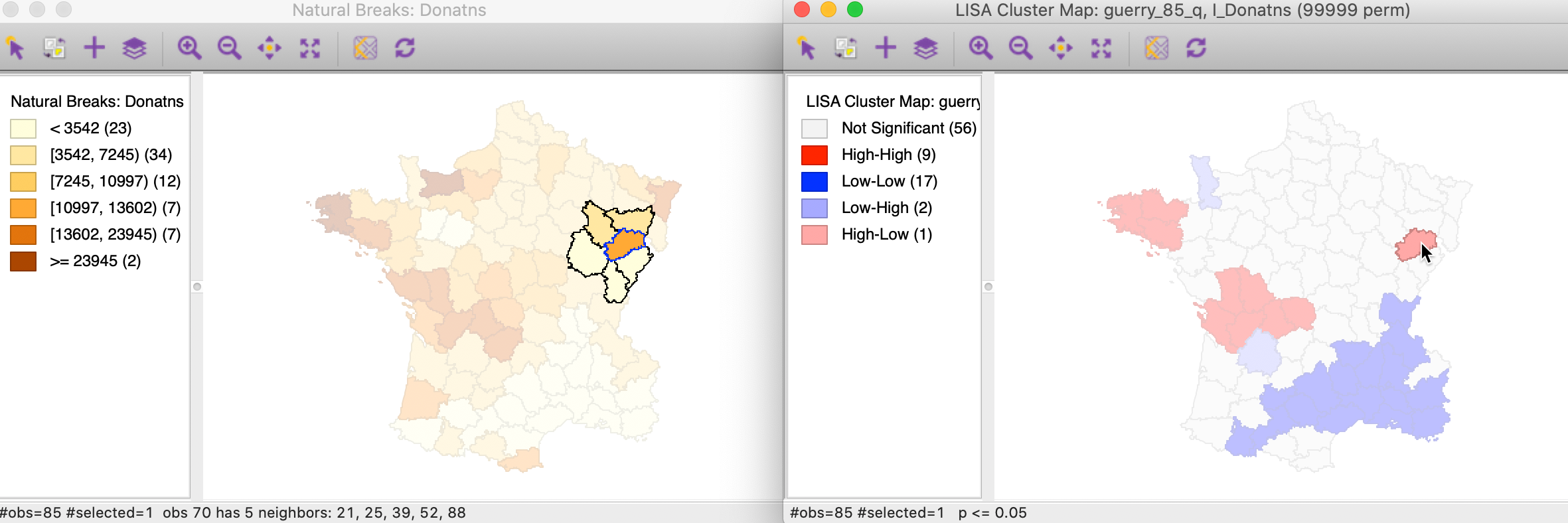
Figure 22: High-Low spatial outlier locations in map
Significance and Interpretation
Multiple comparisons
An important methodological issue associated with the local spatial autocorrelation statistics is the selection of the p-value cut-off to properly reflect the desired Type I error. Not only are the pseudo p-values not analytical, since they are the result of a computational permutation process, but they also suffer from the problem of multiple comparisons (for a detailed discussion, see de Castro and Singer 2006; Anselin 2019). The bottom line is that a traditional choice of 0.05 is likely to lead to many false positives, i.e., rejections of the null when in fact it holds.
There is no completely satisfactory solution to this problem, and no strategy yields an unequivocal correct p-value. A number of approximations have been suggested in the literature, and we consider here the Bonferroni bounds and False Discovery Rate approaches. However, in general, the preferred strategy is to carry out an extensive sensitivity analysis, to yield insight into what may be termed interesting locations.
In GeoDa these strategies are implemented through the Significance Filter, the
second item in the list of options shown earlier in Figure 7.
Adjusting p-values
A straightforward option is to select one of the pre-selected p-values from the list provided by the Significance Filter (i.e., 0.05, 0.01, 0.001, or 0.0001). For example, choosing 0.01 immediately changes the locations that are displayed in the significance and cluster maps, as shown in Figure 23. Now, there are only eight significant locations, compared to 29 with a pseudo p-value cut-off of 0.05.
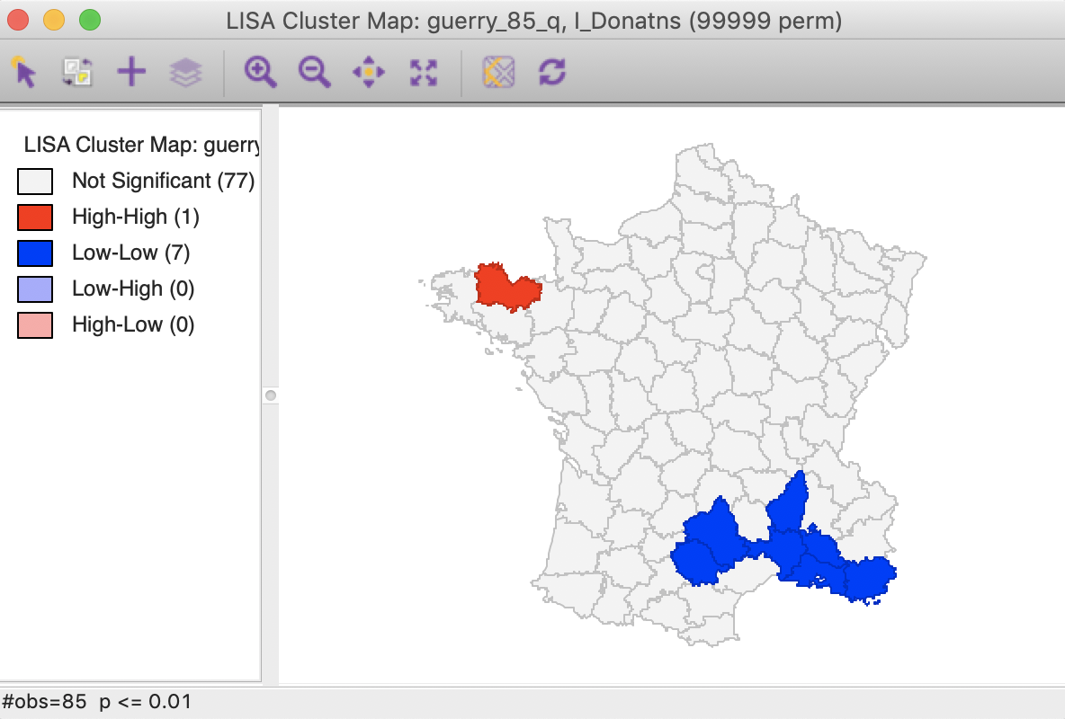
Figure 23: Cluster map (p<0.01)
Note that we can obtain exactly the same locations by selecting the three categories of p-values 0.01, 0.001 and 0.0001 in the original significance map of Figure 8 (click on the rectangle next to p=0.01, followed by a shift click on the rectangles next to p = 0.001 and p = 0.0001). The status bar in Figure 24 confirms that the selection consists of eight values (4 for p = 0.01, 3 for p = 0.001, and 1 for p = 0.0001).
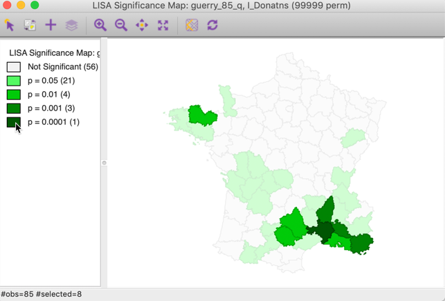
Figure 24: Selected locations in significance map for p<0.01
A more refined approach to select a proper p-value is available through the Custom Inference item of the significance filter, shown in Figure 25. The associated interface provides a number of options to deal with the multiple comparison problem.
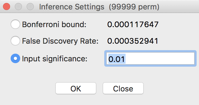
Figure 25: Custom inference options
The point of departure is to set a target \(\alpha\) value for an overall Type I error rate. In a multiple comparison context, this is sometimes referred to as the Family Wide Error Rate (FWER). The target rate is selected in the input box next to Input significance. Without any other options, this is the cut-off p-value used to select the observations. For example, this could be set to 0.1, a value suggested by Efron and Hastie (2016) for big data analysis. In our example, since the 85 observations hardly constitute big data, we keep the value at 0.01.
We now consider the two more refined options, i.e., the Bonferroni bound and the False Discovery Rate.
Bonferroni bound
The first custom option in the inference settings dialog is the Bonferroni bound procedure. This constructs a bound on the overall p-value by taking \(\alpha\) and dividing it by the number of multiple comparisons. In our context, the latter corresponds to the number of observations, \(n\). As a result, Bonferroni bound would be \(\alpha / n = 0.00012\), the cut-off p-value to be used to determine significance.
Note that in their recent overview of computer age statistical inference, Efron and Hastie (2016) suggest the use of the term interesting observations, rather than signficant, which we will adopt as well.
Checking the Bonferroni bound radio button in the dialog updates the significance and cluster maps. Only one observation meets this criterion in the sense that its pseudo p-value is less than the cut off, which is confirmed by the cluster map shown in Figure 26.
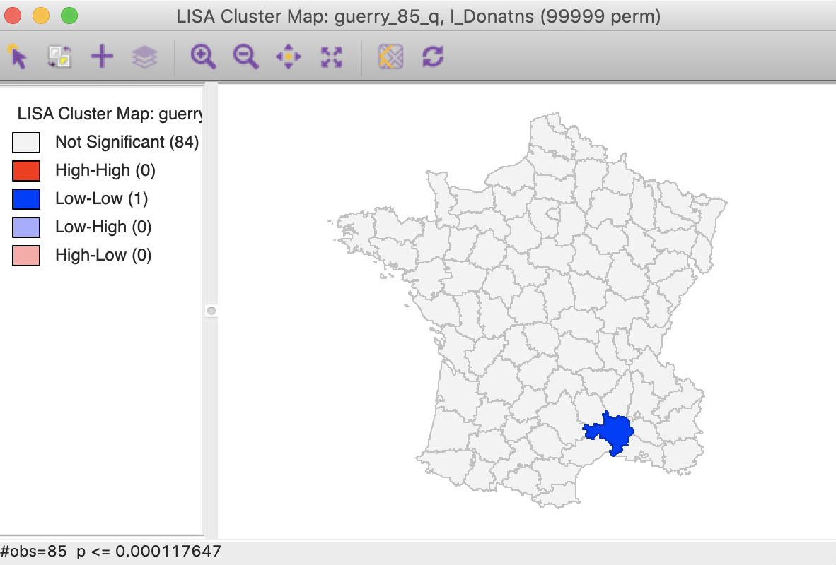
Figure 26: Cluster map, Bonferroni (p<0.00012)
False Discovery Rate (FDR)
A slightly less conservative option is to use the False Discovery Rate (FDR), first proposed by Benjamini and Hochberg (1995). To illustrate this method, we add some columns to the data table. First, we sort the p-values in increasing order, and add a variable to reflect that order, e.g., the variable I shown in Figure 27, computed in the Table Calculator as Special > Enumerate.
Next, we create a new variable (FDR) that equals \(i \times \alpha / n\), where \(i\) is the sequence number of the sorted observations (not the original observation order), \(\alpha\) is the target, and \(n\) is the number of observations.3 In our example, \(\alpha\) is 0.01 and \(n\) is 85, so that \(1 \times 0.01 / 85 = 0.000118\) is the first entry. The second entry is \(2 \times 0.01 / 85 = 0.000235\), etc., as illustrated in the FDR column in the table shown in Figure 27.
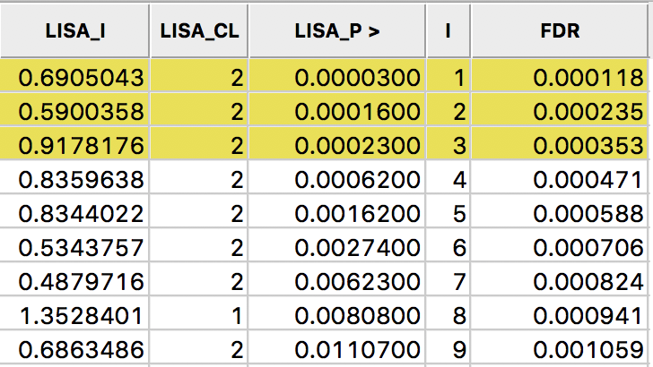
Figure 27: Sorted pseudo p-values
We now determine the p-value in the sorted list that corresponds with the sequence number \(i_{max}\), the largest value for which \(p_{i_{max}} \leq i \times \alpha / n\). In the table with the sorted p-values, we can see how the first three observations meet the criterion, but for the fourth observation, the pseudo p-value is larger than the value in the FDR column. Consequently, this criterion identifies three locations as significant. Checking the False Discovery Rate radio button will update the signficance and cluster maps accordingly, displaying only three significant locations, as shown in Figure 28.
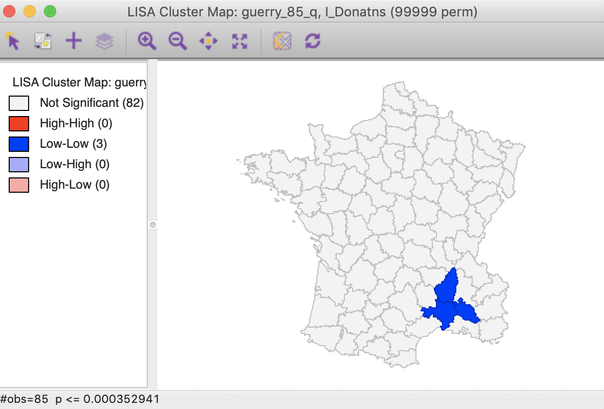
Figure 28: Cluster map, FDR (p<0.00035)
Interpretation of significance
As mentioned, there is no fully satisfactory solution to deal with the multiple comparison problem. Therefore, it is recommended to carry out a sensitivity analysis and to identify the stage where the results become interesting. A mechanical use of 0.05 as a cut off value is definitely not the proper way to proceed.
Also, for the Bonferroni and FDR procedures to work properly, it is necessary to have a large number of permutations, to ensure that the minimum p-value can be less than \(\alpha / n\). Currently, the largest number of permutations that GeoDa supports is 99999, so that in order to be meaningful, we must have at least \(\alpha / n \gt 0.00001\). Otherwise, the Bonferroni criterion cannot yield a single significant value. This is not due to a characteristic of the data, but to the lack of sufficient permutations to yield a pseudo p-value that is small enough.
In practice, this means that with \(\alpha = 0.01\), data sets with \(n > 1000\) will not have a significant location using the Bonferroni criterion. With \(\alpha = 0.05\), this value increases to 5000, and with \(\alpha = 0.1\) to 10,000. However, for truly large data sets, an uncritical application of the Bonferroni bounds will not give meaningful results.
Interpretation of clusters
Strictly speaking, the locations shown as significant on the significance and cluster maps are not the actual clusters, but the cores of a cluster. In contrast, in the case of spatial outliers, they are the actual locations of interest.
In order to get a better sense of the spatial extent of the cluster, there are a number of ways to highlight cores, their neighbors, or both in the Select All… option in Figure 29.
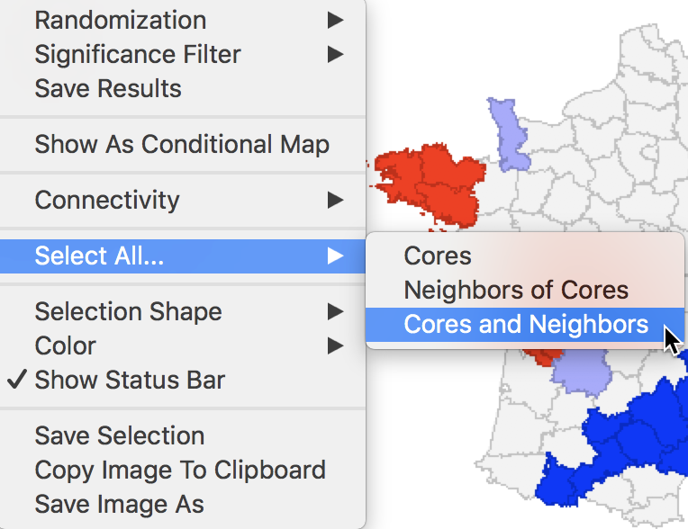
Figure 29: Cores and neighbors option
The first option selects the cores, i.e., all the locations shown as non-white in the map. This is not so much relevant for the cluster or significance map, but rather for any maps that are linked. The selection of the Cores will select the corresponding observations in any other map or graph window.
The next option does not select the cores themselves, but their neighbors. Again, this is most relevant when used in combination with linked maps or graphs.
The third option selects both the cores and their neighbors (as defined by the spatial weights). This is most useful to assess the spatial range of the areas identified as clusters. For example, with the p-value set at 0.01, selection of the cores and neighbors yields the regions in Figure 30, with the non-significant neighbors shown in grey.
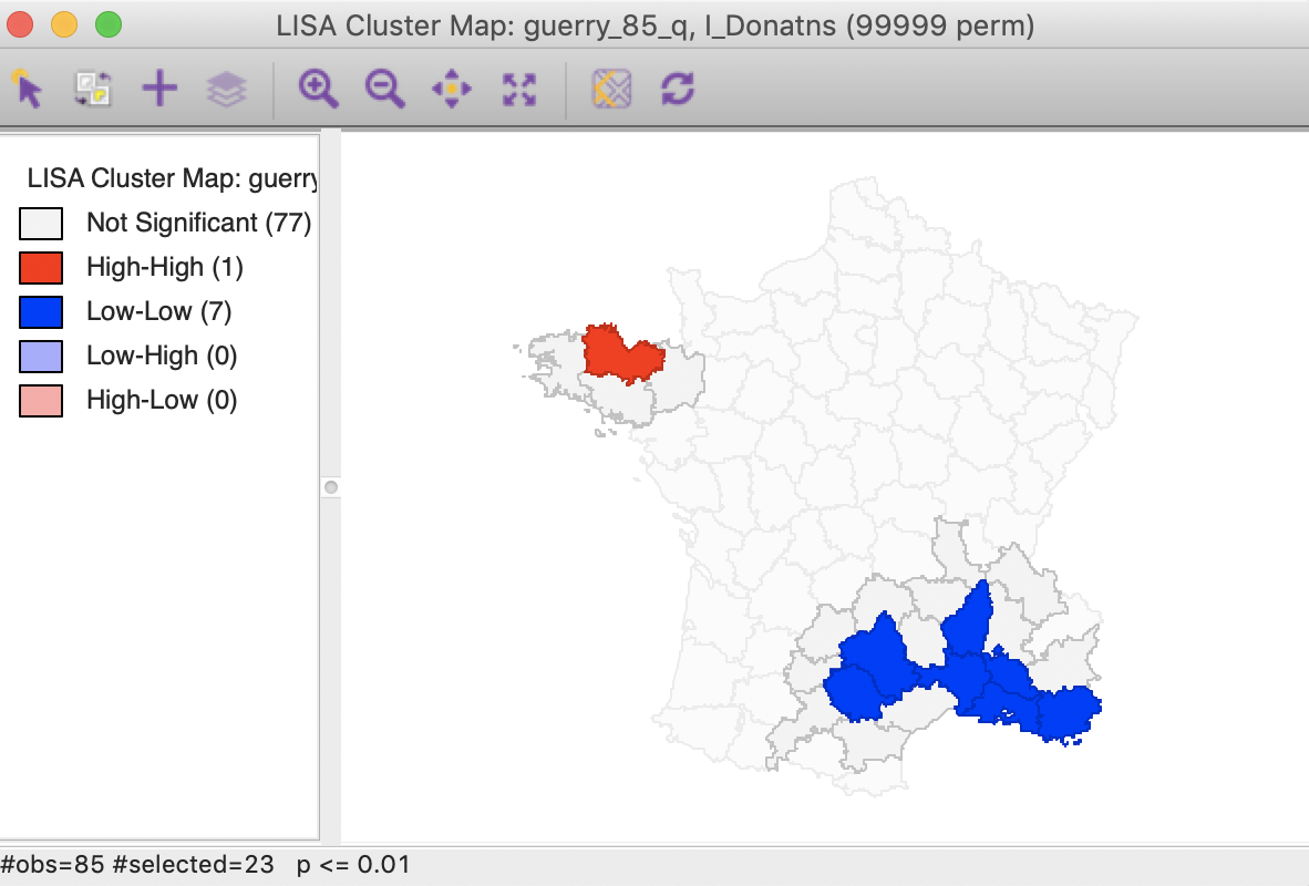
Figure 30: Cluster cores and neighbors (p<0.01)
An interesting application of this feature is to superimpose the cores and neighbors selected for a given p-value, say 0.01, onto the cluster cores identified with a different p-value, say 0.05. In the example in Figure 31, the cores and clusters for 0.01 mostly match the locations identified as cluster cores at p < 0.05. In our example, there are 23 locations selected, compared to 26 significant High-High and Low-Low locations for p < 0.05. The major difference is that the High-High region in the center of the country is totally missed, but the High-High cluster in Brittany and the Low-Low cluster in the south of the country is almost exactly matched.
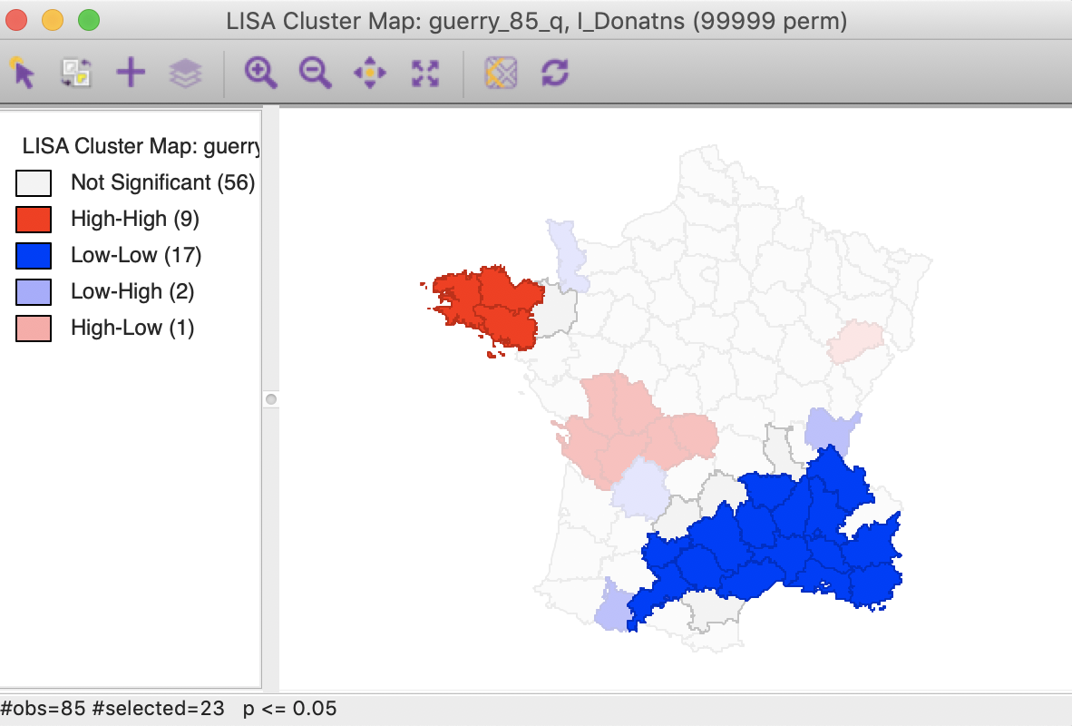
Figure 31: Cluster cores and neighbors for p<0.01 overlaid on cluster map for p<0.05
Similarly, checking the cores and neighbors selected in the significance map, clearly illustrates how some of the neighbors at p < 0.01 are identified as significant cores for p < 0.05, as shown in Figure 32.
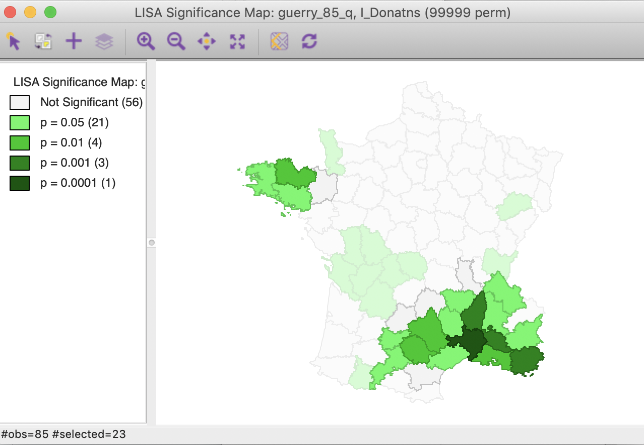
Figure 32: Cluster cores and neighbors for p<0.01 in significance map
In sum, this drives home the message that a mechanical application of p-values is to be avoided. Instead, a careful sensitivity analysis should be carried out, comparing cores of clusters identified for different p-values, including the Bonferroni and FDR criteria, as well as the associated neighbors to suggest interesting locations that may suggest new hypotheses or discover the unexpected.
Conditional Local Cluster Maps
A final option for the Local Moran statistic is that the cluster maps can be incorporated in a conditional map view, similar to the conditional maps we covered earlier. This is accomplished by selecting the Show As Conditional Map item as the fourth entry in the options, shown in Figure 7.
The resulting dialog is the same as for the standard conditional map we reviewed in an earlier chapter. In our example, we take literacy (Litercy) as the conditioning variable for the x-axis, and Clergy as the conditioning variable for the y-axis. In addition, we change the default 3 by 3 micromaps to a 2 by 2 setup, selecting the median as the cut point for each variable (select quantile > 2).
The result is as shown in Figure 33, depicting four micromaps. The maps on the left show the location of clusters and outliers (using p < 0.05 in this example) for those departments with literacy below the median, whereas the maps on the right show the corresponding departments above the median. The main difference seems to be between the maps on the lower end of clergy versus the upper end. The upper end seems to have more High-High cluster cores, with the lower end with more Low-Low cores.
It should be noted that this example is purely illustrative of the functionality available through the conditional cluster map feature, rather than as a substantive interpretation. As always, the main focus is on whether the micromaps suggest different patterns, which would imply an interaction effect with the conditioning variables.
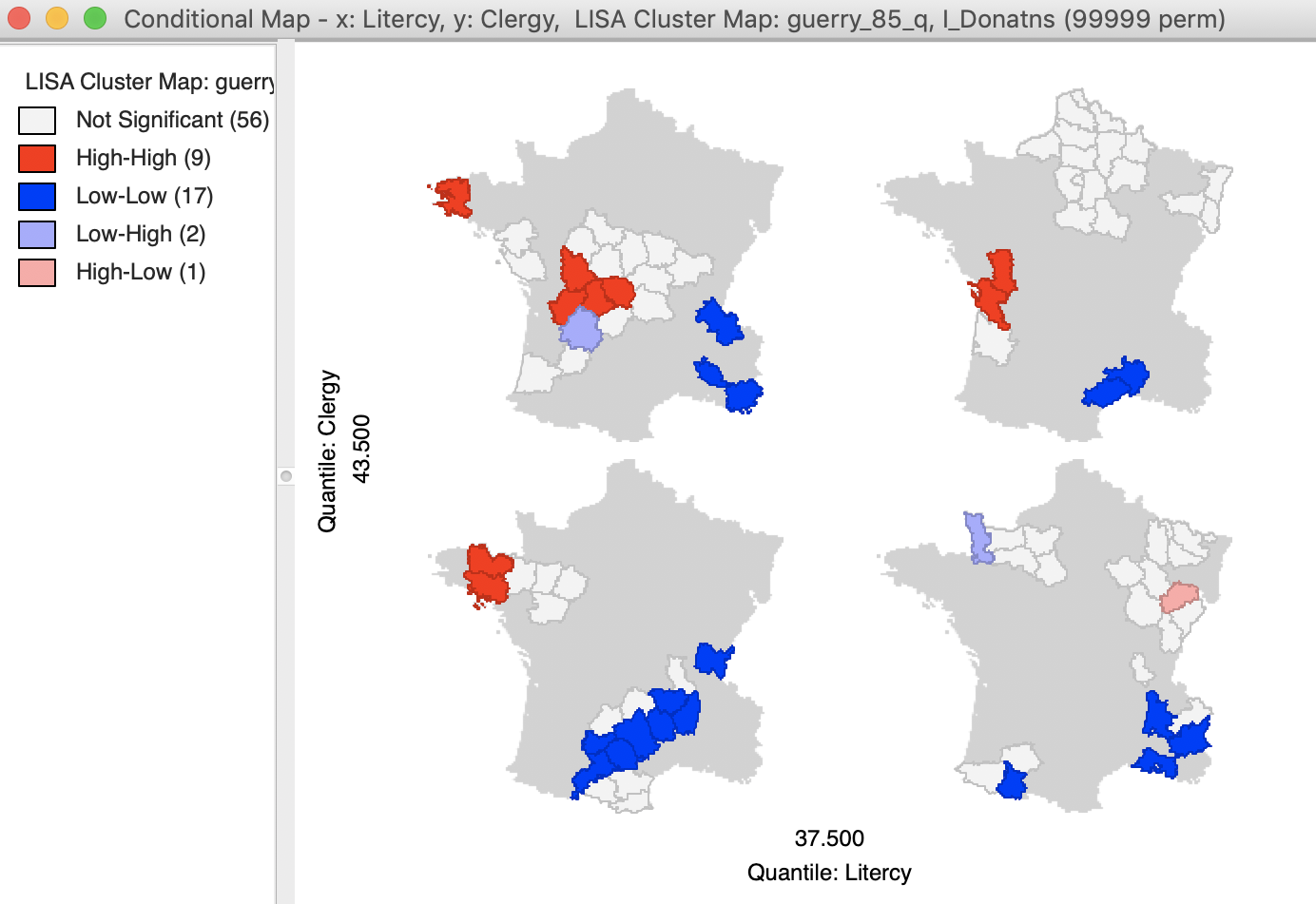
Figure 33: Conditional cluster map
References
Anselin, Luc. 1995. “Local Indicators of Spatial Association — LISA.” Geographical Analysis 27: 93–115.
———. 2019. “A Local Indicator of Multivariate Spatial Association, Extending Geary’s c.” Geographical Analysis 51 (2): 133–50.
Benjamini, Y., and Y. Hochberg. 1995. “Controlling the False Discovery Rate: A Practical and Powerful Approach to Multiple Testing.” Journal of the Royal Statistical Society B 57 (1): 289–300.
de Castro, Maria Caldas, and Burton H. Singer. 2006. “Controlling the False Discovery Rate: An Application to Account for Multiple and Dependent Tests in Local Statistics of Spatial Association.” Geographical Analysis 38: 180–208.
Efron, Bradley, and Trevor Hastie. 2016. Computer Age Statistical Inference. Algorithms, Evidence, and Data Science. Cambridge, UK: Cambridge University Press.
-
University of Chicago, Center for Spatial Data Science – anselin@uchicago.edu↩︎
-
This is accomplished by selecting Connectivity > Show Selection and Neighbors as an option. In addition, we changed the Outline Color of Selected to blue, to highlight the contrast between the selection and its neighbors.↩︎
-
Again, we accomplish this in the Table Calculator. First, we create a new column/variable as FDR, with the constant value \(\alpha / n\), using Univariate > Assign. Next, we multiply the FDR value with the value for I, using Bivariate > Multiply.↩︎