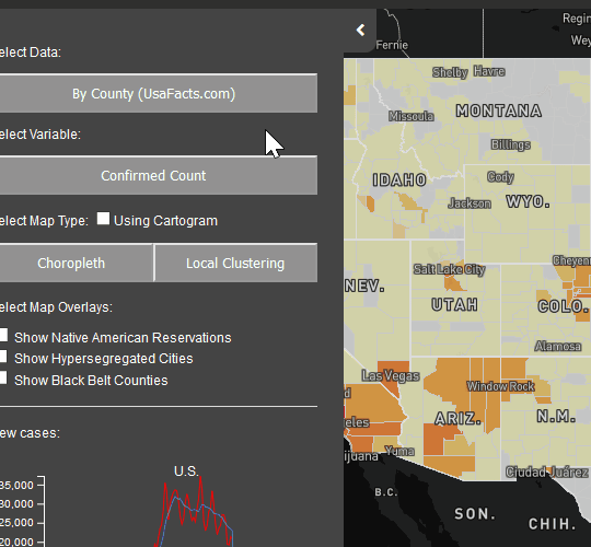
Use spatial statistics to detect hot spots with raw case data or by adjusting for population. Because of the infectious nature of COVID, high numbers of cases anywhere will be of concern. At the same time, identifying areas that have a disporotionately high number of cases within the population is necessary to locate areas hit hardest by the pandemic.
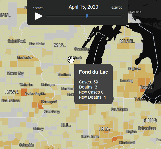
Visualize change over time to better understand the distribution and spread of COVID in the US throughout the pandemic. Move the time slider yourself or click the play button and watch the spread of COVID. Analyze patterns of the spread to support planning for resource allocation.
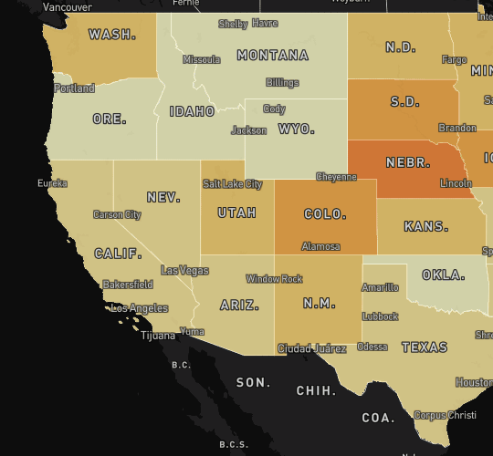
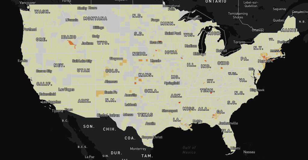
Switch between the state and county thematic maps (ie. choropleth maps) to find COVID at a local level. Then, select and track hotspots over time using the Local Moran's I statistic. Use a powerful visual analytic tool to find COVID spillovers along state borders, emerging from one county to areas nearby, and more.
Click on counties to get more information about community health factors and socioeconomic indicatore like average length of life in an area, percent uninsured, or income inequality metrics. In the main selection panel, overlay segregated cities or Native American Reservation boundaries to identify uniquely vulnerable locales.
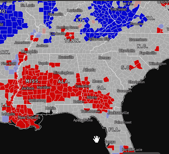
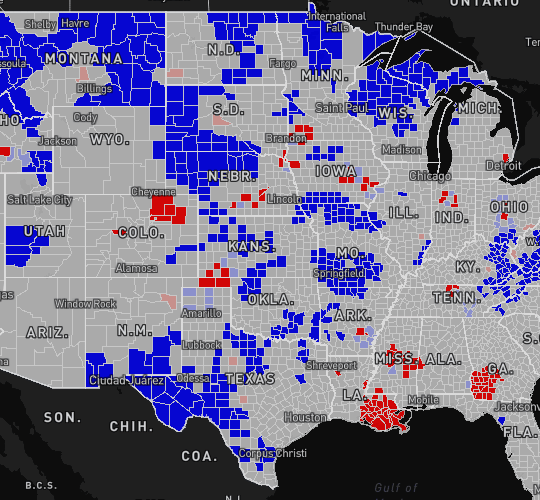
Watch hotspots progress or diminish over time, and identify areas of emerging risk early. Some hotspots begin as spatial outliers -- shown as pink in the map, meaning cases are high in that county but low in neighboring counties. If cases continue to grow and spillover nearby counties, the areas will turn red. Mature hotspots are clusters of counties that remain red over time and continue to grow.