Methodology
Interactive Exploration
COVID cases are commonly visualized across multiple dashboards as quantile choropleth maps or graduated points around state centroids. County-level visualizations are rare but when viewed, show a dramatically more nuanced and detailed pandemic landscape. We visualize data at both state and county-scale as total cases, deaths, and population-weighted rates to provide a richer understanding of the pandemic. Case information can be explored by clicking on county or state areas to generate pop-up windows, or to change graphs of confirmed cases.
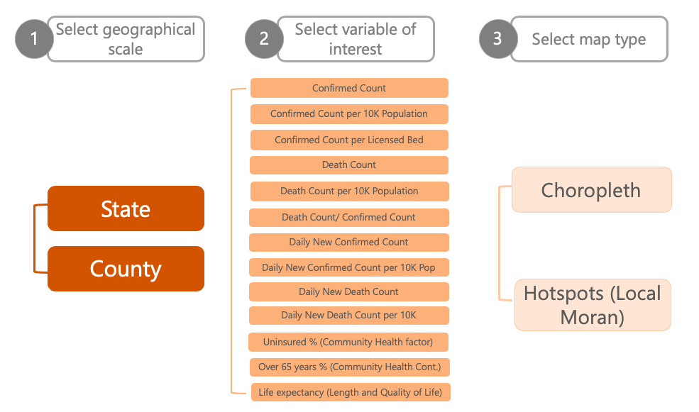
Temporal Exploration
A temporal slider allows the current view to be updated over time, providing users the ability to watch the pandemic emerge over time. See this animation of COVID population centered clusters over time as an example here.
Map Options
- For geo-visualization, we adopt jenks natural breaks maps to classify the values of the pandemic data for each state/county. A natural breaks map uses a nonlinear algorithm to create groups where within-group homogeneity is maximized, grouping and highlighting extreme observations.
- How it works: The Jenks break is a method designed by Jenks (1957) which assigns each observation to the best classification it could possibly belong to. It aims to find the best possible arrangement of the geographical units into classes, such that the deviation from the mean within classes is minimize, while the differences between classes in maximized. In other words, it aims to group more alike geographical units, while trying to maximize the differences between the groups created.
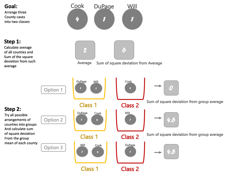
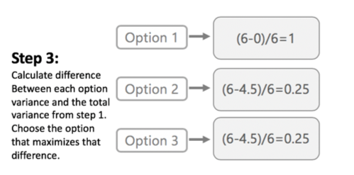
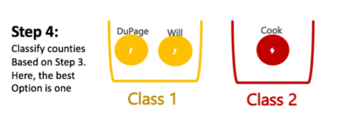
- For illustration purposes only, assume that we want to classify three counties based on its number of covid19 cases into two groups. The Jenks strategy works as follow:
- A formal description of the Jenks break could be found here: Jenks, GF (1967). The Data Model Concept in Statistical Mapping. International Yearbook of Cartography. 7: 186–190.
CHOROPLETH MAP: NATURAL BREAKS
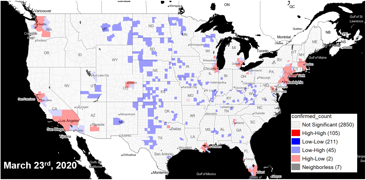
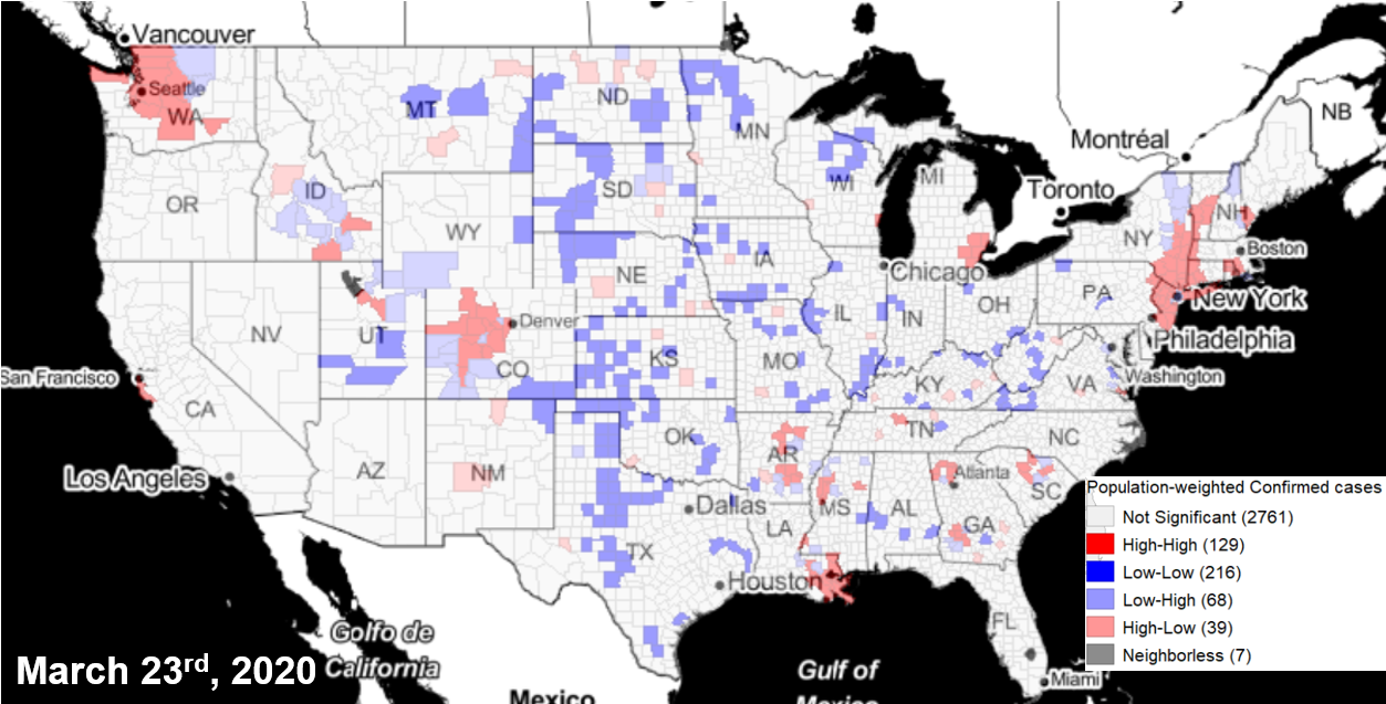
HOTSPOT MAP: Local Moran's I
The CSDS team identifies hot spots two ways: using the total number of confirmed cases and by adjusting for population. Because of the infectious nature of COVID, high numbers of cases anywhere will be of concern. At the same time, identifying areas that have a disproportionately high number of cases within the population is needed to locate areas hit hardest by the pandemic. The team further differentiates hot spot clusters and outliers: clusters are counties that have a high number of cases, and are surrounded by counties with a high number of cases. Outliers are areas that have a high number of cases within the county and fewer cases in neighboring counties, highlighting an emerging risk or priority for containment. We utilize local spatial autocorrelation statistics (LISA) using queen-contiguity spatial weights and 999 Monte Carlo permutations to generate these metrics.
- The Local Clustering maps identify clusters or collections of geographical units similar, in statistical terms, based on the indicator used. They can be used to identify hot spots of cold spots across space. Hot spots are of particular interests in epidemiological analysis such as the spread of covid19, as it allows the identification of “hot” groups of areas (e.g. States, counties) significantly affected by the virus. It is, collection of counties, for instance, with a relatively high indicator which are also surrounded by areas of high indicators. In the maps, such areas are represented by the red colors.
- For more details:
- https://geodacenter.github.io/glossary.html#lisa2
- https://geodacenter.github.io/workbook/6a_local_auto/lab6a.html
- Anselin, Luc. 1995. “Local Indicators of Spatial Association — LISA.” Geographical Analysis 27: 93–115.
- Anselin, Luc. 2018. “A Local Indicator of Multivariate Spatial Association, Extending Geary’s c.” Geographical Analysis.
- Anselin, Luc, and Xun Li. 2019. “Operational Local Join Count Statistics for Cluster Detection.” Journal of Geographical Systems.
GeoStack
The app is made using Libgeoda as a lightweight C/C++ library that acts as a wrapper to the core features of GeoDa, an open source spatial analysis software developed by the Center. For this web map, it’s customized and compiled to WebAssembly, a format supported by most modern web browsers, and bound to the geo-visualization module via Javascript, which is implemented using deck.gl, d3.js and Mapbox.
Opensource
The Github for our project is public and available at github.com/GeoDaCenter/covid. Contributions are welcome. Volunteers are encouraged to start on the “Issues” page and identify “good first issues” to maximize help efforts. A public release of the application will continue to be updated with new data and features on a regular basis.
Limitations
Known limitations exist regarding actual fatality rates, for example, as we may not be aware of the total population infected until testing is expanded. County estimates are in the process of being validated across multiple sources, and may still not be the most updated. Local health departments continue to serve as the most accurate, up-to-date sources. Our team continues to grow new collaborations to better identify the metrics needed for this rapidly changing situation. Issues are encouraged to be posted at github.com/geodacenter/covid/issues and/or by emailing mkolak@uchicago.edu directly.