Space-Time Exploration
Luc Anselin1
03/15/2018 (revised and updated)
Introduction
In this chapter, we will cover the basic procedures for setting up time-enabled variables in GeoDa through the Time Editor. These variables then become available for a simple form of space-time exploration in the limited sense of comparative statics. By means of the Time Player, maps and graphs pertaining to a given variable can be shown for different time periods, allowing for an albeit limited assessment of space-time dynamics.
One limitation of this approach is that it is cross-section oriented. More precisely, the different time periods are considered as separate cross-sectional variables (one cross-section for each time period). While this results in quite a bit of flexibility when it comes to grouping variables, it also means there is no inherent time-awareness, nor a dedicated panel data structure.
To illustrate these features, we will again use the data set with socio-economic characteristics for 55 New York City sub-boroughs that is available as a sample data set.
Objectives
-
Create grouped variables by means of the Time Editor
-
Save group definitions in the Project File
-
Assess space-time patterns by means of the Time Player
GeoDa functions covered
- Time > Time Editor
- grouping variables
- ungrouping variables
- editing the Time label of a variable
- removing time periods from a time-enabled variable
- Time > Time Player
- starting and pausing the player
- Box Plot
- changing the number of time-enabled variables displayed
- changing axes and synchronization options
- Scatter Plot
- moving a scatter plot through time
- time-wise autoregressive scatter plot
- Map
- moving a choropleth map through time using custom categories
Getting started
With GeoDa launched and all previous projects closed, we start by loading the NYC Data from the Sample Data tab in the Connect to Data Source dialog. Since we will be creating a project file to store the space-time definitions that we construct, it is best to save a copy of this data set to a working directory. To accomplish this, we use File > Save As and select ESRI Shapefile as the format. In the examples that follow, we have used NYC_Sub_borough_Area as the file name.
Re-opening a project with the new data set yields the familiar themeless base map shown in Figure 1.
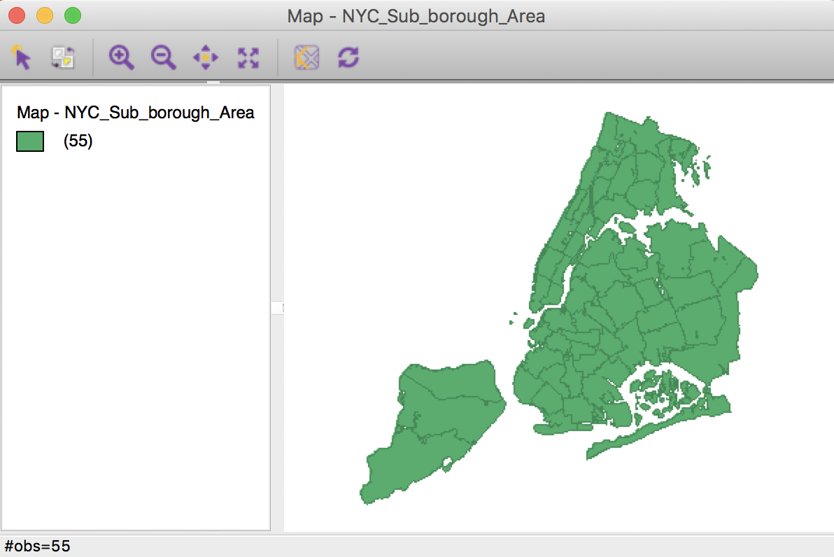
Figure 1: NYC sub-borough themeless map
Time Editor
We start the process of grouping the data for the same variable over different time periods by invoking Time > Editor from the main menu, as in Figure 2.
Figure 2: Time Editor in menu
Alternatively, as shown in Figure 3, we can select the Time icon on the toolbar (the latter brings up both the Time Editor and the Time Player).
Figure 3: Time toolbar icon
The main Time Editor interface is as in Figure 4.
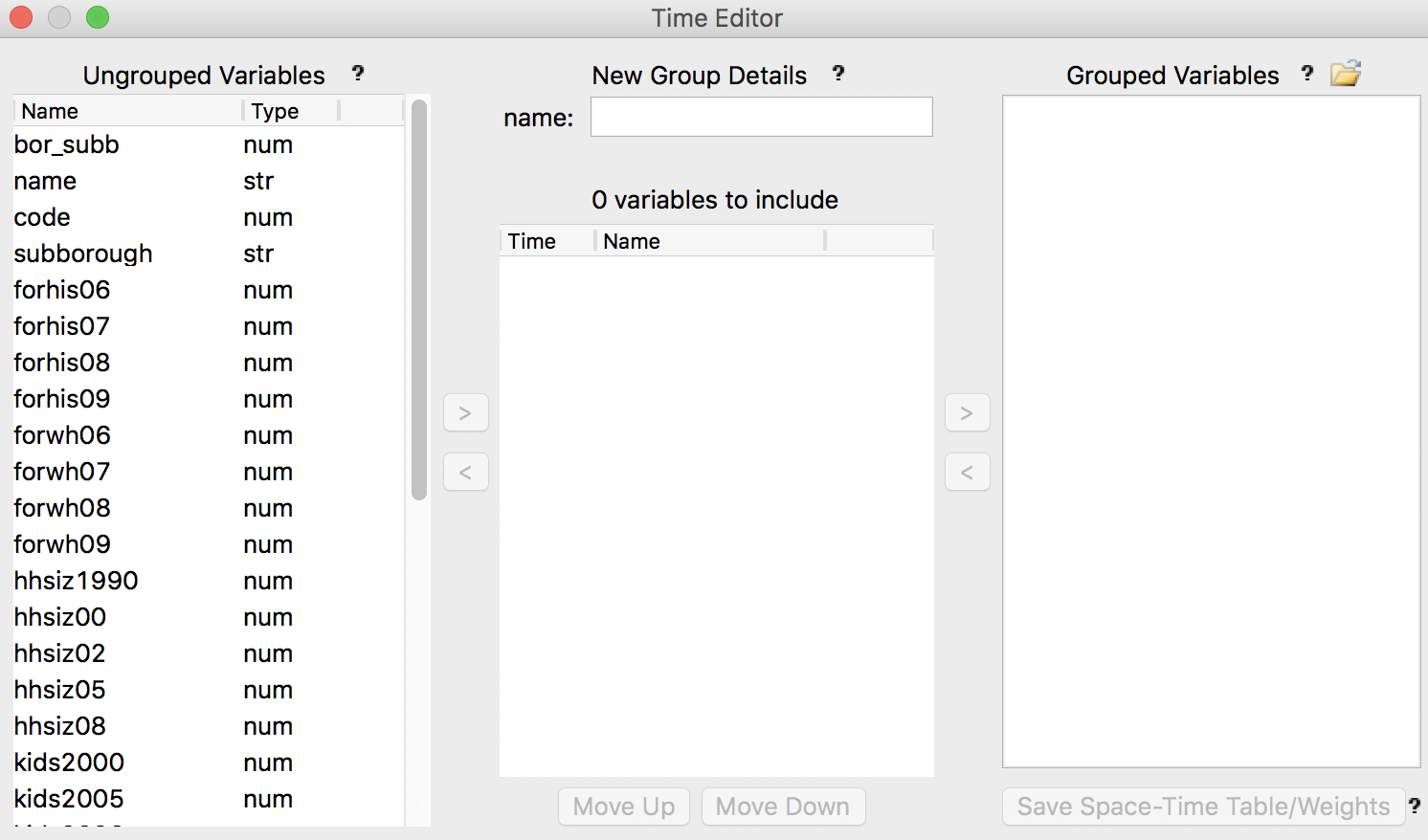
Figure 4: Time Editor interface
Grouping variables
The logic behind the time editor is that different variables are grouped under a single label, with an attached index that refers to the time period. For example, if we wanted to explore the evolution of the percentage households with children over time (the kidsxxxx variables in the data set), we would group the six variables kids2000 to kids2009 as a new time-enabled variable kids.
The Time Editor interface is organized into three panels. The panel on the left, labeled Ungrouped Variables, contains the variables with their original variable name. In addition, after some operations, it also includes the variables that are not time-enabled (for example, a variable like the ID for the sub-borough, which does not change over time). The middle panel, New Group Details, is where the name and time labels for the new grouped variable can be edited. The right-most panel, Grouped Variables, lists the result of the grouping operations.
The first step is to select the variables that are to be grouped in the left panel. For example, in Figure 5, we highlighted six variables, from kids2000 to kids2009.
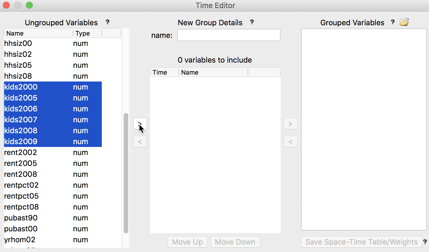
Figure 5: Selection of variables to be grouped
Clicking on the arrow button > moves the variables over to the central panel, with a suggested variable name (kids200) and time labels (time 0 through time 5), as illustrated in Figure 6.
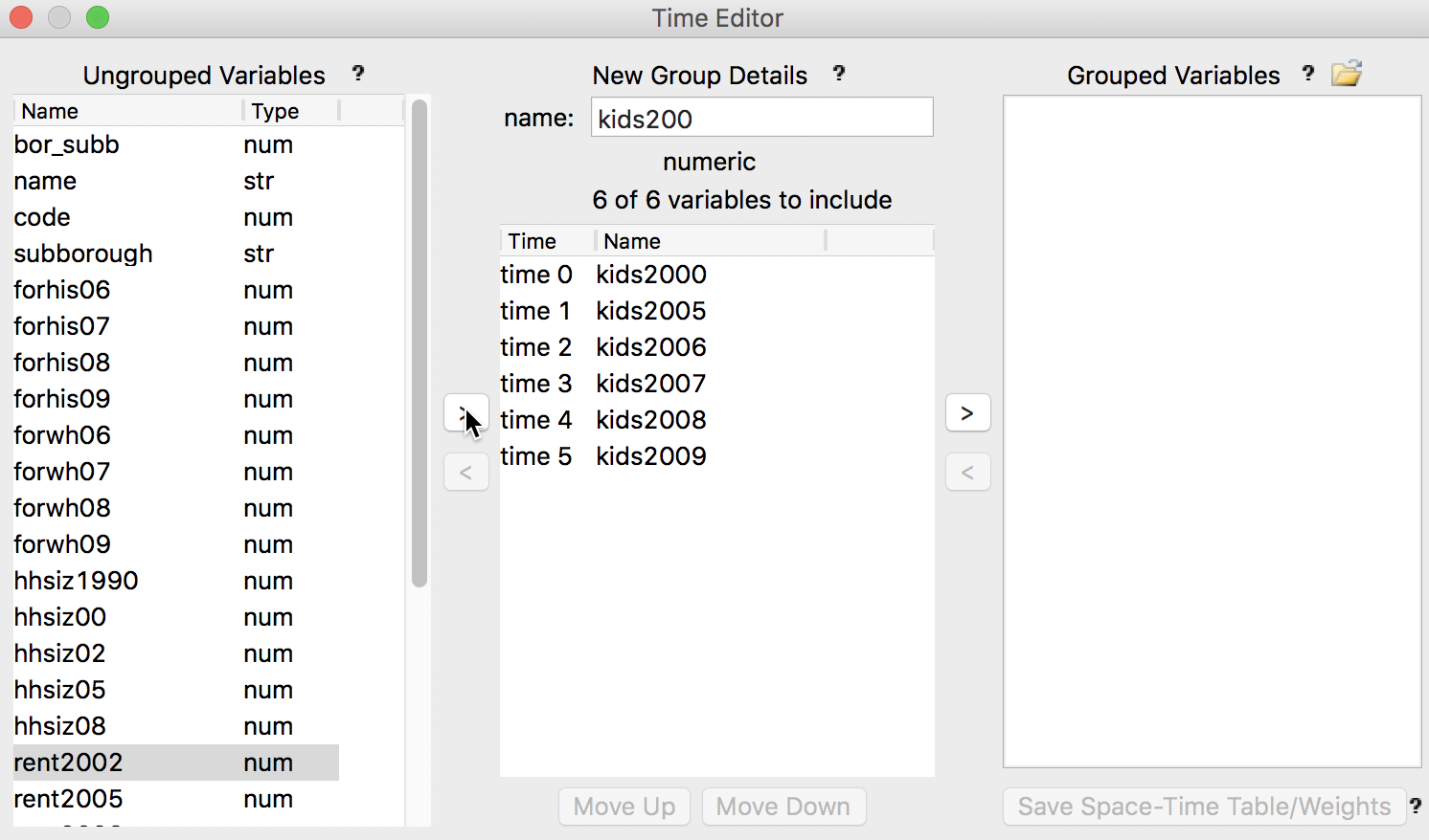
Figure 6: Grouping operation
Editing the time label
Both the time label and the variable name can be edited, as shown in Figures 7-8. Also, individual variables can be moved up or down in the sequence (the sequence determines the order of the comparatives static graphs and maps) by selecting the variable and using the buttons at the bottom of the panel. In addition, any variable can be moved out of the grouping, back to the ungrouped variables list, by selecting it and clicking on the left arrow button (<) to the right of the central panel.
For example, since the observations for 2005 to 2009 are every year, but the first observation is for 2000, we may want to remove kids2000 from the list. This is accomplished by selecting the variable name and clicking on <. This moves kids2000 back to the ungrouped variables panel, but it leaves the first time label in place. We remove it by right clicking on the panel and selecting Remove Time, as shown in Figure 7.
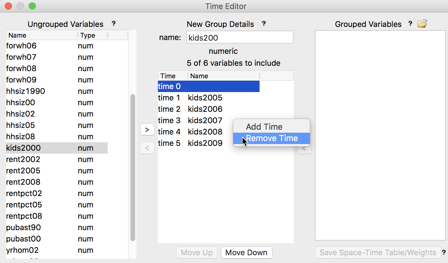
Figure 7: Removing variables and time labels
Next, we change the variable name from the suggested kids200 to kids and start editing the time labels to show the actual year, as in Figure 8.
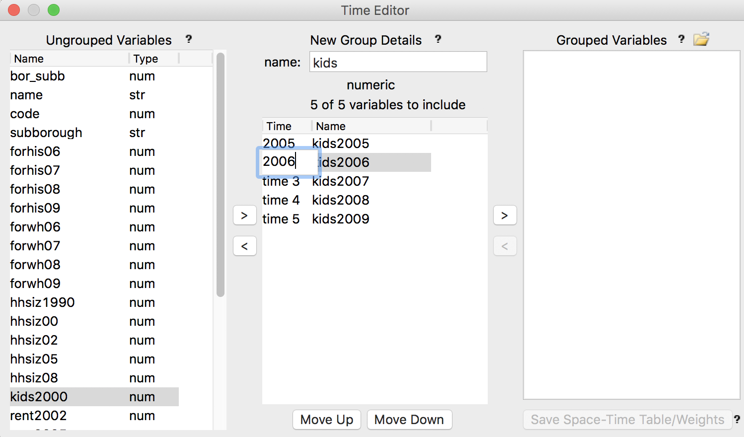
Figure 8: Editing variable name and time labels
At the end of the editing process, the New Group Details panels should look as in Figure 9.
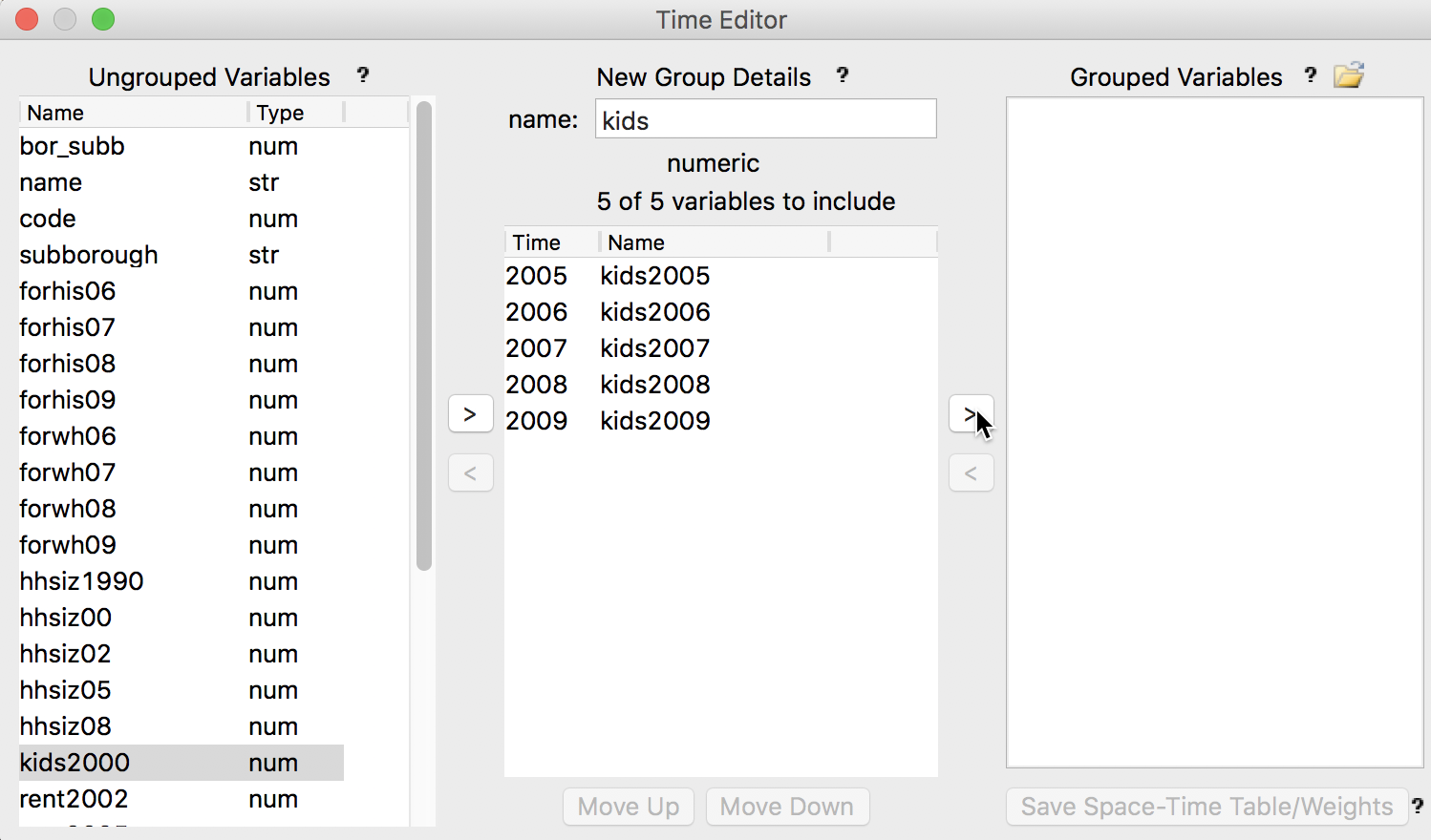
Figure 9: Variables ready to be grouped
The final step in the grouping process is to activate the group by selecting the > arrow to the right of the central panel. This moves the new variable name to the Grouped Variables panel and clears the central panel, as in Figure 10.
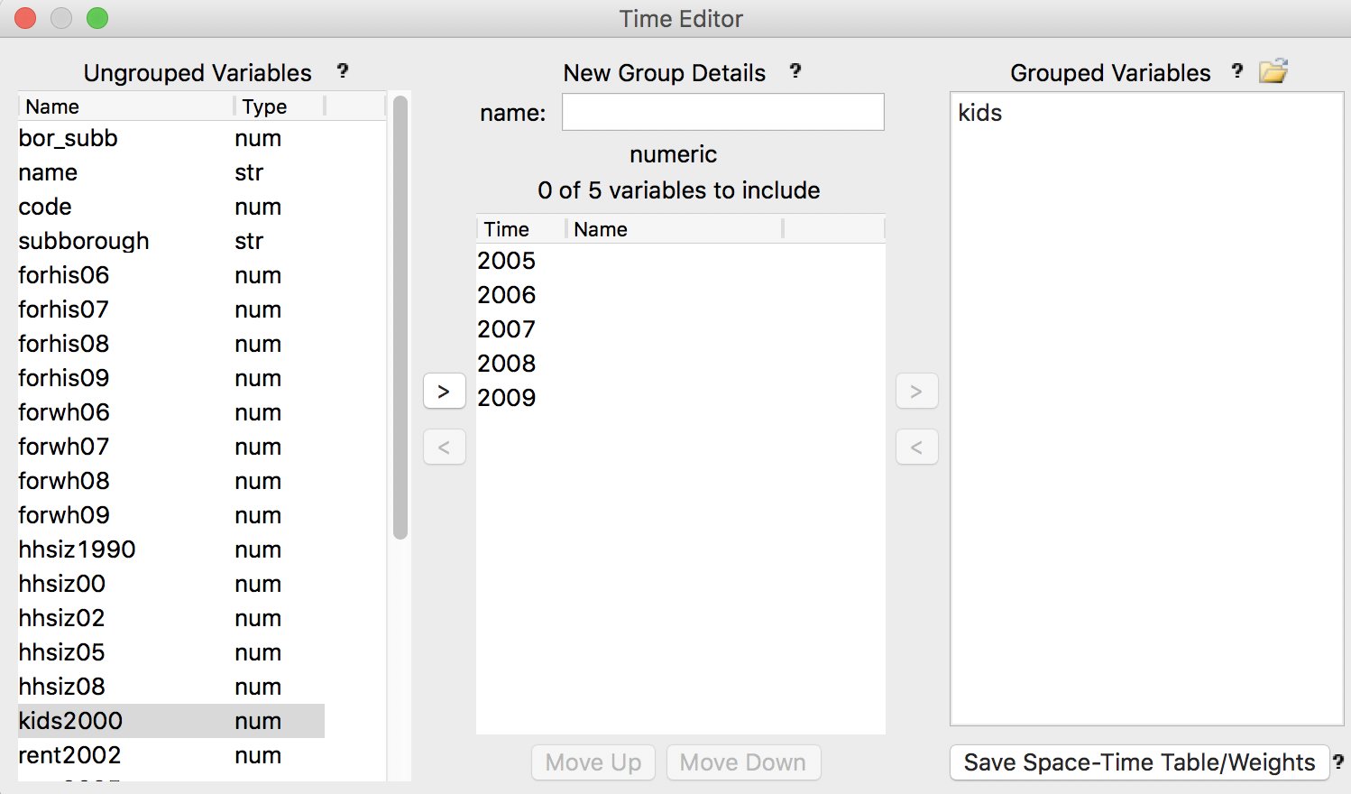
Figure 10: Grouped variable defined
The original five variables in the data table are now replaced by a single entry, showing a new variable kids, with the first time period in parentheses (2005), as in Figure 11. The kids2000 variable, which was not included in the grouping process, is still listed individually.
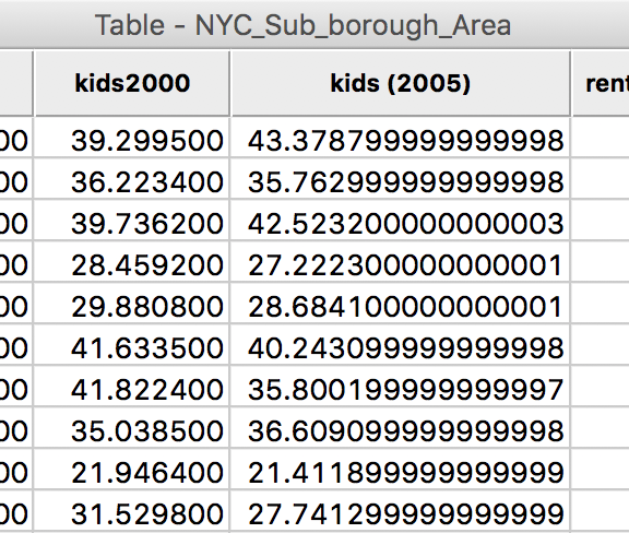
Figure 11: Grouped variable in the table
Note that the grouped variables have not been dropped as individual entries, they are just not displayed as such in the table. The new label in parentheses indicates that they have been grouped.
Finally, GeoDa is agnostic to what variables are grouped and in which order they are arranged, so this procedure can also be used to group variables that do not necessarily correspond to different time periods. For example, this may be useful when constructing a box plot graph that shows the box plots for multiple variables in one window.
Saving the group definitions to a Project File
As we have seen previously in the discussion of custom categories, any special definition such as a grouped variable will be lost if it is not saved in a project file (accomplished through File > Save Project). Once contained in a project file, the grouped variables can be re-used in later analyses. There can be several different project files associated with the same data layer, each focused on a special aspect of time dynamics.
The project file contains the time_ids specified in the time editor, and the new
variable definitions under the
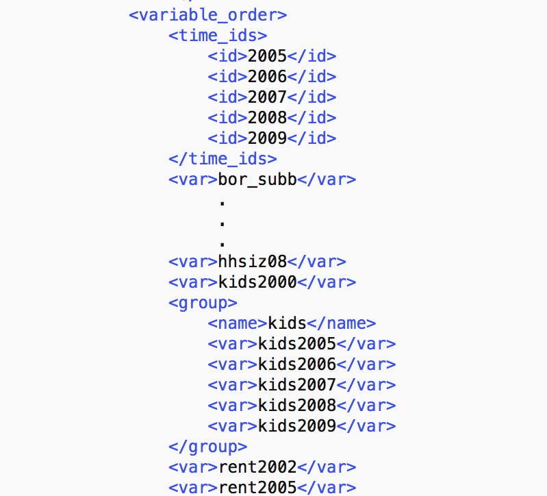
Figure 12: Grouped variable in project file
Note that in the current setup in GeoDa, the grouping of variables can only use one set of time periods, due to the synchronization mechanism that underlies the time player. So, in order to look at different time periods, such as six periods for one variable and three for another, two separate project files would need to be created. More precisely, any active grouping has to pertain to the same time labels for all the grouped variable.
To illustrate the use of grouped variables, we create a new project file with the variables hhsiz, rent, rentpc and yrhom grouped for the three years 2002, 2005, and 2008. We store this in a new project file, say nyc_project2.gda. Then, we close the current project and start a new one by dropping the project file in the Connect to Data Source interface.
Time Player
We start the time player by clicking on its icon, as in Figure 3, or from the menu as Time > Time Player.2 This brings up the simple player interface shown in Figure 13, together with the time editor dialog (not shown). We will ignore the latter in the current discusion.
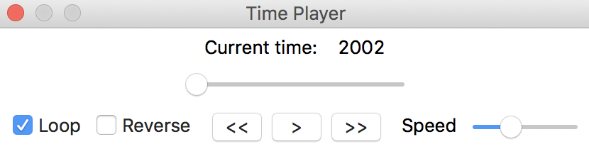
Figure 13: Time player control
The time player shows the Current time at the top, which is the time label that corresponds with the first period of the grouped variable (2002 in our example). For any graph or map in a current window, the time player will cycle through the time periods for the grouped variable(s) displayed. The radio button on the slider shows the progression over time. The controls at the bottom move the player forward automatically using the single arrow >, or manually forward or backward using the double arrows >> and <<. The default is to Loop (box checked) and to move forward (Reverse not checked). Note that forward is whatever order was used in the time editor, and is not automatically or necessarily the correct time sequence. As mentioned above, GeoDa is agnostic as to what is defined as the time order or time labels. Finally, the Speed of the automatic progression can be adjusted by means of the slider button.
In practice, manual progressions typically provides the most insight.
We will illustrate the use of the time player in some simple comparative static analysis of the a-spatial as well as the spatial distribution of a variable over time. We will consider the box plot, scatter plot and choropleth map as examples.
Box plot over time
We start with a box plot. Selecting the box plot icon or menu item brings up the variable settings dialog, in the usual fashion, as shown in Figure 14. However, there is a difference with the case where no grouped variables are present.
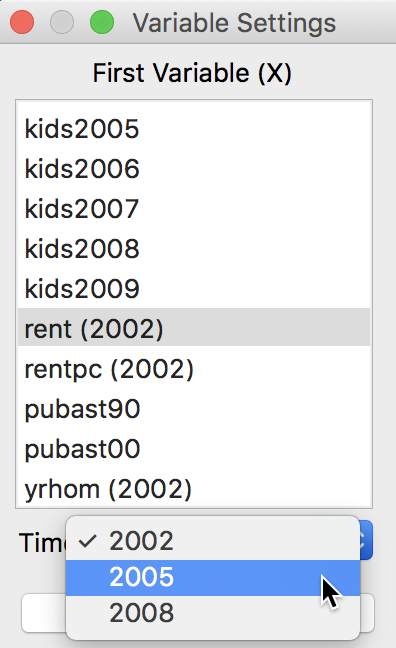
Figure 14: Box plot variable selection
Below the list of variables is a Time box that shows the currently active time label (2002 in our example). All time-enabled (grouped) variables in the interface have the first time label in parentheses next to their name (the variables without the parentheses are not time-enabled). A different time period can be selected from the Time drop down list, as displayed in Figure 14. Once a different label is chosen, all variables in the list will show the updated label in parentheses.
For now, we stay with the initial setting of 2002 and click on OK to bring up the box plot. In the default case, the box plots for all time periods are shown side by side, using the same axis for the associated values, as in Figure 15.
In our example, this clearly demonstrates the upward trend in median rent, something that would not be obvious in a standard (not time-enabled) box plot, since such plot is centered on its own median. In the default setting, the descriptive statistics for each period are listed below the plot.
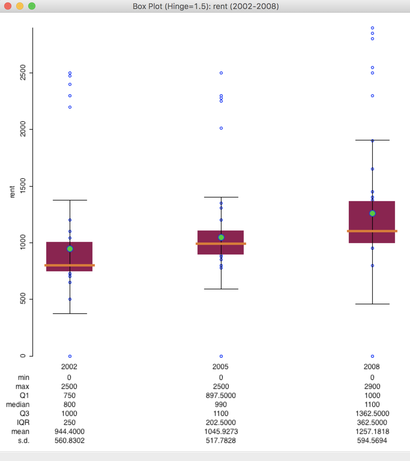
Figure 15: Multiple time period box plot
We can again use linking to identify the outliers, assess whether they remain outliers over time, and show them in a map. In this particular example, we have a few suspicious observations with a value of 0, likely due to a coding error. We ignore this aspect for now.
The time-enabled box plot has a number of interesting options. Perhaps the most useful of these is the Number of Box Plots. As shown in Figure 16, the default is to display All, but it is also possible to display any subset (1 or 2).
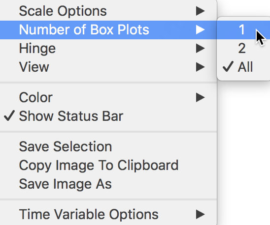
Figure 16: Box plot options
For example, after changing this option to 1, a single box plot appears, as in Figure 17. This graph displays the data for the first period, with 2002 listed in parentheses at the top of the graph. Consecutive clicking on the >> icon in the Time Player will move the plot forward, one period at a time. The other options of the time player allow continuous looping, moving in reverse order, etc., as outlined above.
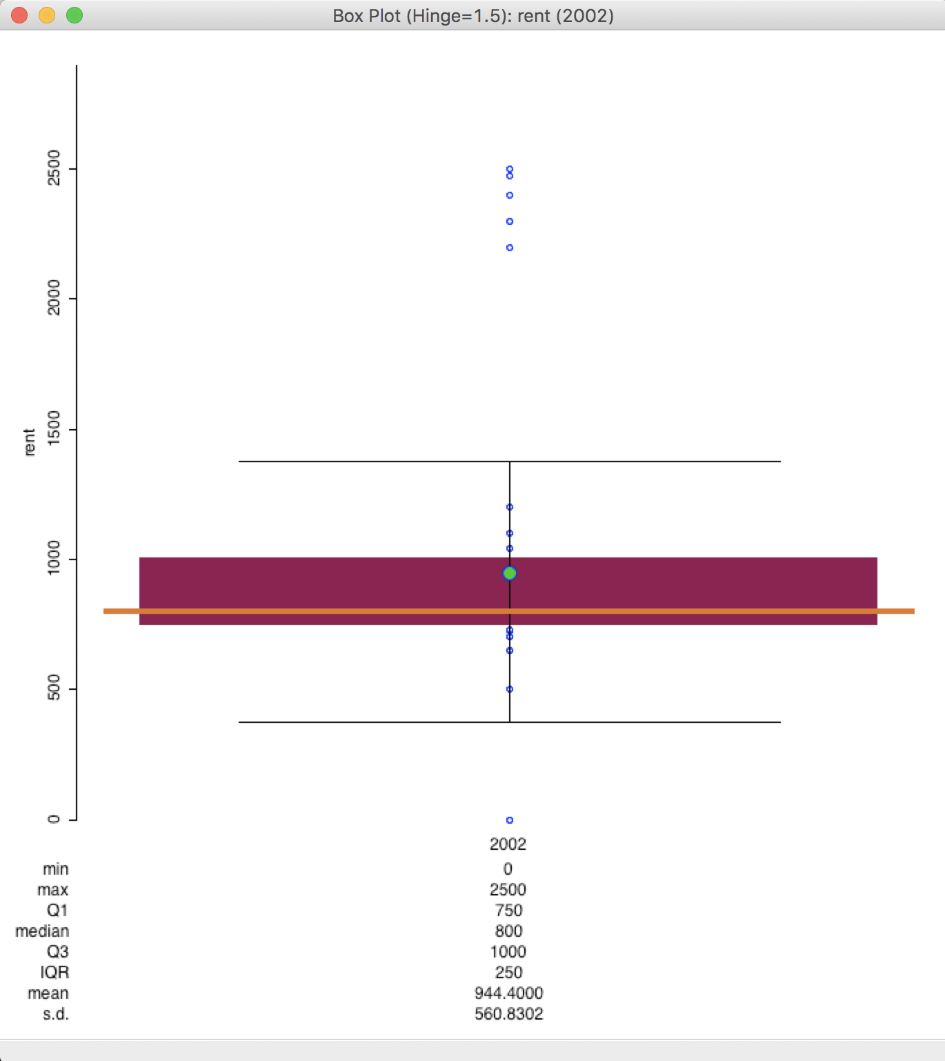
Figure 17: Single time period box plot
Two other options of the time-enabled box plot warrant mentioning (the remaining options work the same way as for the standard box plot). The first item in the menu in Figure 16, Scale Options, is set by default to Fixed scale over time. This only applies to the individual box plots, not to the (default) simultaneous graph. When cycling through the different time periods, the default is that the same scale is used for all. This allows for some visual impression of changing overall patterns over time (e.g., it would show the median bar moving up over time). When turned off, each individual time box plot is as it would be without having a time-enabled variable.
The option at the bottom of the menu pertains to Time Variable Options and is set by default to synchronize all variables through the time control. This means that all graphs or maps that have been constructed for time-enabled variables will be synchronized to move through the time periods as managed by the time player. This is typically the desired behavior. Only in exceptional circumstances should this be turned off, for example, where a given plot should not change by time period.
Scatter plot over time
The scatter plot for time-enabled variables uses the same logic as the box plot. Again, the variables selection interface is enhanced with two Time boxes at the bottom, as in Figure 18. This allows for the time periods for the x and y variables to be different, for example, when comparing the same variable in two time periods, as illustrated in Figures 21-22. The time-enabled variables are listed with the corresponding time label in parentheses.
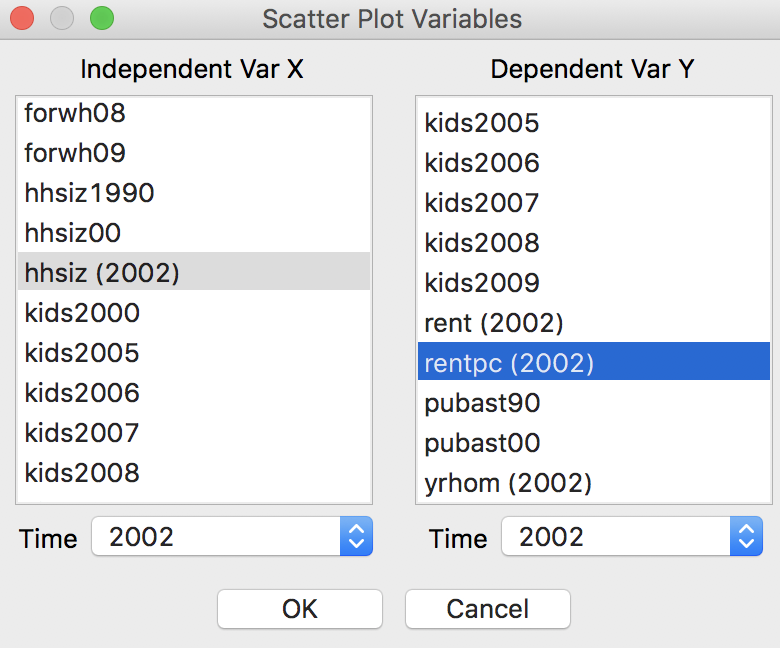
Figure 18: Scatter plot variable selection
To illustrate the operation of the scatter plot, we select hhsiz (2002) as the variable for the x-axis and rentpc (2002) as the variable for the y-axis. The corresponding scatter plot takes on the usual form, but now has the time labels listed next to each variable at the top of the plot, shown in Figure 19.
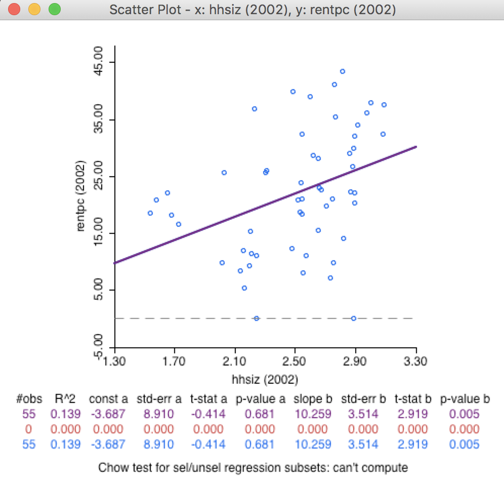
Figure 19: Household size and percent renters, 2002
The scatter plot for the next period is brought up by clicking on >> in the time player. In our example in Figure 20, we see how the slope of the linear fit is no longer significant in 2005. All the usual scatter plot options apply (brushing, LOWESS smoother, etc.)
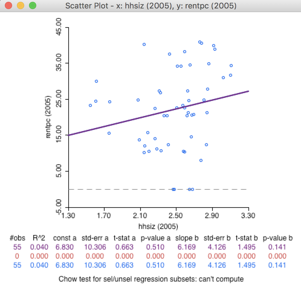
Figure 20: Household size and percent renters, 2005
Serially autoregressive scatter plot
One special feature of the time-enabled scatter plot is that it is very easy to consider a time-lagged bivariate regression. For example, we can select the yrhom variable in 2002 for the x-axis and the corresponding variable for 2005 in the y-axis, as in Figure 21.
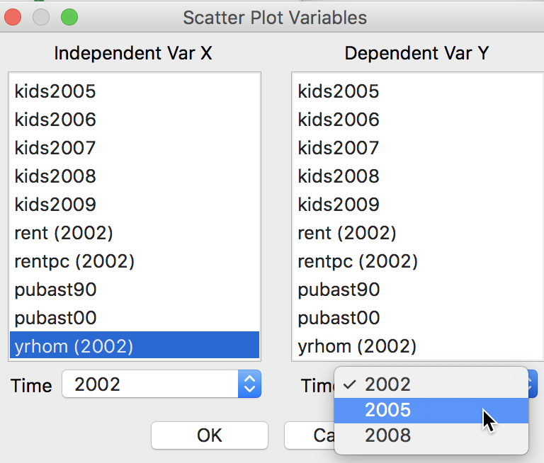
Figure 21: Scatter plot variable selection by period
This results in an assessment of the magnitude of a one period temporal autoregression. In the graph in Figure 22, it follows that the slope of 0.842 is highly significant.
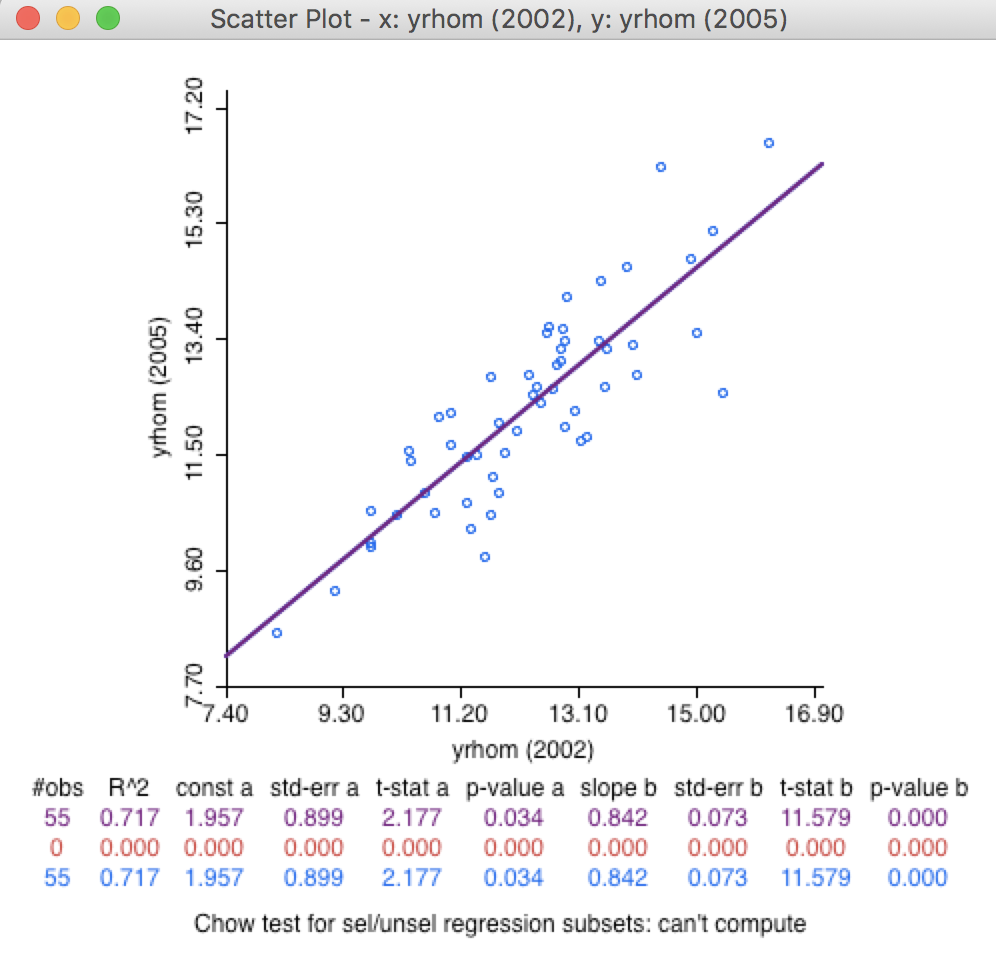
Figure 22: Years in neighborhood, 2002-2005
In the same way as before, this can be moved forward over time. Since there are only three period labels, there will only be two scatter plots considering a one-period lag. All the usual options apply. We do not pursue this further here.
Maps over time
As our final example, we consider the application of time-enabled variables to choropleth mapping. This is one instance where the use of custom categories is especially useful. Unlike for the statistical graphs, there is no built-in fixed scales option for maps, but such scales can be defined through the Category Editor.
For example, say that we want to assess the spatial distribution of median household size by sub-borough over time. We could create any of the choropleth map options starting with the hhsiz (2002) variable and then cycle through the three time periods by means of the time player. However, each of these maps would have its own (relative) classification, making it less intuitive to assess changes in absolute magnitude over time (as opposed to relative magnitude).
Instead, we use the category editor to create a custom1 break, starting with the hhsiz (2002) variable, making the breaks User-Defined, and turning the color scheme into sequential, with 5 categories. We manually enter the break points (somewhat arbitrarily) as 2, 2.5, 2.8 and 3. The result is as shown in Figure 23.
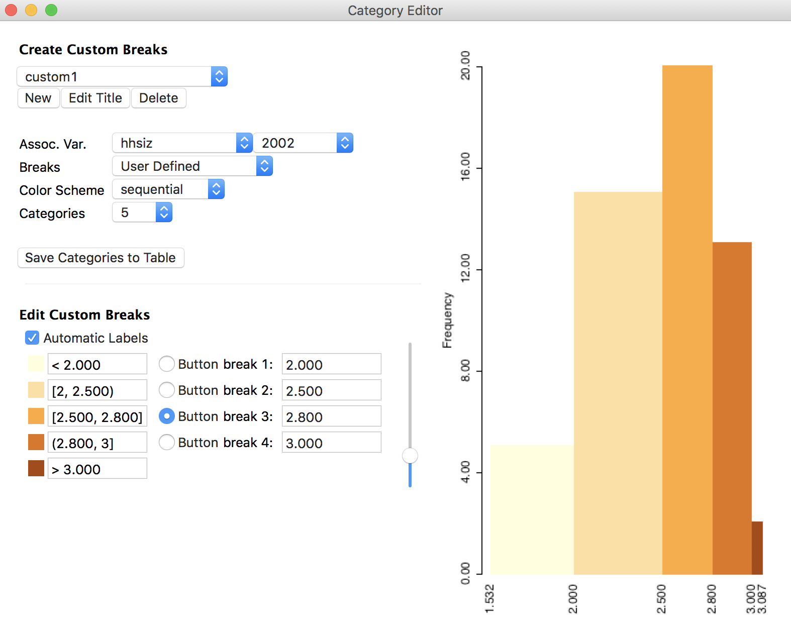
Figure 23: Custom break settings, household size
We now create a new map and choose Custom Breaks from the map menu, with custom1 as the desired classification. The resulting map in Figure 24 shows the spatial distribution of median household size for 2002.
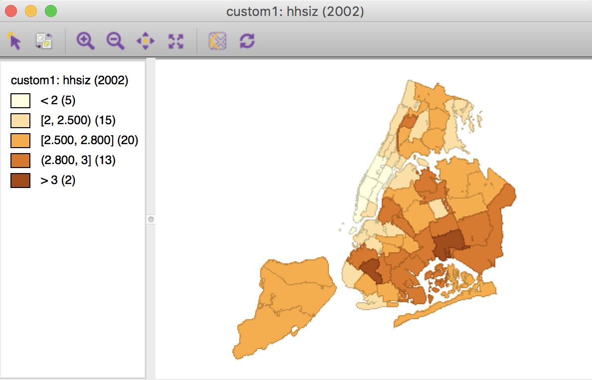
Figure 24: Household size, custom breaks 2002
Moving through to the next period (2005) with the time player yields the map shown in Figure 25 with the same legend classifications as in Figure 24. This way, in addition to comparing the spatial patterns, we see how the second category (2, 2.5) grows from 15 observations to 20, and the next to highest category (2.8, 3) goes from 13 to 7 observations.
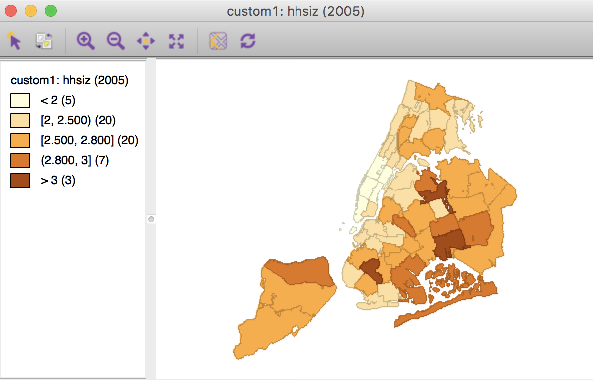
Figure 25: Household size, custom breaks 2005
Finally, moving to 2008 in Figure 26 illustrates a further changing pattern, with now only 5 observations remaining in the categories above 2.8.
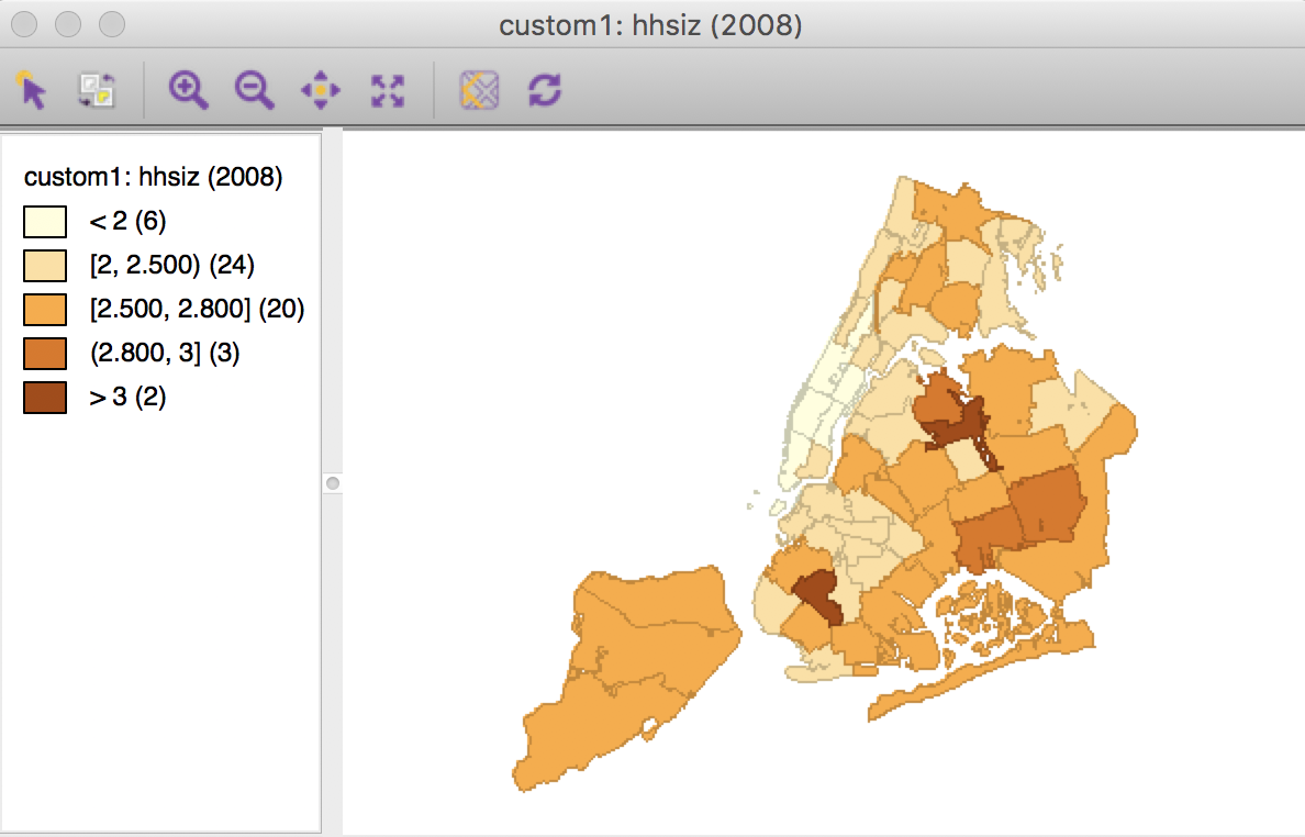
Figure 26: Household size, custom breaks 2008
The use of custom categories to evaluate changes in the spatial pattern over time is particularly useful when the breaks are dictated by substantive concerns, such as specific policy-related criteria.
-
University of Chicago, Center for Spatial Data Science – anselin@uchicago.edu↩
-
The time icon on the toolbar brings up both the time editor and the time player. In the menu, the time editor can be selected separately, but the time player item generates both the player and the editor.↩