6 Thematic Mapping
6.1 Overview
Once we have downloaded the contextual data and generated the access metrics, we can start visualizing them to identify any spatial patterns. This can help identify whether a variable is homogeneously distributed across space or do we see clustering & spatial heterogeneity. In this tutorial we will cover methods to plot data variables spatially i.e. create thematic maps, technically known as choropleth maps. We will cover the most commonly used types of choropleth mapping techniques employed in R. Please note the methods covered here are an introduction to spatial plotting. In this tutorial our objectives are to:
- Generate a choropleth map
- Visualize spatial distributions of data
- Test sensitivty of various thresholds
6.2 Environment Setup
To replicate the codes & functions illustrated in this tutorial, you’ll need to have R and RStudio downloaded and installed on your system. This tutorial assumes some familiarity with the R programming language.
6.2.1 Input/Output
We will using the per capita income data for the City of Chicago downloaded & saved as a shapefile in the Census Data Wrangling. These files can also be found here. Our input is:
- Chicago Zip Codes with per capita income,
chizips_18_pci.shp
Our output will be three thematic maps highlighting the distribution of per capita income at a zip code level across the city of Chicago.
6.2.2 Load the packages
We will use the following packages in this tutorial:
tidyverse: to manipulate datatmap: to visualize and create mapssf: to read/write and manipulate spatial data
Load the libraries required.
6.2.3 Load data
We will read in the shapefile with the per capita income at the zipcode level for the city of Chicago for year 2018.
## Reading layer `chizips_18_pci' from data source `/Users/yashbansal/Desktop/CSDS_RA/opioid-environment-toolkit/data/chizips_18_pci.shp' using driver `ESRI Shapefile'
## Simple feature collection with 85 features and 7 fields
## geometry type:  MULTIPOLYGON
## dimension:      XY
## bbox:           xmin: -87.94011 ymin: 41.64454 xmax: -87.52453 ymax: 42.02304
## geographic CRS: WGS 84## Simple feature collection with 6 features and 7 fields
## geometry type: MULTIPOLYGON
## dimension: XY
## bbox: xmin: -87.94011 ymin: 41.68284 xmax: -87.52454 ymax: 42.01914
## geographic CRS: WGS 84
## GEOID totPp18 prCptIn name objectd shape_r
## 1 46320 13703 17983 CHICAGO 1 6450276623.31
## 2 60007 33420 39312 CHICAGO 1 6450276623.31
## 3 60018 30386 25607 CHICAGO 1 6450276623.31
## 4 60068 37736 53792 CHICAGO 1 6450276623.31
## 5 60076 31867 37700 CHICAGO 1 6450276623.31
## 6 60077 28329 30903 CHICAGO 1 6450276623.31
## shap_ln geometry
## 1 845282.931362 MULTIPOLYGON (((-87.52472 4...
## 2 845282.931362 MULTIPOLYGON (((-87.93523 4...
## 3 845282.931362 MULTIPOLYGON (((-87.85556 4...
## 4 845282.931362 MULTIPOLYGON (((-87.81633 4...
## 5 845282.931362 MULTIPOLYGON (((-87.70866 4...
## 6 845282.931362 MULTIPOLYGON (((-87.7618 42...Lets review the dataset structure. In the R sf data object, the ‘geometry’ column provides the geographic information/boundaries that we can map. This is unique to simple features data structures, and a pretty phenomenal concept.
We can do a quick plot using:
6.3 Thematic Plotting
We will be using tmap package for plotting spatial data distributions. The package syntax has similarities with ggplot2 and follows the same idea of A Layered Grammar of Graphics.
- for each input data layer use
tm_shape(), - followed by the method to plot it, e.g
tm_fill() or tm_dots() or tm_line() or tm_borders()etc.
Similar to ggplot2, aesthetics can be provided for each layer and plot layout can be manipulated using tm_layout(). For more details on tmap usage & functionality, check tmap documentation. The previous map we plotted using plot can be mapped using tmap as in the code below.
## tmap mode set to plotting
In tmap, the classification scheme is set by the style option in tm_fill() and the default style is pretty. Lets plot the distribution of per capita income by zipcode across the city of Chicago with default style using the code below. We can also change the color palette used to depict the spatial distribution. See Set Color Palette in Appendix for more details on that.
tm_shape(chicagoZips_18_PCI) + tm_fill('prCptIn', title = 'Per Capita Income - Pretty') +
tm_borders() +
tm_layout(frame = FALSE, legend.outside = TRUE, legend.outside.position = 'right',
          legend.title.size = 0.9,
          main.title = 'Per Capita Income, by Zipcode, Chicago 2018',
          main.title.size = 0.9)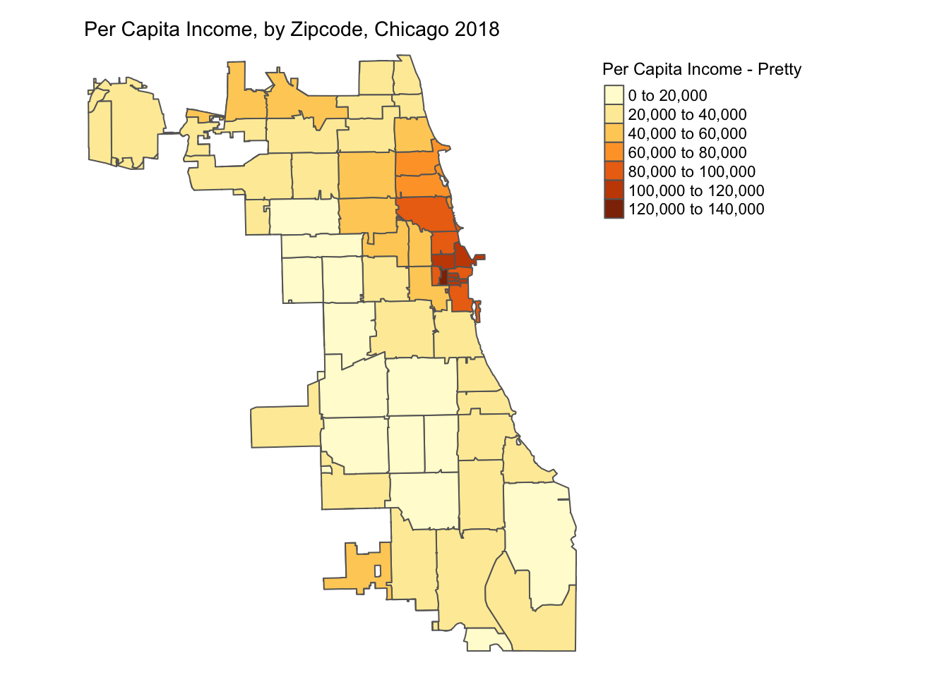
We will be plotting the spatial distribution of variable perCapIncome for the city of Chicago using three methods.
- Quantile
- Natural Breaks
- Standard Deviation
For a more detailed overview of choropleth mapping and methods, check out the related GeoDa Center Documentation.
6.3.1 Quantile
A quantile map is based on sorted values for the variable that are then grouped into bins such that each bin has the same number of observations. It is obtained by setting style = 'quantile' and n = no of bins arguments in tm_fill().
p1 <- tm_shape(chicagoZips_18_PCI) + tm_fill('prCptIn', title = 'Per Capita Income - Quantile',
                                style = 'quantile', n = 5) + tm_borders() +
      tm_layout(frame = FALSE,legend.outside = TRUE,
                legend.outside.position = 'right', legend.title.size =0.9,
                main.title = 'Per Capita Income, by Zipcode, Chicago 2018',
                main.title.size = 0.9)

#tmap_save(p1, 'PctHisp_18_Quantile.png') # save the map in a .png file
p1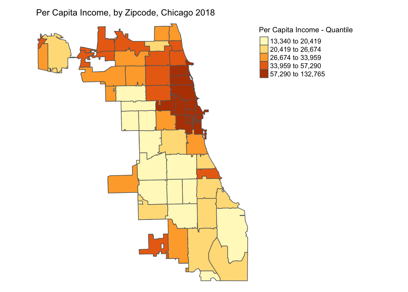
6.3.2 Natural Breaks
Natural breaks or jenks distribution uses a nonlinear algorithm to cluster data into groups such that the intra-bin similarity is maximized and inter-bin dissimilarity is minimized. It is obtained by setting style = 'jenks' and n = no. of bins in the tm_fill().
As we can see, jenks method better classifies the dataset in review than the quantile distribution. There is no correct method to use and the choice of classification method is dependent on the problem & dataset used.
p2 <- tm_shape(chicagoZips_18_PCI) + tm_fill('prCptIn', title = 'Per Capita Income - Jenks',
                                style = 'jenks', n = 5) + tm_borders() +
      tm_layout(frame = FALSE,legend.outside = TRUE,
                legend.outside.position = 'right', legend.title.size =0.9,
                main.title = 'Per Capita Income, by Zipcode, Chicago 2018',
                main.title.size = 0.9)

#tmap_save(p2, 'PctHisp_18_Jenks.png')# save the map in a .png file
p2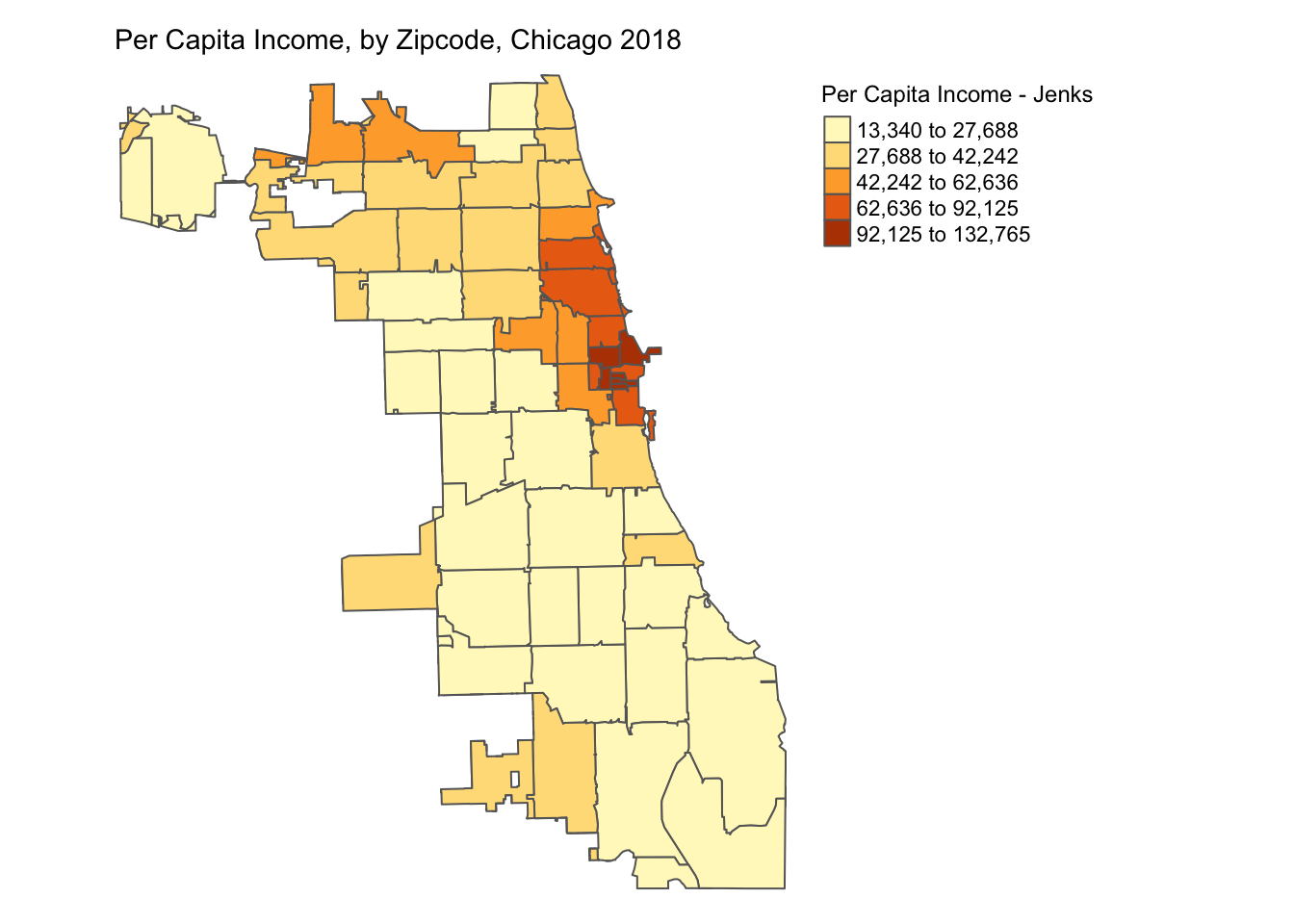
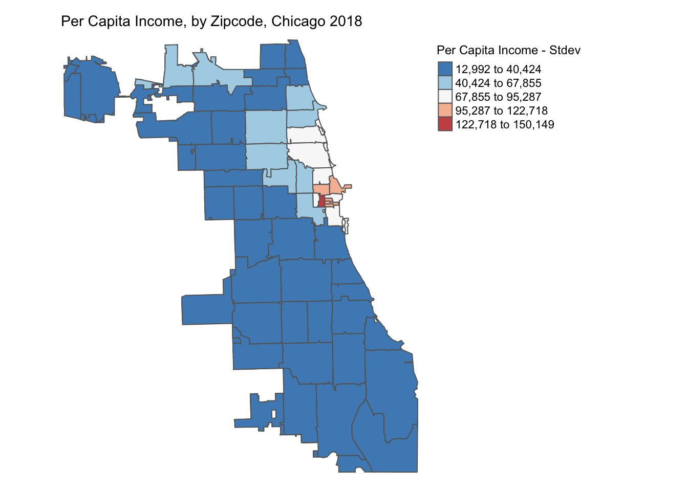
6.3.3 Standard Deviation
A standard deviation map normalizes the dataset (mean = 0, stdev = 1) and transforms it into units of stdev (given mean =0). It helps identify outliers in the dataset. It is obtained by setting style = 'sd' in the tm_fill().
The normalization process can create bins with negative values, which in this case don’t necessarily make sense for the dataset, but it still helps identify the outliers.
p3 <- tm_shape(chicagoZips_18_PCI) + tm_fill('prCptIn', title = 'Per Capita Income - Stdev',
                                style = 'sd') + tm_borders() +
      tm_layout(frame = FALSE, legend.outside = TRUE,
                legend.outside.position = 'right', legend.title.size =0.9,
                main.title = 'Per Capita Income, by Zipcode, Chicago 2018',
                main.title.size = 0.9)

#tmap_save(p3, 'PctHisp_18_Stdev.png')# save the map in a .png file
p3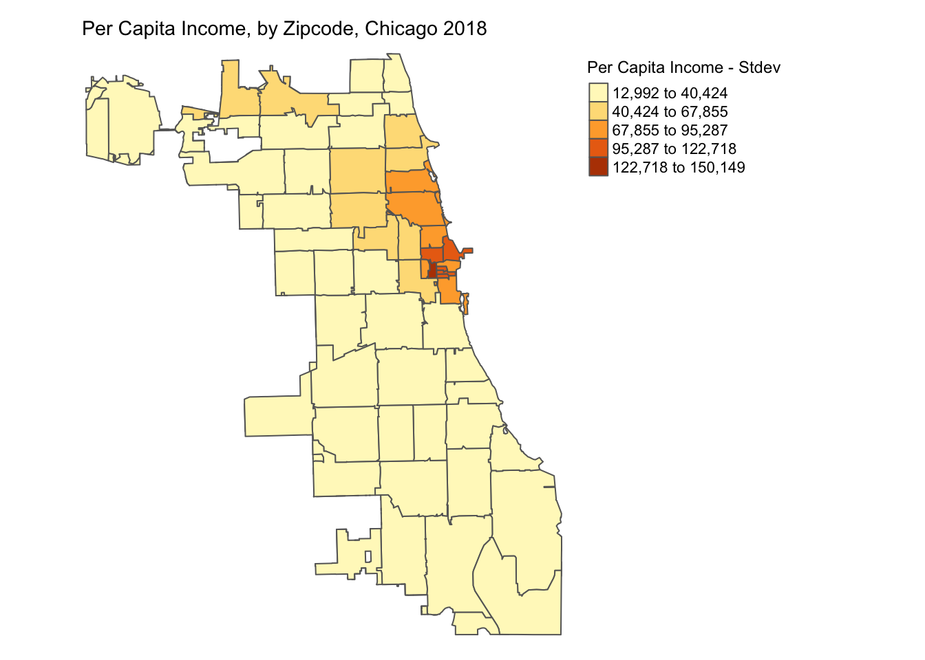
6.4 Appendix
Set Color Palette
The range of colors used to depict the distribution in the map can be set by modifying the palette argument in tm_fill(). For example, we can use Blues palette to create the map below.
tm_shape(chicagoZips_18_PCI) + tm_fill('prCptIn', title = 'Per Capita Income - Jenks',
                                style = 'jenks', n = 5, palette = 'Blues') + tm_borders() +
tm_layout(frame = FALSE,legend.outside = TRUE,
          legend.outside.position = 'right', legend.title.size =0.9,
          main.title = 'Per Capita Income, by Zipcode, Chicago 2018',
          main.title.size = 0.9)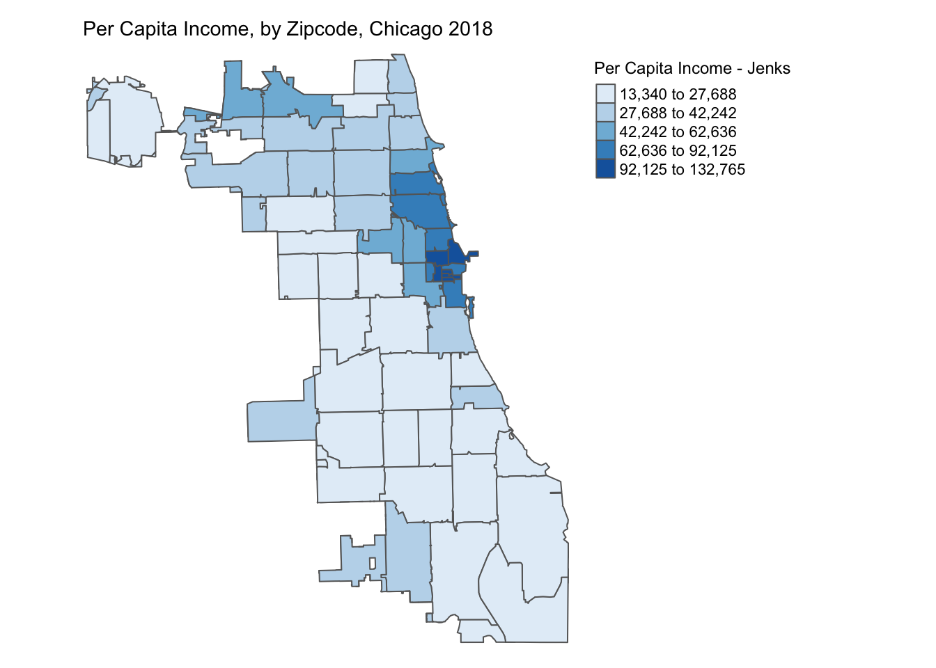
Use ColorBrewer
To build aesthetically pleasing and easy-to-read maps, we recommend using color palette schemes recommended in ColorBrewer 2.0 developed by Cynthia Brewer. The website distinguishes between sequential(ordered), diverging(spread around a center) & qualitative(categorical) data. Information on these palettes cab be displayed in R using RColorBrewer package.
We can get the hex values for the colors used in a specific palette with n bins & plot the corresponding colors using code below.
## [1] "#F6EFF7" "#BDC9E1" "#67A9CF" "#1C9099" "#016C59"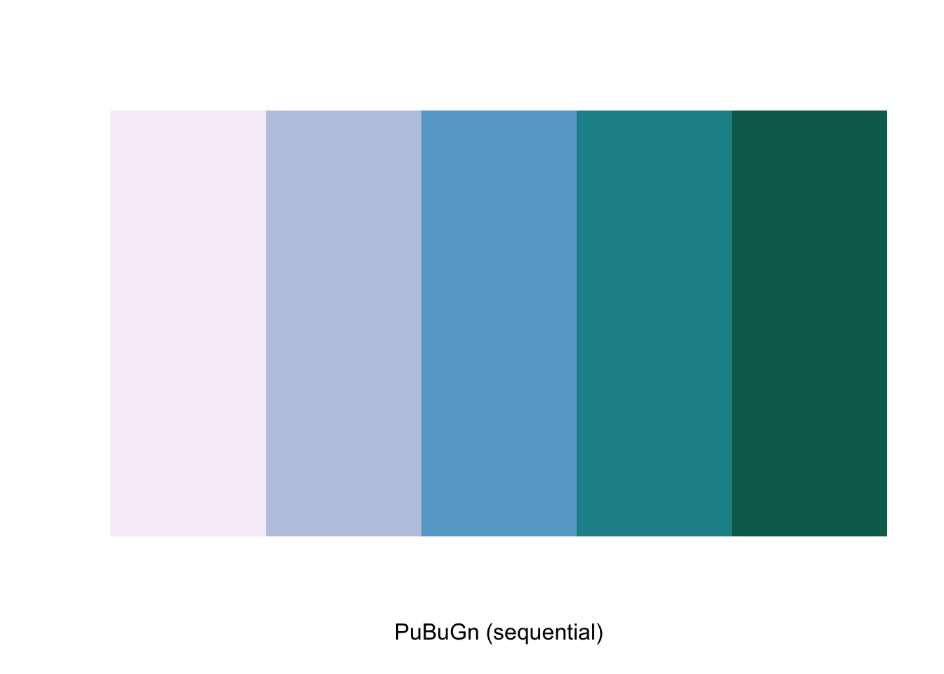
We can update the jenks map by using this sequential color scheme and changing the transparency using alpha = 0.8 as below.
tm_shape(chicagoZips_18_PCI) + tm_fill('prCptIn', title = 'Per Capita Income - Jenks',
                                style = 'jenks', n = 5, palette = 'PuBuGn') + tm_borders() +
tm_layout(frame = FALSE,
          legend.outside = TRUE, legend.outside.position = 'right', legend.title.size =0.9,
          main.title = 'Per Capita Income, by Zipcode, Chicago 2018',
          main.title.size = 0.9)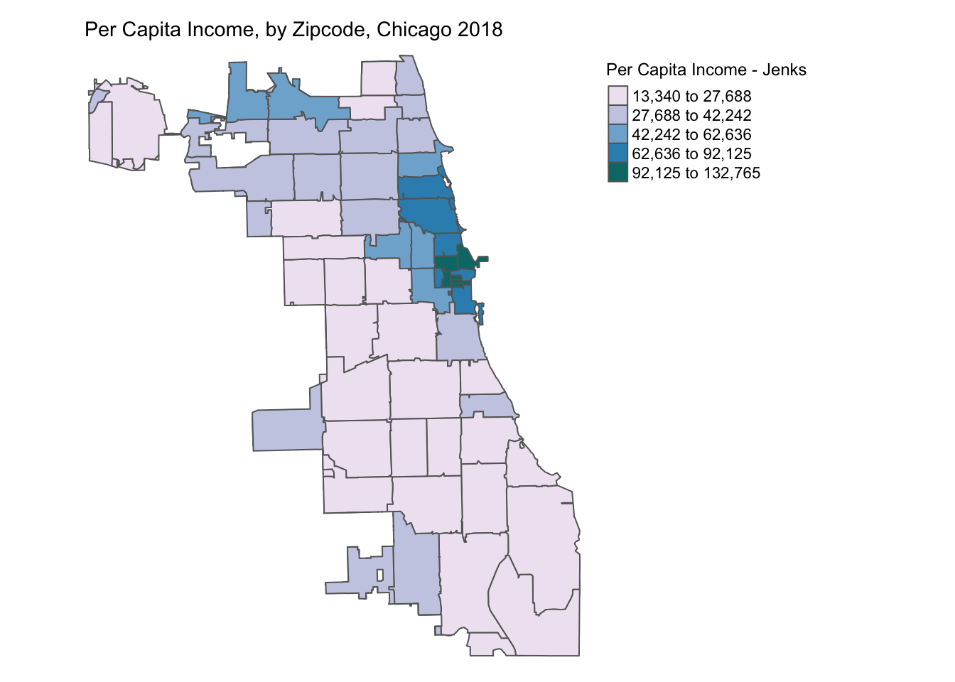
We can also update the stdev map by using a diverging color scheme as below.
tm_shape(chicagoZips_18_PCI) + tm_fill('prCptIn', title = 'Per Capita Income - Stdev',
                                style = 'sd', palette = '-RdBu', alpha = 0.9) + tm_borders() +
tm_layout(frame = FALSE,
          legend.outside = TRUE, legend.outside.position = 'right', legend.title.size =0.9,
          main.title = 'Per Capita Income, by Zipcode, Chicago 2018',
          main.title.size = 0.9)